

تصميم بروشورات
حقق تواصلاً ملموساً مع جمهورك.
كلاسيكي ولكنه فعال. يوصل المصممون رسالتك من خلال بروشورات تجذب انتباه القارئ من النظرة الأولى، مدعومة برسوم توضيحية تؤكد أهدافك.
كلاسيكي ولكنه فعال. يوصل المصممون رسالتك من خلال بروشورات تجذب انتباه القارئ من النظرة الأولى، مدعومة برسوم توضيحية تؤكد أهدافك.
أعمالنا محبوبة في جميع أنحاء العالم 


زيادة الوعي بالعلامة التجارية من خلال البروشورات

ستجذب الانتباه أكثر مع الكتيبات المصممة باحتراف

من المرجح أن تبرز بين المنافسين
زيادة الوعي بالعلامة التجارية من خلال البروشورات
ستجذب الانتباه أكثر مع الكتيبات المصممة باحتراف
من المرجح أن تبرز بين المنافسين


نقوم بفهم أهدافك النهائية والجمهور المستهدف ونبدأ بتطوير ووضع الخطوط العريضة.
نقوم بإنشاء مسودات تنقل الرسالة بشكل فعال ومفهوم.
يقوم مصممونا بوضع التصميم النهائي الذي سينقل المعلومات التي ستخدم غرضك.

التصميم الاستثنائي من برزلاب أدى إلى تحسين حضوري عبر الانترنت, هم جديرون بالثقة وملتزمون بالوقت ودائماً ما يلبون احتياجات تصميمي

اسماعيل حماده الرئيس التنفيذي لشركة Biznet Consulting
فريق برزلاب سريع الاستجابة، ويتميز بالموثوقية والدقة، مما جعله شريكاً فعالاً وديناميكياً، نجح في الارتقاء بمستوى العروض التقديمية والمحتوى المرئي لدينا

مهر حسين حساب تيك توك مخصص للأعمال
برزلاب أبهرتنا بحلولها الإبداعية و خبرتها ثنائية اللغة وشراكتها الجديرة بالثقة

خالد السبي مدير تسويق بشركة Audi
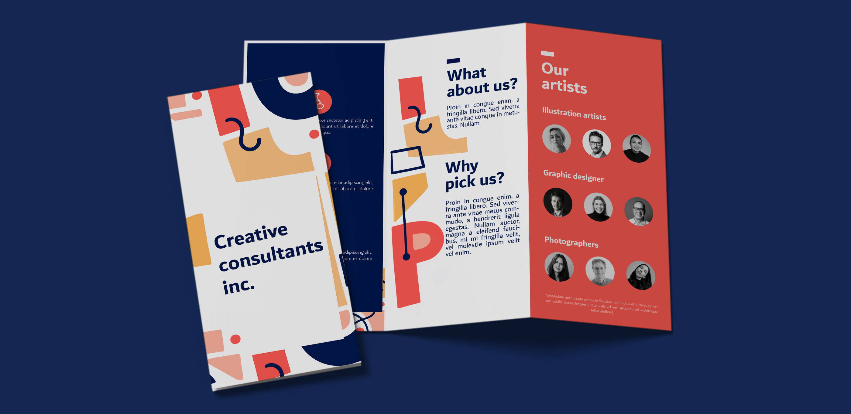
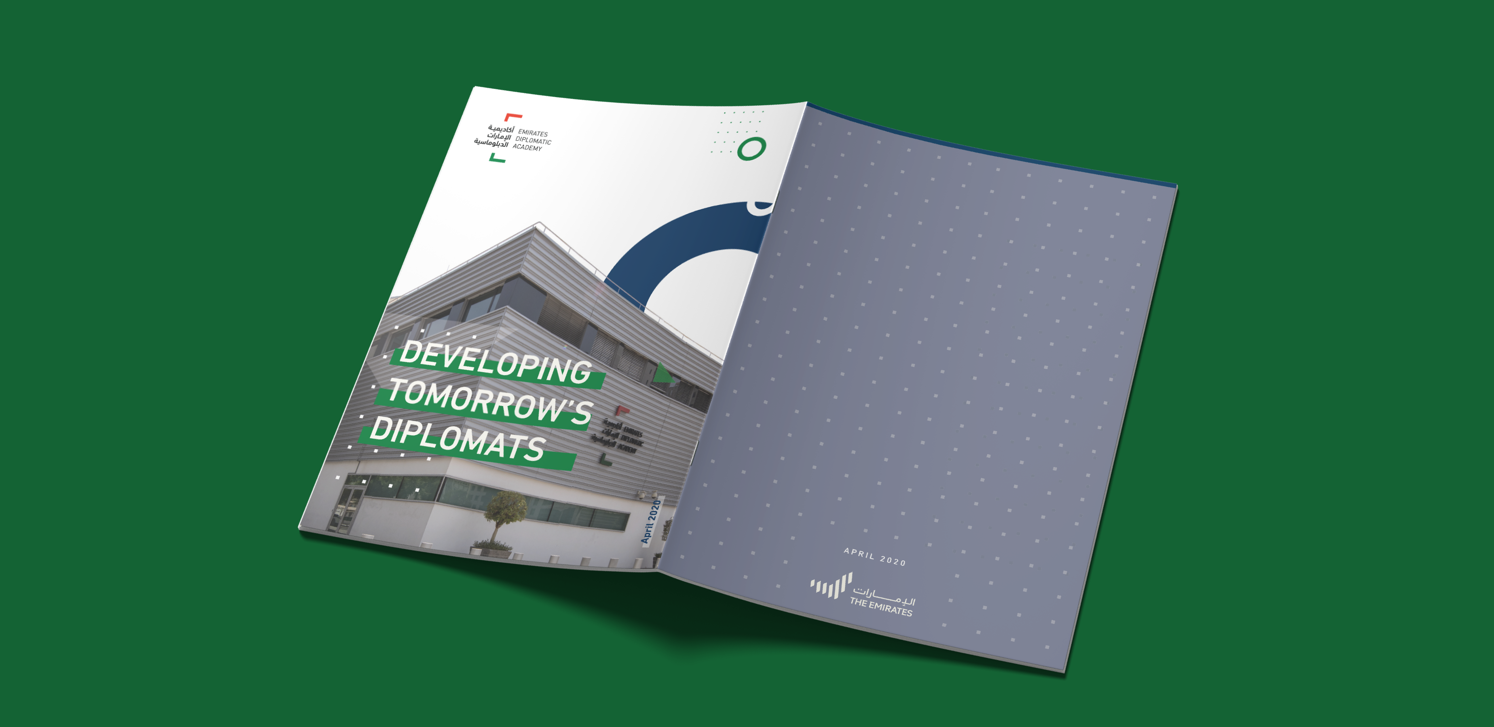
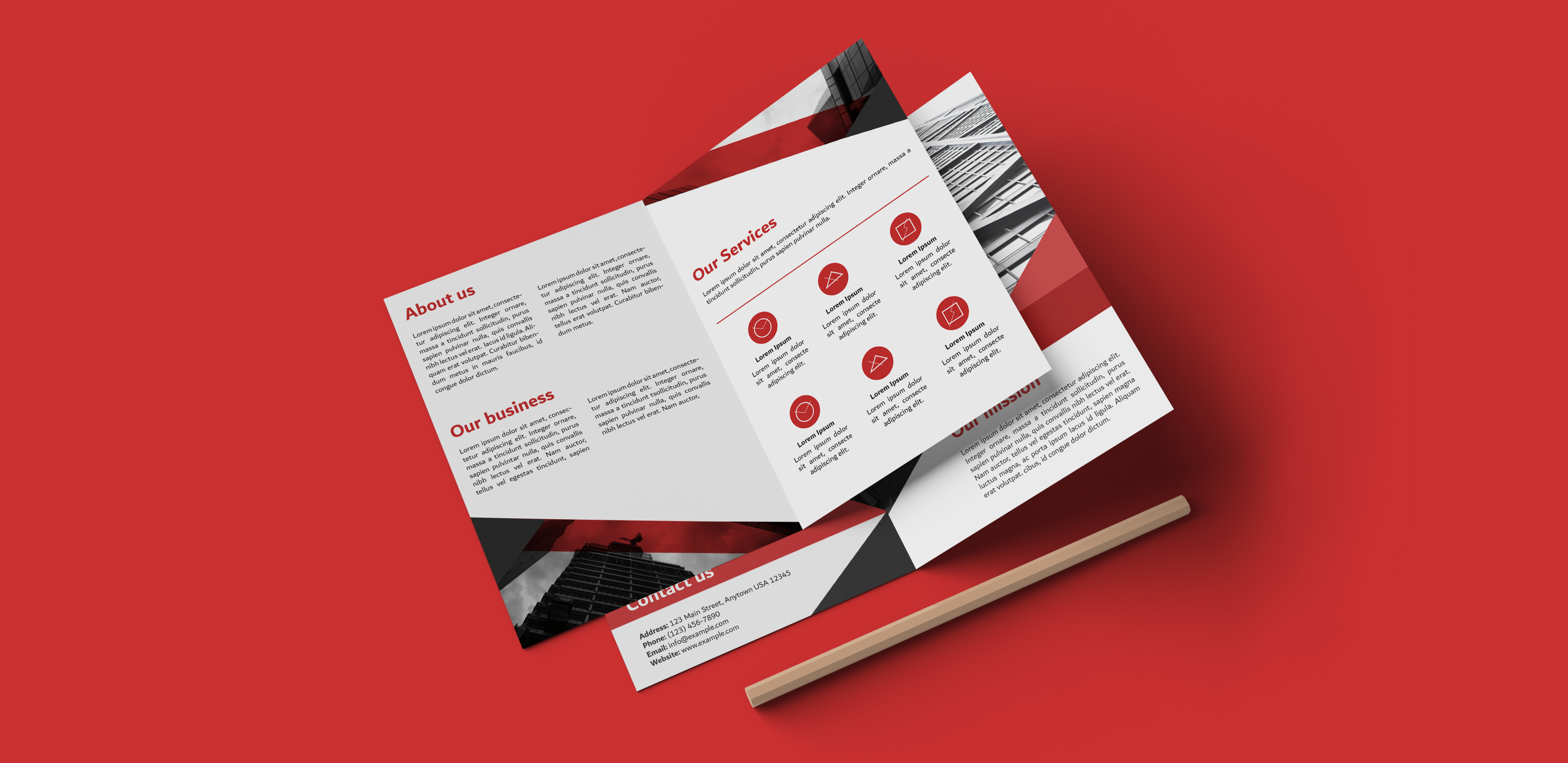
البروشور هو كتيب أو منشور تتم مشاركته من أجل الدعاية والتسويق للأعمال التجارية وخدماتها. غالباً ما يتكون من ثمان صفحات مطوية كطية الأكورديون. تعدّ الكتيبات مثالية للعملاء المحتملين. تصميم البروشور يجب أن يكون ملفتاً للنظر، والمحتوى سهلاً وقابلاً للقراءة.
يمكن لمصممي برزلاب تصميم أي نوع من البروشورات، سواءً كانت كتيباً أو منشوراً، بما في ذلك المنشورات والكتيبات ذات الطيات الثنائية والثلاثية، والطيات على شكل حرف z.
البروشورات وسيلة لإيصال جميع المعلومات التي ترغب بمشاركتها مع عملائك المحتملين بطريقة موجزة وشخصية، حيث يسهل توزيعها في أي افتتاح أو حدث أو تجمع.
يعتمد ذلك على الجمهور المستهدف، لكن استخدام أنواع مختلفة من البروشورات ستكون أكثر فاعلية في الترويج لعملك. ينقل المنشور وجهة نظرك بسرعة إلى أكبر عدد من الناس. أما البروشورات المطوية بشكل حرف Z فسهلة الحمل، مما يجعلها رائعة في التوجيه والإرشاد. بينما تصبح البروشورات ثنائية أو ثلاثية الطي الحل الوسط، فهي غنية بالمعلومات و مختصرة.
يتم تصميم البروشور في ثلاث خطوات: البحث, التخطيط ومن
ثم الإنشاء. أولاً: نبدأ في تحديد جمهورك وفهم أهدافك لتطوير
الهيكل العام. ومن ثم نقوم بصياغة تصميم أولي يحدد كيفية إيصال المعلومات بشكل واضح وفعال. وأخيراً، نستعرض التصميم النهائي الذي يحتوي على كافة المعلومات ويحقق أهدافك.
يمكنك العثور على مجموعة تضم جميع التصاميم السابقة هنا.