

التصميم الرقمي والموقع الإلكتروني
تحديد اتجاه واضح للرحلات الرقمية المقبلة.
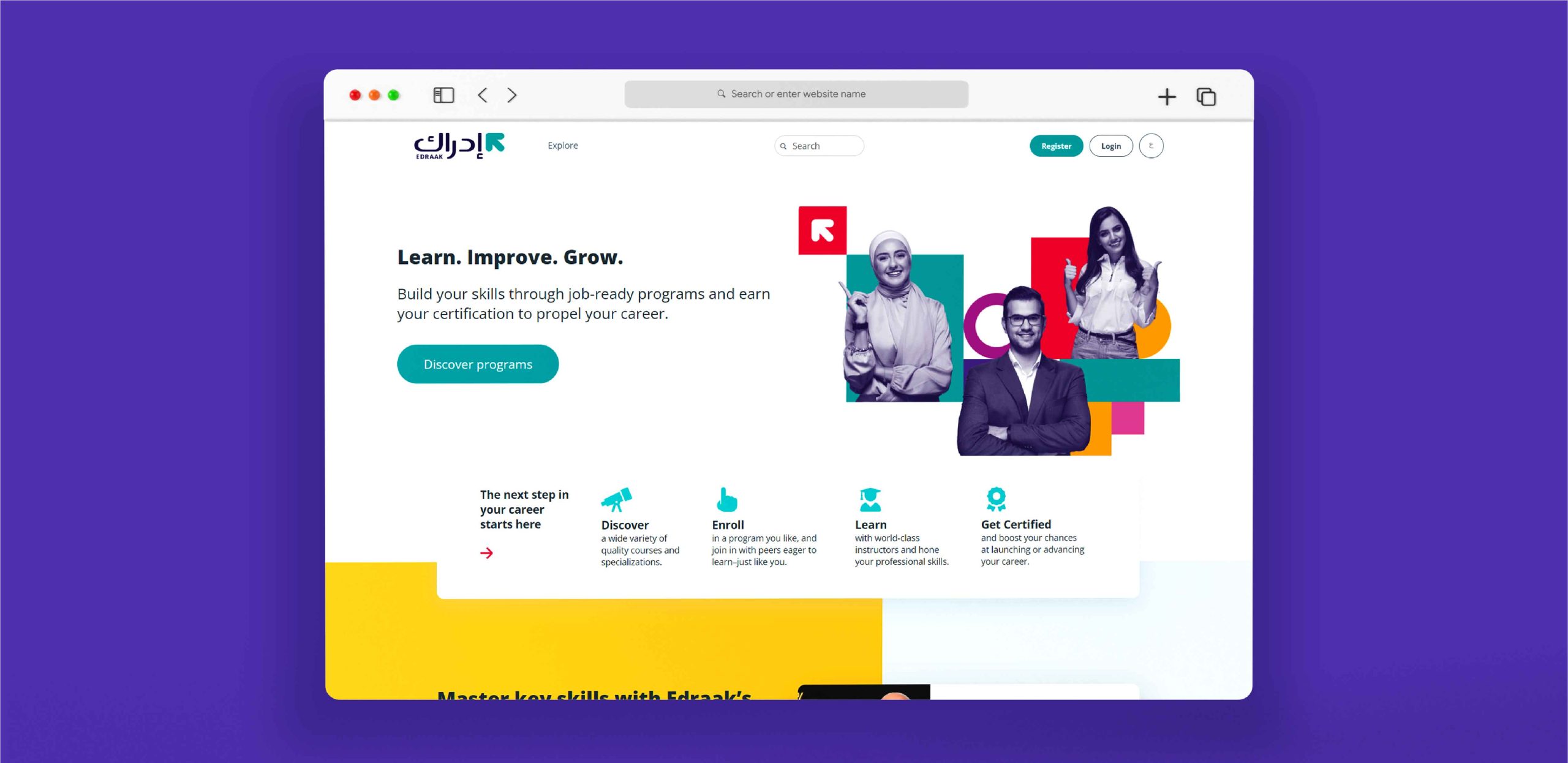
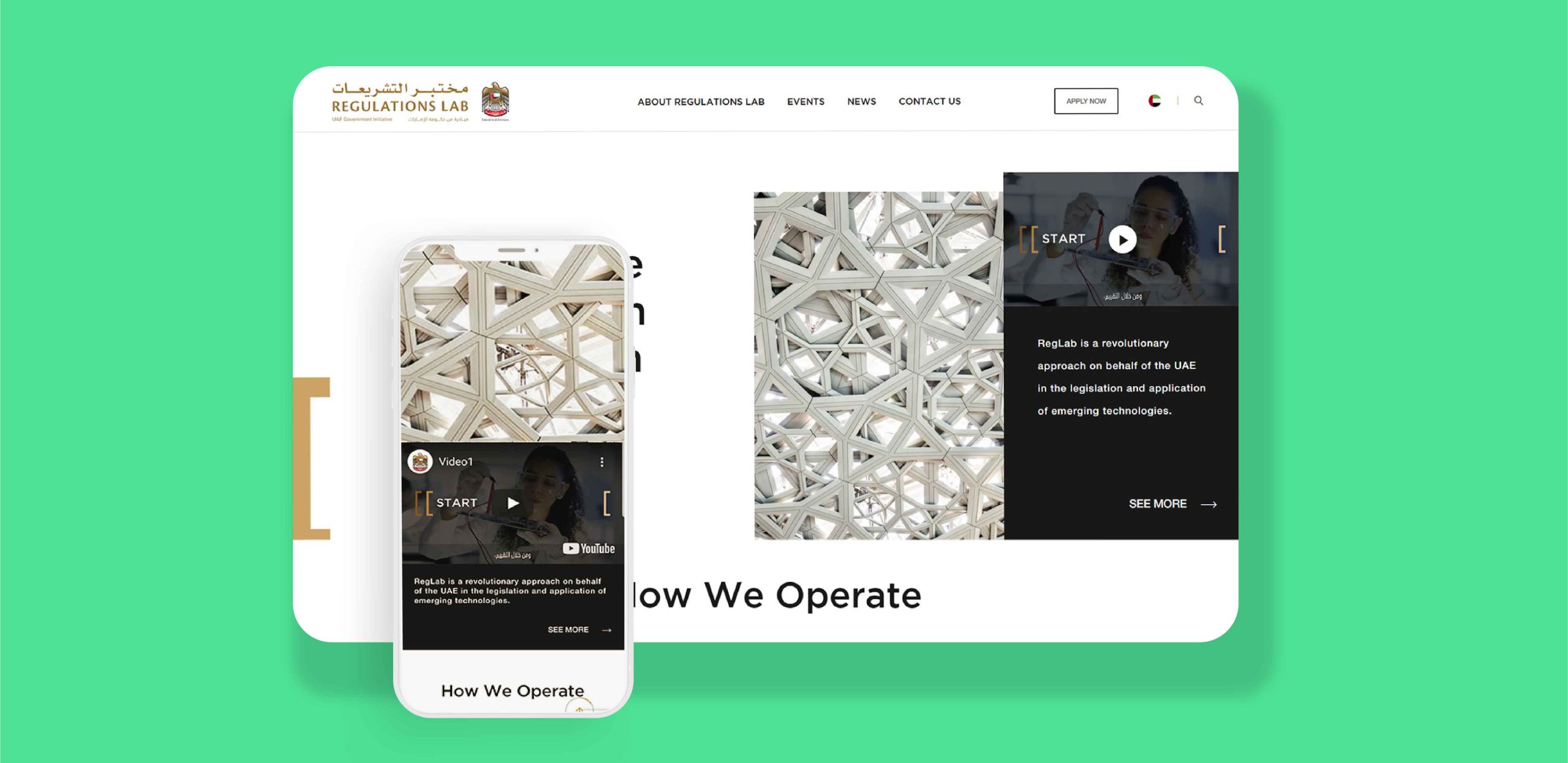
تبدأ استراتيجيتك الرقمية من خلال موقع ويب صديق للعملاء، يحركه ROI ويعكس هوية علامتك التجارية باستخدام مبادئ UX/UI الموجهة للأعمال.
تبدأ استراتيجيتك الرقمية من خلال موقع ويب صديق للعملاء، يحركه ROI ويعكس هوية علامتك التجارية باستخدام مبادئ UX/UI الموجهة للأعمال.
أعمالنا محبوبة في جميع أنحاء العالم 


نخبة السوق في تصميم تجربة المستخدم وواجهة المستخدم UX/UI.

تقليص الوقت اللازم للتعديلات الداخلية وأعمال الصيانة التقنية.

من المرجح أن تبرز بين المنافسين.
نخبة السوق في تصميم تجربة المستخدم وواجهة المستخدم UX/UI.
تقليص الوقت اللازم للتعديلات الداخلية وأعمال الصيانة التقنية.
من المرجح أن تبرز بين المنافسين.


نجمع موجزك ونقيمه ونبدأ في البحث وإنشاء خريطة مشروع لتطويرها فيما بعد.
يقوم مصممونا بإنشاء نموذج أولي لموقع الويب لتصور صفحة الويب للمراجعة والتعليق.
يتم تصميم صفحة الويب وتطويرها بواسطة مطورين سيحيون موقع الويب بميزات تفاعلية وسهلة الاستخدام.

التصميم الاستثنائي من برزلاب أدى إلى تحسين حضوري عبر الانترنت, هم جديرون بالثقة وملتزمون بالوقت ودائماً ما يلبون احتياجات تصميمي

اسماعيل حماده الرئيس التنفيذي لشركة Biznet Consulting
فريق برزلاب سريع الاستجابة، ويتميز بالموثوقية والدقة، مما جعله شريكاً فعالاً وديناميكياً، نجح في الارتقاء بمستوى العروض التقديمية والمحتوى المرئي لدينا

مهر حسين حساب تيك توك مخصص للأعمال
برزلاب أبهرتنا بحلولها الإبداعية و خبرتها ثنائية اللغة وشراكتها الجديرة بالثقة

خالد السبي مدير تسويق بشركة Audi
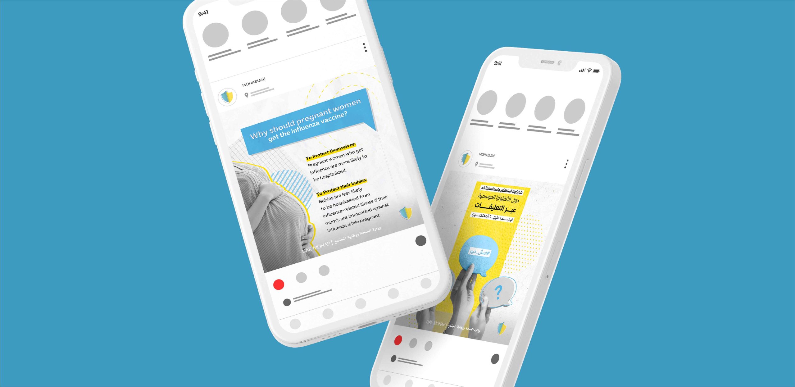
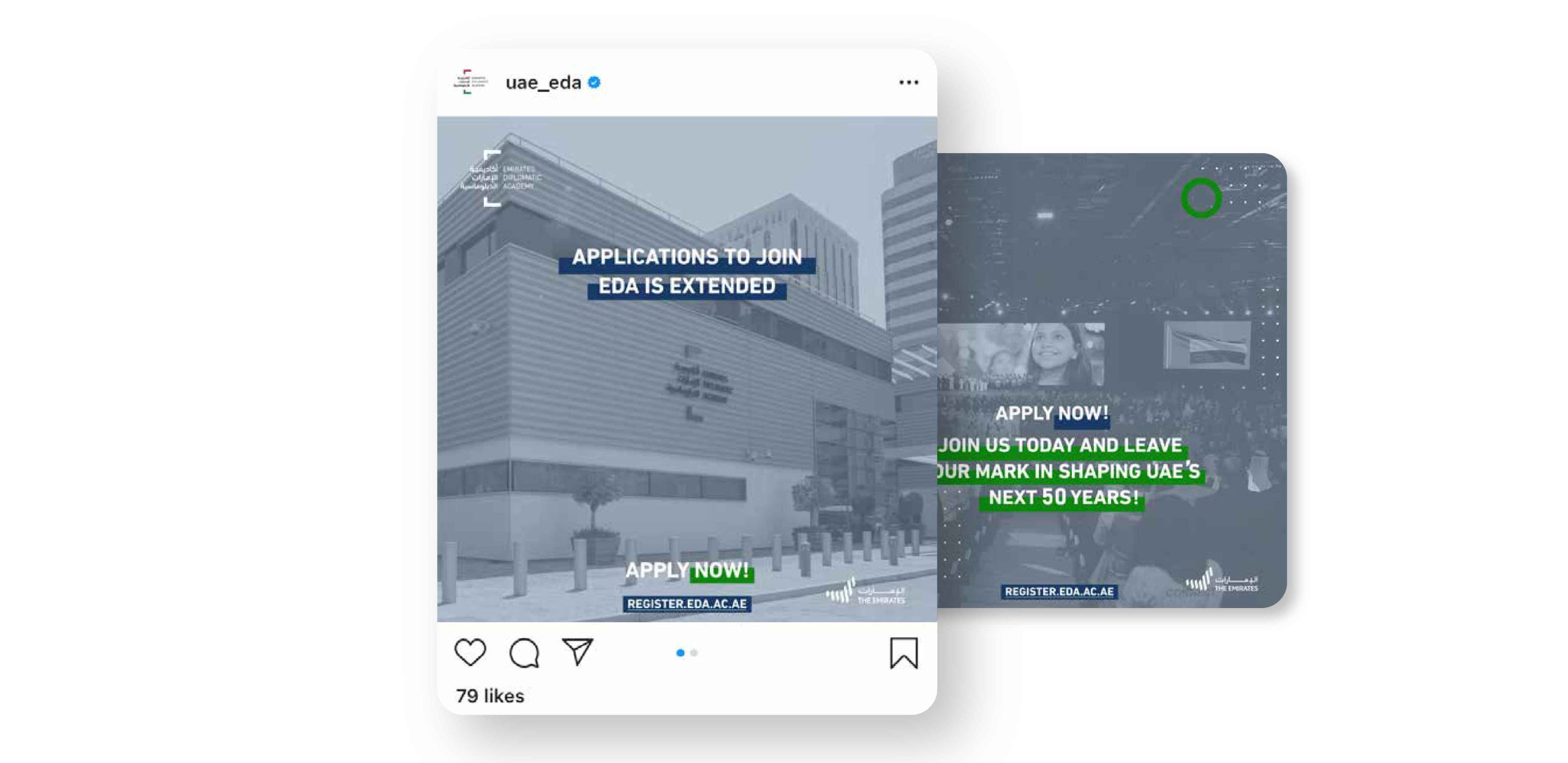
تستخدم الشركات التسويق الرقمي في عدة قنوات مختلفة للتواصل مع عملائها. في برزلاب، نحن متخصصون في جميع أنواع أدوات التسويق الرقمي، بما في ذلك إنشاء مواقع الويب والوسائط الاجتماعية وصفحات الهبوط وUX (تجربة المستخدم) / UI (واجهة المستخدم) وSEO (تحسين محركات البحث).
ينصب تركيزنا على تطوير مواقع الويب سهلة الاستخدام والقائمة على ROI والتي تعكس هوية علامتك التجارية وتجعلك متميزاً في المنافسة. نولي أهمية للوظائف ونؤكد على التصميم والإبداع، مما يعني أن الواجهة والتجربة لأعمالنا يجب أن تكون عملية وجذابة لمستخدميها.
يعد التسويق الرقمي جزءًا لا يتجزأ من عالم الأعمال الحديث. فقد أصبح أكثر شيوعاً في السنوات الأخيرة، مع انضمام العديد من الشركات لهذا المجال.
هناك العديد من الفوائد للتسويق الرقمي. فهي منخفضة التكلفة وقابلة للتطوير، ويمكن تخصيصها لأي جمهور، ومن السهل قياس نجاحها.
تحسين محركات البحث (SEO) هي تقنية لتحسين الوصول إلى موقع الويب في محركات البحث. إنها عملية تتطلب وقتاً وتفانياً، لكنها تستحق الجهد المبذول. يساعد (SEO) موقع الويب الخاص بك للحصول على ترتيب أعلى في محركات البحث مثل Google وBing وYahoo ومحركات البحث الأخرى.
يتلخص نهجنا في التسويق الرقمي وتصميم الويب في ثلاث خطوات: الاكتشاف والنموذج الأولي والتطوير. أولاً، نقوم بتقييم موجزك وإجراء بحث مكثف خاص بنا وإنشاء خريطة للمشروع. بعد ذلك، يقوم المصممون لدينا بإنشاء نموذج أولي لموقع الويب يتم مشاركته للمراجعة والتعليق. أخيراً، نضع صفحة الويب ونطور الموقع ليصبح تفاعلياً وسهل الاستخدام.
يمكنك أن تجد ملف نماذج الأعمال لجميع تصاميم الويب الخاصة بنا هنا.