

Digital and Website Design
Setting a clear direction for digital journeys ahead.
Your digital strategy begins with a customer-friendly, ROI-driven online presence that reflects your brand identity with website and social media designs.
Your digital strategy begins with a customer-friendly, ROI-driven online presence that reflects your brand identity with website and social media designs.
Loved by clients worldwide 


Top of the market in UX/UI design

Fewer hours on internal edits and maintenance

More likely to stand out among competitors
Top of the market in UX/UI design
Fewer hours on internal edits and maintenance
More likely to stand out among competitors


We collect and assess your brief and begin researching and generating a project map to develop.
Our designers create a website prototype to visualize the webpage for review and feedback.
The webpage is laid out and developed by developers, who enliven the website with interactive and user-friendly features.

“Prezlab's exceptional design improved my online presence. They're reliable, timely, and always meet my design needs.”

Ismail Al Hammadi CEO of Biznet Consulting
“The Prezlab team is highly responsive, reliable, and punctual. They have been an active and dynamic partner.”

Mehr Hussain TikTok for Business
“Prezlab impressed us with their creative solutions, bilingual expertise, and reliable partnership.”

Khalid Al-Sabi Marketing Manager at Audi
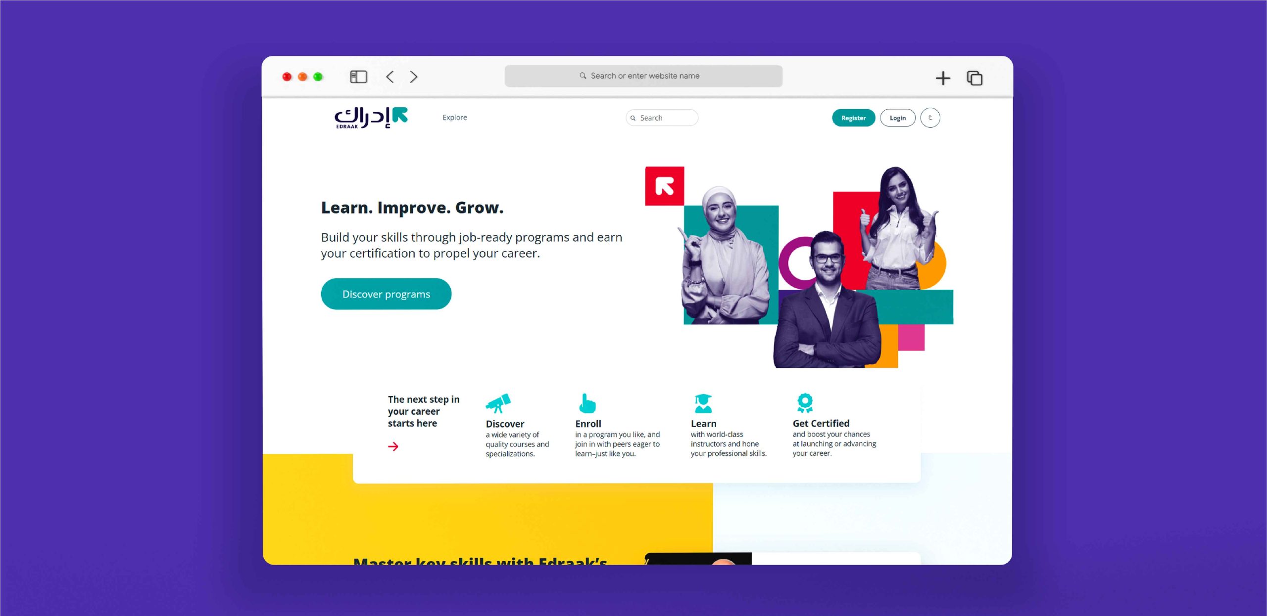
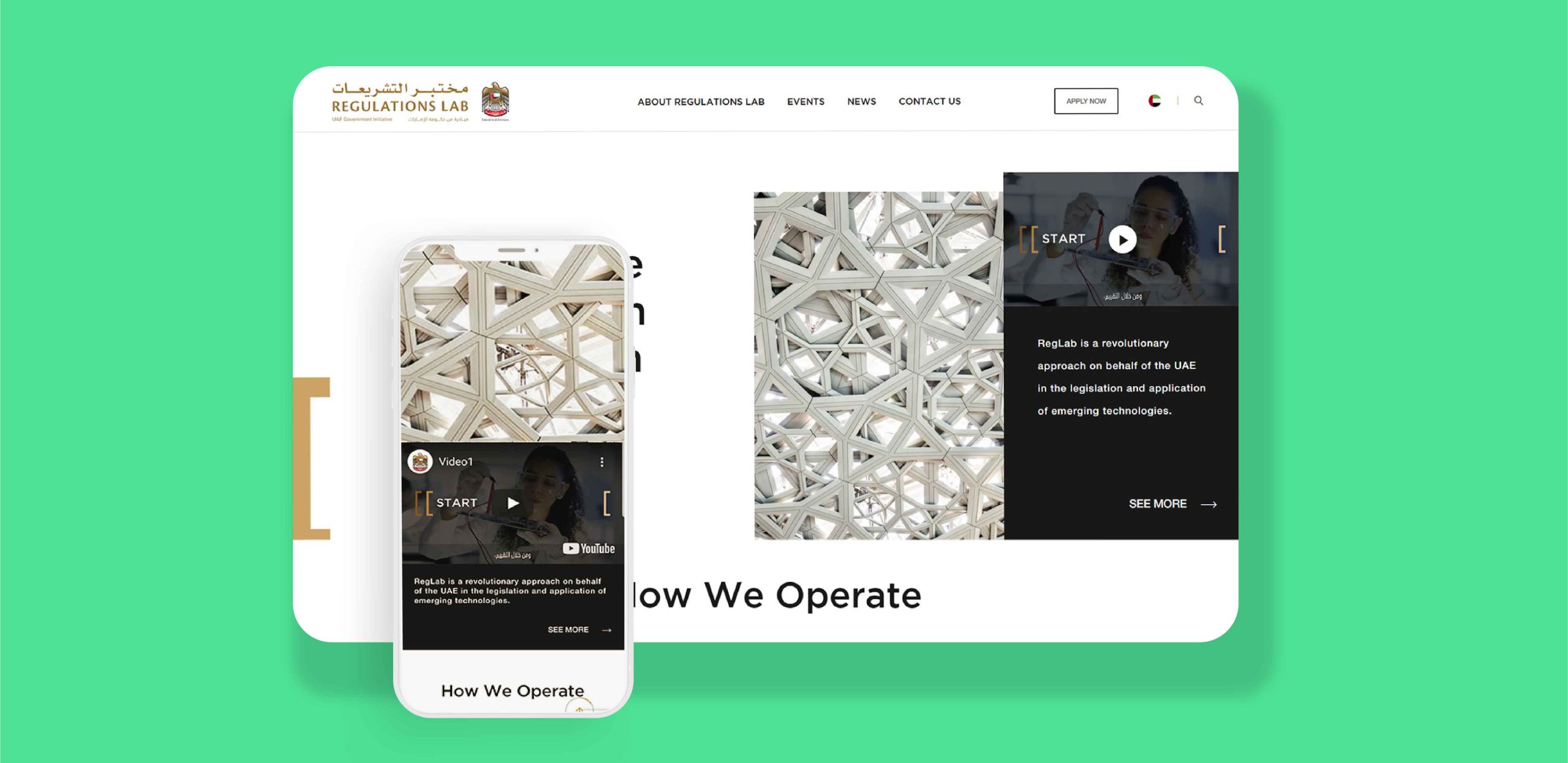
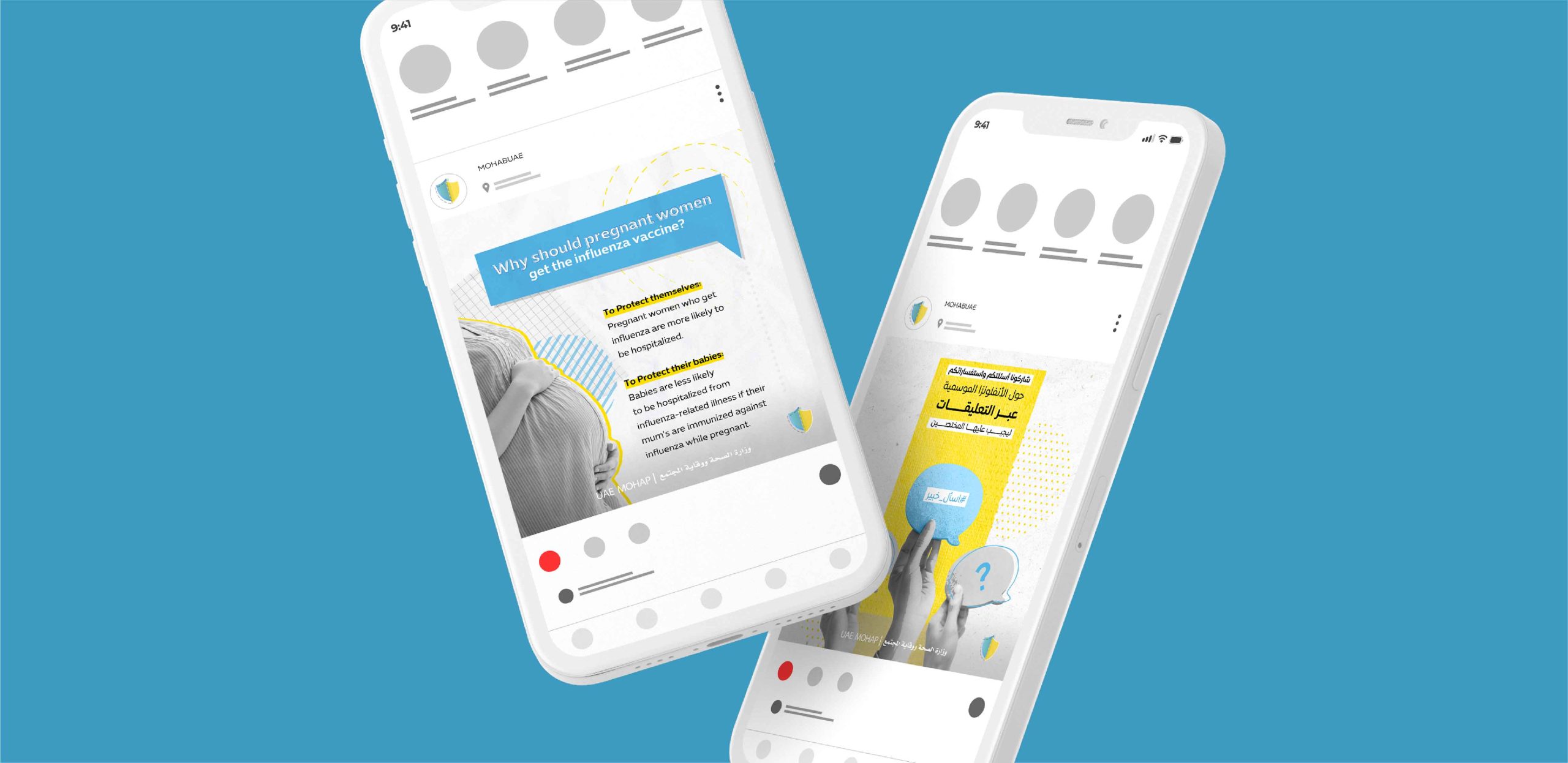
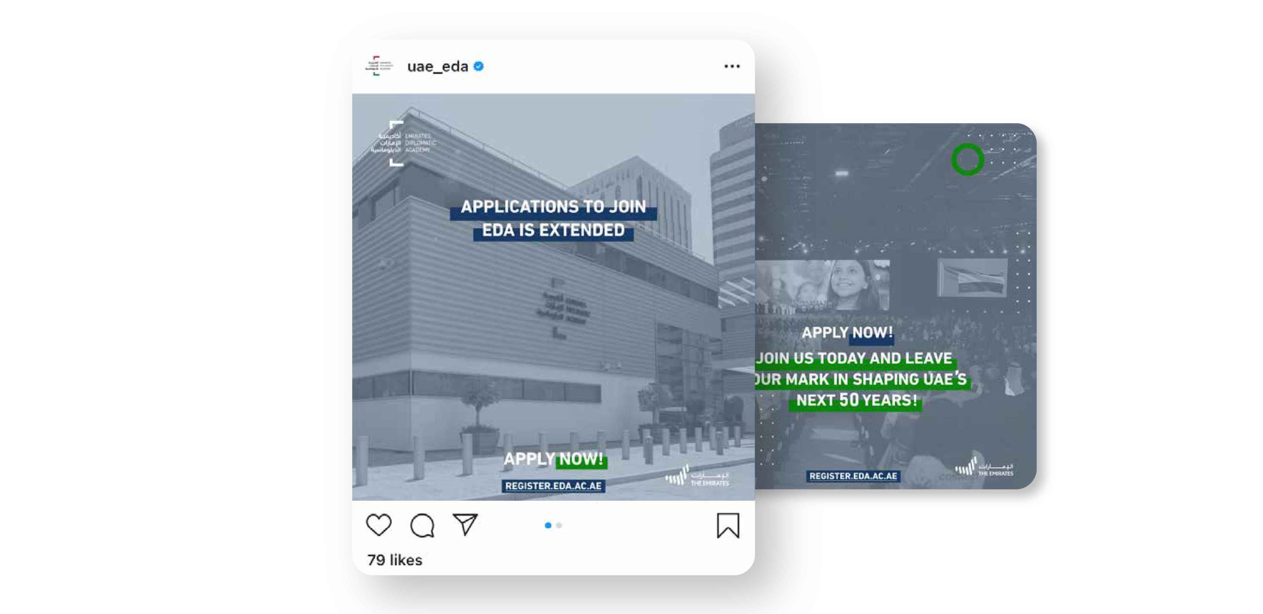
Digital marketing can be used in several different channels for businesses to connect with their customers. At Prezlab, we specialize in all kinds of digital marketing tools, including website creation, social media, landing pages, UX/UI, and SEO.
Our focus is on developing customer-friendly, RIO-driven websites that reflect your brand identity and make you stand out from the competition. We value functionality and emphasize design and creativity, meaning our business-geared UX/UI is both practical and appealing for its users.
Digital marketing is an integral part of the modern business world. It has become more and more popular in recent years, with many businesses jumping on board.
There are many benefits to digital marketing. Including the fact that it’s affordable and scalable, that it can be tailored to any audience, and that it’s easy to measure success.
Search engine optimization (SEO) is a technique to improve the visibility of a website in search engines. It is a process that requires time and dedication, but it will be worth the effort. SEO helps your website rank higher in search engines like Google, Bing, Yahoo, and others.
Our approach to digital marketing and web design is summed up in three steps: discovery, prototype, and development. First, we assess your brief, conduct our own intensive research, and generate a project map. Then, our designers create a website prototype that is shared for review and feedback. Finally, we lay out the webpage and develop the website to become interactive and user-friendly.
You can find a portfolio of all our previous website designs right here.