 Tweet
Tweet
 Send
Send

12 March 2024
Key Ideas
- Choosing the right chart type is critical to ensuring data is clear, understandable, and actionable.
- Understanding the psychology of charts helps in selecting visuals that resonate with your audience.
- Chart selection should consider data type, presentation objective, and audience needs.
- Common mistakes like using the wrong chart type or overcomplicated visuals can undermine the message.
- Decision frameworks and structured approaches allow consistent, effective visualization across presentations.
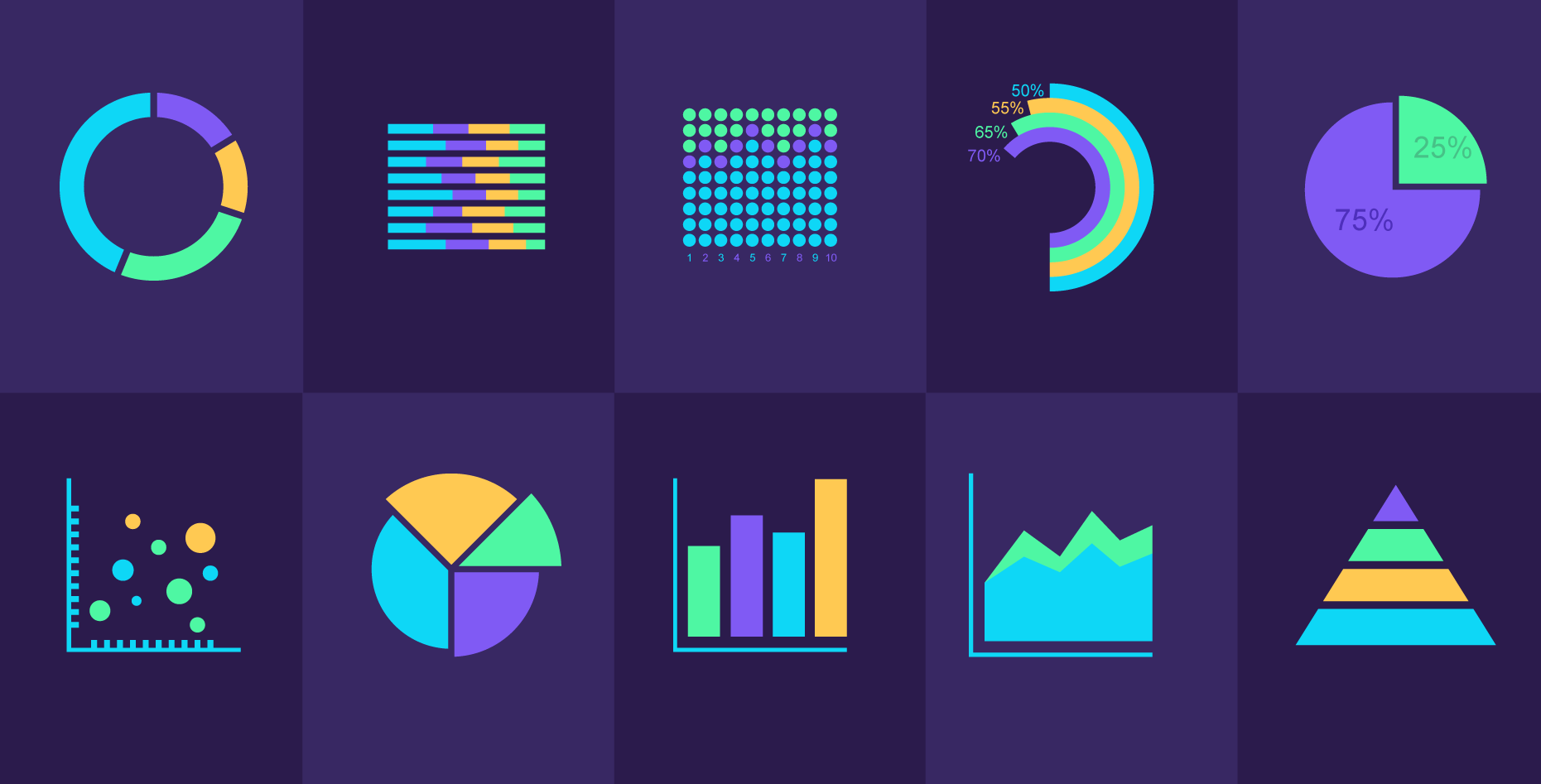
Data visualization gives numbers a purpose—a slide full of numbers looks impressive, but if the audience can’t quickly understand it, the point is lost. Charts and graphs are the representation of your data story. Choosing the right visual format influences how insights are remembered (or ignored).
Most people think any chart will do as long as it’s colorful, but they’re missing something important. The human brain interprets information differently depending on how it’s presented. Bar charts, line graphs, and scatter plots all communicate in unique ways. Determining which works best ensures your audience not only sees the data but also understands it and can act on it.
Understanding chart psychology
Data visualization doesn’t stop at aesthetics. Cognitive psychology plays a huge role in how charts are interpreted since people naturally perceive certain patterns faster than others. For example, comparing length through bar charts is easier to interpret than angles in pie charts.
Some key principles to consider:
- Pre-attentive processing: The brain notices differences in color, size, and orientation almost instantly. Use these to highlight important trends.
- Gestalt principles: People perceive elements as part of a group or pattern. Proper grouping can guide attention and improve comprehension.
- Consistency and expectation: Using chart types familiar to the audience reduces cognitive load, allowing them to focus on insights rather than trying to decode the visual.
Understanding these principles makes it easier to match the chart type to the data story, helping the audience interpret the information correctly.
Matching data types to the right chart
Different types of data visualization require different approaches. To break it down:
- Categorical data: Best shown with bar charts or column charts. These make comparisons straightforward.
- Trends over time: Line charts are ideal for showing progressions, patterns, or changes.
- Relationships or correlations: Scatter plots reveal relationships between variables effectively.
- Proportions: Pie charts and stacked bar charts can illustrate shares of a whole; however, overusing them can be confusing.
- Distributions: Histograms and box plots allow audiences to see patterns and variation across data sets.
Selecting the right chart is about matching the data to the visualization and the story you want to tell, not just picking up the flashiest option.
Audience considerations for data visualization
An extra tip: even the perfect chart can fail if the audience can’t relate to it. The same dataset may require different visualizations for different audiences. Executives may prefer high-level overviews with simplified charts, while analysts might need detailed scatter plots or histograms to draw their own insights.
Other considerations include:
- Familiarity: Avoid unusual chart types if the audience isn’t familiar with them.
- Decision-making needs: What action should the audience take after seeing the data?
- Attention span: Too many charts on a single slide overwhelm viewers. Keep it focused.
Audience context should drive chart selection, complexity, and labeling style.

Common data visualization mistakes
Even experienced presenters can slip up. Some common pitfalls with using data visualization include:
- Using 3D charts that distort data.
- Overcomplicating visuals with too many variables.
- Choosing charts that don’t fit the data type, for example, choosing line graphs to represent categorical comparisons.
- Relying solely on color to differentiate data can fail for colorblind viewers.
- Ignoring labeling and scale clarity, making interpretation difficult.
Recognizing these mistakes early prevents confusion and ensures data integrity and credibility.
A framework for choosing the right chart
Using a structured approach reduces any hesitation or doubt when choosing how to visualize your data. One practical method is a decision framework; you can refer to this table to determine which type of chart works best for the data you’re trying to represent:
| Data Type | Best Chart Options | Common Pitfalls | Goal |
|---|---|---|---|
| Categorical | Bar, Column | Pie charts with many categories | Easy comparison of categories |
| Time Series | Line, Area | 3D line charts | Highlight trends over time |
| Relationships | Scatter, Bubble | Misaligned axes, too many bubbles | Reveal correlations |
| Proportions | Pie, Stacked Bar | Overcomplicated stacks | Show share of the whole |
| Distributions | Histogram, Box plot | Small bins or misleading scales | Show spread and variation |
This decision matrix ensures consistent choices for visualizing data across slides and presentations. Teams can quickly identify the right format for any data scenario.
Implementing your chart selection
When charts are chosen without a framework, it can lead to audience confusion, misinterpretation, and wasted time. Using a repeatable process avoids that. Here’s an approach to guide you:
- Assess the data: Identify the type, range, and key insights.
- Define the objective: What story or decision should the chart support?
- Select chart type: Match the data type and objective using the framework.
- Simplify visuals: Remove unnecessary elements and emphasize the key message.
- Test for comprehension: Share internally or with a small audience to check clarity.
By embedding this process into the workflow, teams maintain consistency, accuracy, and clarity throughout their presentation.
Measuring chart effectiveness
Charts should communicate insights effectively, not just exist. To understand if your data visualization is truly making information easier to grasp, think of these metrics:
- Audience comprehension: Can viewers extract the intended insight quickly?
- Retention and recall: Do viewers remember the key point after the presentation?
- Decision impact: Are charts helping the audience take action?
- Engagement: Are viewers interacting with data where possible, e.g., clickable dashboards or polls?
Collecting feedback and testing data visualization improves effectiveness over time.
A thoughtfully chosen chart is the lens through which data contributes to a clear, compelling story. Selecting visuals based on your data type, audience, and goal means that your message can be understood and remembered. Using structured decision frameworks helps refine your approach over time. Ultimately, charts help translate data into insight, giving each slide a purpose in a persuasive, action-driven story.