28 November 2024
Data storytelling has emerged as a vital tool for transforming complex data into actionable and relatable narratives. It is a process that combines data, narrative, and visual elements to put insights into context and leverage them to be better understood and acted upon. It takes a clever eye to create a compelling narrative out of chunks of lifeless data, but in this guide, we will break down the process to turn any information into an engaging story that captivates audiences.
What is data storytelling?
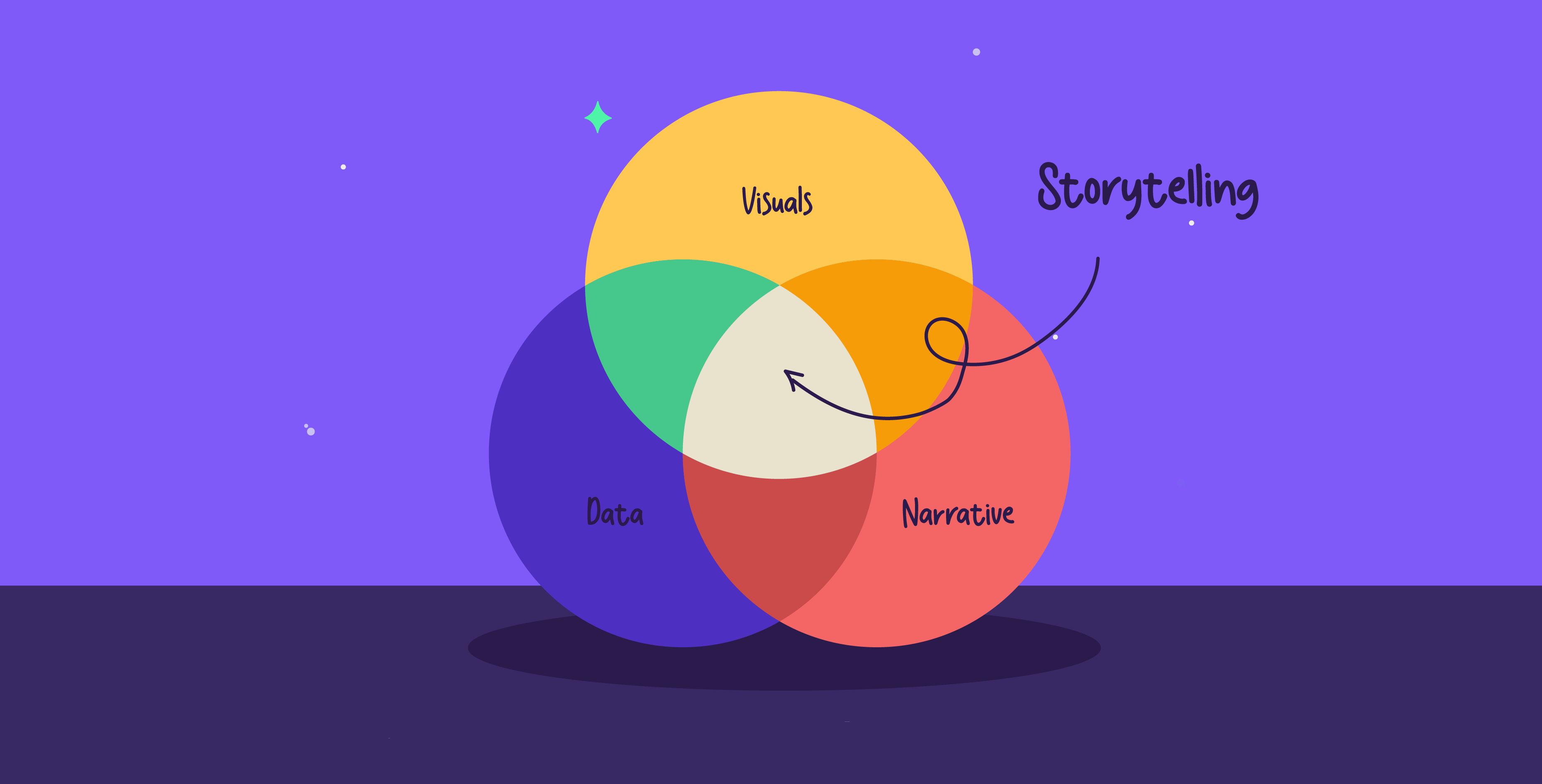
Data storytelling is the process of communicating ideas and insights from data using narratives to put insights into context and encourage action from your audience. The three main components of data storytelling are data, narrative, and visualization. Data is the foundation of the story, with all the numbers, insights, and analysis that enable you to understand the full picture. The narrative or storyline communicates these insights acquired from the data, as well as the context and recommendations. Finally, data visualization is needed to represent the data story visually through graphs, charts, or images for clarity.
Why is data storytelling important?
Data storytelling turns complex data into compelling narratives that help audiences retain information in a way that resonates with them. It allows raw data to transcend and offer insightful narratives that are relevant to the audience. Combining numbers and narratives is an effective approach on two fronts: the numbers assure credibility and data storytelling helps make the numbers stand out. This way, there isn’t a surplus of overwhelming numbers, and every piece of data is intentional and purposeful.
Data storytelling also democratizes data, making it accessible to audiences from a variety of backgrounds. Using the visual aids and narratives that make data storytelling possible ensures that anyone can grasp the data’s implications and how it connects to other business objectives.
Data storytelling vs. data visualizations
Although data storytelling and data visualization can be used interchangeably, they play different roles in communicating information. Data visualizations are often a piece in a larger narrative, a tool used to illustrate a single point or concept within a story. Meanwhile, data storytelling is about infusing different visual elements with expertise to highlight trends within an industry. For visualizations, they could show trends over time, while data storytelling provides background and ties it to a broader context.
How to tell a story with data
Data storytelling is a broad process that can be approached in several days due to its technical and versatile natures, there are key components that can be applied anytime:
Find the story within the data
The first step in determining the pieces of a data story begins with understanding the narratives that lie within the data. Discern what the data is saying; are there any correlations, links, or patterns? Your understanding of the data forms the foundation for a resonant story. Data storytelling is not always a clear-cut process; sometimes the story stands out, and other times it requires deeper discernment to uncover any meaningful insights. The insights that you catch shape the data story’s overarching themes and ideas, creating an engaging narrative from the raw data.
Determine what data matters
There is a high chance you might get swept up by the sheer volume of available content, which is why selective focus becomes vital. Begin by pinpointing which data directly informs the story; that way, you can start to prioritize which data sets are relevant and weave together narratives. Using a targeted approach maintains clarity and keeps you focused on the essential points without getting sidetracked by extra data.
Identify the most effective data visualizations
Using data visualizations plays a huge role in conveying data in a simplified manner, and with the variety of visualization types available, choosing one that complements your data is essential. Let’s say you would like to show trends changing over time, that would mean that a chart that incorporates time series is the ideal format for sharing it. Choosing a data visualization tool is less about aesthetic appeal and more about ensuring that the data is comprehensible and accessible to the audience.
Assess how the data are calculated
An important step in data storytelling is analyzing how the data is calculated. Determining how numbers are calculated impacts how you choose to tell the story; depending on the calculation approach, the data’s message can either be misrepresented or amplified. Unless you clearly lay out how the calculations were made, the story will get muddled along the way.
Lay out simple data points
As with all forms of data communication, less is more. Overloading your audience is inadvisable, so it’s crucial to identify the key points of your data findings and highlight them. For example, instead of listing all the responses to a survey, it is much more impactful to highlight how 80% of respondents gave the same response. Not only does this approach simplify how you present data, but it also compels you to be more thoughtful about your narrative. The points you decide to highlight should always align with the overarching narratives you are sharing.
Organize the data thematically
When working with data, organizing the data based on sequence can feel like a natural step; however, it often results in a disjointed narrative that fails to convey the central message. Instead, focus on organizing the data based on a theme, which can also involve gathering correlating information across data sections. The idea is to focus on the overarching question that is being answered, and by aligning each statistic with the relevant argument, the data story becomes more coherent and effective.
Provide context
Data alone does not create a data story; providing a background and foundation for an audience to fall back on is an essential part of crafting an effective narrative. This requires continuously framing your insights within the realities and context to communicate the full picture. For an audience to comprehend the complete narrative, a comprehensive context is needed for a deeper understanding.
Structure your story
Data storytelling is still storytelling, and it benefits greatly from incorporating traditional storytelling structures to enhance its impact. Setting up the story with an introduction, followed by rising action, climax, and resolution, culminates in a thoughtful presentation of the data. Creating a storyboard and utilizing this familiar formula creates a flow that captures the audience’s attention and gives them a comfortable format to follow and process.
Data storytelling is more than just a way of presenting information; it is an art form in itself. The process of discerning insights, structuring data, and shaping a narrative is satisfying to ensure clarity and engagement. In an increasingly data-driven world, effective data storytelling is a vital skill that allows us to communicate data clearly and meaningfully.


