28 August 2024
Apple has long been respected not only as a tech giant but as a meticulously attentive and intentional brand in every aspect of its branding and communication. One thing that it shines at in particular is the innovative and engaging use of white space in all its materials. This fundamental design principle is a transformative tool that turns aesthetics into function, and clutter into clarity. Here, we will explore the uses and functions of white space and how Apple implements them to contribute to their memorable and sophisticated designs.
What is white space?
White space, sometimes called negative space or empty space, is one of the essential design elements that help create visually appealing compositions. Mainly, it encompasses the blank areas that surround the elements in a design, such as text, images, buttons, and so on. You can spot its use in websites, printed material, digital platforms, and more, and when used intentionally, it can become a powerful tool for directing attention and organizing content. By understanding it, designers can effectively leverage it to create functional and aesthetically pleasing designs. One
Micro space
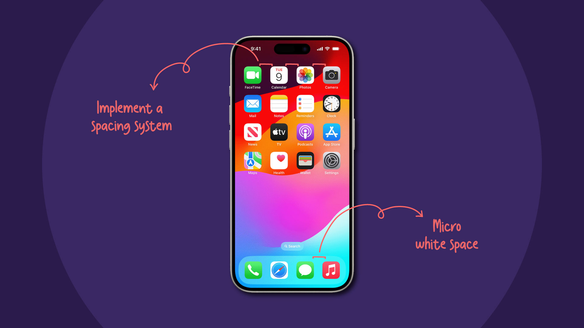
As the name suggests, micro space refers to situations with minimal empty space, such as that in between letters, lines of text, and images in a grid. Mirco space is subtle and is usually utilized to ensure that the text is legible and that elements in a grid or pattern are not too crowded or cluttered.
Macro space
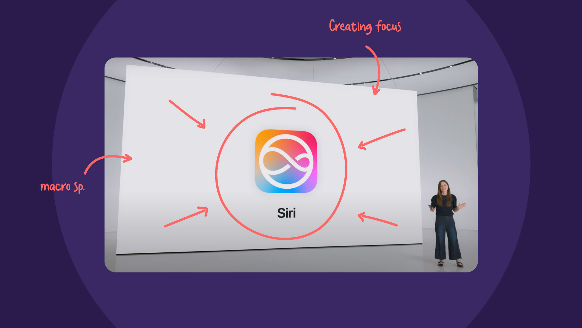
On the other hand, macro space refers to larger areas of blank space within a design. This is usually what you first think of when you think about white space; it can appear as the larger margins on the sides of a blog post, for example. Another example of macro space is the gap between the header and this blog post.
Active vs. passive white space
Aside from the differences between micro and macro space, you can also perceive it as being active or passive.
Active white space is used to elevate a page’s structure to guide the viewer through the content. It is used to intentionally place more focus on specific parts of the design.
As for passive white space, it is used to enhance the overall design, without a specific practical function. It is used as a more organic and natural way to improve a design’s readability and aesthetic.
The purpose behind white space
Now that we understand the bread and butter of how empty space works in design, we need to know why it is important, especially for brands like Apple, to incorporate it into their designs.
Clarity and comprehension
One of the main reasons designers and brands integrate empty space into their designs is to make the content legible and clear to the viewer. White space helps reduce the cognitive load for a viewer and improve readability and comprehension. It is used to separate blocks of text that enhance the visual appeal and facilitate better readability and comprehension of the content. The thoughtful use of negative space ensures that the message is communicated effectively and is clear and accessible.
Luxury and sophistication
White spaces serve an important function in design, invoking a sense of sophistication and quality. By strategically incorporating space in layouts, designers create an elegant and refined aesthetic in a design. This also helps draw attention to the key focus of a design, allowing it to stand out and command the viewer’s attention. Negative space helps shape the perception of a brand by implying exclusivity and luxury.
Trust and credibility
In design, negative space has several uses beyond just aesthetics and can influence perceptions, signifying trust and credibility in branding. This space suggests professionalism and reliability, fostering trust in the viewer. By adjusting the space to divide and group elements, viewers can process information more intuitively.
Case Study: Apple and white space
When you observe the websites and branding of many large companies, you will start noticing how they incorporate white space into their designs. Apple in particular stands out in how perfectly they utilize this design element.
Apple’s design philosophy is known for its minimalism and elegance, and a key element in achieving this is its use of negative space. This allows for their products to take center stage, whether in their website’s UX/UI design, their marketing materials, or their actual products.
Marketing materials: In all the marketing materials, namely their keynote presentations, negative space serves a purpose in structuring a design. It gives all other elements in a design more clarity and room to breathe, creating a visual hierarchy and emphasizing the main design’s focus. The positive space, or the main design, should be balanced with the white space, sharing the space gracefully to create proportion and a thoughtful positioning for the main message.
Product packaging: Apple uses packaging design as an opportunity to center its products using white space. Clean layouts with ample amounts of space surround the product’s image, allowing it to become the focal point of the package. Minimalistic copy also adds context without being too detailed or overwhelming to the visual. This minimal and uncluttered approach creates a sense of anticipation during the unboxing of the product, emphasizing the premium quality of Apple’s products.
User Interfaces (UI): When you go on any app on your iPhone or Mac device, you’ll be met with a spacious and uncluttered interface. Apple knows that visual breathing room is for accessible and functional applications, elements such as icons, buttons, and text are surrounded by negative space to create a more intuitive user experience.
Website: Like an art gallery showcasing all the artwork, Apple’s websites use a similar format. They use clean layouts with an ample amount of empty space surrounding the product’s images and descriptions. The product photography is simple and eye-catching, only using simple copy to add just enough context. This creates a sense of purpose to effortlessly draw attention to the main focus: their products.
Incorporating space into the design is a strategic and impactful tool for creating focus, intention, and clarity in a design. This is why some of the biggest brands, such as Apple, have made it a vital component of their visual branding across all mediums. From their clean website layouts to their intuitive user interfaces, Apple creates a sense of anticipation and quality. Not only does white space improve visual appeal, but it also communicates trust and sophistication, setting a high standard in digital design.


