28 August 2024
If you believe communication is either one or the other, you are wrong. Here is why:
Every great communicator, regardless of whether they are a politician, a sales wizard, a marketeer, or a teacher at a high school, understands that there is more to great communication than just the structuring of words and sentences. It’s obvious that the left brain’s rationality is super important when it comes to communication, but numerous studies have shown us that what makes good communication great happens in our right brain. Aspects of communication such as spontaneity, authenticity, and intuition come from our right brain.
So is communication more art than science? It’s both. However, not only do great communicators have a firm grasp on the mechanics of communication (science), but they also tap into the reservoirs of creativity emerging from their right brains. When Martin Luther King gave his “I Have a Dream” speech, it was more of an artistic endeavor than a scientific one.
This is as true for marketing and design as it is for leadership. Think of any advertisement that still lingers in your memory. It will become clear that its artistic (creative) features are the reason you still remember it.
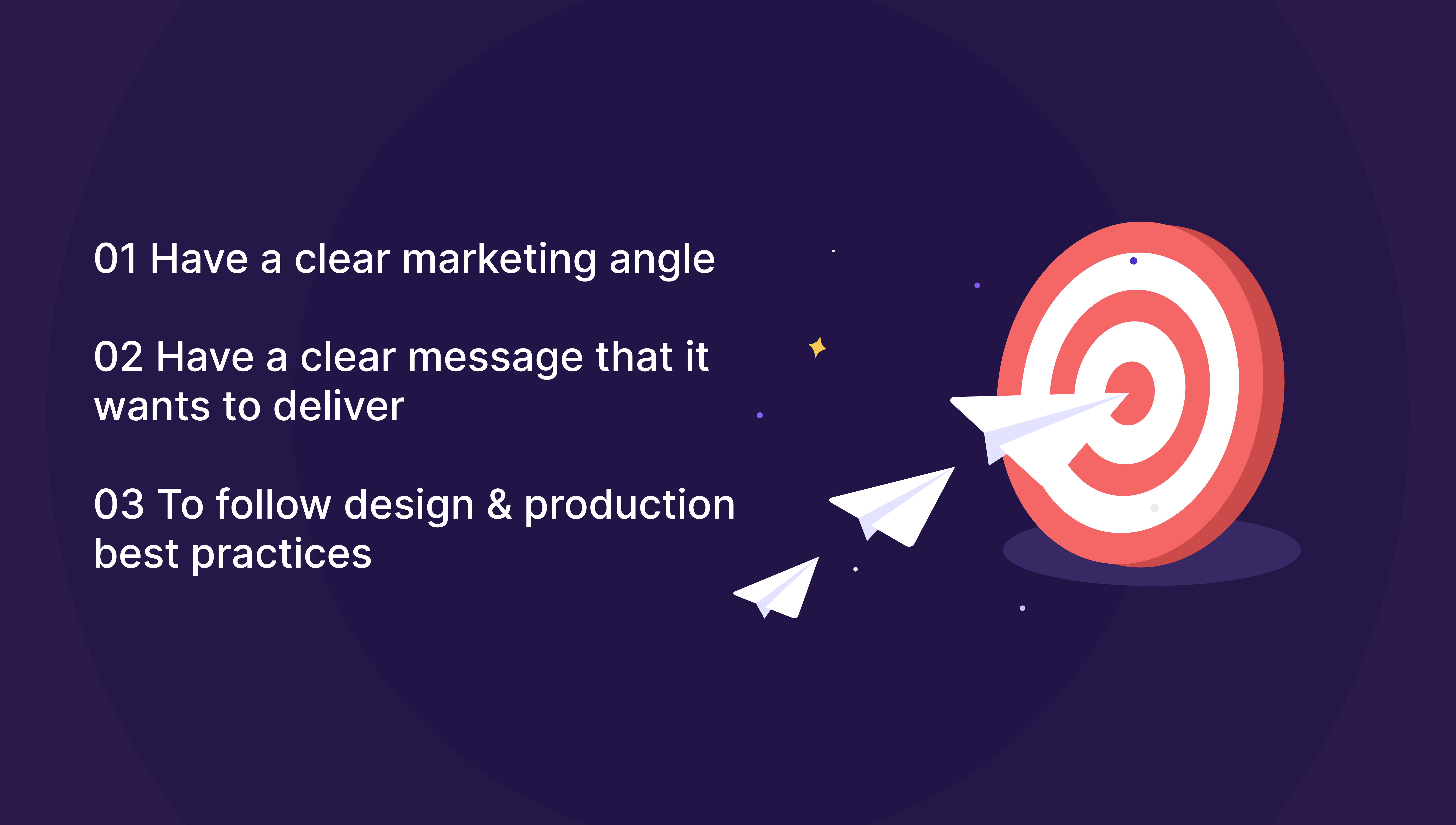
Having said that, successful marketing messages should consider the points below. Without them, even the most creative and ingenious touch will seem like an unsolved jigsaw puzzle.
One of the problems of marketing messages nowadays is that most of these focus on one or the other but very rarely do you come across an ad or a presentation that does both. The jaw-dropping Apple keynote presentations are not just brilliant from a creative point of view; they are also structured and delivered in a way that’s scientifically proven to be better. The Nike commercials are not just brilliant creative ideas, they are also an example of the perfect execution of well-known (and mostly ignored) scientific best practices.
Best Practices for Presentation Communication
1st best practice
Each slide should communicate just one thought or idea—this is proven good advice because the human brain can only focus on one idea or thought at a time.
2nd best practice
Declutter your slides—less is more. Resist the urge to stuff “as much as possible.” It’s proven that too many visual elements lead to the audience remembering none.
3rd best practice
Try to tell a story. Humans are wired to love stories—we all know that.
4th best practice
Build on your previous points one at a time while keeping the progression of the presentation systematic and logical.
5th best practice
Find the ideal emotion you would like to evoke and try to strike it. No presentation has to be dry and devoid of life. Even corporate presentations should have an element of emotion in them—after all, you are pitching/selling/persuading humans.
6th best practice
Keep it short and sweet.
7th best practice
Use design best practices (right fonts, colors, sizes, spacing, etc.) to create maximum visual impact. Yes, the default PowerPoint templates are a surefire way to bore your audience.
We hope this settles the science vs art question when it comes to communication, and the next time you sit down to create a marketing campaign, make sure you get both the science and the art right.
Presentation design is at the very core of what we do, what we love doing, and what we are extremely good at. If you are struggling with your existing sales presentation or need to spruce up an existing pitch deck to land that next round of funding, or maybe you need a presentation that hits home with a client, then feel free to talk to us about it.


