12 March 2024
In the field of data visualization, The Economist is regarded for its clear and insightful presentations. Their focus on simplicity ensures that each chart or graph conveys a story that is easy to understand, thanks to their careful design choices. They turn complex data into visual stories that speak to the viewer. There’s much to learn from their approach to charts, providing valuable lessons for those interested in data visualization.
Why The Economist?
For much of its history, The Economist relied on data to communicate news, with tables and statistics appearing in print as early as 1847. Over many years, their graphs evolved and became a weekly staple, adapting to different mediums and data visualization styles. Their reliable and engaging graphs remained grounded in one main principle: the viewer should learn the primary message of the chart after only a few seconds. Afterward, as they examine and explore even further, they will gain more information, just like reading a full page of text.
Use a simple design approach
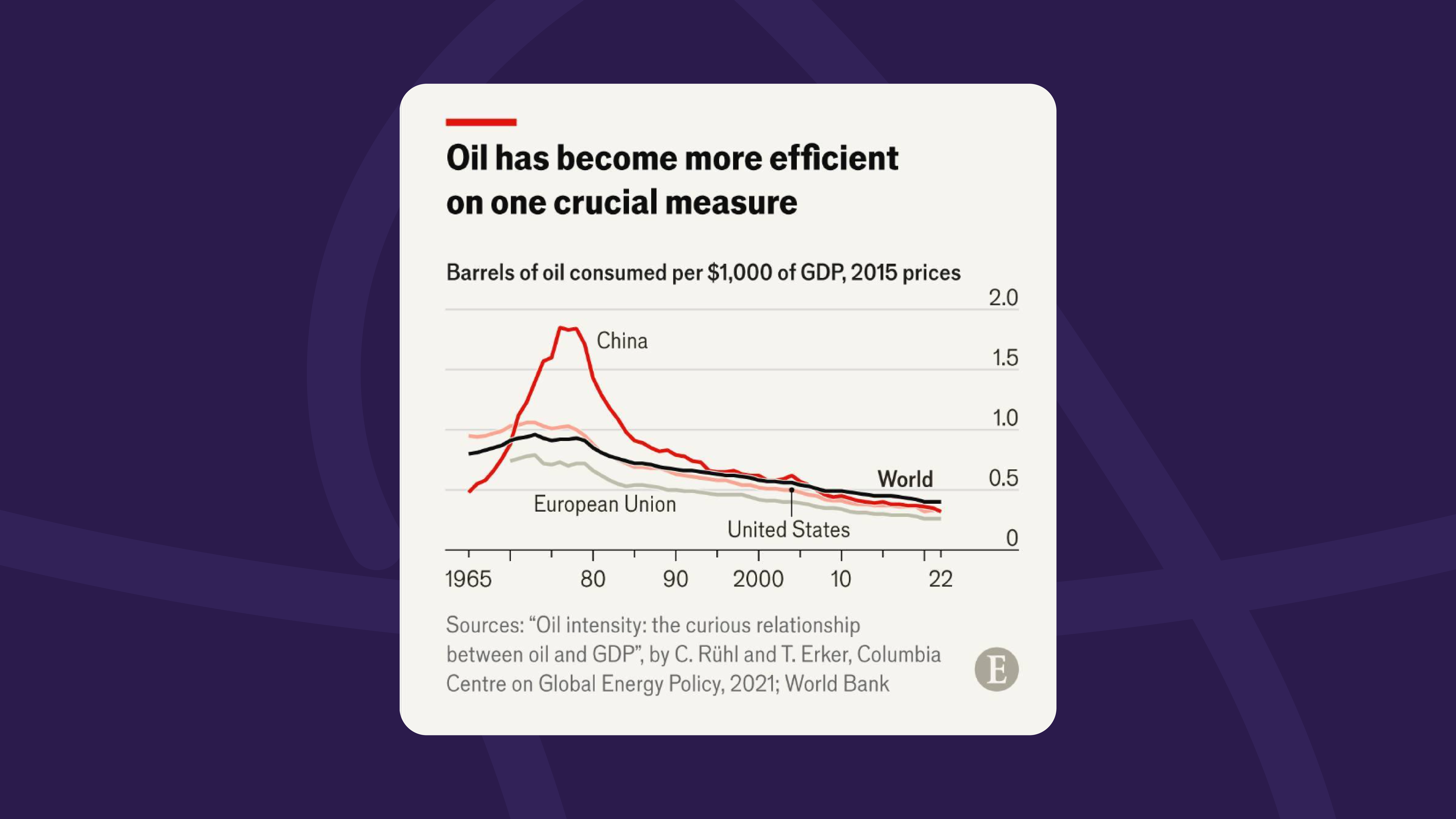
A standout feature of this publication’s graphs is their commitment to the design’s simplicity. They regularly use basic line charts or bar charts complemented by straightforward, yet descriptive, titles in a sans-serif font that’s easy to read. These kinds of choices ensure that the data visualization is understood at a glance and keeps the focus on the information. Another method they use to maintain simplicity is sticking with a simple color palette that detracts from any distractions that can undermine the original goal of readability.
The chart matches the message
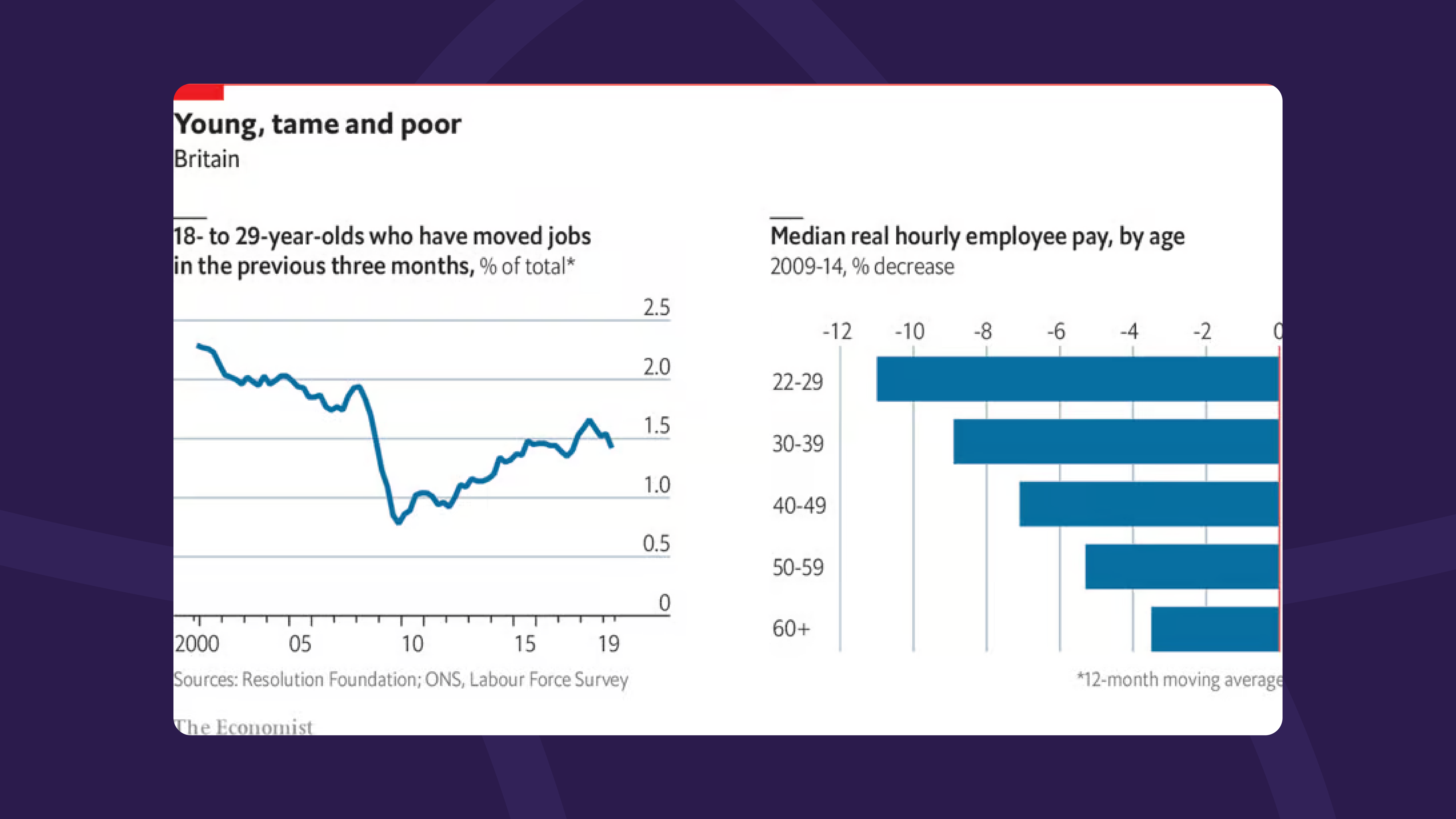
Following a vital principle in data visualization, The Economist tries to match the chart with the main message. Selecting the appropriate type of chart to communicate the data emphasizes the main message, and allows the viewer to grasp the information more easily and intuitively. For example, a line chart helps visualize changes over time, while a bar chart helps highlight the differences in comparisons. Similarly, combined charts like a stacked area chart offer a comparative view of different data sets, allowing for a more layered understanding.
Guide the viewer to the insight
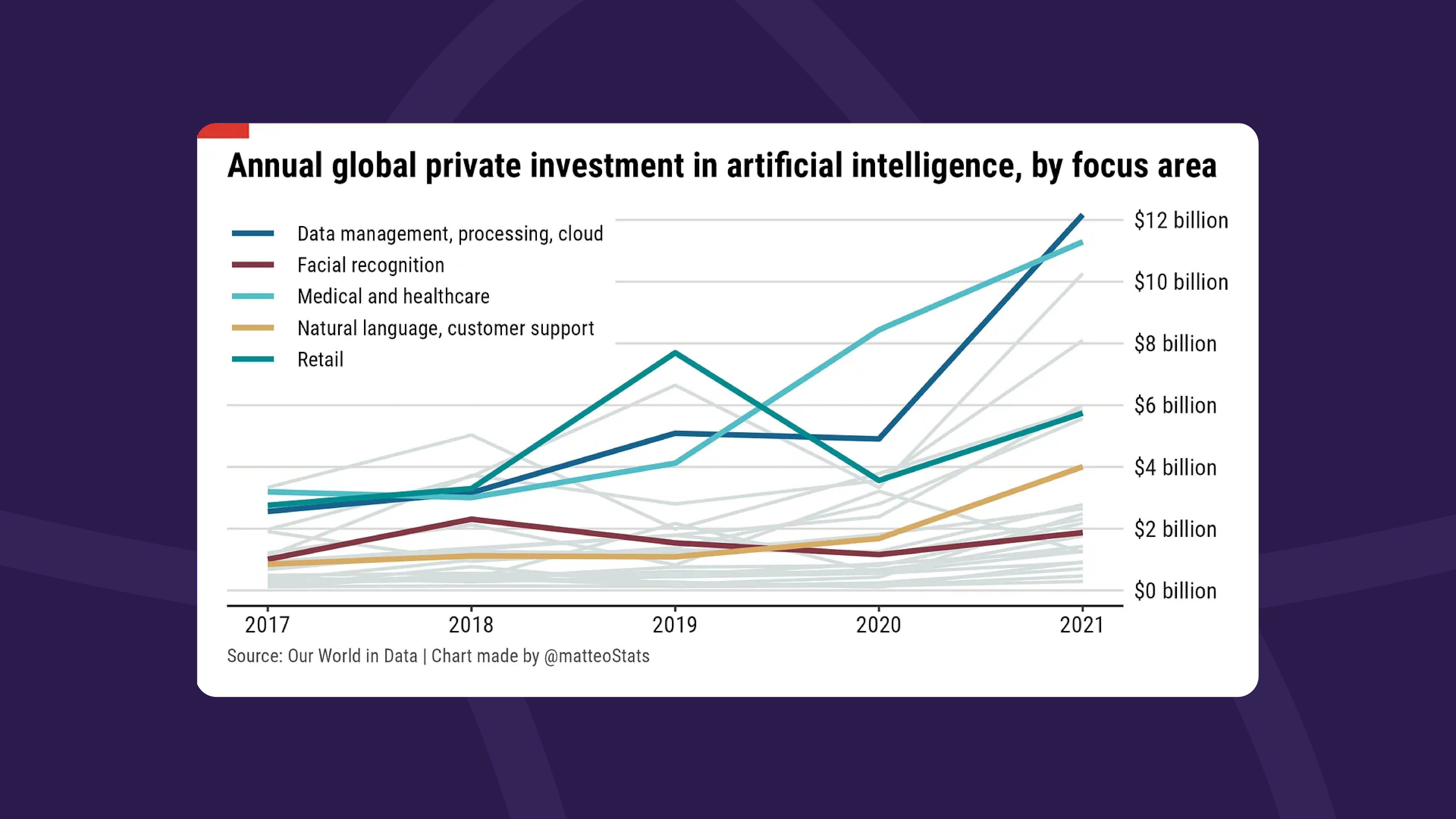
One of the most helpful approaches utilized by The Economist is how they guide the viewer to the heart of a chart’s insight. Throughout the entire graph, the elements work together to move the viewer to the main idea, starting with the title that spells out exactly what you should walk away with. Then there’s the strategic use of color that highlights the pivotal data points and the bolded text and numbers to emphasize their importance. The overall design choices work together to create harmony with all the elements and reinforce the central message.
Use consistent, unified data visualization
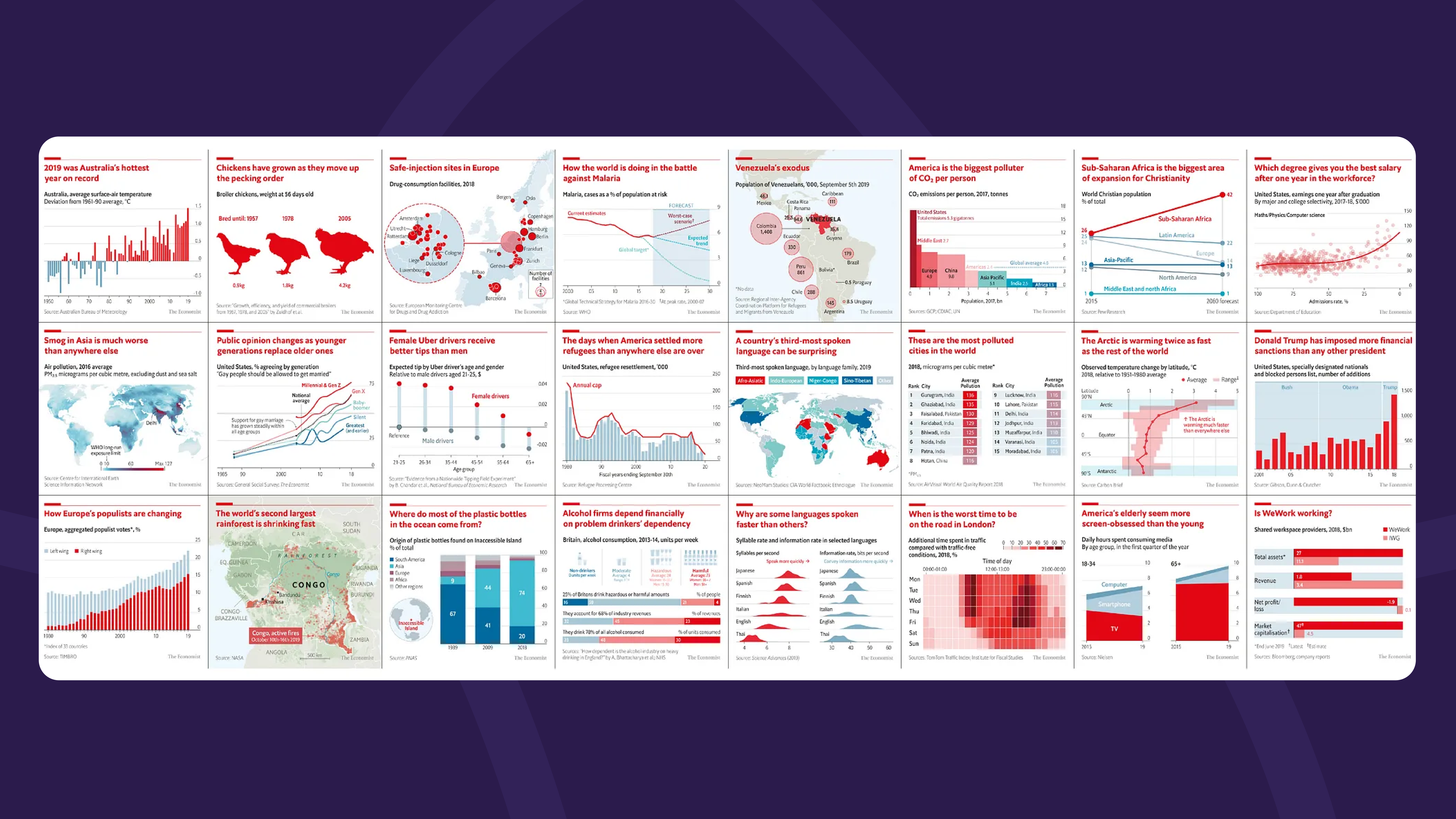
The Economist notably manages a unified, consistent presence across all their platforms, whether on social media, print, or their website. They maintain a seamless visual language wherever you may encounter them. This uniformity is created through a singular color scheme, design style, and foundational principles that minimize clutter and distractions. By embracing consistent design elements, they enhance their data visualization’s legibility and reinforce their brand identity.
Implement strategic use of color
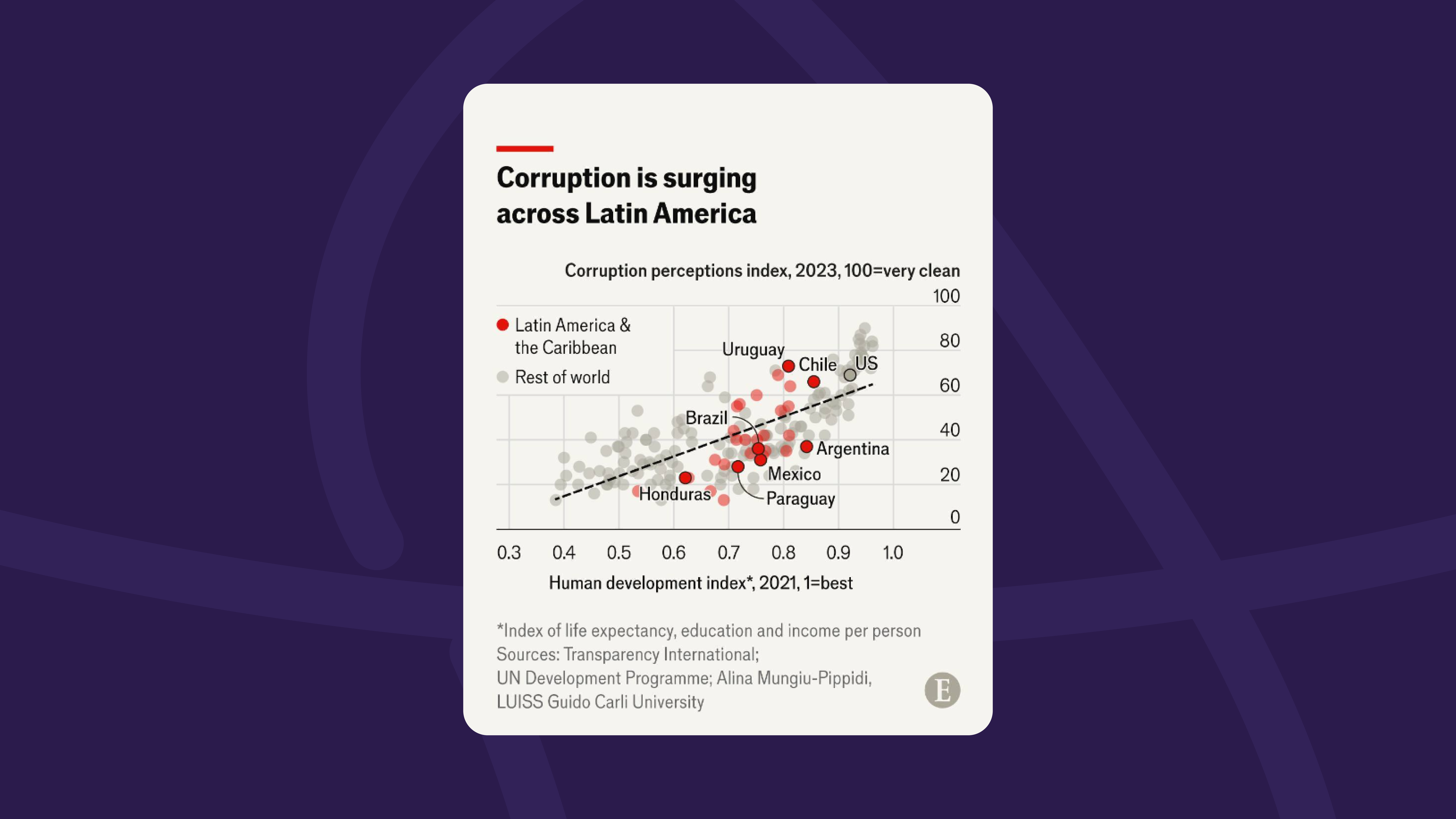
Color plays a large role in creating clarity in data visualization. For example, a chart that aims to compare between two variables across different regions. Initially, contrasting colors would imply that the categories are unrelated, so to avoid this, The Economist will use a more refined strategy that uses consistent color schemes, playing around with opacity levels to highlight specific points. Furthermore, using typography can assist in emphasizing the key findings and main differences without misleading viewers.
Break the Y-axis scale
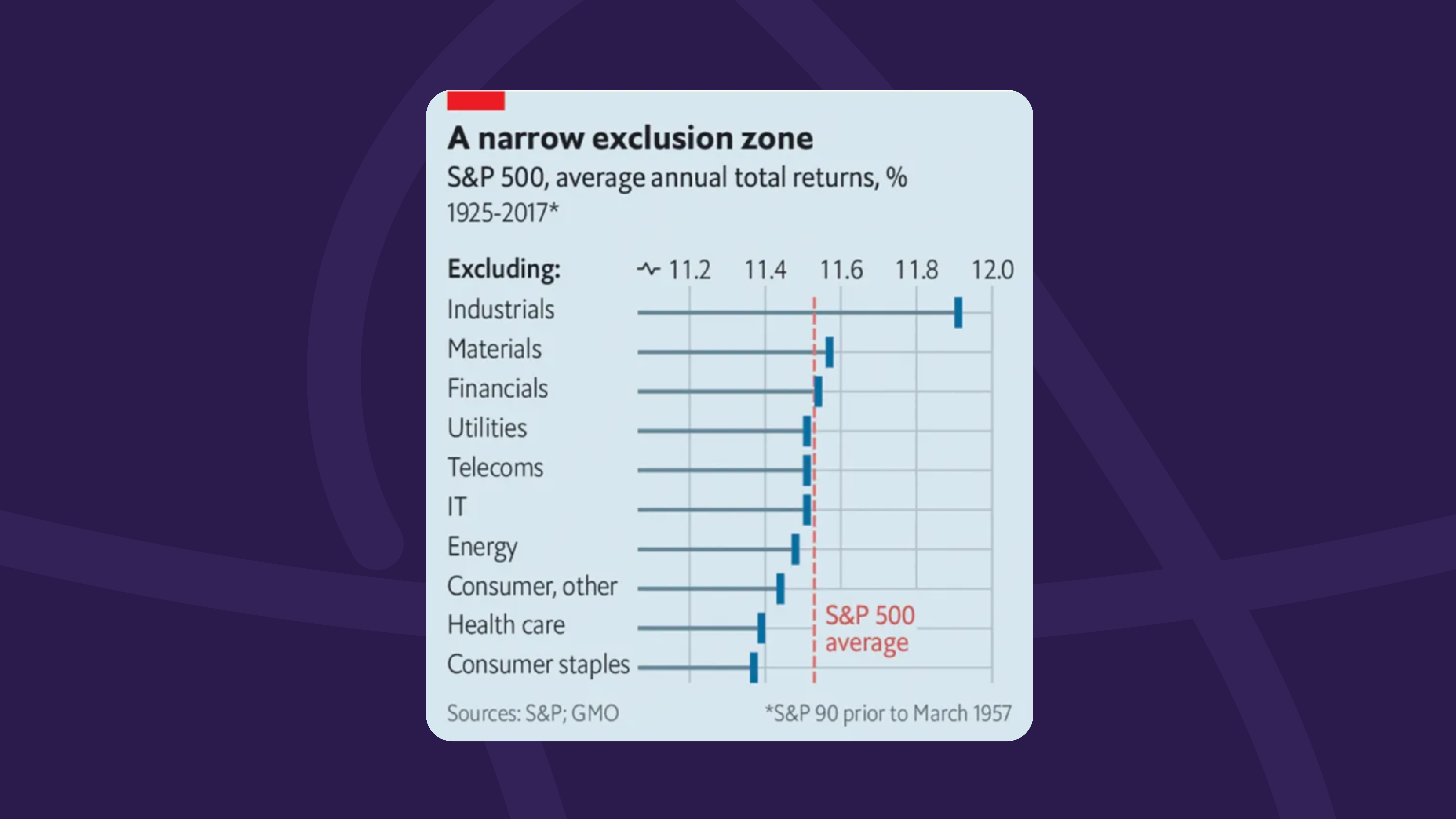
Adjusting the Y-axis scale on charts can be a testy decision, especially when it doesn’t start at zero. This practice is often criticized and avoided due to potentially misleading viewers. But, as we see in The Economist, there are instances where emphasizing minor variations is crucial for highlighting the story in the data. In these cases, limiting the chart’s ranges becomes necessary to highlight these nuances. However, it is important to clearly identify when the scale has been adjusted for transparency’s sake. It is also important to note that breaking the axis in a bar chart is generally not advised, as it can misrepresent the proportional relationship between the data and its representation.
Integrate the text and graph in the data visualization
Effectively integrating the text and visual elements in a report is crucial for clear communication, but in many instances, they fail due to the “slideshow effect.” This is when the narrative only repeats what is shown in the graph. The publication implements a more impactful approach by creating visuals that complement that narrative but are informative enough to stand on their own. This means leveraging legends (which explain the symbols in a chart) that are positioned close to the data they are describing could greatly enhance readability.
In conclusion, a harmonious blend of simplicity, guidance, and consistency are the pillars that make The Economist’s graphs stand out thanks to thoughtful data visualizations. We can learn from their approach how to leverage design principles in data visualization to prioritize the reader’s understanding. And of course, if you have any data that could benefit from elevated design and storytelling, you could always contact our team at Prezlab to learn more about our information design and infographic design services!
Sources:
- https://www.instagram.com/p/C5JPJoEs-78/
- https://www.instagram.com/p/C4s6gkQsosF/
- https://www.economist.com/graphic-detail/2020/01/28/young-britons-are-staying-in-jobs-for-longer
- https://medium.economist.com/charting-new-territory-7f5afb293270
- https://www.instagram.com/p/C4qVtJusubR/
- https://medium.economist.com/why-you-sometimes-need-to-break-the-rules-in-data-viz-4d8ece284919
- https://medium.com/@matteo.larrode2/create-a-the-economist-style-chart-84193a69263e


