 Tweet
Tweet
 Send
Send

15 September 2024
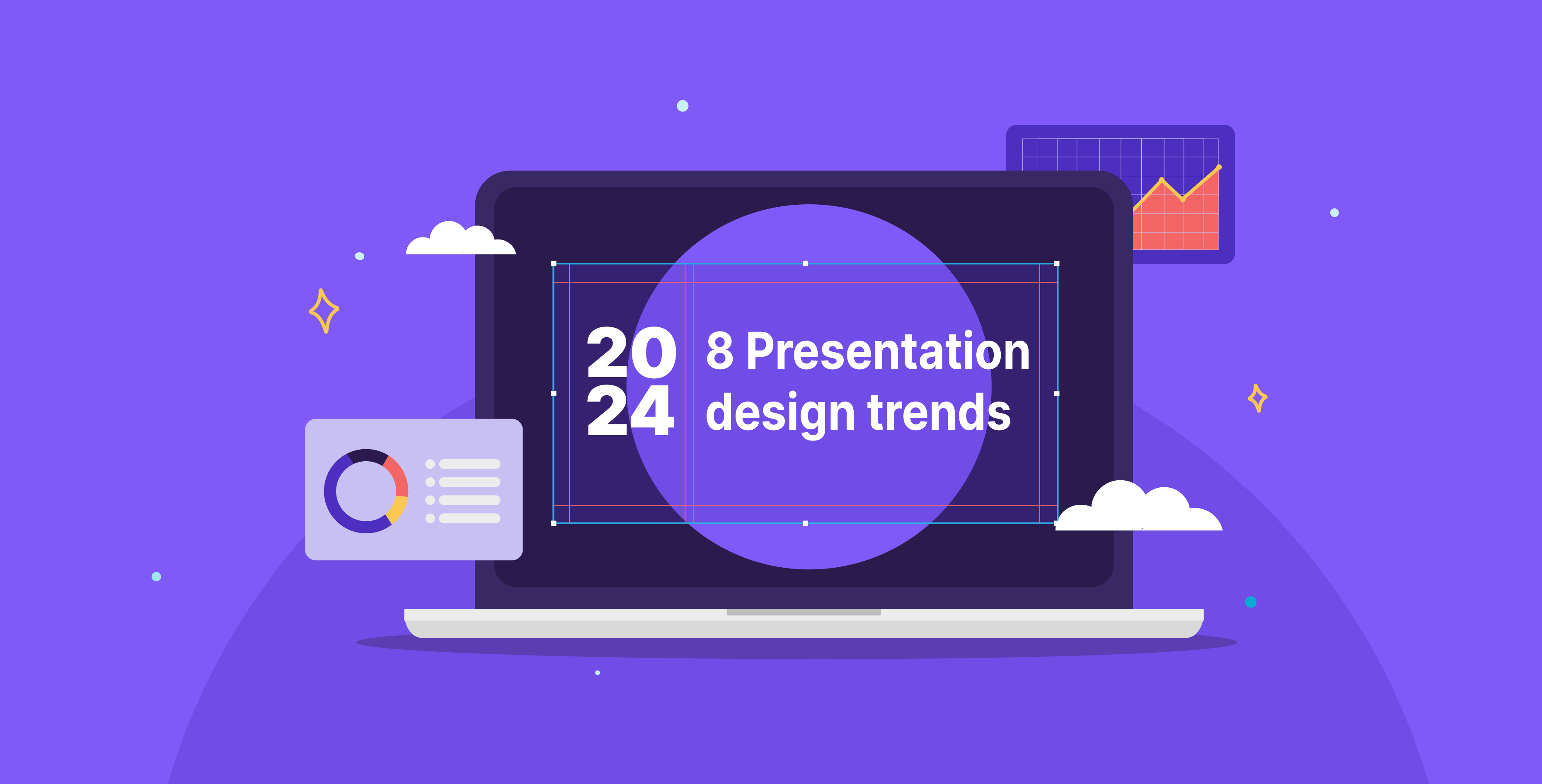
Presentation design is an ever-evolving field of design that continues to grow more innovative and exciting every year. In a world saturated with data, messages, and information, effective communication is paramount. The interesting dynamic between design and technology continues to inspire new ways of sharing information visually. Here, we discuss eight new presentation design trends that we predict are going to be influential in 2024.
If you want to learn more, you can check out our video on YouTube about the latest presentation trends:
Simplicity and minimalist design
Despite the new trends that flow in and out every year, simplicity still reigns supreme. The allure of minimalist design still grabs viewers with its clean, uncluttered frames that are organized well enough to follow the content easily. The appeal of minimalism comes from the way it draws attention to the most fundamental elements and ensures that they are the focus of a design. It also offers a subtle way to be bold by making the primary visual the center of attention. For presentations, simplicity can help emphasize your message and ensure it resonates with the audience effectively with clarity.

Interactive charts
Data visualization stands as an art form within the realm of visual communication, particularly presentations, as it can simplify intricate data into captivating visuals. Going into the new year, the power of data visualization stands strong, and the value it offers is as important as ever. Interactive charts breathe life into data by bringing the viewer closer to the data being presented. For example, animated charts and dynamic graphs invite the audience to observe patterns of change and highlight key insights while allowing them to explore the information at their own pace.

Infographics as presentation design
Another popular and timeless form of data visualization is infographics. In the digital era, they have become a primary form of visual communication utilized across different fields and industries, from finance presentations to public service announcements. Infographics transcend language and can attract and educate viewers from diverse backgrounds with clarity and straightforwardness. In presentations, infographics are some of your best allies, bringing together visual communication and informative data to craft a compelling narrative for your audience.

Dot display graphics
Using dot-display graphics is an emerging trend in graphic design that blends modern and retro aesthetics for fun technology-inspired visuals. This style merges dots into typography or incorporates them into backgrounds and images to add a high-tech appeal to your slides. The style of monochrome dots is also heavily featured in more modern or minimalist presentation styles. They are a super versatile trend that adds a unique touch; depending on how they’re used, they can lend a futuristic or nostalgic feel to your overall presentation.

Pixels in presentations
Another trend that balances between the past and present is using pixelated visuals in presentation design. This style is inspired by the early internet days, which lacked high-resolution images and is now repurposed to create a retro yet contemporary aesthetic. The pixels aesthetic incorporates 8-bit pixel elements such as typography and graphics and contrasts it with modern visuals. This nostalgic approach creates a compelling touch that highlights innovation, futurism, and possibilities.

Freehand sketches
Freehand sketches add a spontaneous and eccentric touch to any slide, whether with simple accents or central illustrations. They add a handcrafted charm that is easily adaptable to the context, especially considering the contrast with often-digital designs. Scribbles show us that presentation design does not need to be rigid; it can be fluid, free-spirited, and unpretentious. Moreover, they give off a sense of authenticity, which can sometimes feel needed in a professional setting. Adding endearing doodles throughout your slides expresses personality, highlights ideas, and simplifies concepts.

Expressive typography
Typography is a staple in every presentation design and has long transcended traditional fonts as the main means of expression. Now, designers infuse personality into their typography to reflect the style of their message as well as their brands. Mastering typography with innovative letterforms makes your message stand out even more and allows it to take center stage. Fonts are not just about the text; they make a statement in and of themselves by conveying their prominence, boldness, elegance, or whatever other feeling they’re meant to showcase. Using expressive typography contributes to a visual narrative that enhances the impact of a presentation by ensuring that the message sticks with your audience.

AI-generated images
As coding becomes a creative asset, creating mesmerizing visuals to incorporate into your presentation becomes easier than ever. Generative or AI art is a useful tool for creating visuals that represent your ideas and brand identity once you’re able to crack the right code and share the right prompt. This provides you with an art style that reflects the role of technology in design and enriches your slides. With tools like ChatGPT’s DALL·E, Midjourney, and Adobe Firefly, and some adventurous experimentation, you can join the wave of this new art form.

As we look through different artistic directions for presentation design trends in 2024, we have a peek into the future of visual communication. The core principles of presentation design remain the same with its objectives of clarity, but embellishing it with unique styles makes it a more engaging visual experience for audiences. Whether you’re sticking to the classic minimal styles or open to experimenting with AI art, there are endless ways to share your ideas in a presentation that can leave your audience impressed.
References:
(1): https://www.pinterest.co.uk/pin/147211481562003145/
(2): https://www.hongkiat.com/blog/js-library-interactive-charts/
(3): https://visual.ly/community/Infographics/food/food-thought
(4): https://www.behance.net/gallery/178021823/DOTWORLD-Dot-Maps-for-All-195-Countries
(5): https://www.behance.net/gallery/144448515/Hyebird
(6): https://www.vecteezy.com/vector-art/27032656-coffee-is-always-a-good-idea-vector-typography-design-for-t-shirt-restaurant-coffee-shop-coffee-day-quote-hand-drawn-lettering-on-dark-brown-color-background-coffee-day-typography