29 September 2024
Graphic design is a vast field, so where do you begin? To break it down, the design elements are your toolbox, and the design principles are the instruction manual. These two factors work together to shape how a viewer perceives and interacts with a brand, offering a guideline for engaging and pleasing visuals.
What are the design elements?
Design elements are the basic components of graphic design that designers use to create compelling visuals. The elements represent the aspects of an image that define a visual such as shape, color, texture, or symmetry. We arrange the design elements to convey a particular mood or steer attention in a certain direction.
Point
A super basic design element, the point can be used on its own or in a group to form a shape. It is a single mark that does not extend but can be used to highlight a relationship between positive and negative space.
Line
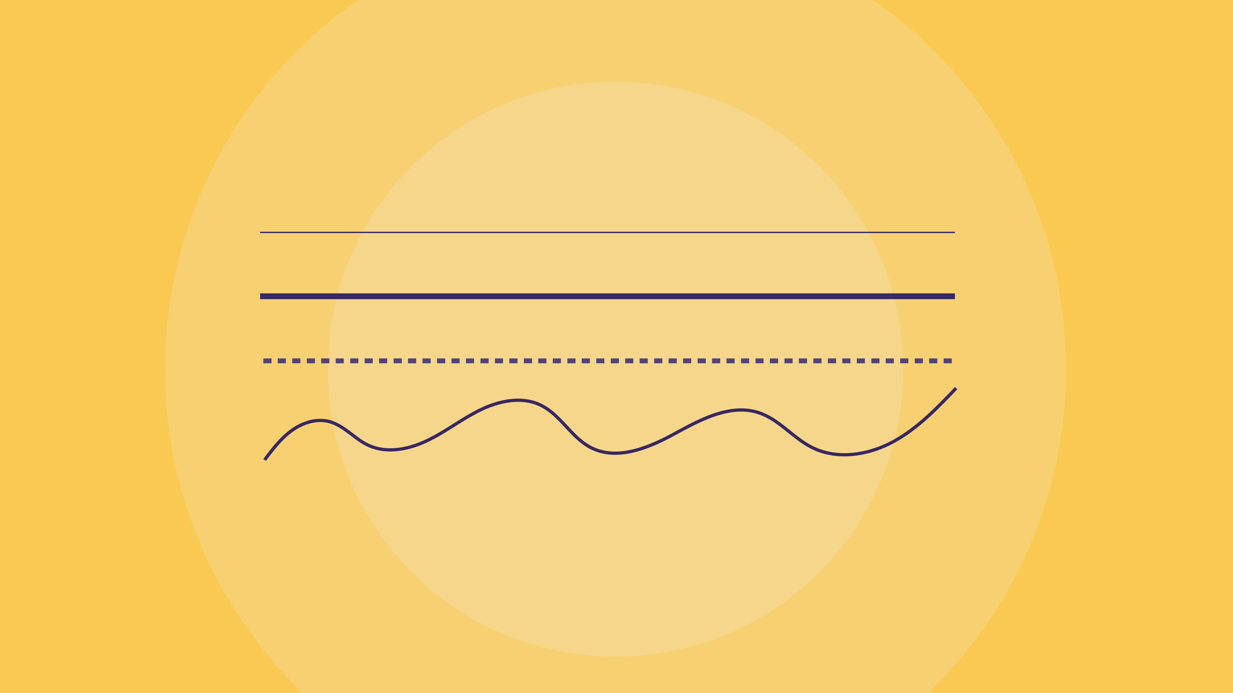
A line refers to the way two or more points are connected. Lines could be horizontal, vertical, zigzagged, curvy, diagonal, thick, or thin. Seamless and versatile, they could be layered to create patterns, curved into shapes, create outlines, or help direct the eye toward certain elements in a visual. They are often used to organize elements in a visual by emphasizing or separating specific components of an image.
Shape
Shapes are all around us. There are three types of shapes that we distinguish: organic or natural shapes, geometric shapes, and abstract shapes. And like color, shapes are imbued with meaning that we associate with them. In geometric shapes, for example, rounder shapes signify safety, sharper shapes like triangles often imply danger or action, and rectangles and squares are balanced, invoking a sense of stability. This is why, in graphic design, understanding these connotations helps when selecting the appropriate shapes for your visual.
Form
The form refers to the way a shape occupies a space. The basic forms include spheres, cubes, and cylinders. It is a design element that adds dimension to a shape. Using light, shadow, and negative space, designers turn shapes into 3D forms by giving them the appearance of height, width, and depth.
Color
Color is an essential component that characterizes a subject in a visual, so it’s important to use it wisely and consider the subjective perceptions of color according to factors such as profession and culture. Using color theory, designers refer to the color wheel and develop color schemes that help convey a certain mood.
Value
The value refers to the lightness or darkness of a hue, usually pictured as a gradient that showcases the different shades. From the colors portrayed, designers could use different colors to incorporate shadow and volume into an element.
Texture
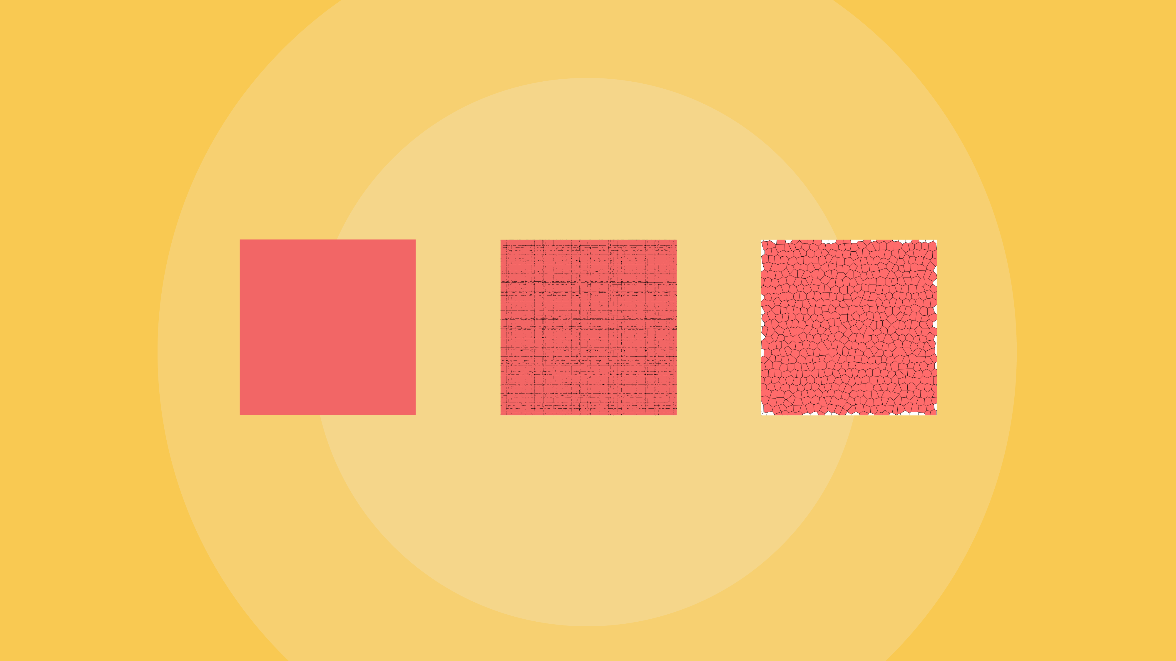
The texture is the design element that depicts the tactile feel of an object. It could be smooth, rough, grainy, or otherwise. In graphic design, the texture should help the viewer imagine the palpable feeling of a visual.
Space
Using space wisely is the best way for a viewer to understand your design’s objective. The positive space is where your design’s focal point is centered, and by using white space (or negative space), you redirect the viewer to the image’s subject. When a design is crowded, it is usually because of a lack of negative space that overwhelms the visual.
Symmetry
Symmetry refers to shapes with a balanced proportion whose opposites mirror each other. Symmetry creates patterns that are familiar to us and that humans are naturally drawn to and find very aesthetically pleasing. Note that symmetry does not need to be perfect; it only needs to be suggested.
What are the design principles?
Design principles refer to the ways a designer might use an element when creating a visual; they offer recommended guidelines to create good designs. The design principles serve different purposes, from highlighting certain elements to creating overall appeal and harmony. However, note that these principles are connected, so the challenge becomes finding a way to coordinate them for a cohesive final piece.
Balance and alignment
Balance occurs when elements are aligned evenly, spacing out the different elements to create a harmonious equilibrium in a design. A lack of balance happens when no alignment guides the viewer to a visual’s subject. Balance could be symmetrical or asymmetrical, meaning that a lack of symmetry does not entail a lack of balance.
Emphasis
Using emphasis in a design ensures that a viewer’s attention is directed toward the most important message first. Whether it’s a title, a text, or a subject, for the design’s main purpose to be highlighted, a designer would emphasize it by presenting it cleverly to focus the user’s attention.
Movement
Movement is the design principle related to motion. It arranges the elements for the eye to fluidly move between pieces of information the way they’re intended to be received. Movement gives visuals a narrative or story by presenting the main information in a hierarchy that makes sense to the viewer.
Pattern
Whenever a shape or symbol is presented repeatedly, it creates a pattern. There are many ways to experiment with patterns: you could alternate shapes or use consistent repetition or switch up repetition styles.
Repetition
Repetition occurs when design elements are duplicated in a design, it could occur either as a motif or as a pattern. The repetition principle creates an effective brand identity, and unlike patterns, repetition is not limited to shapes. Repetition of colors and styles creates a sense of familiarity in bigger projects or dense designs.
Proportion
Once you understand balance, alignment, and contrast, handling proportions should become easier to grasp. Proportion refers to the size of elements in a visual (think aspect ratio) and their composition to establish a sense of order. It’s easy to start by grouping elements together; thinking in sections allows for more thoughtful compositions.
Rhythm
Rhythm can apply to a wide range of disciplines aside from music, such as art and design. Rhythm in graphic design refers to the spacing and arrangement of elements in a visual to develop the desired pace for how the design is received.
Variety
Variety in design refers to the combination of different elements, such as lines, colors, values, shapes, and textures, to create a diverse and visually interesting design. The trick is finding ways to unify all these elements so that they complement each other in a cohesive design.
Unity
Unity as a design principle applies to the ways various elements interact and complement each other. Unity refers to both conceptual and types of visual unity. Conceptual unity is concerned with the information in the design making sense, while visual unity is for the colors, shapes, and textures placed to achieve a harmonious balance.
Contrast
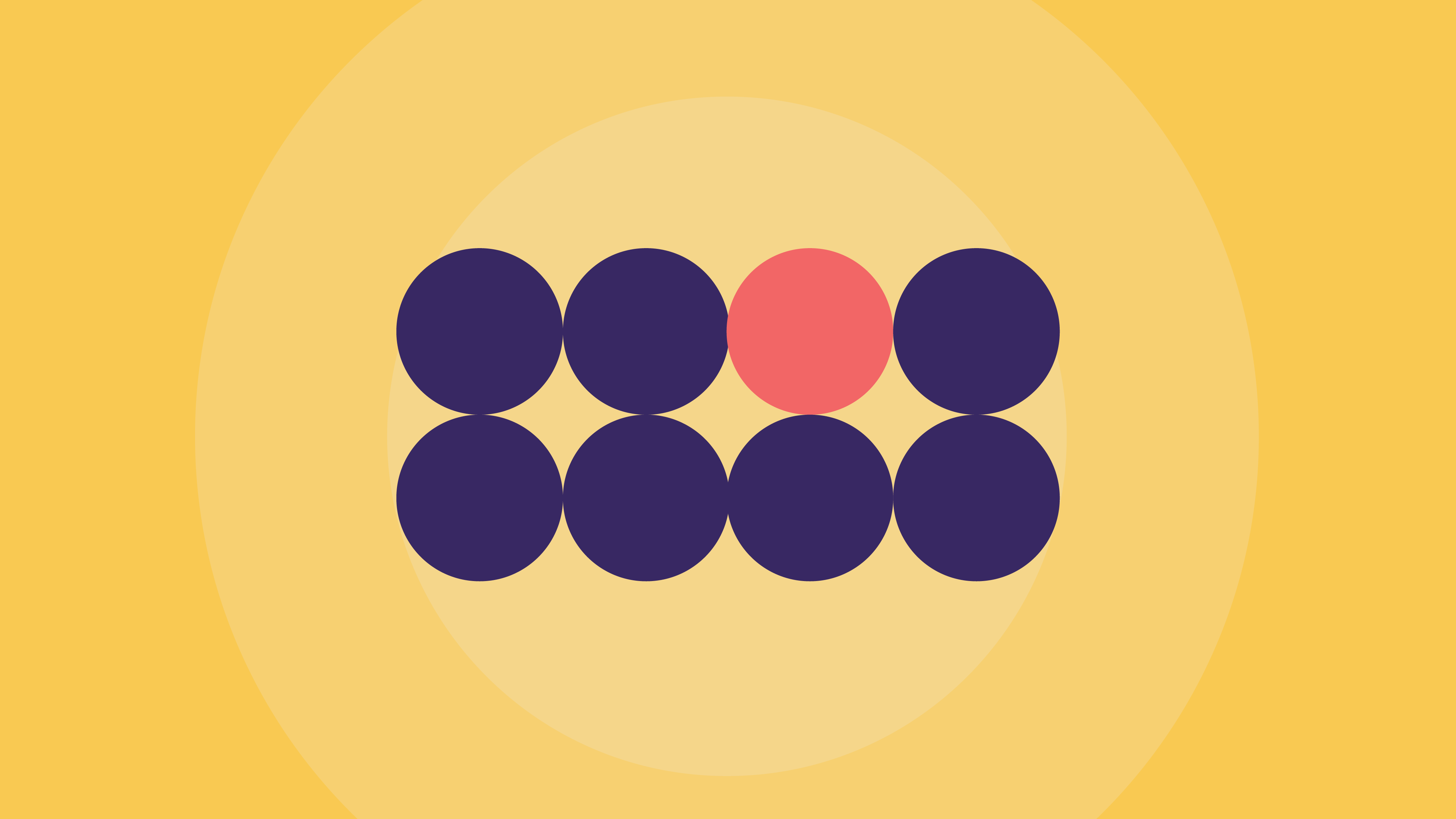
Contrast highlights an element by placing it in an unconventional position. Using contrast creates a visual interest that makes the viewer want to follow the odd element. Common ways to create basic contrast are by using contrasting colors, shapes, or sizes.
White space
White space, or negative space, refers to the empty space in a visual. Using the white space to your advantage, you can create sparse designs with room for your elements to breathe. It is a design principle concerned with what you don’t add to a design. It creates a hierarchy and helps organize the visual to prioritize the subject.
Hierarchy
When creating a visual hierarchy, you want the viewer to follow a particular order when scanning the information in a design. It is about structuring the elements to highlight the main subject and information first and portray a rational flow of information. When a design lacks prioritization, it feels purposeless and cluttered, so it’s important to have an emphasized element that the design focuses on.
How to use the principles of design?
Familiarize yourself with the above design principles and get comfortable with them. Not every design has to use these principles to be good, but after understanding design principles, you can experiment and break away from them. In either case, the priority is to convey the image’s ideas and information.
What are the differences between the elements and principles of design?
The main difference between design elements and principles is that one is a set of rules, while the other is a collection of components to which these rules apply.
Design elements are the basics of graphic design, the most simple elements one needs to create any design. Lines, colors, shapes, and textures, are fundamentals featured in nearly every visual.
Meanwhile, the design principles are concerned with how to use these elements. They are the rules to keep in mind when using the elements to give visual design cohesion and clarity.
What is the relationship between principles and elements in a design?
While the design elements are the basic elements for any visual, the design principles provide guidelines for working with them and using them to their full potential.
When can you break the rules of design?
Although following what seems like a long list of design rules can feel stifling, good design does not rely on them. Design principles are helpful when trying to achieve a certain goal with your visual. Even though you could be walking a fine line, it is neither uncommon nor discouraging to break these rules sometimes.
All of these elements and principles are the primary building blocks of any design project. Once you develop fluency in all of these aspects, you can break them down and be flexible and creative with them.


