02 July 2024
Selecting a color scheme that stirs the desired reaction in your audience is a tricky and challenging process. Unfortunately, picking out an appropriate color scheme isn’t as simple as putting together the colors you like. The color choices used in a PowerPoint presentation reflect the character and personality of your business. When the color wheel offers itself to your imagination, how do you know how to use it correctly?
We cannot underestimate the power of color. It’s a language of its own, influencing emotions and setting the mood for your presentation before you even begin to speak. Presentation slides can convey a relaxed, professional, or confident persona based on the color scheme alone.
What do colors mean?
Starting off with the tough question: what is color?
All that color comes down to is perception. When an object reflects light, it reflects different combinations of wavelengths that our brains interpret as color. And once we begin to understand color theory, we start to have a better understanding of how we perceive colors.
What is color theory?
Color theory offers a foundation for understanding the rules around color and color schemes. It is a basic guideline for mixing colors and analyzes the visual effects of how colors mix or contrast with each other.
Once you understand the logic of color, you can create and use color palettes more effectively and confidently.
Primary colors
Primary colors are colors that cannot be created by mixing colors and they are yellow, red, and blue. When it comes to creating a color palette, the primary colors anchor the color scheme. Meaning that using any one or any combination of the primary colors will place limits on your color scheme when you decide to select other colors.
Secondary colors
The secondary colors are created by mixing the purest form of any two primary colors. The three secondary colors are orange, purple, and green.
Tertiary colors
Tertiary colors take things a step further. They are created by mixing a primary color with a secondary color, making them a mix of several colors. But unlike secondary colors, they are not mixed in equal amounts.
For example, red-purple, or magenta, is a mix of red and purple, meaning it is two parts red and one part blue.
The six tertiary colors are red-purple (magenta), red-orange (vermillion), blue-purple (violet), blue-green (teal), yellow-orange (amber), and yellow-green (chartreuse).
The color theory wheel
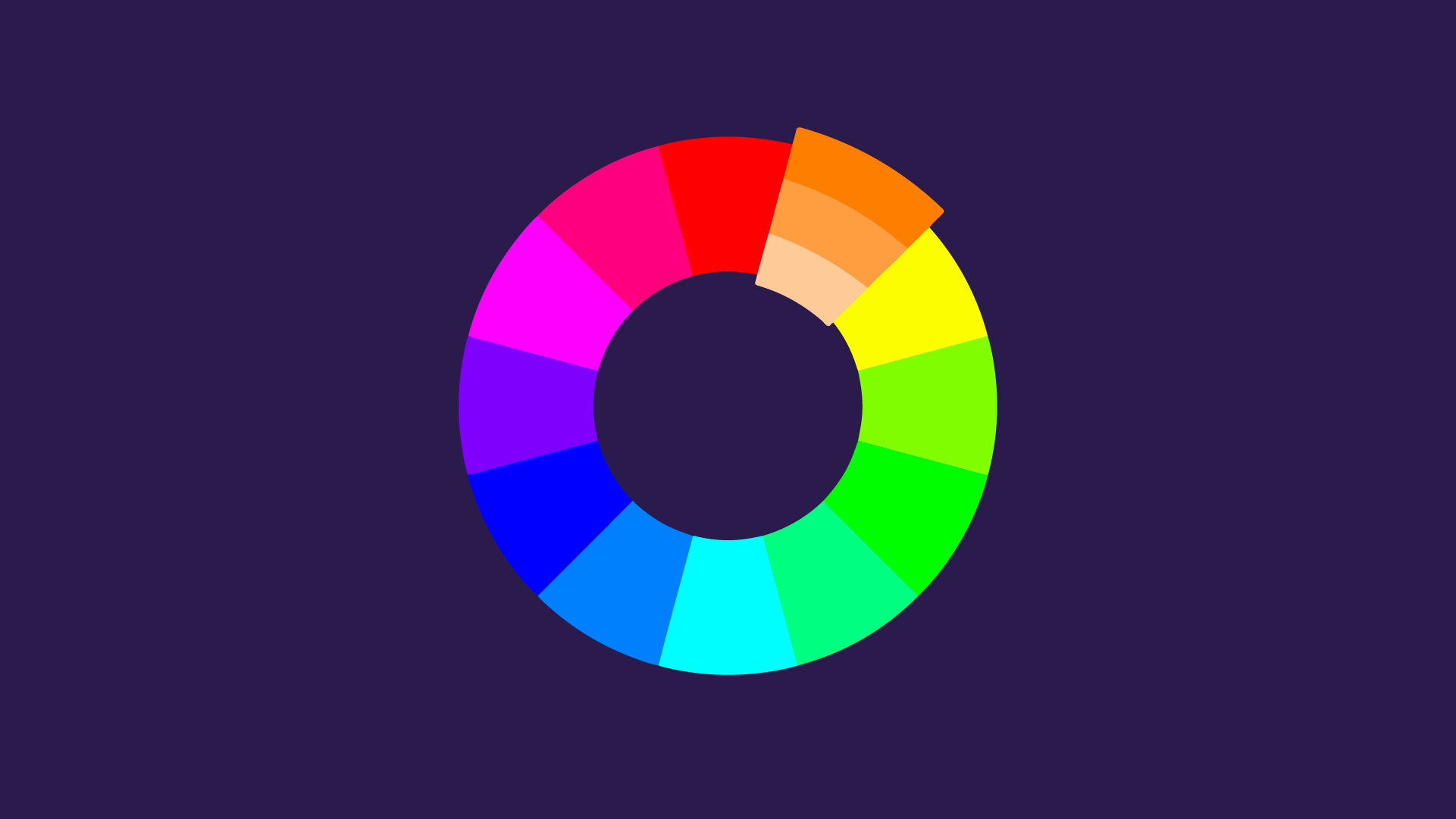
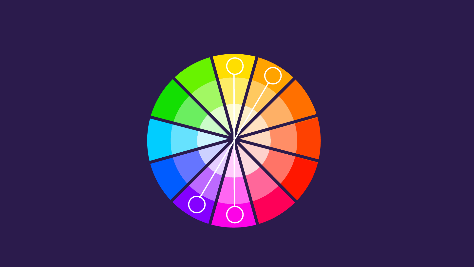
The color wheel is a chart that organizes colors in a circle to showcase the relationships between the primary, secondary, and tertiary colors. From the mind of Isaac Newton, a color wheel is a tool used to visualize colors to help facilitate the creation of color schemes.
What are the additive and subtractive color theories?
The additive and subtractive color models are systems of color reproduction related to how the eye receives light to produce colors.
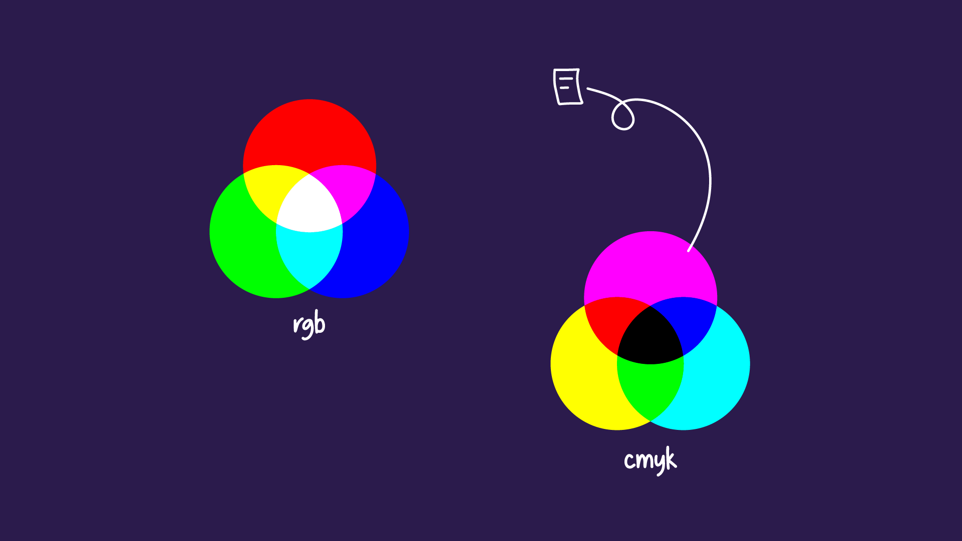
The additive colors are red, green, and blue, or RGB. The RGB color models are for electronic screens like computers or TVs. It begins with black and then adds red, green, and blue light to convey a spectrum of colors. When more colors are added, the result is lighter and closer to white. With the three colors combined in equal amounts, you get white light.
Meanwhile, the subtractive color model applies to any color typically seen on a physical surface, namely paper. In this model, you subtract colors to get closer to white. The subtractive colors are cyan, magenta, yellow, and key/black (CYMK), and these are usually the colors listed on printer cartridges. When these colors are printed, they absorb the light and appear black.
How to combine colors?
Using the color wheel, we can experiment with color combinations to create original and effective color schemes. There are seven major color schemes in graphic design that designers regularly use and return to.
Warm colors
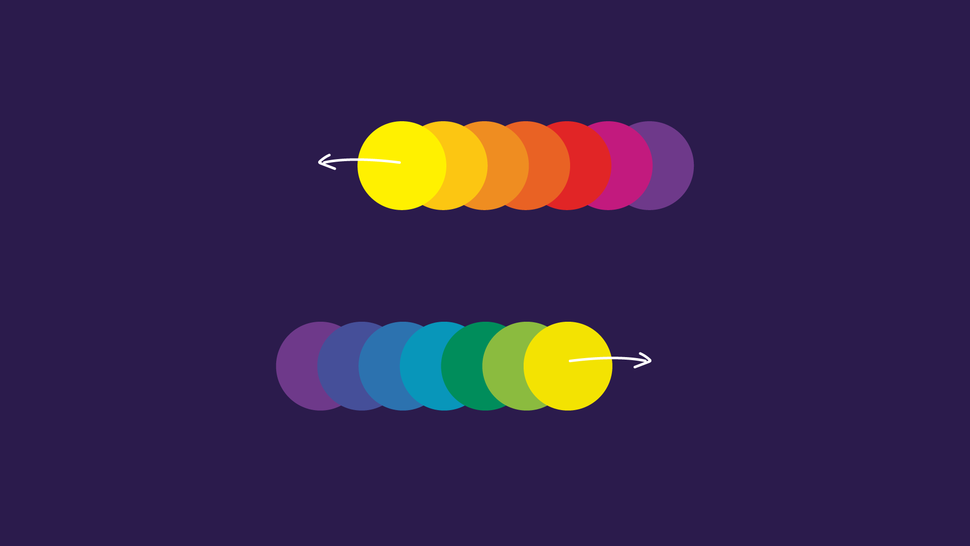
If you draw a line through the color wheel, it cleanly separates the warm and cool colors. The warm colors are reds, yellows, and oranges, and they are hues associated with energy, brightness, and action.
Cool colors
Cool colors are blues, greens, and purples, and they often connote feelings of peace, calm, and serenity.
Complementary colors
A complementary color scheme comes from combining colors that stand directly opposite each other on the color wheel (such as purple and green, orange and blue) and their respective tints.
Since this color scheme offers a strong contrast, it’s best to use one color as a dominant color and use the second color as an accent in designs. Use contrast to highlight important points in your presentation.
Split complementary colors
A split complementary color scheme features a selected base color and the two colors that neighbor that base color’s complement. The result is a versatile and nuanced color palette that is more diverse than a complementary color scheme while still maintaining a healthy and interesting contrast.
Although this color scheme is easy to achieve, it can be tricky to maintain. A split complementary scheme offers more color combinations, but it takes a bit of experimenting to find a good balance.
Triads and tetradic color combinations
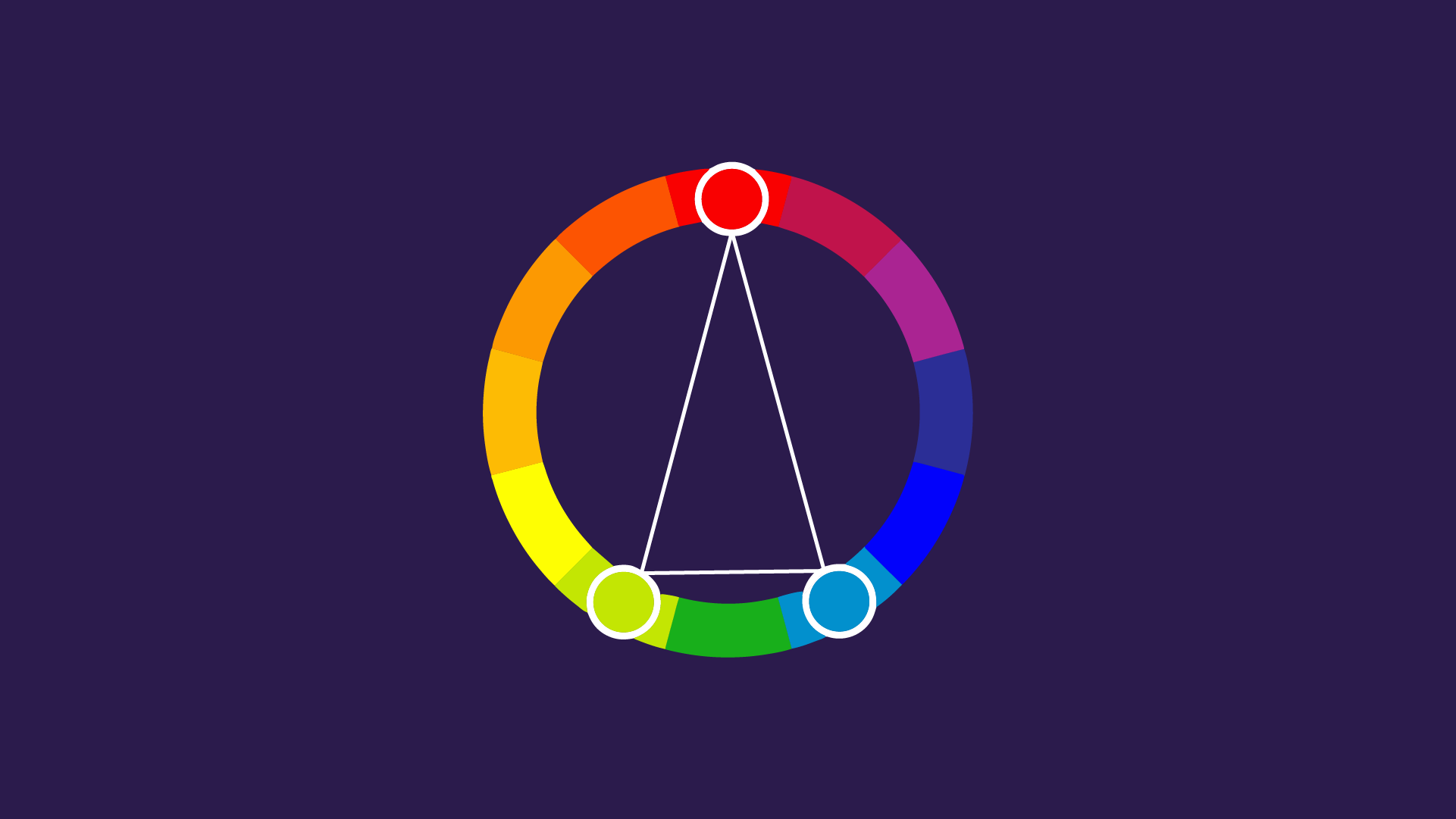
A triadic color combination creates a balanced contrast by featuring three colors at an equal distance from each other on the color wheel, forming a triangle. However, it can feel overwhelming when the colors selected are bold. This can be handled by choosing one color to be the dominant one and using the others sparingly or by selecting a softer tint.
A tetradic color scheme is achieved by drawing a rectangle on the color wheel, resulting in a vibrant color scheme.
Analogous colors
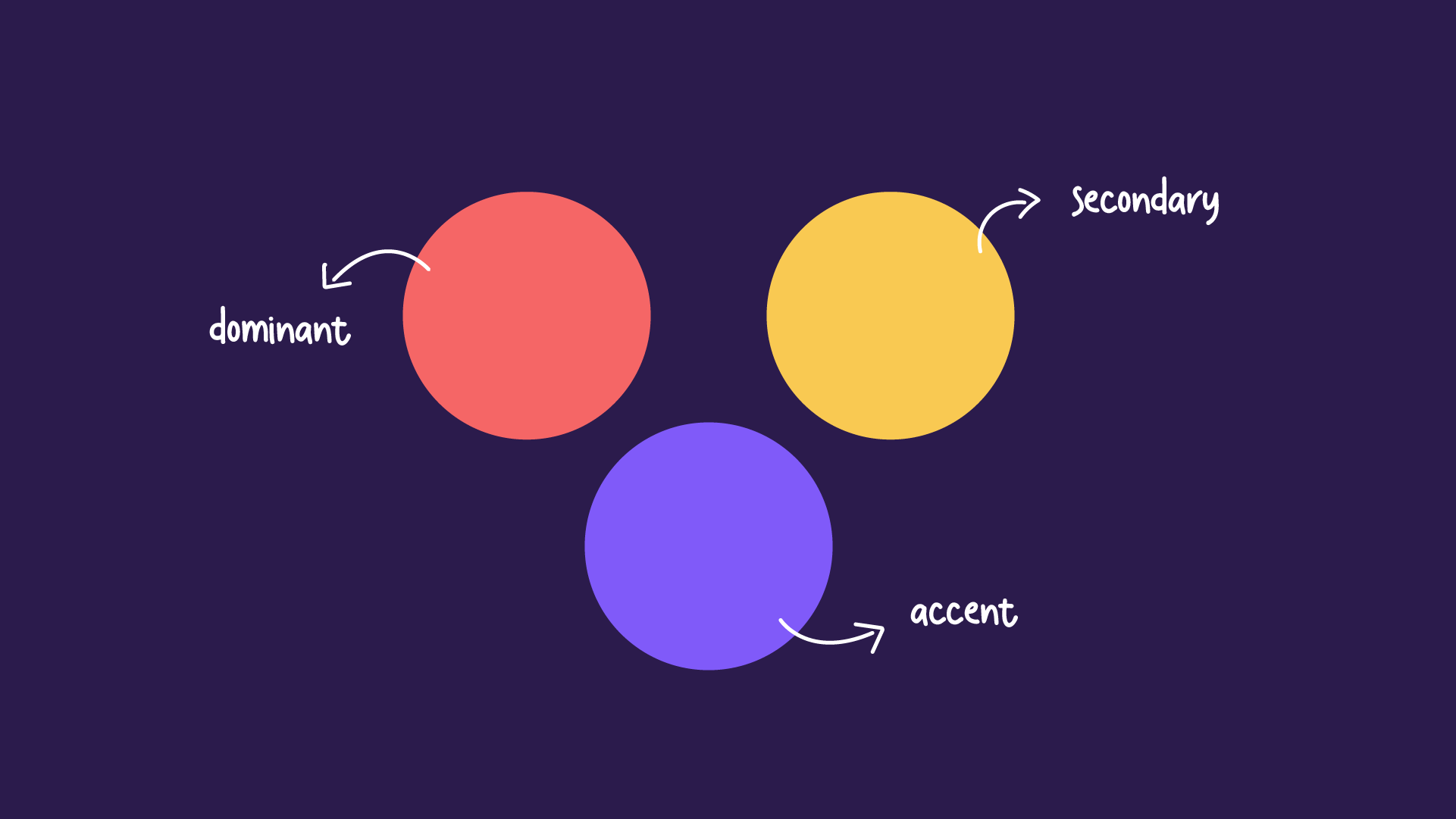
Analogous colors sit next to each other on the color wheel and together create a soothing color scheme. When using analogous colors like red, yellow, and orange together, it’s best to have one color dominate, the second color support, and a third color accent.
Monochromatic colors
With a monochromatic color scheme, you choose one color and support it with its varying shades and tints. The result is a calm and consistent feel that looks polished and professional. This type of color scheme is easy to use since you only need to select one color and then use black, white, or grey to change it.
How to choose a color scheme?
These formulas for putting together color combinations are easy to pick up with enough practice. Yet, the challenge lies in the other factors you must consider when choosing colors for your color palette, which affect the impact and effectiveness of your color scheme.
Consider the user experience
When creating a presentation, consider the audience and the purpose. For example, using a monochromatic color palette is appropriate for a professional presentation, while complementary palettes are versatile for different types of occasions.
But also remember the details; for example, a bright background could be distracting and make it hard to read the text.
Set a mood for your color scheme
What is the mood you want to convey? If you want an energetic presentation, you’re better off using brighter colors like reds and yellows. While shades of blue are great for creating a peaceful and serene mood. Or you could tone down the clutter by creating negative space in black or white.
Working with high contrast
Be clever with your use of contrast. If you’re using a dark background, use light text that your audience can read, and vice versa. It’s important to use high contrast in more professional presentations to draw the audience’s attention to the contents. Draw attention to your important points with accent colors.
Follow the 60-30-10 rule
Originally an interior design rule, the 60-30-10 principle has proved to be a great tip for graphic design. It adheres to a balance of 60% of the main color (for backgrounds), 30% of the secondary color (filling in shapes or images), and 10% for the accent colors in outlines and text.
Refer to your color wheel
Use the color wheel to your advantage. Refer to it constantly to select color combinations of different color schemes. Sometimes, a color scheme that may look good in theory might not work with your presentation. It takes several tests to find a scheme that resonates with your personality and serves your presentation.
Draft multiple designs
As with any creative endeavor, there is no way to find out how your ideas will work without drafting and experimenting. In your quest of finding the appropriate color scheme, you need to create multiple drafts with your palette suggestions and see which works best. It’s good to step away from your work and sleep on it to refresh your perspective.
Keep it simple
Don’t overthink it. Keep your color scheme simple. A monochromatic palette is a great starting point for beginners since you’d only be working with one color. For more advanced users, try not to work with more than four colors; anchor your design in one dominant color and use the others for support.
Avoid unnecessary usage of color
Exercise restraint. Not every instance will need an explosion of color. For example, in a chart with only two variables, heights, and length suffice as differentiating factors. But when a third or fourth variable is introduced, then the color becomes necessary to emphasize or highlight differences.
Be consistent with color across charts
When using multiple charts and graphs, make sure to be consistent throughout the presentation when referring to the same groups. It keeps the document neat and organized and helps the reader follow along.
Leverage the meaningfulness of color
Different colors hold different meanings and symbolism. If you’re using color in graphs to represent certain groups, then keep in mind the colors they are typically associated with to make it easier for a reader to follow.
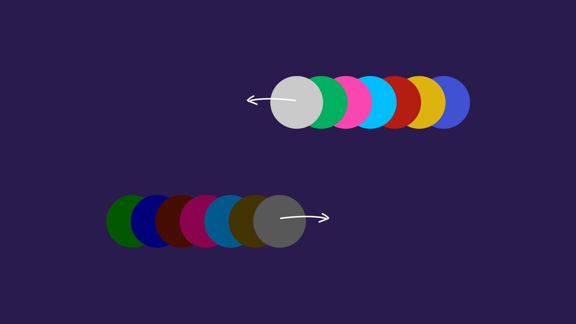
A general rule to follow is avoiding high color brightness and saturation or at least keeping them to highlight a particular element.
Attend to color blindness
Be inclusive of those with color blindness. The most common form of color blindness causes those afflicted to confuse red and green, and less commonly the confusion between yellow and blue. So use variety in the lightness and saturation to differentiate between colors rather than relying only on hue.
Sites like Coblis have color blindness simulators to help you get an idea of how your visuals will look and if there are potential ambiguities.
Types of color palettes
When it comes to data visualization, color is a necessary component in visual aids such as charts and elements. Misusing color could be distracting or confusing, but using color productively helps you tell the story you want to tell. Depending on the data you want to convey, there are different types of color palettes to consider.
Qualitative palette
A qualitative palette is used when the information presented deals with categorical variables such as age groups, countries, race, etc. In a qualitative palette, a distinct color is assigned to each variable or group.
A qualitative palette relies on the colors to differentiate between several variables, so try to limit the palette to no more than ten colors. Any more would create confusion in distinguishing between groups. Play around with hues, lightness, and saturation to create distinctiveness between colors.
It’s also important to maintain overall cohesion to not create unintentional bias by highlighting certain variables more than others.
Sequential palette
A sequential palette is used when the variables are numeric and typically portrayed sequentially. Often in a sequential palette, the lightness or hues are the distinguishing factors between variables.
The use of lightness is the most recognizable form of a sequential palette, which is why a single hue could be used. Low values are connoted with lighter colors, while darker colors are used for higher values. Otherwise, it is recommended to use two adjacent colors from a warm or cool palette.
Diverging palette
A diverging palette is applied when numeric variables have a central value (like zero). It’s useful to think of a diverging palette as two sequential palettes meeting at a middle point. The two sides are assigned two distinctive colors, and as with sequential palettes, lightness is used to portray distance from the central value.
Discrete vs. continuous palette
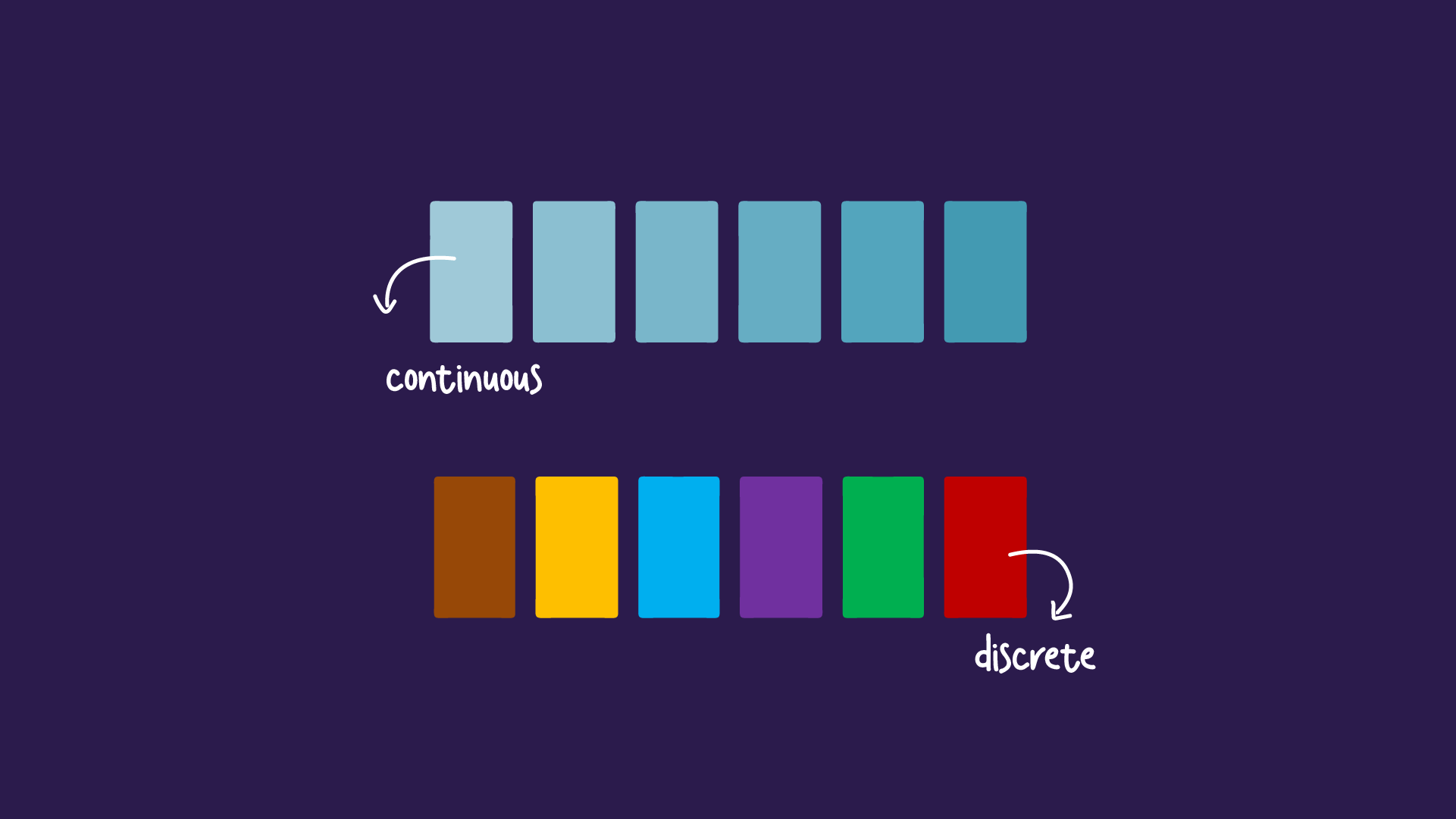
Sequential and diverging color palettes interact with data values with either discrete colors akin to a numerical value or through a continuous fading function between the variable and color.
Often, the process of creating color palettes follows the first method of using discrete or distinct colors, even though it would make sense to use a continuous color function to communicate the relationship between values.
However, people distinguish details such as length or position more quickly than they do color differences. So discrete palettes highlight patterns in the data, and we can set a clearer range within a discrete palette. While on a continuous palette, data would be pushed into a narrower range.
How to create a color scheme for your presentation
With the variety of color schemes and color palettes possible, where do you even begin creating your own? There are many variables involved in building a color scheme for your presentation, so start at the root and select colors appropriate for your goal. You can also reach out to our team for their presentation design (and palette-making) expertise.
Our presentation design services
Pick your colors
Building a color scheme begins with selecting colors that fit your purpose and mood. The process of picking colors is simplified once you can select a base color to build on.
The dominant color
Visual language is very effective in creating a subconscious connection and resonating with your audience. So begin by selecting a dominant color that encapsulates your beliefs and best represents your topic and niche to create the base for your color palette.
The secondary color
A secondary color supports your scheme’s dominant color and makes it stand out more.
The accent color
Accent colors are used to contrast and emphasize points in a presentation. Complementary colors make for perfect accent colors as they offer a bold contrast that attracts the eye. Accent colors are meant to be used sparingly to not overwhelm the viewer.
Keep colors in balance
Maintain a balance with your color palette and diversify the use of colors in highlighting text or brightening slides. Apply the 60-30-10 rule to your dominant, secondary, and accent colors.
Use the theme color palette
When creating your presentation, take advantage of the theme palette feature in PowerPoint and Google Slides. This tool allows you easy access to your color palette and lets you quickly change the colors of text and elements in your presentation at once without having to do them individually.
Use the tools at your disposal
There are several tools available for building a color scheme and using color palettes in presentation and design software. Use them to create a cohesive and engaging color scheme to be used in your presentations.
Tools and resources for using colors
By now, you should have a pretty good idea of color theory and how to build a color scheme. However, that shouldn’t discourage you from using tools and resources that help you speed up the process of selecting the perfect color scheme for your presentation.
Data Color Picker
Data Color Picker is a great tool for generating color schemes for sequential and diverging palettes. Often, some hues are left out between the two endpoints of a sequential palette, but Data Color Picker has a default tab for palettes that is perfect for generating multi-hued palettes.
Chroma.js Color Palette Helper
This tool has detailed options for crafting a color palette, with options for the type of palette desired (sequential, diverging), correcting lightness, and a color blindness simulator. These features of the chroma.js Color Palette Helper allow for more refined and cohesive palettes.
Color Thief
Since there aren’t many tools for creating qualitative palettes, you could extract potential color palettes from images with colors that resemble your intended mood. Color Thief is a tool that lets you generate a color palette from your own uploaded pictures. Although you would need to tweak your options to create an appropriate palette, Color Thief is a great starting point.
Viz Palette
Similar to Coblis, Viz Palette is a color palette tool that allows you to see how your palettes are perceived by individuals with different color perception deficiencies and color contexts. Furthermore, you can alter the color palette instantly in the tool.
Adobe Color
Adobe Color is a free Adobe tool for building color palettes based on different schemes and combinations. Moreover, it offers premade color schemes to play around with, use in your presentation, and even save if you’re an Adobe user.
Illustrator Color Guide
In the Illustrator Color Guide, you could generate a 5-color scheme along with its tints and shades based on the one color you select. And with preset modes, you could select the type of color scheme you want to create. You can save your color palettes to return to them in future presentations.
Preset Color Guides
Chances are, you’re familiar with Microsoft Office products. Well, did you know that all of the Office softwares have preset color schemes that you can use for your projects? In PowerPoint, you can find the color schemes in the Colors menu in the Slide Master view. You could select an option or customize your own.


