28 August 2024
You might already recognize aspect ratios as the ratios displayed on your digital cameras or smartphone cameras. They are involved in every medium that uses images or video, and since each medium uses shapes specific to its vessel, they are modified to suit different purposes. Understanding them can help you frame images more effectively for their intended platform.
What is an aspect ratio?
Aspect ratio refers to the relationship between the width and height of an image or the image’s proportions. It characterizes the shape of an image as a rectangle, square, or landscape. In smartphones and most cameras, the aspect ratio is typically a horizontal or vertical rectangle.
An image’s aspect ratio is unrelated to size, so if an image had a ratio of 1:1 or 400×400, it would still be square in both cases.
To understand this better, consider using units to picture the width and height of an image. For instance, a 3:2 ratio would comprise 3 equal units for width and 2 units for height.
Pixel aspect ratio
The pixel aspect ratio or PAR is the proportion of pixels in an image. Pixels are squares, meaning that the PARs are 1:1. Different displays could have rectangular pixels for 4:3.
Display aspect ratio
The most common or relevant type is the display aspect ratio or DAR. It refers to the standard proportions for different screen displays. For some devices, the DAR is fixed, so images are optimized to be well-displayed. You may notice, for example, that if you show a video intended for a 16:9 widescreen on a different device, it distorts the image. That is because certain images/videos are created for particular platforms and will appear odd otherwise.
Storage aspect ratio
The storage aspect ratio, or SAR, is a formula related to encoded video files, referring to the relationship between the width and height of a video frame. The frames would all need to be consistent for a final video to display well. For most widescreen videos, find the display by multiplying the SAR by the PAR.
Why is the aspect ratio important?
People retain images very quickly, so when creating video or image content, the screen ratio affects how it is perceived. If the size is inconsistent with its platform or device, it will look and feel odd to the viewer.
It is especially important to keep the aspect ratio in mind for social media platforms so that images appear interesting to viewers. Luckily, there are tools available to change and amend the aspect ratios we get into later in this article if you’re unsure where to start.
What are popular aspect ratio formats?
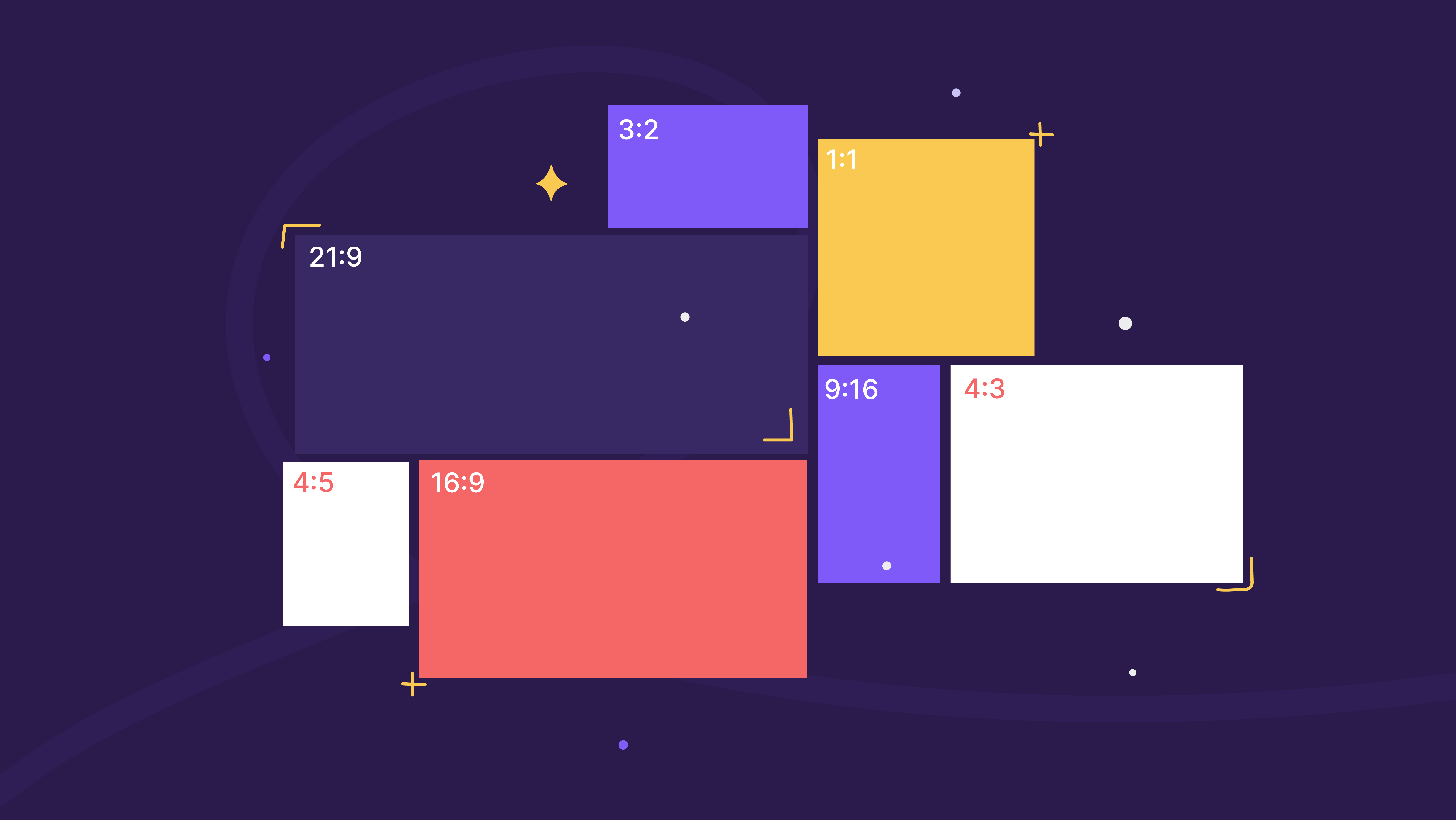
The appropriate aspect ratio to use differs from purpose to device to platform. However, there are commonly utilized sizes that are a constant standard for designers and photographers.
16:9
You may already be familiar with the 16:9 ratio as a staple for film and TV. Its panoramic size made it perfect for TV, cinema, and computer screens. And now, its influence has migrated into digital spaces and has become the norm for online video as well.
9:16
9:16 is the default vertical ratio for social media, perfect to use in IGTV, TikTok, and stories. To avoid having your content cut off it’s best to publish TikTok and IGTV videos in a 9:16 ratio for its mobile portrait frame.
1:1
Also commonly used on social media, 1:1 makes a perfect square standard in social media posts (like Instagram) and web design.
4:3
Originally designed for TV and computer displays, 4:3 was the first video format used since TVs initially had square screens. The 4:3 format is also great for landscape photography since it captures a wide area.
3:2
Slightly wider than the 4:3 format and corresponding well with the 4 x 6” photo size, the 3:2 ratio is the typical aspect ratio for 35mm film cameras.
21:9
21:9 is another aspect ratio used for film, particularly for cinematic anamorphic formats that translate well on computer monitors.
4:5
For platforms like Facebook, it is recommended to use 4:5 for vertical videos since it gives a tight frame that creates an appealing composition in its videos.
Which aspect ratio is the best?
The best size depends on the type of image you want to create. If you want to capture panoramic landscapes, then refer to 16:9, while 1:1 is perfect for Instagram photos.
In photography, it’s best to use a full-frame camera for its high-definition sensor. That way, you could crop photos to your desired size without compromising their quality.
How to find the aspect ratio?
The formula for aspect ratios is x:y, the x being width and y resembling height. Let’s say you want to find the ratio of an image with a 3000×2000 resolution, just divide the two numbers for the result, 1.5:1 or 3:2.
You could also refer to the tools mentioned below, such as specialized calculators, to aid you.
How to adjust the aspect ratio?
Many DSLR cameras allow you to select the aspect ratio before taking photos. There will usually be a box on the screen that will show where the frame cuts off to help with composition.
Smartphones also have options to select different sizes; for example, iPhones let you choose between 1:1 (square), 16:9 (panoramic), and 4:3 or default mode.
And you could always crop your photos when you edit them. Although it is important to note that different formats will affect your final product. So, learn to plan your shots and frame them with the final size in mind.
How important is the size in storytelling?
Aspect ratio plays a role in the way content is received on the platform it’s shared on. Whether it’s a cinema screen, Instagram, or YouTube, the wrong aspect ratio could turn off the viewer from the video or image. However, you could use aspect ratios creatively to reflect different settings or time periods in a film.
How do aspect ratios affect UI/UX design
Any project that involves an image or video display will need to consider the aspect ratio in its exhibit. The composition will play an important role in the way it is displayed on different devices. Responsive web design guarantees that content is showcased properly on all devices and automatically resolves issues regarding the appropriate aspect ratios. However, composing an image beforehand helps avoid problems with quality or cut-off content.
When images look off or out of proportion on a website or are stretched or shrunk to fit the screen, it negatively impacts a visitor’s impression of the website. Not to mention that ill-proportioned elements can obstruct the site’s usability. All of these factors discourage a visitor from continuing to use a website. Meaning that the designers’ and developers’ knowledge of aspect ratios should contribute to creating a fluid structure for a comfortable and practical visual effect.
Aspect ratio and responsive design
When thinking about responsive design, you will need to maintain a cohesive shape across several devices. Understanding aspect ratios ensures that meaning is not lost when images are cropped. In responsive website design, designers could resize images manually or use coding to control how they appear on the screen.
In these cases, it’s helpful to think of them as percentages, like 4:3 is 75% and 16:9 is 56:25%.
Tools for changing the aspect ratio
With several elements to consider when it comes to aspect ratios, from framing and composition to sizing to measurements, it can feel overwhelming to keep up with them all to produce a great final result. Luckily, several tools are available to help you use them effectively and efficiently.
ImageResizer
This tool helps resize images and change photo ratios. By adding the image to the interface, you could choose the size and edit it to create the result you want.
Veed.io
Another great tool for resizing and editing, Veed.io allows you to process local and Dropbox files with its many features. Note that this tool places its watermark on processed files.
ResizeImage
ResizeImage processes GIFs and other images up to 100MB and 30MB, respectively. Dropping the files to the interface, you could then select an aspect ratio, crop the image to your need, and play with other features such as adding a background and rotating.
Adobe Creative Cloud Express
With presets for social media platforms, Adobe Creative Cloud Express helps edit images in all the relevant formats quickly and easily. You can also set up your own custom aspect ratio based on your taste or need.
Kapwing
Kapwing offers a range of editing features to fix up processed images. Daunting at first, but once you learn the ropes, you’re able to efficiently use the tool’s options to your advantage. Its diverse features let you pad and choose background colors for your images.
Croppola
Once your image is processed, Croppola selects the appropriate aspect ratio and lets you crop images automatically. It also offers an option for you to change and select the aspect ratio and crop the image manually yourself.
Clideo
After adding your images from your device, Google Drive, or Dropbox, this tool has social media presets and customizable options to resize the image as per your requirement, along with the option to crop, fit, and fill.
ImgOnline
This editing tool supports diverse functions such as converting, compressing, and effects, along with cropping and resizing. Plus, its settings for adjusting DPI size and interpolation make it a very handy tool to have on hand.
The context or platform for an image means that the shape will play a role in how effectively the image is perceived. Knowing the ways that the aspect ratio influences a viewer’s experience helps photographers and designers make smarter decisions in planning and framing images.


