28 August 2024
It is a universally shared experience to walk into an IKEA store and find it very difficult to leave with just one or two items. What is the secret? Beyond just furniture design, IKEA has cracked the code for masterful retail psychology, turning mundane errand shopping into an exciting experience. From the labyrinthine layout to the thrill of putting together a new piece for your home, every aspect of the experience is specifically designed to captivate. In this blog, we will delve into the strategies they use to create an unforgettable customer journey for their visitors.
Like many retailers, they rely on marketing techniques to draw in customers and inspire them to buy their products. These techniques cover many aspects of the customer’s journey to make them comfortable and confident in the brand, and they include:
The Ikea Effect
Have you ever put together a piece of IKEA furniture and felt an unexplainable sense of pride in your accomplishment? This is what is often referred to as the IKEA Effect, the psychological phenomenon or the unique sense of pride a customer feels after successfully assembling a piece of furniture. This leads to a cognitive bias that makes a person more attached to the product, creating a bond between the consumer and the brand.
By turning customers into creators, their products become a tangible reflection of their efforts, which in turn fosters a sense of connection with the brand. The company leverages psychology to design furniture that is easily assembled to facilitate this feeling of achievement that encourages customers to value their products.
The smart store layout
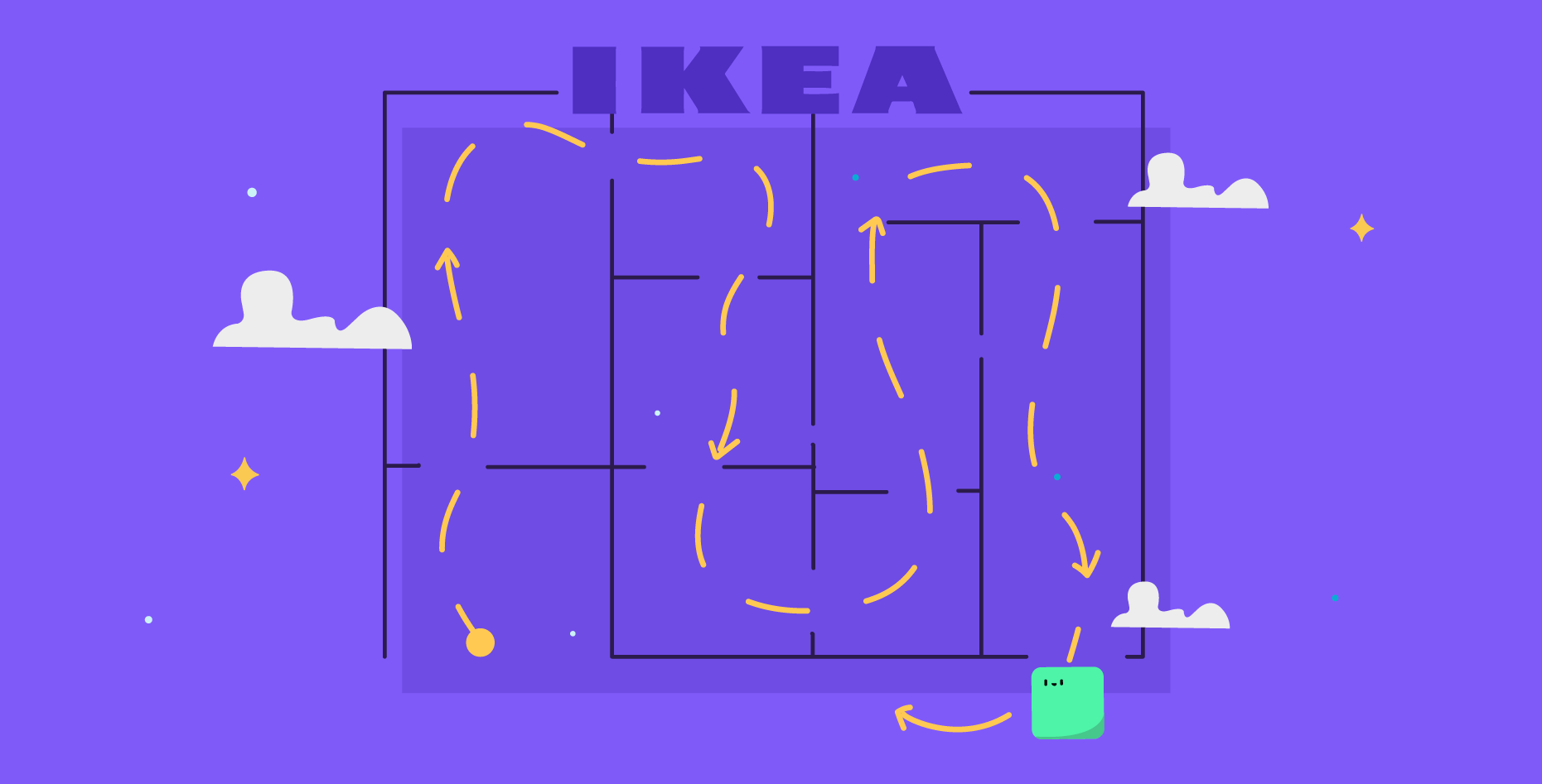
Think back to your visits to IKEA’s stores and the way the store’s rooms seamlessly transition from one perfectly curated section to the next. This is an example of the Guren Effect, where the store’s layout works to enhance the customer’s experience by allowing them to explore more freely, sometimes (most times, actually) encouraging diversions from the original agenda.
In addition, their store locations are often far from city centers and therefore have lower rents and property taxes. Their far-off locations allow them to face less competition and take up more space with more parking. IKEA’s massive stores with a “maze” layout guide customers through different sections, encourage them to stay longer and expose them to more products. The layout design also encourages impulse purchases by strategically arranging matching items in mock rooms that inspire decor ideas. These all contribute to a clever retail journey that encourages spending without the customer feeling forced.
Bulla Bulla and open wallet
Other strategies that IKEA uses are the “Bulla Bulla” and the “Open Wallets” strategies to stimulate impulse buying. The Bulla Bulla strategy places a bunch of affordable items into a jumbled or disordered display, such as the large baskets, to give the perception of abundance. This technique is the reverse of the Scarcity Effect, which tells us that fewer items make it more valuable, but with Bulla Bulla, if the item is abundant and available, then shouldn’t it be cheaper?
Another trick is that they always switch out the Bulla Bulla items for something new. With the Open Wallets strategy, inexpensive items are placed near the checkout to boost last-minute purchases. Relying on consumer psychology, the company enhances the shopping experience without breaking the bank.
The IKEA restaurant
IKEA’s founder, Ingvar Kamprad, famously observed that “it’s hard to do business with someone on an empty stomach,” which explains the massive dining area in the middle of the store experience. Although it is one of the largest food chains in the world, the restaurant is also a clever marketing tool. Not only does it offer a break for the customer to eat and recharge, it also gives a chance for the customer to interact with the products. In the restaurant, they are sitting at IKEA tables and chairs, using their cutlery, and experiencing the products firsthand. Also, when customers dine in the store, they stay longer and are more likely to purchase something.
Emphasizing affordability and sustainability
IKEA understands that psychology alone cannot guarantee repeat business, so to maintain customer satisfaction and loyalty, they rely on two key pillars: affordability and sustainability.
Prioritizing these values appears in how their products are designed to be customizable and flexible, catering to different needs and circumstances to extend their use. While longevity isn’t always guaranteed, offering durable products reflects their commitment to sustainability. Through reusable bags or adaptable furniture, IKEA relies on affordability and sustainability to ensure long-term satisfaction and repeat customers.
Brand recognition
Anywhere in the world, most people can instantly recognize the brand’s bold blue-and-yellow logo. It is no secret that IKEA is a household name for furniture and home decor, becoming the default option for affordable furniture solutions. With its sleek Scandinavian designs and functional approach to design, it has a universal appeal that makes it a go-to destination for budget-friendly home decor. Through its iconic brand identity, it continues to shape consumer preferences around the world, making it an indispensable fixture in furnishing and lifestyle.
Shopping at IKEA isn’t about furnishing a home; it’s an adventure through design, sustainability, and consumer psychology. From the IKEA Effect which instills pride in a customer over their creation, to the strategic layout that encourages exploration, each element of the store experience is crafted to create a connection and encourage spending. Their blend of affordability, sustainability, and clever marketing ensures their status as a household name in home decor and furnishing.


