17 April 2024
With the abundance of data available online, there has been a rise in infographic design and information technology as communication tools. The way content is presented and created has transformed, people seek structured content that presents information efficiently and attractively.
What are infographics?
The word “infographics” itself sums it up pretty well; it is a medium that combines graphic design, information, and/or stats. They are the visually compelling communication medium that allows marketers specifically to present complex information that comes initially as ‘raw data’, and transforms it into captivating graphics that not only convey the right message but also tell a story while doing so. As a visual medium, infographics explain dense and complicated facts and figures for simple and transparent understanding.
Now, what makes a good story great? Emotion.
Infographics have an emotional power that presents an idea, or a relationship, or explains how something works more quickly and effectively.
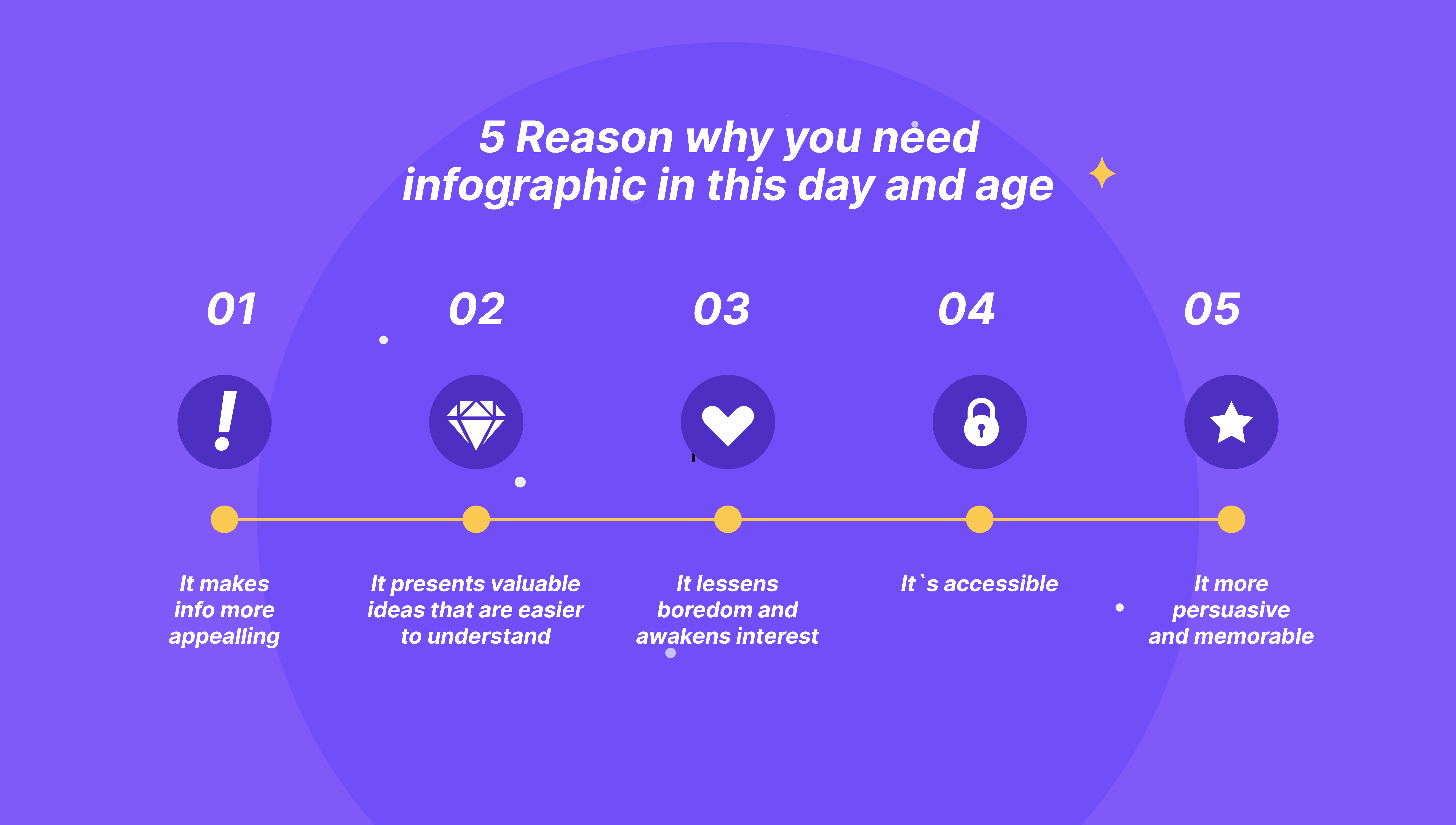
5 Reasons to use infographics 
They are appealing
Infographics share information in an engaging and interactive visual format. The motion and colors in an infographic make it an attractive and compelling vision that draws the eye.
They present ideas more clearly
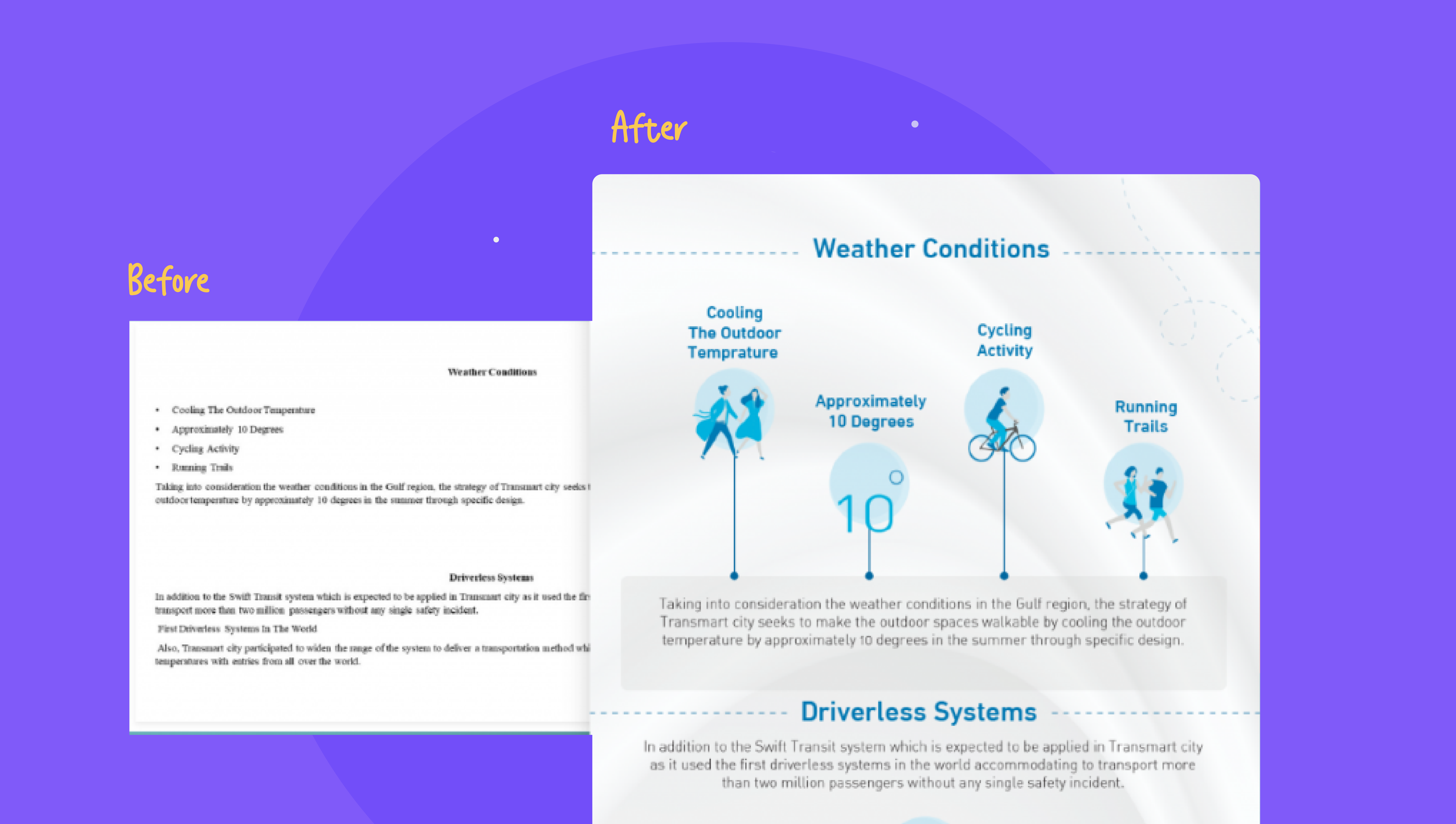
Many people are visual learners, so infographics are perfect for condensing complex ideas into simpler terms for all types of audiences to understand.
They create interest
When you present information through an eye-catching and fluid design, viewers are more likely to be interested in what a visual is trying to say.
They are accessible
They make big chunks of data less intimidating and overwhelming so that all kinds of people can learn from them.
They are persuasive and memorable
Data and information are made more interesting with creative and narrative visuals, which make them more memorable in people’s minds.
Who can use infographics?
Infographics simplify and explain complex concepts for audiences of different ages and backgrounds, which makes them ideal for individuals and businesses across all fields. Marketers and consultants use infographics to build brand awareness and connect with clients by explaining industry-related concepts. While government agencies, nonprofits, and educators use infographics for purposes related to educating students or the general public on certain initiatives or to create awareness.
How does infographic design grab attention?
Infographics are a compelling format; they are sleek and informative, and they work for a variety of audiences and niches. When done well, infographic design can communicate valuable information in a purely visual manner. Of course, when it is created thoughtfully, it commits to a tone, provides a concise summary, and ensures a clear statement that is tailored to its target audience.
In short, infographics can:
1 – Grab the attention effortlessly
2 – Deliver the idea easily
3 – Make the concept more interesting
“If you invest in high-quality infographics, the traffic and links they generate may help you achieve bigger and better results as compared to other forms of content.”
Besides their ability to quickly get people’s attention, infographics are also highly effective in getting people to learn and retain what they know. Studies have shown that a lot of people learn better visually and have a hard time understanding concepts without seeing images. Businesses can leverage the power of infographics to communicate complex marketing messages, show product benefits, and visually show stats and other data to really drive a message home. Almost all businesses, regardless of their industry or size, can find creative ways to make infographics work for them.
How to use infographic design effectively in business
Infographics help simplify complex concepts easily and quickly. An infographic is effective when you think through what the underlying message is and how it could be best conveyed via an infographic. The idea is to just not use infographics for their own sake.
Here are some keys when designing infographics:
Outline your goals
Decide on your infographic’s main objectives. Think of the narrative you want the infographic design to depict. Depending on the purpose or goal you want to achieve, you can narrow down and choose the information you want to include. Afterward, you begin developing an outline for your infographic design that features the headers, data, and any design elements you intend to use.
Collect data
Once you’ve decided on your infographic’s goals, you should begin collecting all the relevant information about the details of your topic. That includes information about your target audience, their interests, hobbies, ages, or other demographic information and reliable sources that authenticate your research. Once you have all your research, you can decide how to arrange and highlight the data in the infographic, as well as what information is worth disposing of.
Create visuals
Making infographics uses compelling graphics that attract and engage the target audience while simultaneously communicating your message. The information’s layout is an essential component of infographic design, so it’s important to be thoughtful of the style used in showcasing your information. Again, depending on the goals of your infographic, your layout will determine how the data is perceived. The layout will differ based on the infographic’s goals. It could explore a concept, compare information, share information, visualize trends, or depict data.
Develop a template
A template is super helpful for deciding how you want to arrange and present your data and the elements you want to incorporate. Focus on the structure of your outline: how does it flow? Are there enough elements included or is it too crowded? Once you have a template, you can then customize it and manipulate it to serve your goals.
Incorporate style and design
When making infographics, there are several design elements to include, such as icons, shapes, lines, and others. The common elements used in infographic design include text, color, white space, and alignment. Design elements are used to provide context, highlight certain points, bring consistency, or make the design more readable. Your template might give you an idea of where and how to use elements, but the elements you decide on, however, must remain consistent throughout.
Share your infographic
Decide on the platform that can help you best reach your target audience. Then share it on the channels where your audience is most likely to find them.
What are the important things to consider when designing infographics?
Be simple
The point is to condense a lot of data and design a visual solution to interpret it in smaller pieces of content. The concept of ‘less is more’ could not be more vital. The design itself should allow the user to navigate the information easily and without being confused or overwhelmed.
Be universal
“Infographics can take on a language of their own by delivering information in an accessible way.” Creating designs that adapt to a universal language allows your message to resonate more with everyone.
Be original
Today, people, businesses, and ideas have reached the high potential of digital maturity and are still on the rise. Wanting to be a big fish in a small pond is the goal, but many question their ability to achieve it.
So, from a business standpoint, each infographic design should be original, whether you choose to create a sales report or marketing strategy. But how can you do that if you’re in a big pond? The answer is through your brand.
Your brand is your voice. It’s original. Through the creative use of color, proportion, fonts, images, and text, the design will speak for itself as you maintain a cohesive aesthetic with the subject matter and brand image of your organization.
Types of Infographics: Importance & Effectiveness
There are several types of infographic design styles, depending on the nature of the displayed information and the intended platform. The most common infographic designs are:
Static Infographics
The typical static infographic includes images and text that don’t necessarily require user input, so they serve as fixed resources. An emphasis on illustration is another common characteristic. Static infographics are appropriate for professional settings since you can use them in many different ways and across many platforms. They can be used in blogs, articles, advertising, brochures, etc.
Prezlab: Static Infographic Work Sample
Animated Infographics
With the popularity of video content online, animated infographics are effective for gaining views on social media and presenting complex data in a refreshing and entertaining way. But what was once a mostly static form of content has evolved dramatically to include animation and animated elements that help make ideas more easily interpretable and engaging. Using moving illustrations or motion graphics is ideal for articles and tutorials online to give a more visual aid. Whether they’re GIFs or videos, animated infographics are intense visual pieces of content that are easy to consume and easily linked to.
Prezlab: Animated Infographic Work Sample
Interactive Infographics
Interactive infographics invite the viewer to participate and learn about the data. The data-rich visuals allow for more innovative data visualization, greater dynamism, and greater user engagement with the presented information. This infographic design style lets the viewer explore the information at their own pace by allowing them to scroll, click, unfold, pan, and zoom over the infographic. In turn, these movements trigger the function within the design to display additional content. It is ideal for handling large data sets.
Prezlab: Interactive Infographic Work Sample
Statistical Infographics
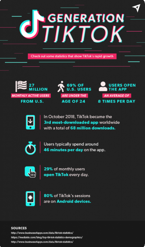
Since statistics are based on studies, evidence, and experiments. They are great for reinforcing an argument. In a statistical infographic design, the charts and numbers are the main stars, with much less focus on text and narrative.
Informational Infographics
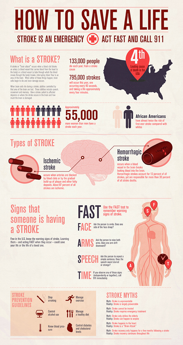
The topic is deeply explored in an informational infographic, using images and heavy text. These infographics thoroughly simplify the main ideas by making specific or niche subjects understandable.
Timeline Infographics
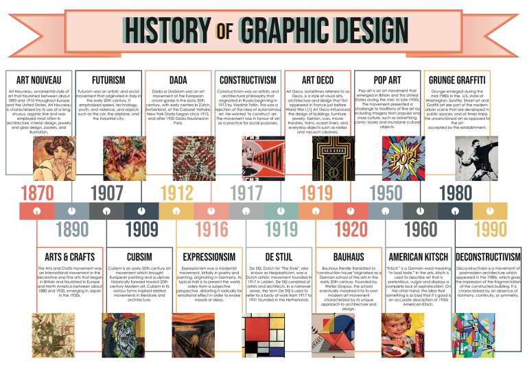
Timeline infographics use a linear structure to portray information chronologically. Often this structure is used to present topics related to historical events, project milestones or timelines, the evolution of a product or business, plans, or biographical information regarding an influential person.
Process Infographics
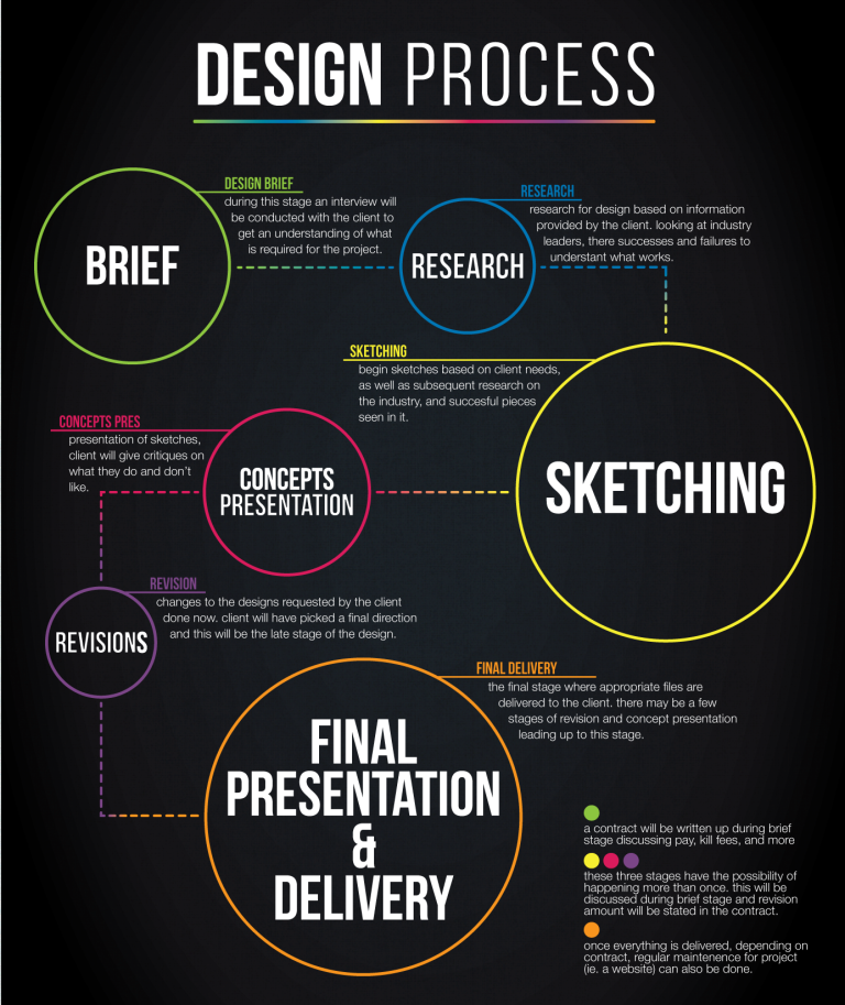
In a process infographic design, instructions or strategies are outlined in steps. A process infographic applies a balance of images and text to make it accessible to all types of learners. Usually used to convey information related to topics like product guides or digital marketing strategies.
Geographic Infographics
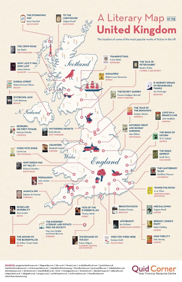
A geographical infographic handles regional data such as weather patterns, global trade patterns, population growth, or mapping the physical locations of a target market audience.
Hierarchical Infographics
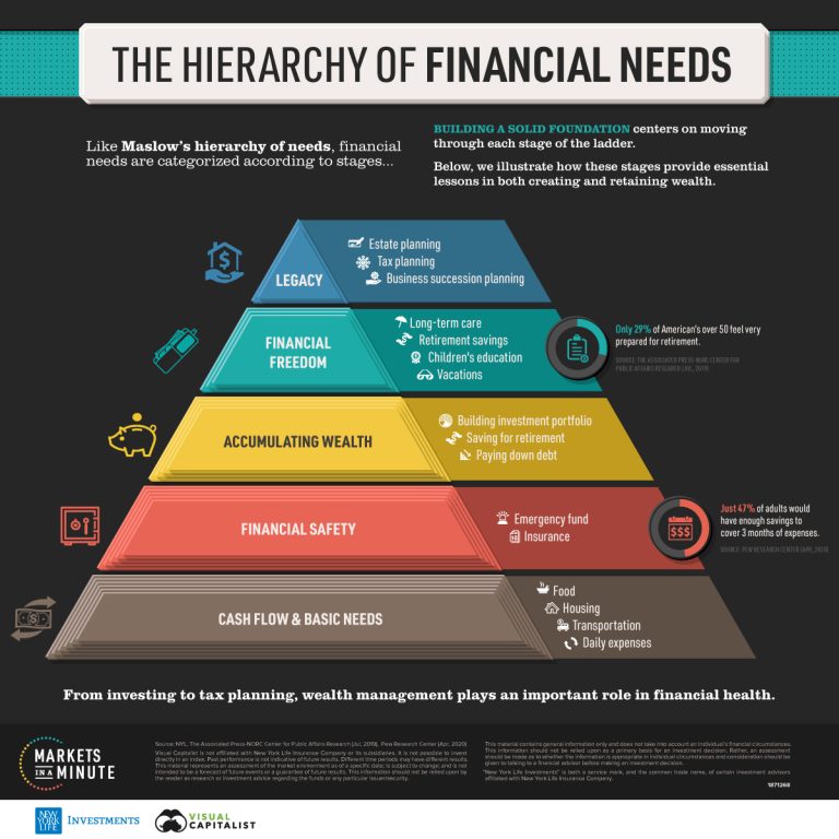
Hierarchal infographic designs separate information based on categories or levels, creating a hierarchy. Typically, this type of infographic uses flow charts or pyramids to portray the information and uses elements such as lines and arrows to highlight connections. Hierarchical infographics are often used in showing family trees and management hierarchies.
List Infographics
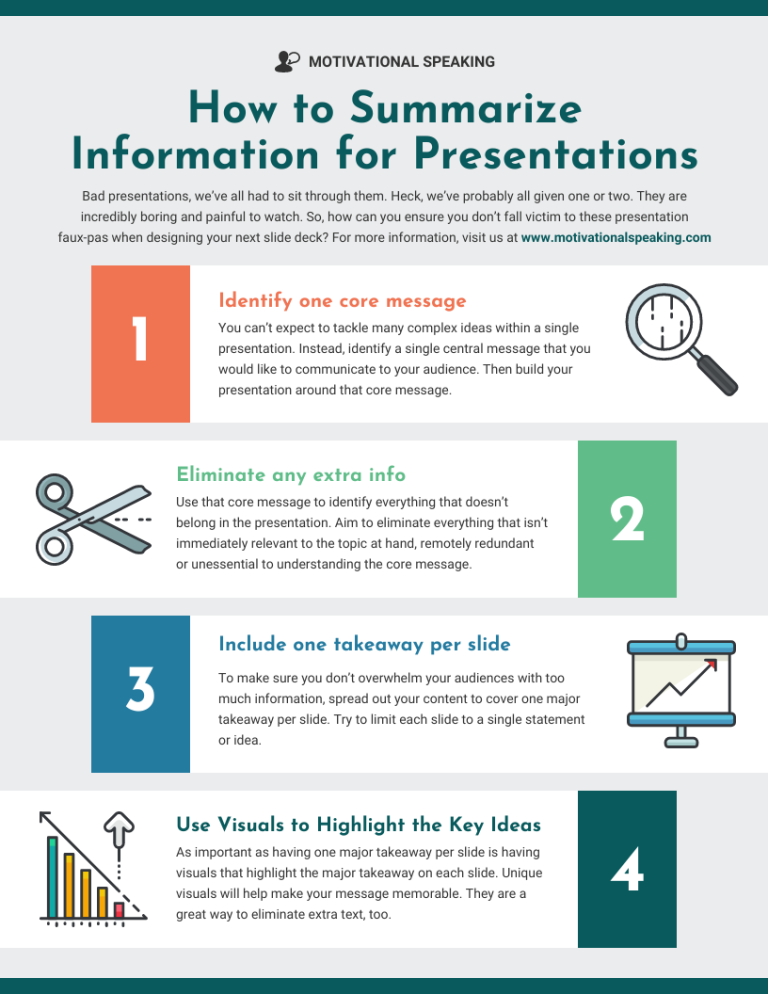
List infographics summarize information and highlight the important takeaways through clever design. They are used to help remember information and use elements such as icons to list bullet points and summarize textual information.
Conclusion:
When developing an infographic, you are making the bundles of data more accessible to an audience. We highly recommend that you make use of infographics to uplift your content marketing efforts and boost your business ROI. You’re able to create customized designs that tailor to your business objectives and you’ll notice their effectiveness and importance instantly.
If you are looking for a custom infographic design that drives the message home for your business then hit us up at PrezLab. We have done some great infographics for our clients and are more than happy to put our creative prowess to work for you as well which covers the subject of presentation design.
If you liked this blog, you might also like these:
5 Presentation Lessons You Can Learn from Steve Jobs
Presentation Designs: How To Give Power To Your Point
Sources:
- Infographic (1): https://www.pinterest.com/pin/3025924741010342/?mt=login
- Infographic (2): https://www.behance.net/gallery/5722533/Infographic-for-American-Stroke-Prevention-2012
- Infographic (3): https://www.behance.net/gallery/71209893/History-of-Graphic-Design-Timeline-Infographic
- Infographic (4): https://www.behance.net/gallery/51723765/Design-Process-Infographic
- Infographic (5): https://www.visualistan.com/2018/12/a-literary-map-of-united-kingdom.html
- Infographic (6): https://advisor.visualcapitalist.com/hierarchy-of-financial-needs/
- Infographic (7): https://venngage.com/templates/infographics/how-to-summarize-information-for-presentations-infographic-6a1d022b-abd0-48d8-b64c-66ec74c92aa3


