28 August 2024
Translating information into engaging data visualizations is indispensable in today’s data-dense world. From PowerPoint presentations to boardroom meetings, data visualization is the secret to enhancing your audience’s engagement and understanding. But wanting to visualize your data is easier said than done, so we will look into techniques that help communicate your data in PowerPoint much more effectively to leave a lasting impression.
Why data visualizations matter
Data visualization is a powerful tool for simplifying dense and complex information to make it more accessible to an audience. By incorporating visual aids into PowerPoint, a presenter can enhance audience engagement and comprehension since visual elements help facilitate understanding. However, its effectiveness heavily depends on selecting the right data visualization type. Choosing the appropriate visualization that aligns with the message is important for ensuring a presentation with impact. We have a whole blog about choosing which chart to use with your data that can help determine what you need.
Creating a chart in PowerPoint
There are two main ways to add data visualizations to your presentation, either by inserting a chart or by importing one:
Inserting a chart:
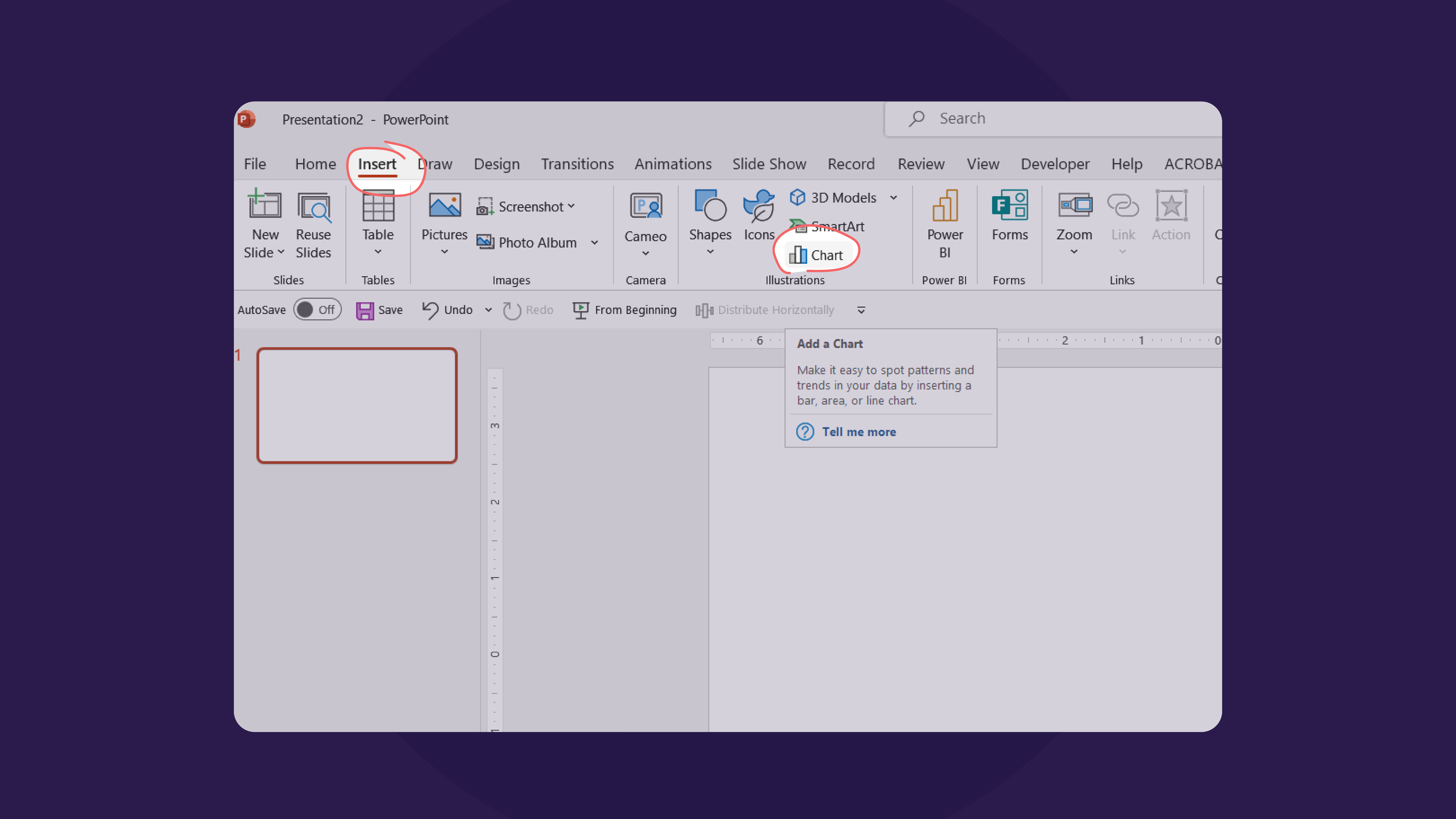
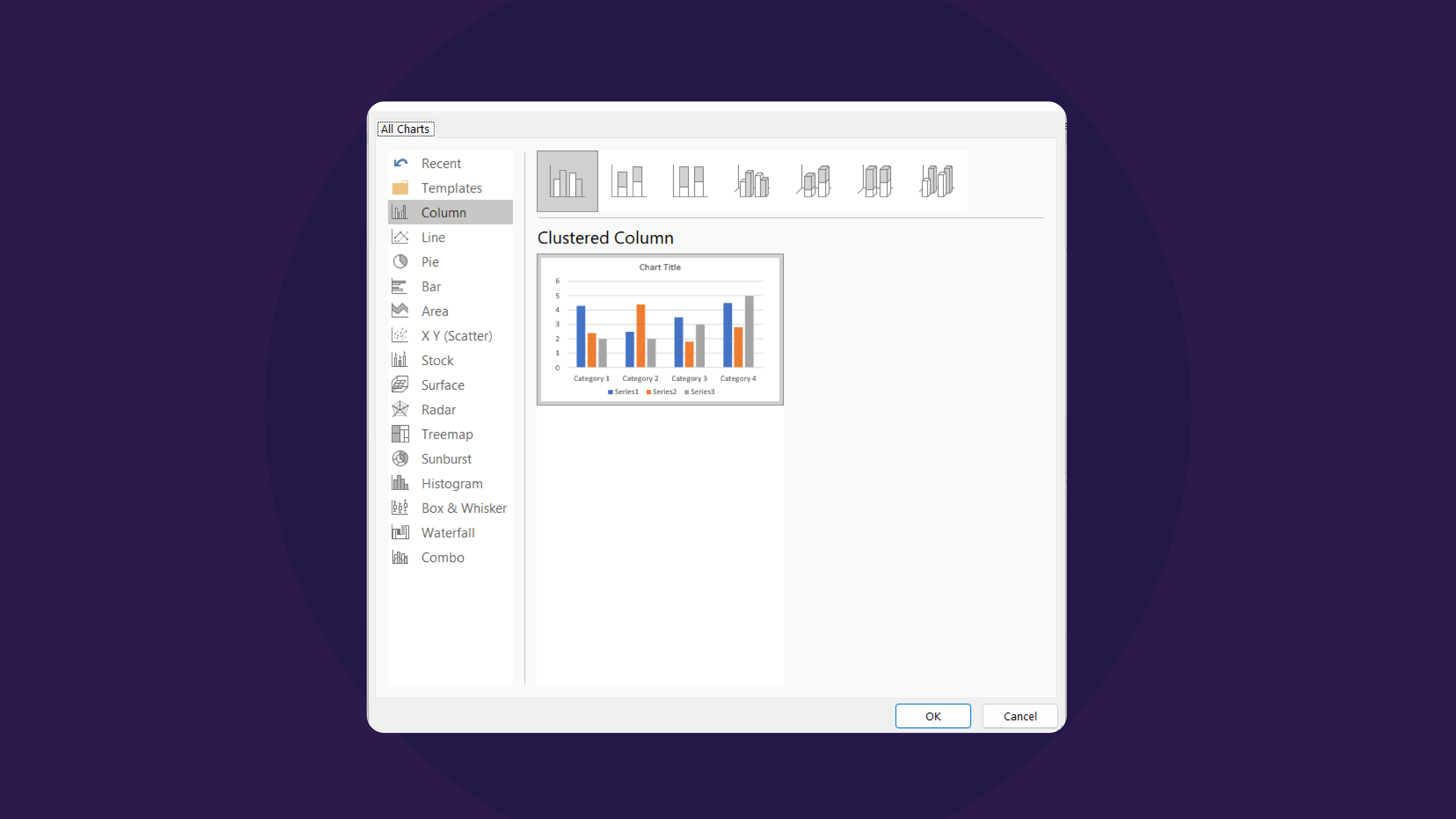
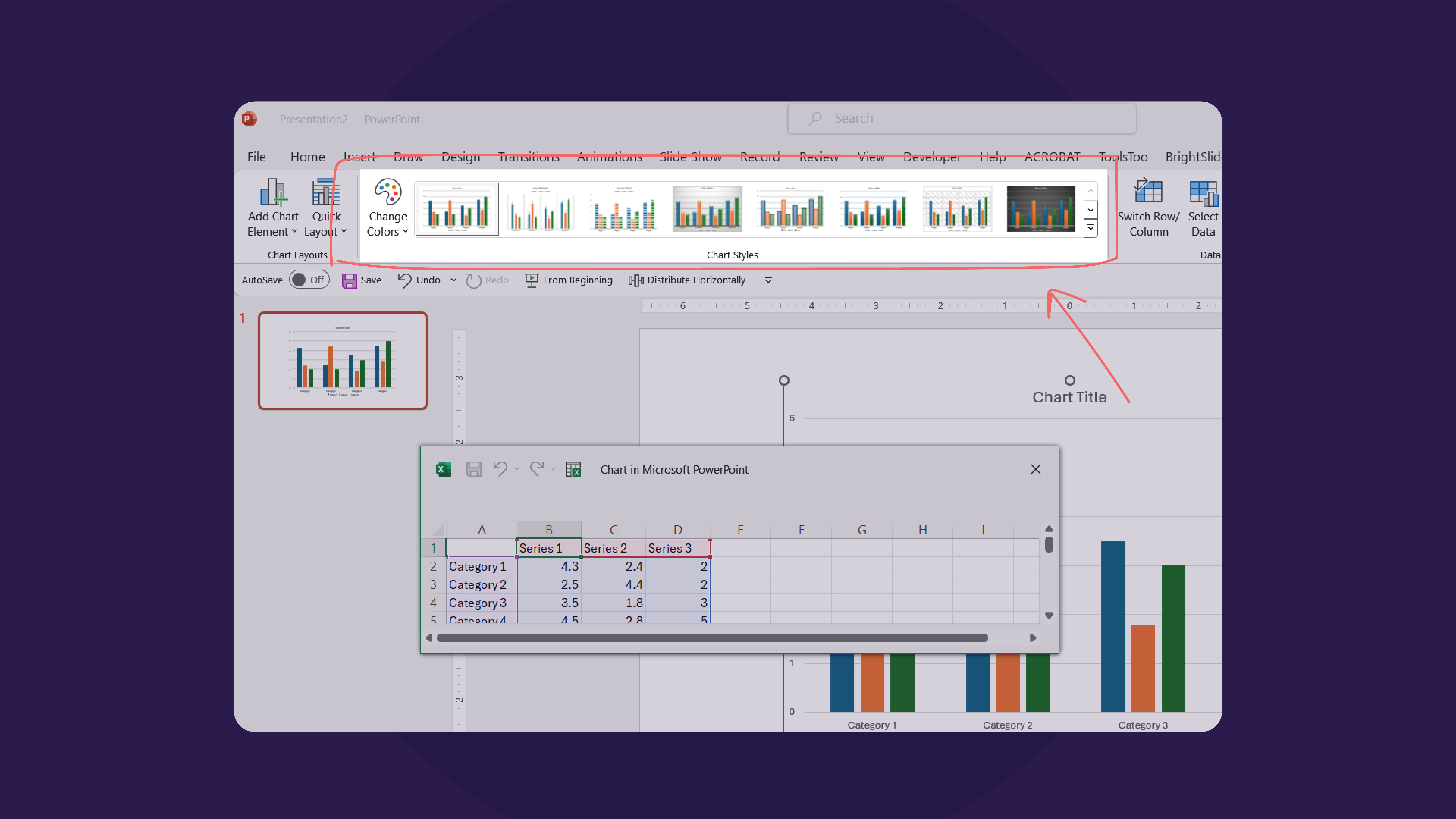
Once you’ve decided what type of chart you want to use in your presentation, you can go to the Insert tab and click on Chart. From there, select the chart you want to use. Once you do, a small Excel sheet will pop up that you can fill in with your data.
To further customize, you can go to Chart Tools at the top, where you can edit features like colors, outline, and design.
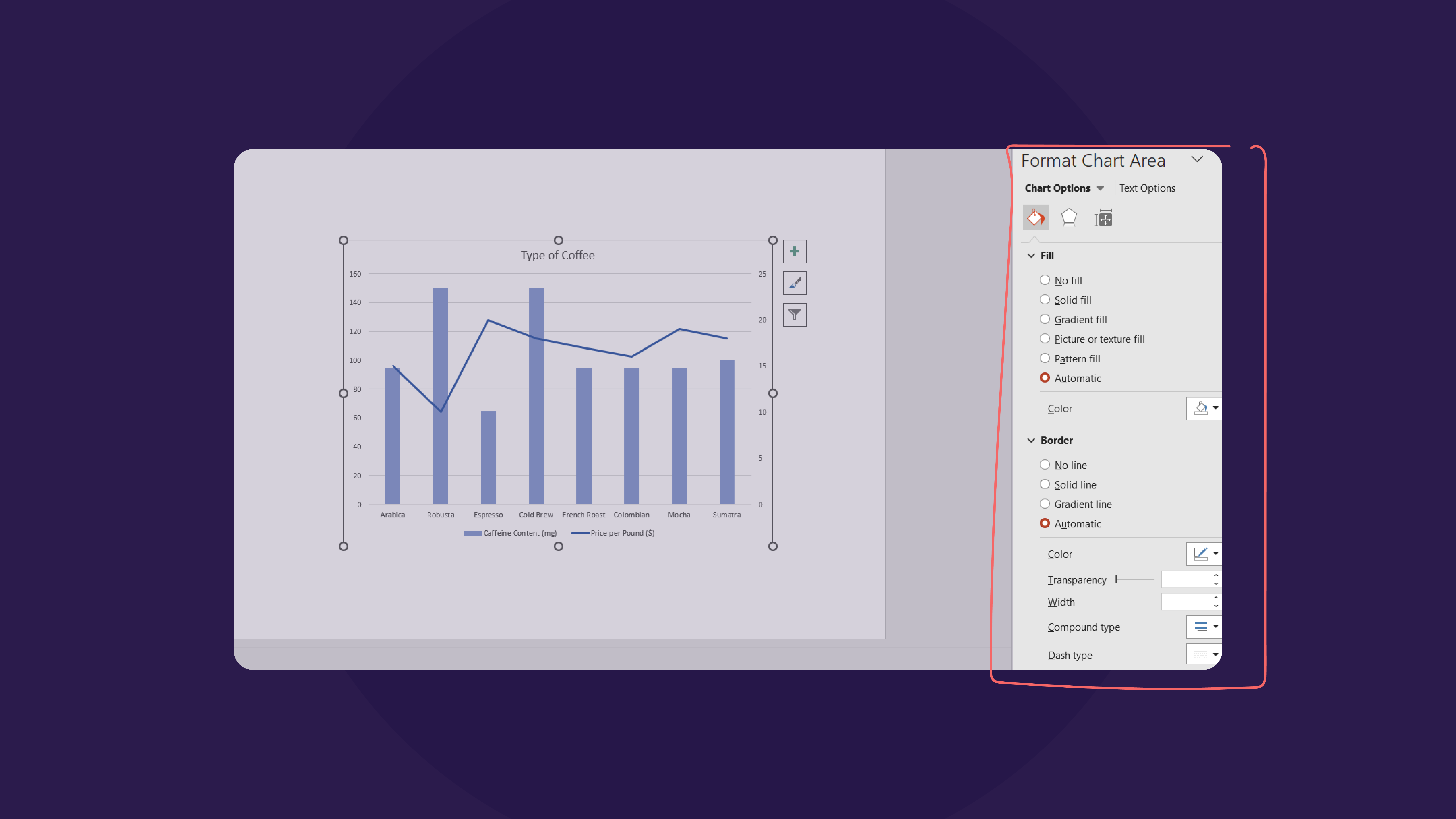
If you double-click the chart itself, a side will appear on the right where you can format the axis, data points, titles, chart legend, and labels and change the shadow, edges, glow, and gap between the data.
Importing data from Excel to PowerPoint
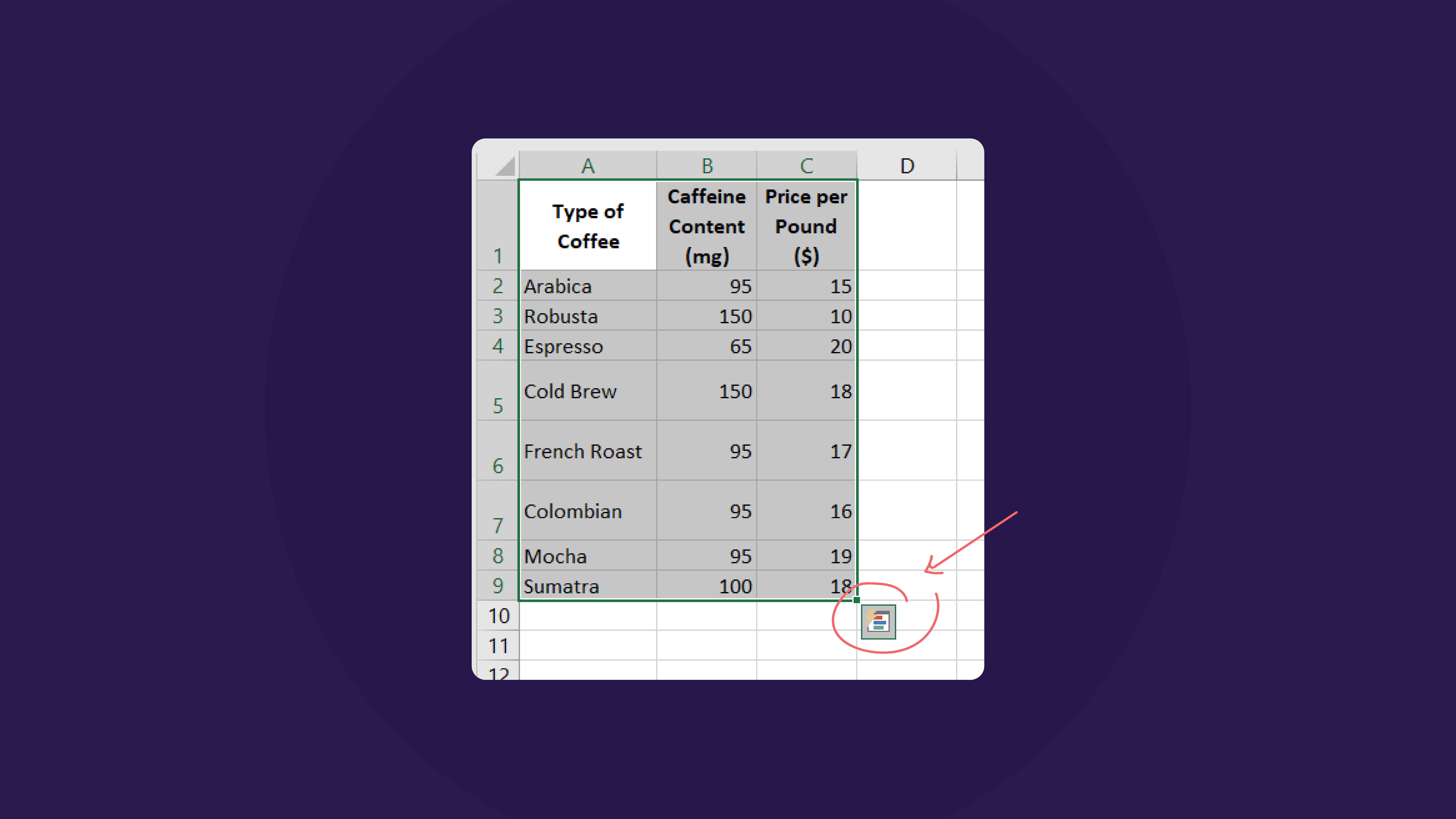
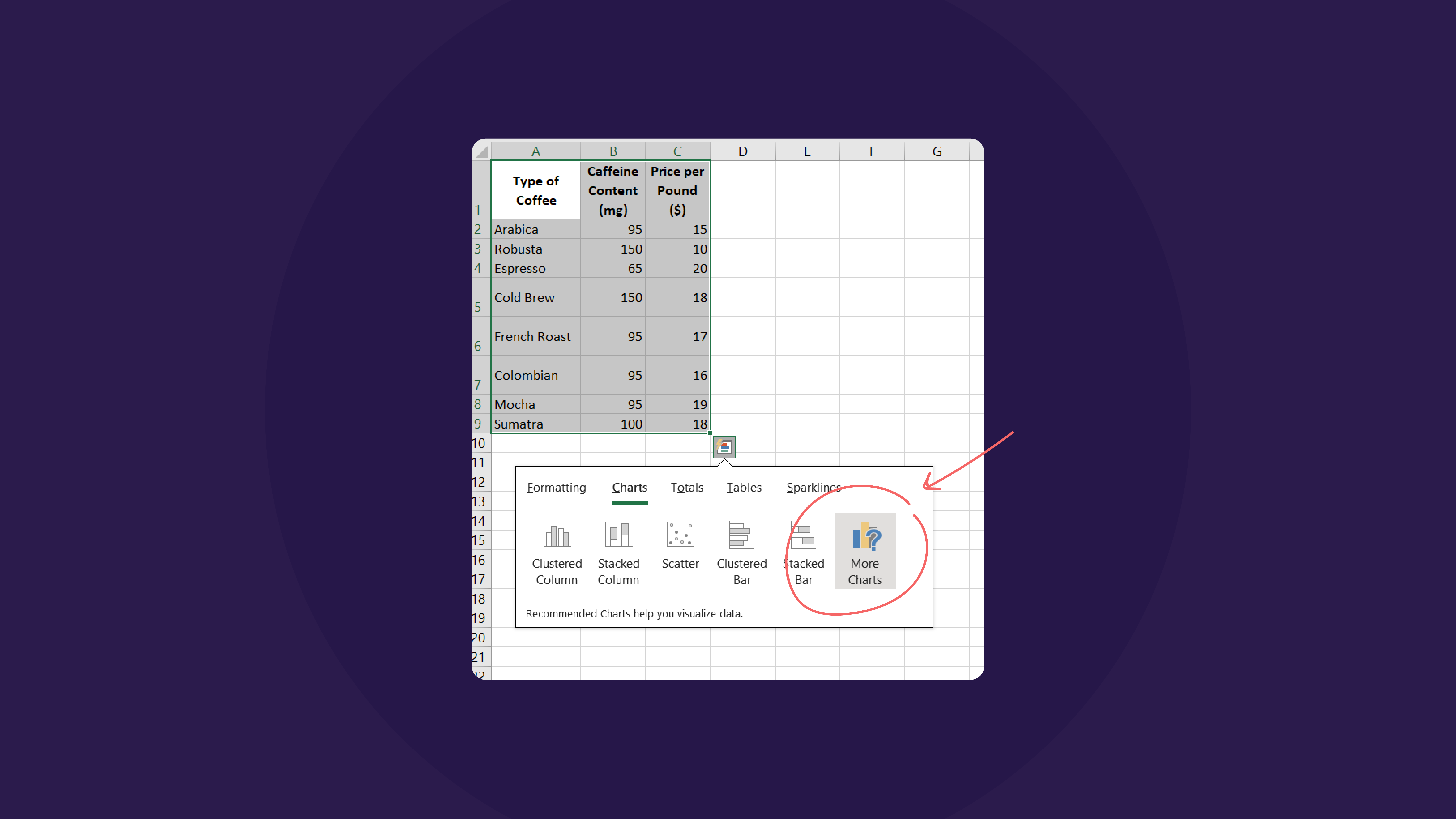
If you already have data available on an Excel sheet, you can still import it to your PowerPoint. Start by selecting the data in Excel, right-click, and going to Quick Analysis; this also appears in a small icon on the bottom right when the data is highlighted.
Select the chart that best fits your data; see More Charts for more options.
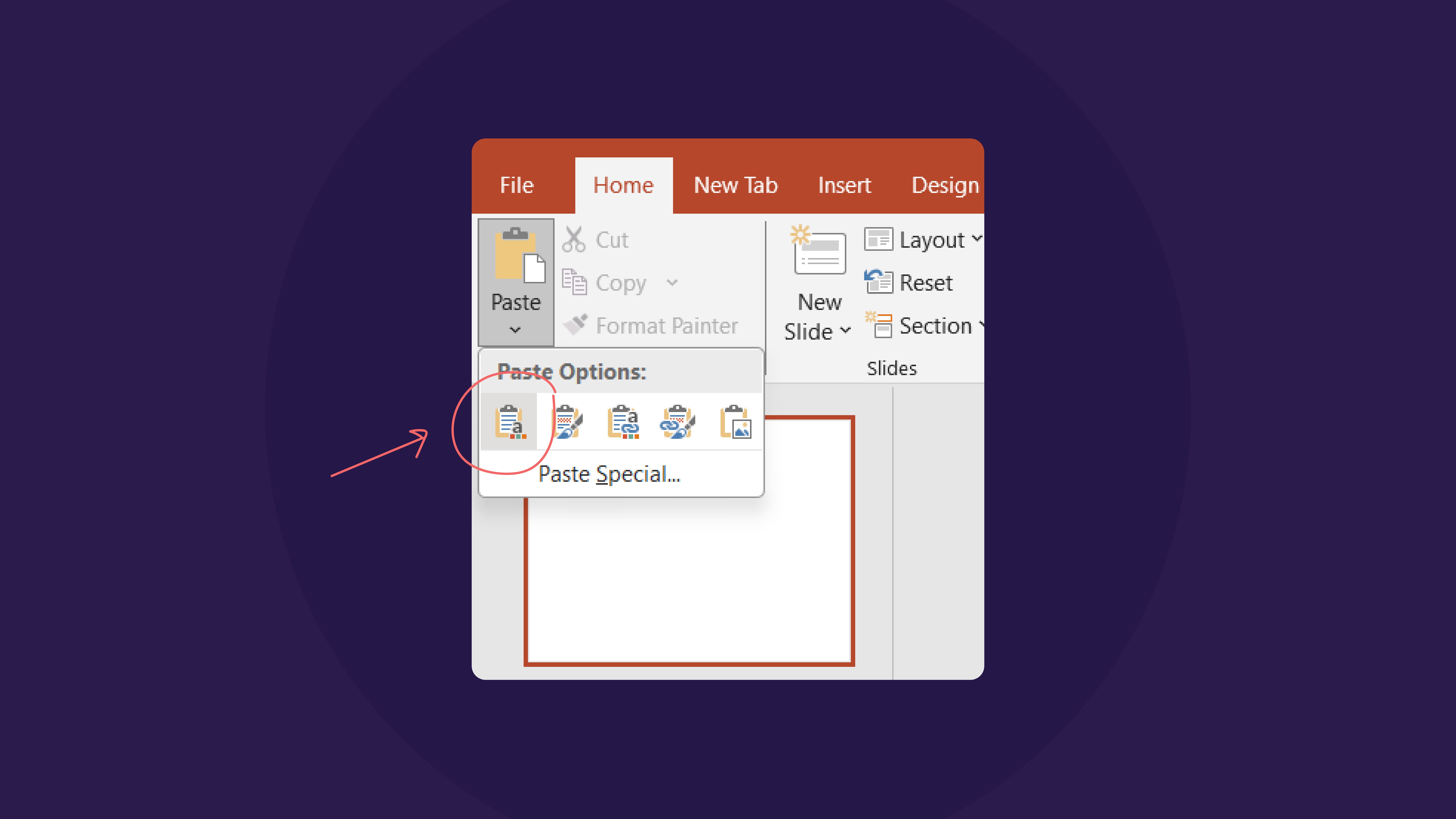
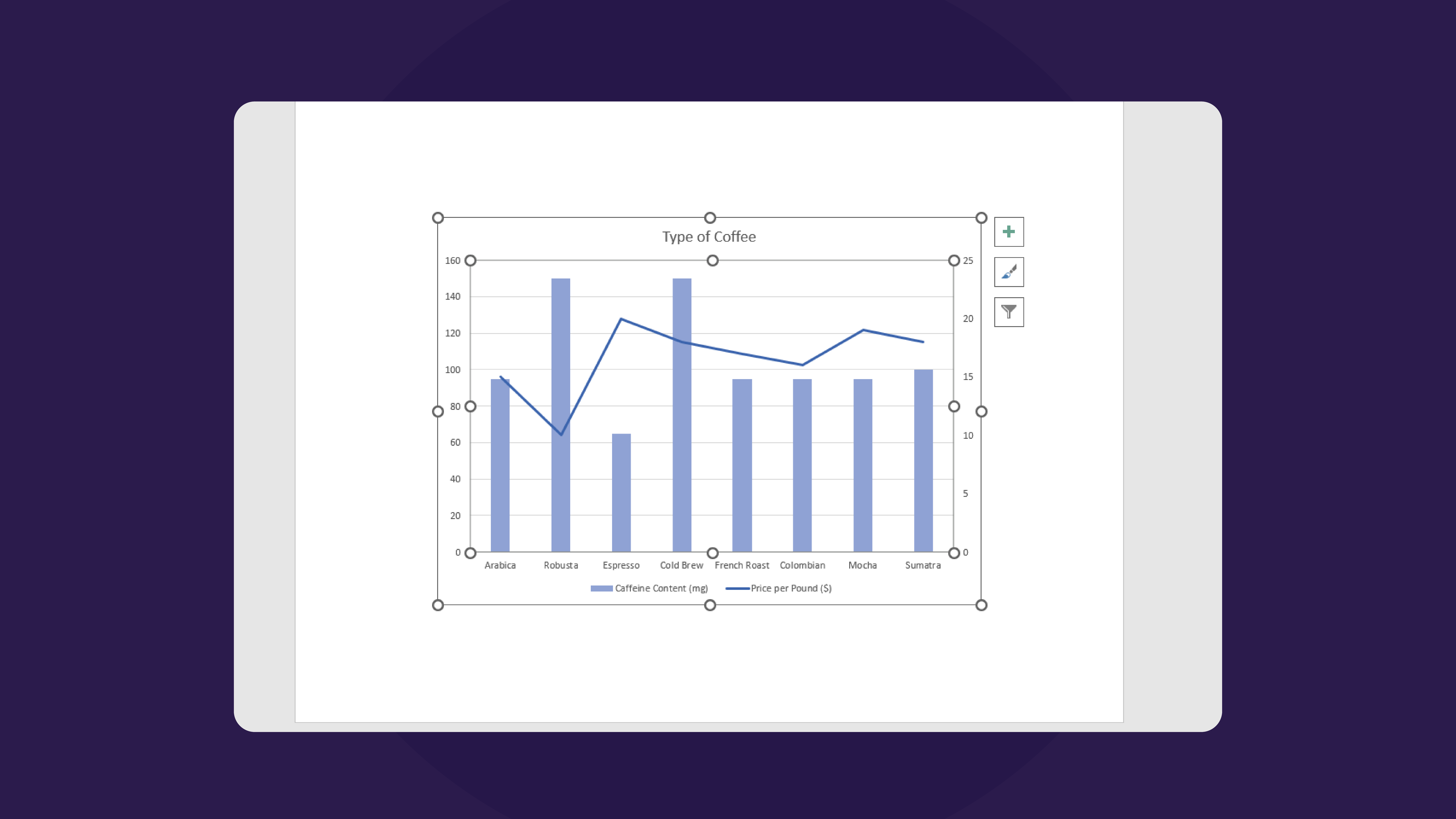
Once your chart appears, copy it, go to your PowerPoint slide, go to Paste options in the Home tab, and click on Use Destination Theme & Link Data.
This way, the data visualization is linked with the original file, so any changes made to the data appear directly in the PowerPoint as well.
Best practices for creating data visualizations in PowerPoint
Creating data visualizations goes beyond just slapping some numbers on a page; you must intentionally consider the visuals that communicate them to ensure comprehension. For the information to truly be beneficial, you need to be considerate of factors related to the layout and techniques:
1. Simplify and focus
The primary purpose of data visualization is to simplify data, so the main emphasis when creating it is to maintain simplicity and focus. There’s no need to overload a chart with too much data, as it is distracting, confusing, and ineffective. Focus on the main idea that the data is meant to convey and prioritize the data points that add to it to present it in a digestible format.
2. Use color strategically
For visually captivating data visualizations, the strategic use of color can make all the difference. Selecting colors that complement each other ensures readability and accessibility to viewers. It is best to limit the number of fonts in the chart to a maximum of three fonts to maintain consistency and prevent visual clutter. When considering a color palette, think about color accessibility and color schemes as you decide to use them to convey key messages and elevate their impact.
3. Incorporate visual elements
Visual elements are a core element of effective storytelling, and integrating icons, images, and shapes into a presentation can boost its effect and draw in your audience. Visual elements are powerful tools for enhancing the data’s narrative. For example, using icons to leverage specific dates. This can also look like visual cues guiding the viewer through vital information to ensure the data resonates with the audience.
4. Ensure readability and clarity
Readability is a key component of a powerful visualization, and to optimize readability, it is crucial to pay attention to details like text size, font choice, and color contrast. Selecting appropriate text sizes and font choices ensures the text is legible, even from a distance. Plus, the color contrast guides attention and distinguishes between different data points and elements. In addition to readability, maintaining clarity is essential for presenting complex information. Clear labels, straightforward titles, and intuitive layouts are all ways to help prevent confusion and present information with clarity.
Data visualization is an invaluable tool for simplifying complex information in any presentation, which is why integrating these visual aids needs to be done well. Whether by inserting or importing a chart, the process can be streamlined by implementing best practices to really bring your information to life. Adhering to these principles, presenters can create fascinating data visualizations that can captivate audiences and communicate information with precision and clarity.


