20 November 2024
As web design continues to evolve, new exciting developments have made their way into the digital landscape. Creating an intuitive and seamless experience for website visitors is now an essential part of website design and has a profound impact on how users perceive your business or establishment. In this blog, we explore the new trends expected to take center stage this year. But one thing will continue to be true: web design is all about impressions!
UX-Focused Design
One of the most important and transformative aspects of web design is integrating UX-focused design. You might notice the emphasis on user experience on many websites, and there’s a good reason for that: crafting an immersive, user-friendly web experience leaves a lasting impression on site visitors. Plus, it can more easily lead users to create traffic and conversions. From the navigation bar, hero image, buttons, or text, structuring them clearly and concisely to serve the user engages them.
Vibrant Gradients
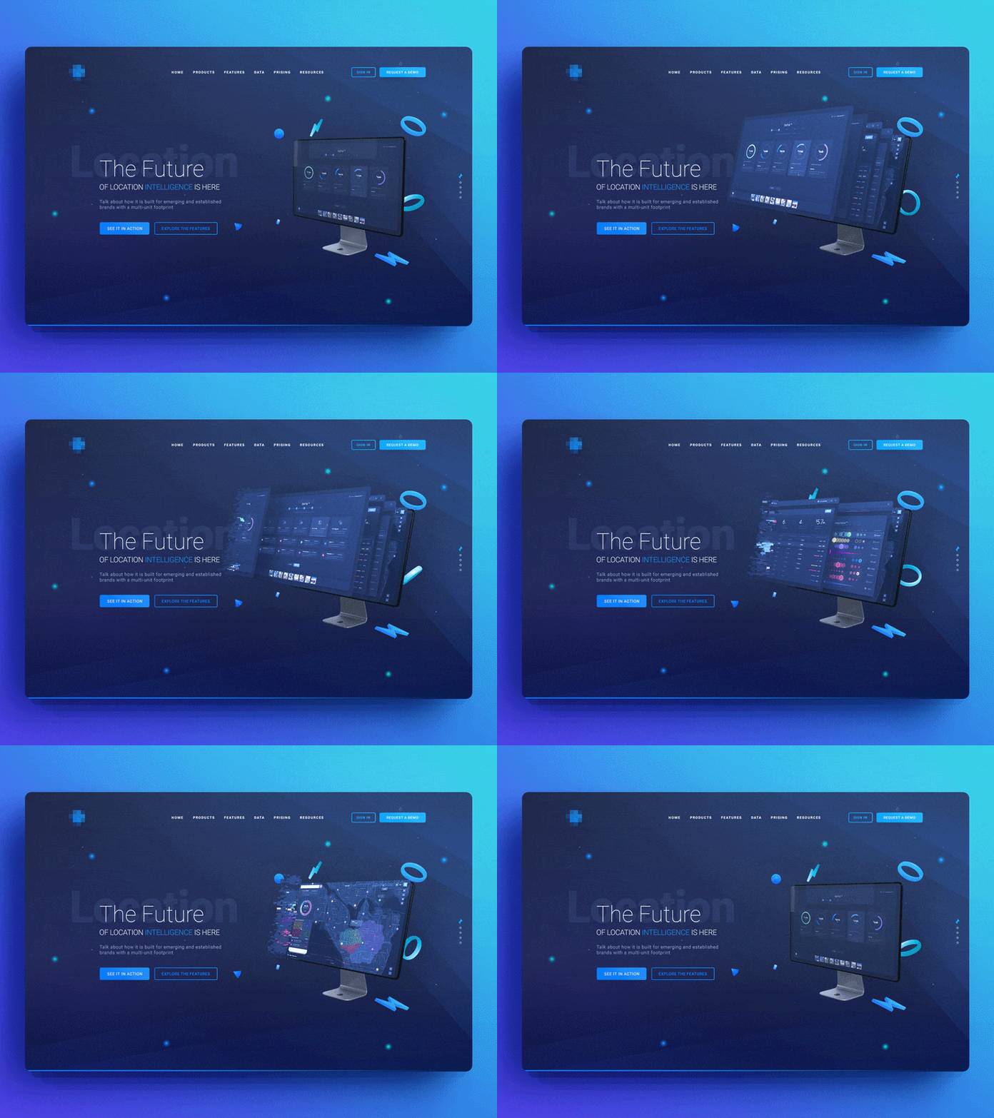
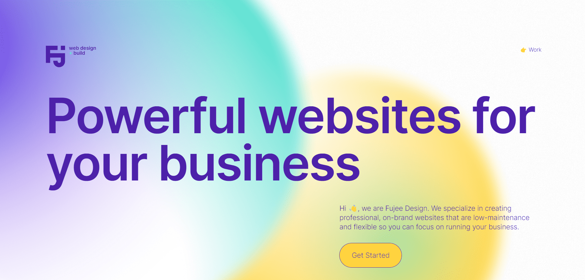
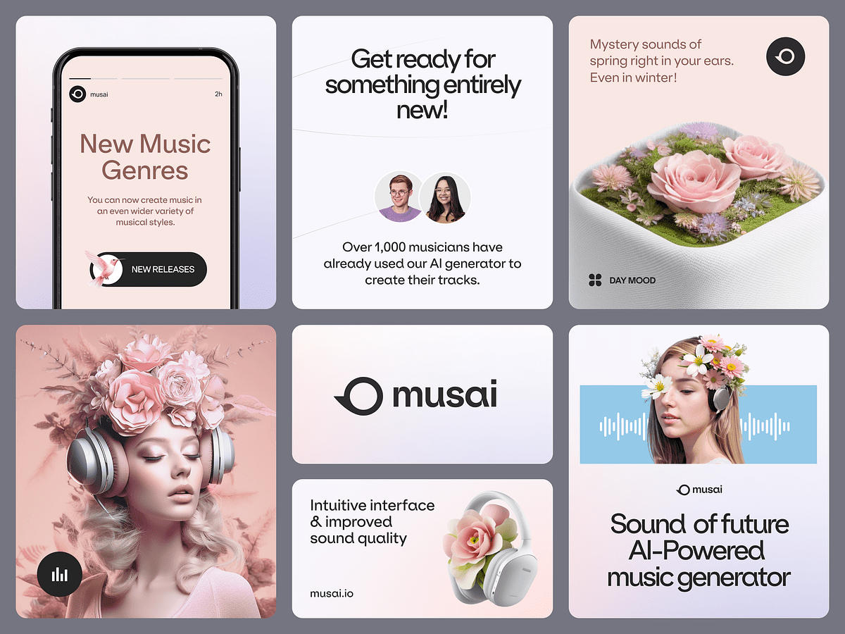
Gradients are making a comeback in the design world, and web design is no exception. Making their way into backgrounds, typography, and even logos, enhancing the visual appeal of these elements. In web design, they are versatile and can be used across different elements, making them stand out when infused with gradient accents. They can also be used to highlight essential messages, which can help drive engagement.
Clear or Visible Borders
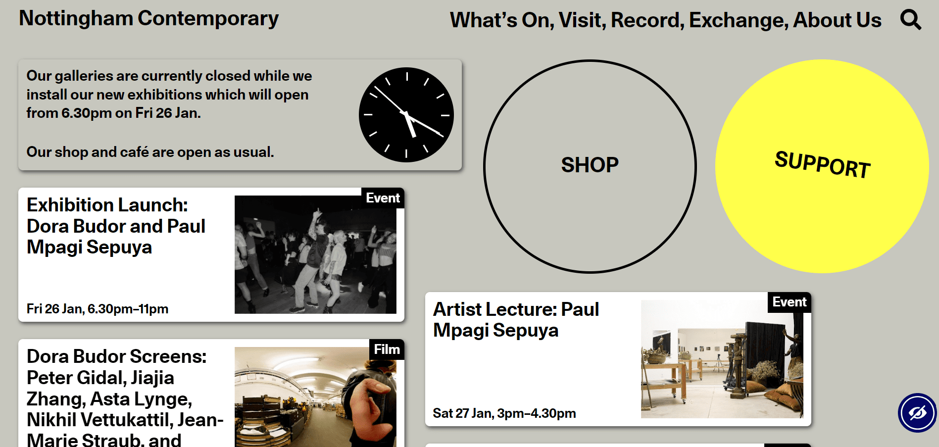
One standout development is the use of clear and visible borders. This trend adds structural clarity to a web page by implementing well-defined borders around different sections or images. Borders are an easy and elegant way to simplify navigation and also draw attention to certain parts of a webpage. This is especially true for websites regarding e-commerce, portfolios, or business pages, as they can elevate the web design with a symmetrical and balanced touch.
Micro-Animations
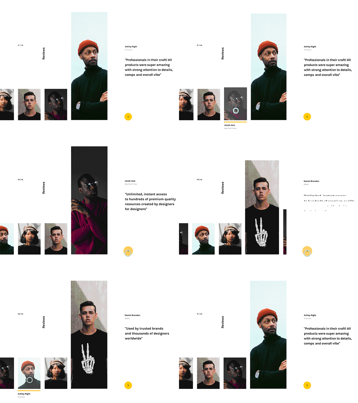
Micro-animations, unlike micro-interactions, do not require the user to interact with the webpage to prompt them. They are small, impactful animations that ensure a seamless interaction by guiding the user through a website. They create a charming element in an online space and implement it organically by considering the natural motion and flow.
Nostalgic Web Design
Nostalgia is always a powerful emotion to revisit, and it brings a sense of familiarity to the viewer whenever it is used. Embracing the aesthetics of a bygone era adds a sentimental and familiar touch to a website, so implementing elements from the 1990s or early 2000s Internet can add an exciting edge. It is delightfully unpredictable, but always welcome.
Large Typographic Hero Images
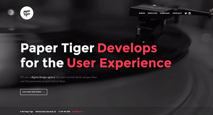
In website design, the “hero image” is the central image or banner that is in the page’s header, and it’s an essential staple of any homepage. It is an opportunity to grab the viewer’s attention with a single visual. Using typography in the hero image is a break from the typical standard, and it’s an opportunity to share your website’s message and personality directly. A hero image with bold, extra-large typography is a sure way to make an impression on every website visitor and is a testament to the impact of typography on the current digital realm.
Use of Artificial Intelligence
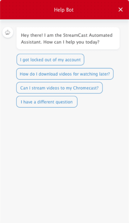
Integrating artificial intelligence (AI) into web design has been a game-changer for any website. Of course, the development of AI is constantly changing, but its impact on the digital space is undeniable. One example of incorporating AI into website design is through additional features such as chatbots, where visitors interact with the website to facilitate simpler navigation. AI can also appear on e-commerce websites by guiding users to similar products and other aspects they may be looking for.
Micro-Interactions
Micro-interactions add vitality and dynamism to a user’s experience. They are these tiny animations that respond to the user’s interaction with the website. For example, micro-interactions can look like buttons changing color when a cursor hovers over them or a scissors icon doing a snipping motion when clicked. Using these small animations makes the visitor’s experience more enjoyable and interactive, and are bound to make waves in the next era of web design.

The digital landscape is constantly evolving, and in recent years, there has been a clear shift toward a more user-centric design that makes a user’s visit simpler. Bold, eye-catching gradients and typographic hero images also play a role in grabbing the user’s attention and leaving them with a strong impression. In this ever-changing digital landscape, where captivating user experiences are essential, we, as a presentation design agency, understand the importance of blending aesthetics and functionality to leave a lasting impression.
References:
- (1) https://www.behance.net/gallery/67817393/20-Excellent-UIUX-Design-Animation-Examples
- (2) https://fujeedesign.com/
- (3) https://dribbble.com/shots/22599375-MusAI-Branding-for-the-Music-Generator-App
- (4) https://dribbble.com/shots/4815842-User-Reviews-Micro-Interactions
- (5) https://www.nottinghamcontemporary.org/
- (6) https://rafaltomal.com/5-ideas-to-design-amazing-hero-banner-typography/
- (7) https://blog.happyfox.com/10-chatbot-designs-for-inspiration/
- (8) https://www.toptal.com/designers/product-design/microinteractions-better-ux


