26 June 2024
Who said that presentations can’t be on trend? Believe it or not, the world of presentation design is not immune to the styles and fads of the design world. You can prove that your brand is fresh and contemporary through the presentation design of your slides. But tastes change, and as we approach the new year, the trend cycle will change and bring new ideas to the forefront of graphic design.
However, there are presentation trends that will always be timeless. These elements will always make a presentation appeal to the audience, no matter what. They grab the audience’s attention right away and hold onto it throughout. So regardless of the trend cycle, these points consistently boost any presentation and are important to keep in mind.
Timeless presentation features:
Engaging and interactive content
The core of any presentation is the material and how it is shared. It is not enough to list facts; there needs to be room to breathe. By including icebreakers, games, polls, and activities, the listener can directly interact with the information and ideas shared. It bridges the gap between them and gives the audience a chance to connect with the content.
Use of data and visualizations
When data is visualized in charts, graphs, or infographics, is easier to understand. It is helpful for your audience to have a visual medium that they can follow that simplifies your data for them to understand. With the sheer volume of information available, data visualization helps guide the audience through your ideas and data in a way that doesn’t overwhelm them.
Storytelling
Stories have a universal appeal. People relate to them and they can never fail you. Spinning together a story draws the audience into your world, evokes empathy, and establishes a level of trust. Learning how to tell a story is more effective than learning how to persuade. A story can simplify a complex idea while moving your audience to action.
Creative and unique designs
A good presentation design relies on its creative use of design elements, colors, and images. Creative slide design maintains its impact the same way it maintains the audience’s attention. Using engaging design trends can also help explain your ideas more effectively and support your presentation’s flow.
7 Presentation Trends in 2023
The presentation trend cycle is similar to the regular design trend cycle, which makes it easier for our presentation experts to predict what presentation design trends will take over in 2023. There is an emphasis on connecting with your audience in a new way inspired by the Internet age and social media.
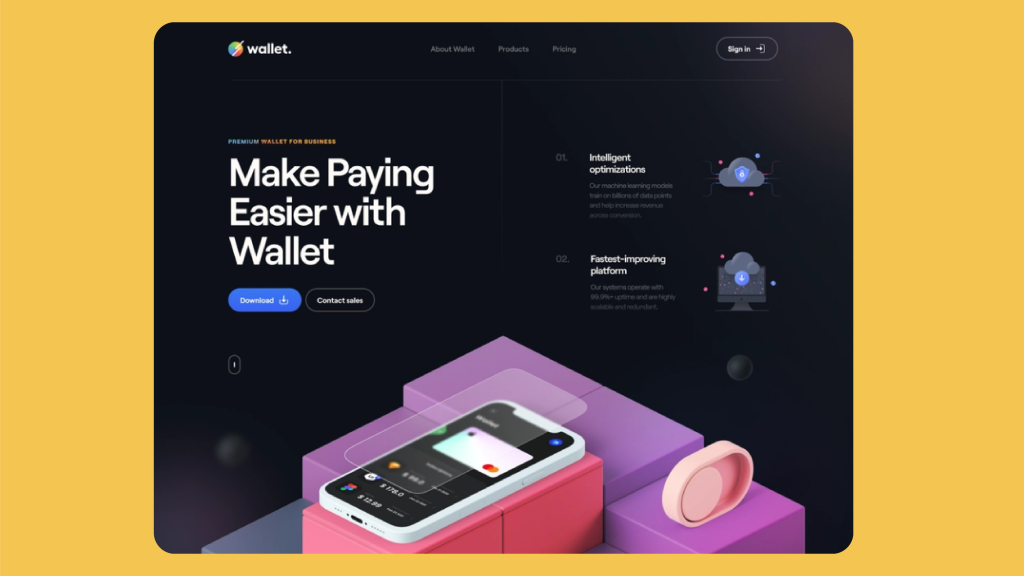
01 Dark mode
In interface design, the increasing preference for dark mode for mobile users has translated to incorporating the dark style into web design. For a long and extensive presentation, it is wise to go for a sleek and dim aesthetic that is easier on the eyes and can maintain focus for longer.

02 3D graphics
The rise of VR technology, the metaverse, and the love of all things Y2K have revived a strong interest in 3D graphics. Creating a visual experience that draws the viewer into the image has a powerful appeal across several mediums that could continue to rise. 3D backgrounds go beyond the clever use of shadows and now use texture and motion for a touch of attention-grabbing realism.
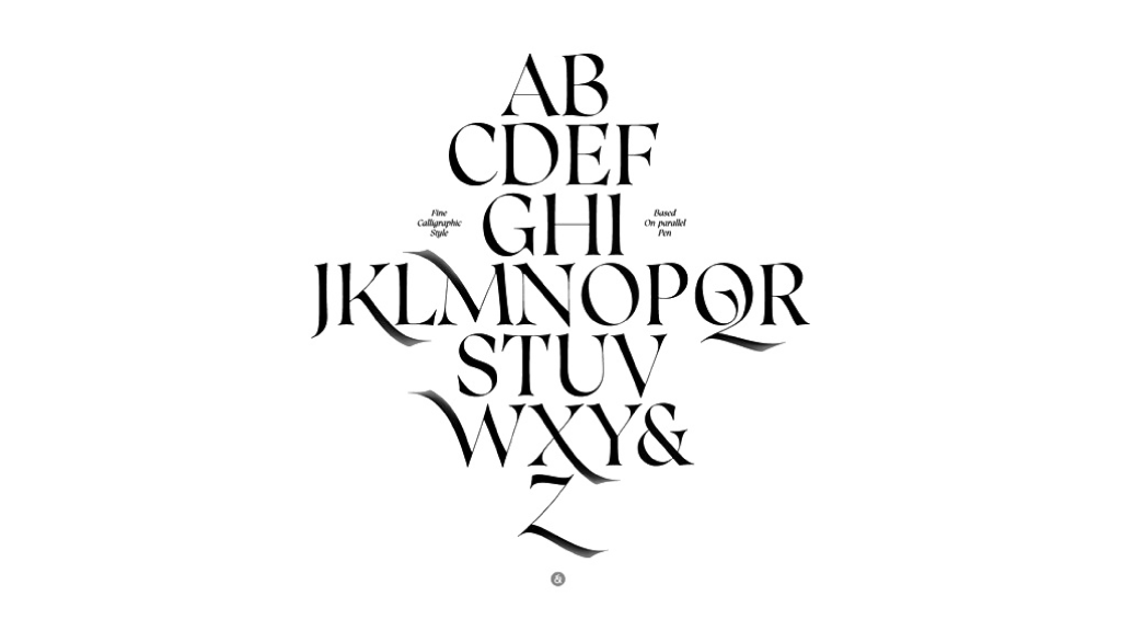
03 Experimental typography
Fun and experimental typography are having a moment this year, becoming more popular for film and TV posters. Playing around with different typefaces is a fun approach for your slides to illustrate your brand identity and mission. Serif fonts, in particular, are making a comeback as they are legible, bold, and graceful, achieving both a practical and aesthetic function.
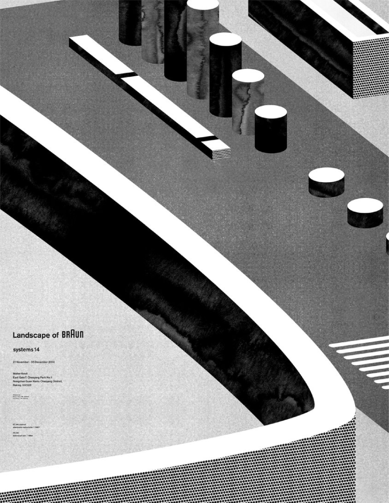
04 Monochrome
Monochrome color palettes are made by selecting a single color and its various hues. Following the idea of a more comfortable aesthetic, the monochrome trend is simple, practical, and elegant. On another note, a simple color scheme helps brand recognition when creating a presentation design built around the brand’s primary color.
05 Inclusive visuals
Beyond the world of graphic design, there has been a surge in efforts to include individuals of different cultures, backgrounds, ages, disabilities, locations, and classes. In presentation design, this translates into an effort to showcase a variety of people in the illustrations and visuals used to celebrate diversity.
06 Branded memes
Memes are an essential part of the fabric of social media; they’re perfect for adding a touch of humor to your presentation. Adapting memes to fit your brand makes your slides more relatable, and adding humor to your presentation helps build a connection with your audience. The art of a tastefully utilized meme can be tricky, but all in all, the main rule is to avoid a controversial meme and stick to a lighthearted approach.
07 Bold and vibrant colors
In previous years, we’ve seen a rise in minimalist and muted styles. But now, designers and viewers alike yearn for a return to brighter and bolder colors. Vibrant colors create attractive and energetic designs, especially when contrasting the trend of geometric and clean shapes. This style doesn’t use these hues as an accent or emphasis, rather they are the design itself.
What should you do for a rich and trendy presentation?
Note that presentation trends go beyond quirky graphics and thoughtful color palettes. As technology evolves and progresses, we expect presentation design and graphic design to evolve alongside it. Slide design is an essential component of your presentation, but they are in no way the core, rather they are the starting point. These are factors to consider that will make your presentation stand out from your slides:
Going beyond PowerPoint
As we mentioned, PowerPoint is merely the starting point. But what comes after it? Earlier, we mentioned how interactive games and icebreakers allow your audience to connect with the material. They can also switch up the pace with a diverse approach. Another way to branch out of the typical presentation format is to add videos that can further simplify and explain your point. Hand out brochures as tactile souvenirs that summarize your presentation to leave your listeners with. Have a questions and answers session afterward to open up room for any further inquiries.
Making it mobile-compatible
It is not uncommon for presentation slides to become resources that are reused and revisited. When designing your presentation, make sure that whatever design trend you opt for can be adapted to different formats. The key to a mobile-friendly presentation is simplicity. Increasing the font size, creating cleaner visuals and charts, using mobile-friendly resolutions, and exporting the final product as a PDF.
Utilizing new technology
If you’re ready to truly go above and beyond for a presentation, utilizing new technologies is a surefire way to stand apart from the competition. New technologies now grant new ways for presenters and audiences to interact with and visualize the material. From holograms to augmented reality to real-time data visualization, these technologies offer exciting opportunities to explore ideas and concepts through an original and stimulating channel.
Incorporating presentation design trends into your slides ensures that your brand is as relevant as ever. As graphic design evolves as a field, there will be a trickle-down effect that reaches presentation design. Presenters and designers alike are constantly thinking of new and innovative ways to share ideas, so why not ride the wave?
Sources:
- (1) https://dribbble.com/shots/15110279-Wallet-Hero-Header-v-4#
- (2) https://dribbble.com/shots/9517316-TV
- (3) http://luc.devroye.org/fonts-51855.html
- (4) https://www.creativeboom.com/inspiration/alex-valentina/
- (5) http://createsend.com/t/d-6E0C5BE989E4E3912540EF23F30FEDED
- (6) https://www.instagram.com/p/CPqAbcehax5/?utm_source=ig_web_copy_link
- (7) https://www.behance.net/gallery/80889667/Cult-Beauty-Patterns


