17 April 2024
While text-heavy slides are not recommended, font choice plays a role in engaging the audience during a presentation. To ensure that the text is read during the limited time it’s on screen, using a clear font is necessary. Each font has its own personality, which contributes to the overall tone of your presentation. However, with the wealth of fonts and typefaces available, how do you know which is supposed to work best for your PowerPoint?
Why is choosing the right font for PowerPoint so important?
Font choice serves as a visual element that can grab the audience’s attention; it sets the tone and contributes to the presentation’s overall atmosphere. Slides are only displayed for a moment before the presenter moves on with their next point; thus, the font choice needs to be readable for brief time frames to support the presentation’s overall clarity.
When deciding on the ideal fonts for your PowerPoint presentation, you first want to understand the voice your presentation is going for. Are you going for a Times New Roman tone that is formal and classic? Or something professional, less about the fuss and feathers, like Arial? Do you want to stick to familiar options at all, or do you prefer to stand out with a unique typeface?
Understanding your desired voice helps guide you in your search for the perfect font. And to start, you need to be familiar with the four types of fonts you will choose from serif, sans-serif, script, and decorative.
Serif fonts are known for their decorative strokes at the ends of their letters, as we see in Garamond and Times New Roman, while sans-serif fonts are more about clean lines, like Calibri and Verdana. Typically, serif fonts are deemed more suited for printed text, and san serif fonts are better for on-screen texts. However, this is all flexible and can be adjusted based on your preferences. You can mix and match serif and sans-serif fonts together based on what works best for your brand. Meanwhile, script and decorative fonts resemble handwriting and can give a more special and almost ceremonial dimension to a presentation.
Tips for choosing the best font for PowerPoint presentations
With the wealth of options available, it can be tricky to decide on the right font for your presentation. To make your decision easier, here are some ideas to keep in mind as you whittle down your options.
Stick to standard fonts
It can feel like the easy and obvious choice, but standard fonts are recommended for a reason. Naturally, you’d want your presentation to maintain consistency across different devices and platforms, and the basics such as Calibri and Tahoma are a safe bet that will look the same without any formatting issues. Also, familiar fonts are known to audiences and are great for readability.
Consider color contrast
Other than the typeface and font pairings, color contrast is another important detail to consider. As discussed earlier, color pairings can make or break a presentation, including the text’s color. Contrast is necessary to make the text readable for the audience, not to mention, of course, being mindful of your brand’s color palette. Additionally, consider the needs of those with color blindness when selecting the color scheme to enhance their experience.
Consider font pairing
Needless to say, using several fonts at once can create an overwhelming and jarring experience for the viewer. However, a clever combination of two complementary fonts can be a great way to effortlessly create a visual hierarchy and visual interest. Typically, a font pairing would be a balanced blend of a serif font for the headline and a sans-serif font for the body text. Sometimes, font resources will suggest pairings that work well together, but in the end, the key to a good font pairing is how the two fonts balance each other out.
Choose the right size
The perfect size for a font in a PowerPoint isn’t necessarily one size fits all; however, there are general guidelines to adhere to. For example, font size 32 or larger is better for headlines, and font size 24 is appropriate for body text. Choosing smaller font sizes would not make the font readable on a screen; it’s crucial to choose a font size large enough for the audience to read.
Avoid decorative or complicated fonts
While decorative or script fonts such as Lucida Calligraphy and Gothic fonts may be visually appealing, they can be difficult to read for some audiences. They can make for beautiful titles, but the driving force behind your font choice should always be readability first; avoid the swooping decorative font as well as italics or all-caps fonts. Opt for typefaces that are comprehensible and suited for all occasions.
Keep an eye on font tracking and kerning
Familiarizing yourself with typography and typographic terms will help simplify choosing a font. Both kerning and tracking affect a text’s readability; kerning refers to the spacing between two letters in a font, while tracking refers to the spacing between the letters of a whole word. When using fonts, you need to avoid typefaces that are too crowded to be legible or too spaced to follow along. Luckily, both are features you can tweak directly in PowerPoint.
Maintain consistency
Consistency is always key, and the same rules apply to every design aspect used in a presentation. Once you’ve decided on your font or font pairings, stick to your font choices all throughout your presentation, as well as the font’s size, color, text type, etc., for a professional look that signifies your credibility.
Limit the use of animated fonts
Animated PowerPoint features have become outdated, and animated fonts can be more distracting than engaging. You need to reflect on the purpose of the animation—is it just a fun effect or does it enhance your text in any way? Chances are it doesn’t, so step away from the animation tab.
10 of our favorite presentation fonts
The world of fonts is vast and limitless, and it can be hard to choose from the thousands of options available. Here, we compiled our favorite typefaces, from the classics to what we think are underrated fonts.
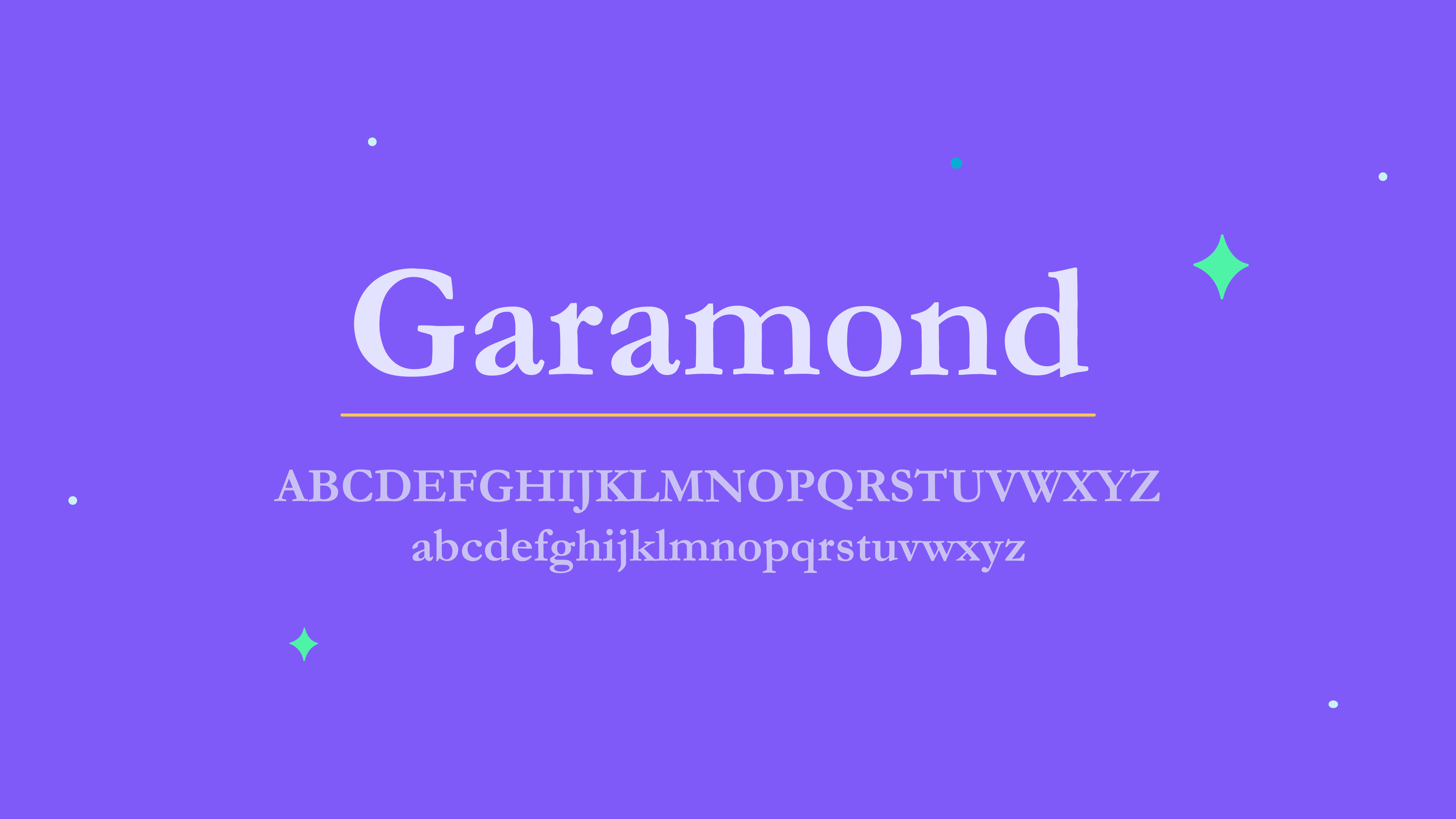
Garamond
We previously mentioned Claude Garamond in our article about graphic designers; he is the mind behind one of the oldest English typefaces we have, dating back all the way to the 16th century. Garamond is a typeface that encompasses a variety of fonts, such as Adobe Garamond, Garamond ITC, and the Roman Style of Garamond. The Roman Style, in particular, includes design choices that improve legibility after printing, making it a great choice for body texts.
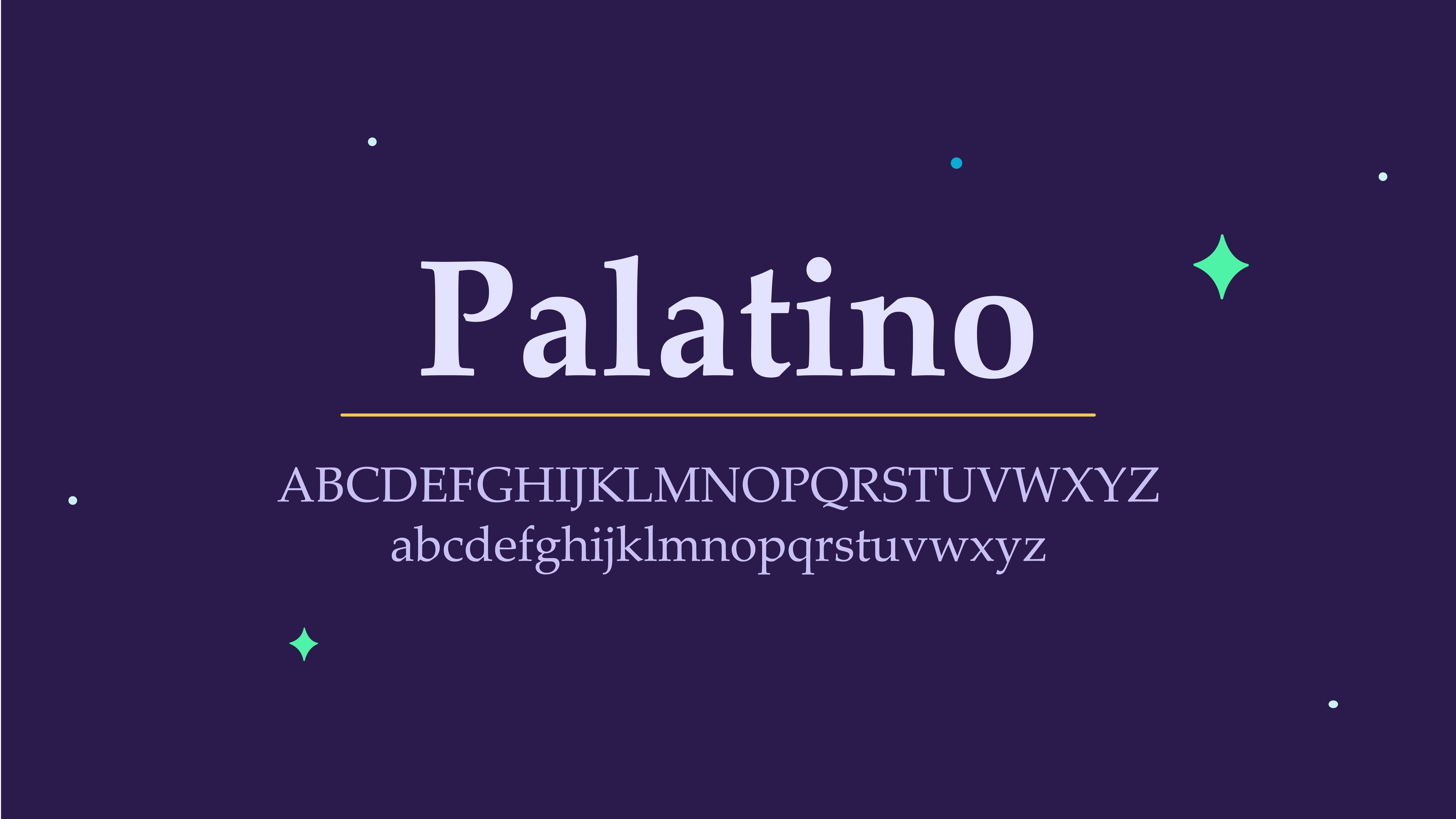
Palatino
In 1949, Hermann Zapf, inspired by calligraphic works and the Italian Renaissance, developed the Palatino style used in advertising and other print media headings. He created a font to remain readable on low-quality paper and small prints, which makes it suitable for presentations where the text will be read from a distance.
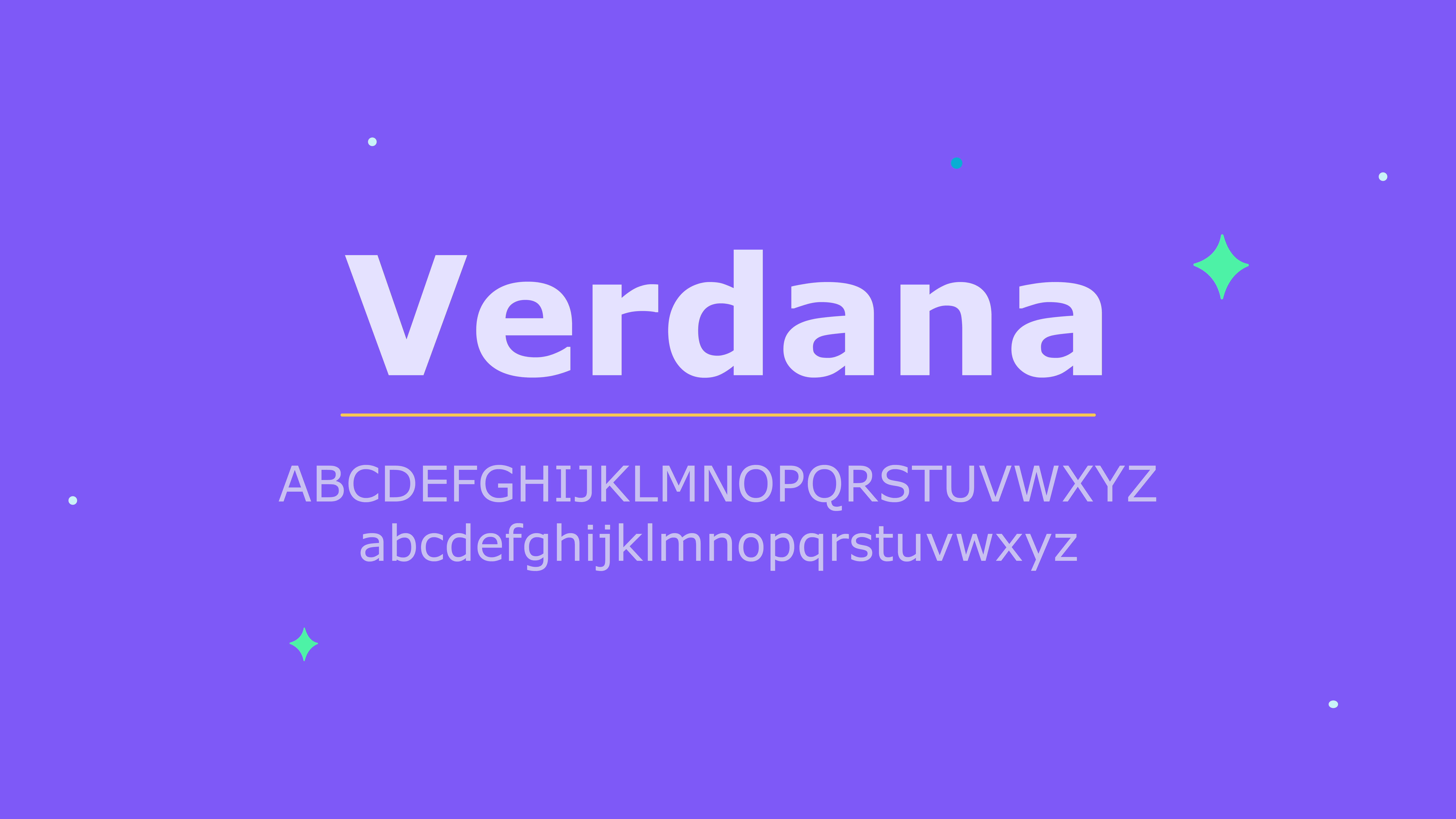
Verdana
A super common choice for PowerPoint presentations, Verdana is a young font created in 1996 for Microsoft, and it has been developed to be used onscreen. The wide spaces and tall lowercase letters make it easy to read; plus the font is also compatible with both Windows and Mac devices.
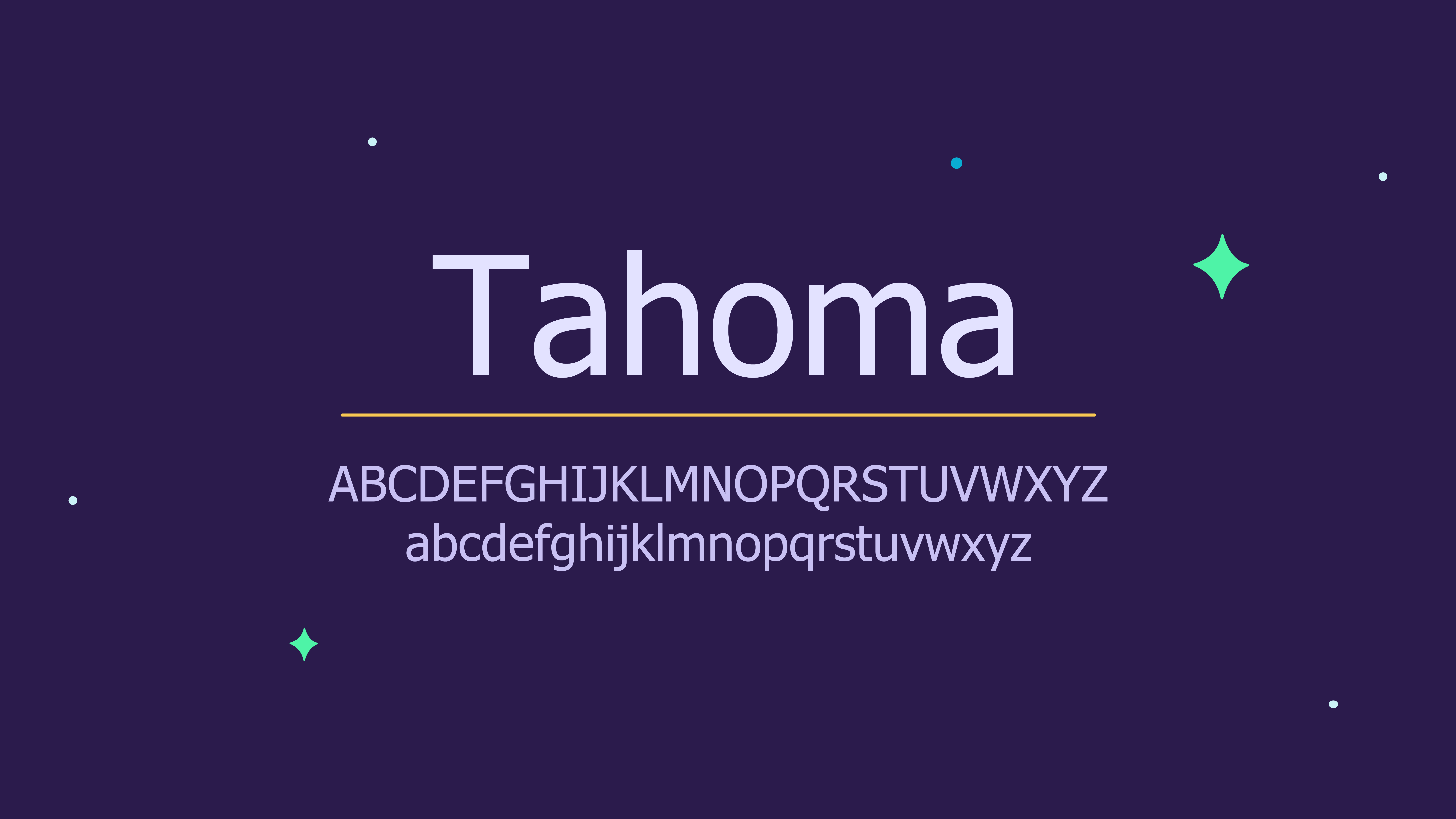
Tahoma
Another font that was designed for Microsoft, Tahoma is Verdana’s more orderly cousin, considering the tighter spaces between the letters that create formality and clarity. Tahoma fonts have been a common choice for PowerPoints since the 1990s and remain a classic for a reason.
Roboto
Roboto can be an excellent font option with its modern and friendly aesthetic, making it a suitable choice for many different presentation styles and industry topics. Regardless of whether you decide on a serif, sans-serif, or script font, Roboto is simple and versatile enough to complement a wide range of different fonts. This adaptability makes it a clear choice for harmonious and appealing slides.
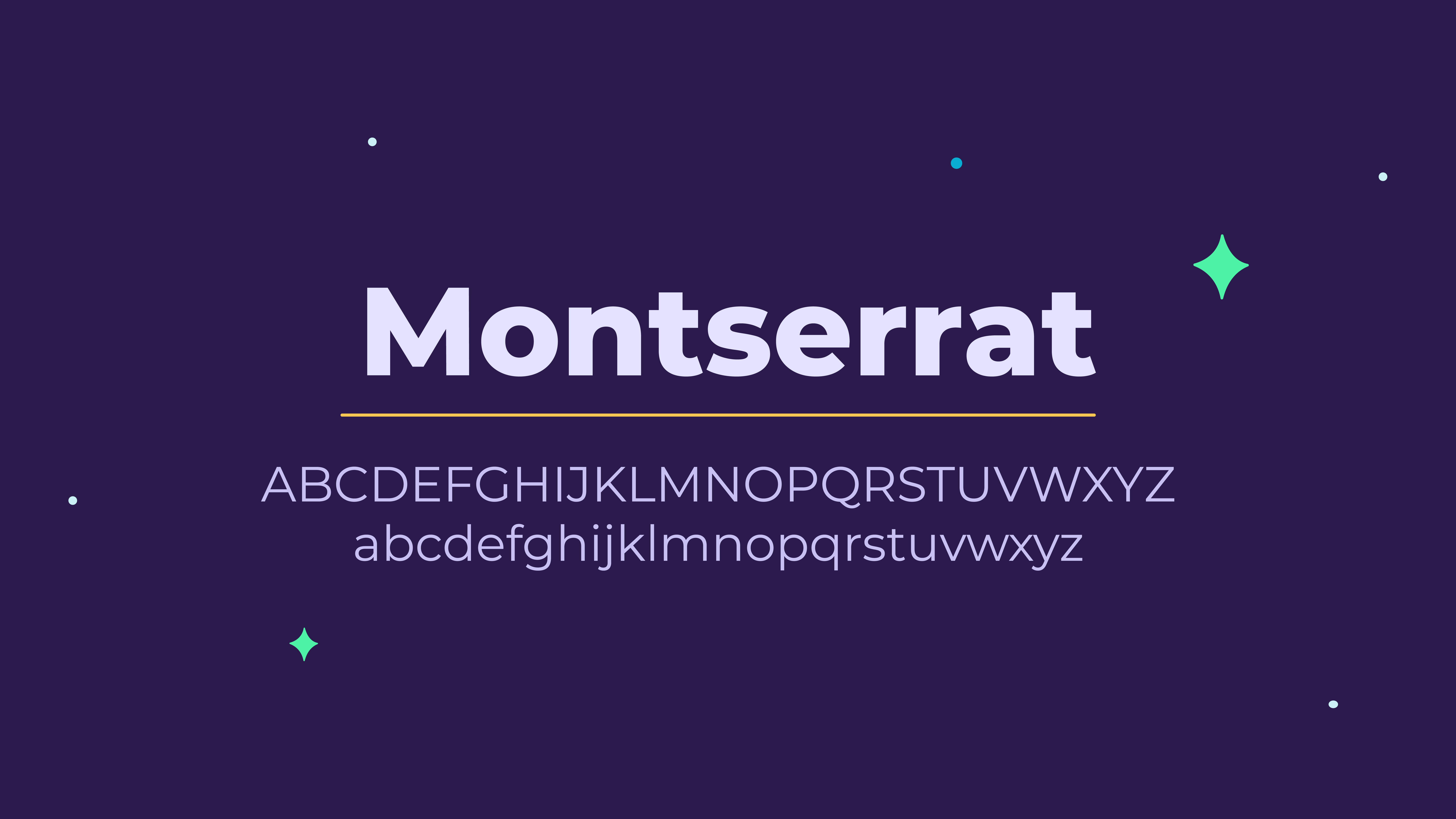
Montserrat
Montserrat is a popular font, and for good reason; it is a practical and contemporary font that can be found on many websites and presentations. It might be a cliche option, but it is certainly not a boring one.
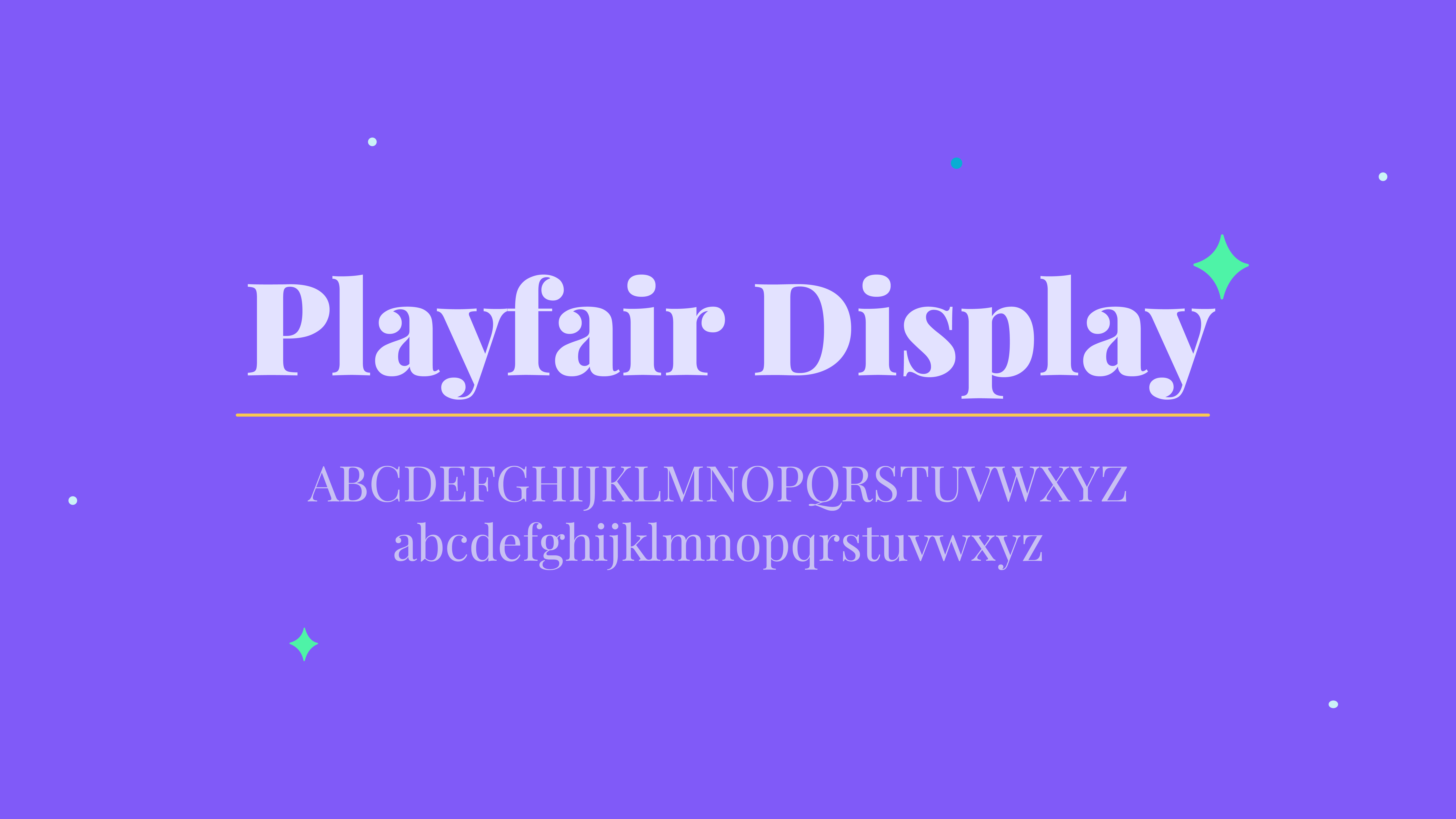
Playfair Display
The effortlessly chic Playfair Display is a fashionable choice for those unwilling to stick to a standard font, but unwilling to go bold. The boxy feel of the letters might make for disorienting paragraphs, but it creates more pronounced headers with uncompromising elegance. Playfair Display is also a beautiful choice for quotes or subtitles used in a presentation.
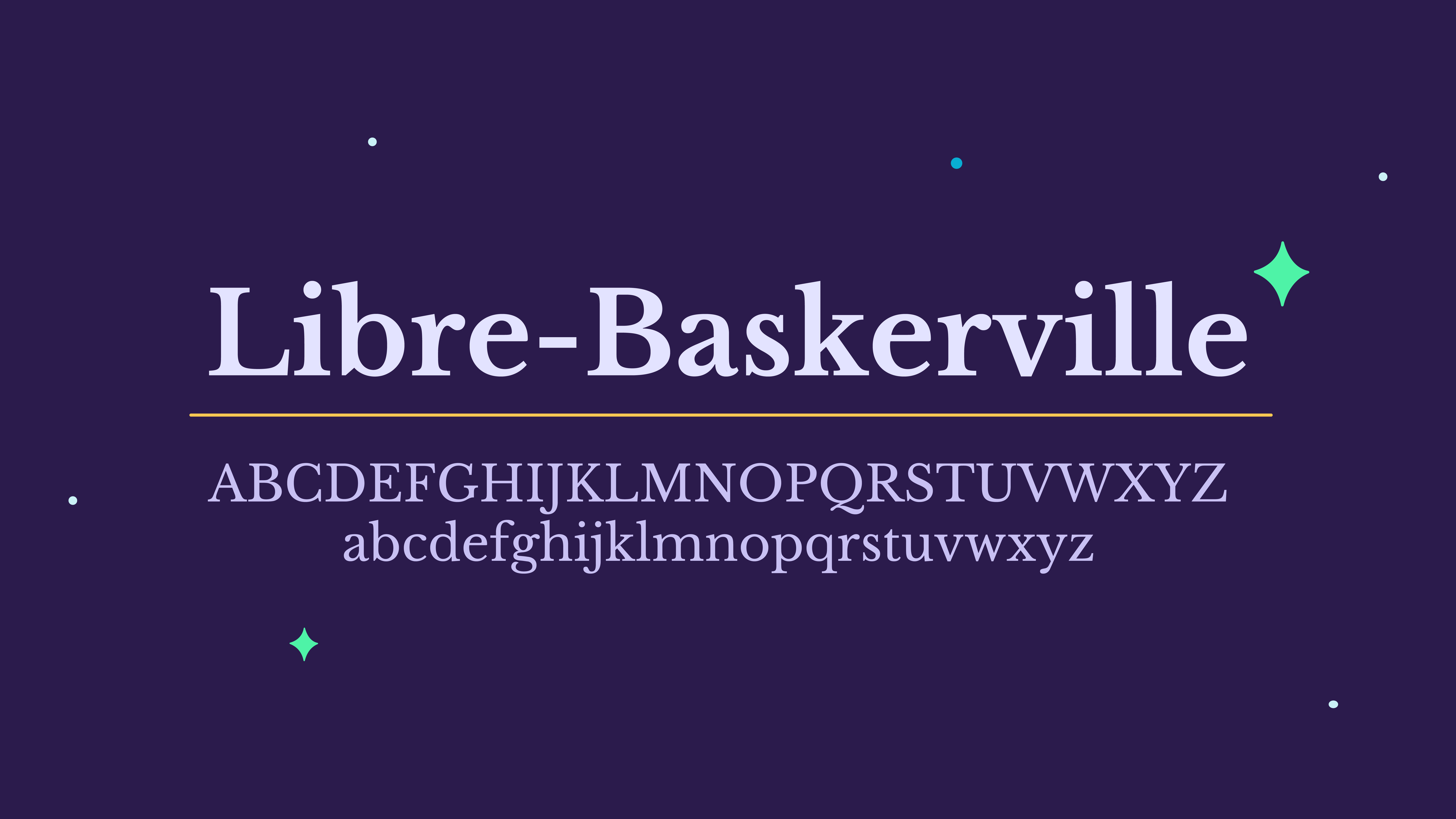
Libre-Baskerville
This serif font creates a traditional look that you can easily pair with many typefaces and color schemes. Surprisingly, Libre-Baskerville works well as both a headline and a body text font, it’s easy to read and eye-catching. Also, it doesn’t hurt that it’s a classic that conveys the user as a professional with authority.
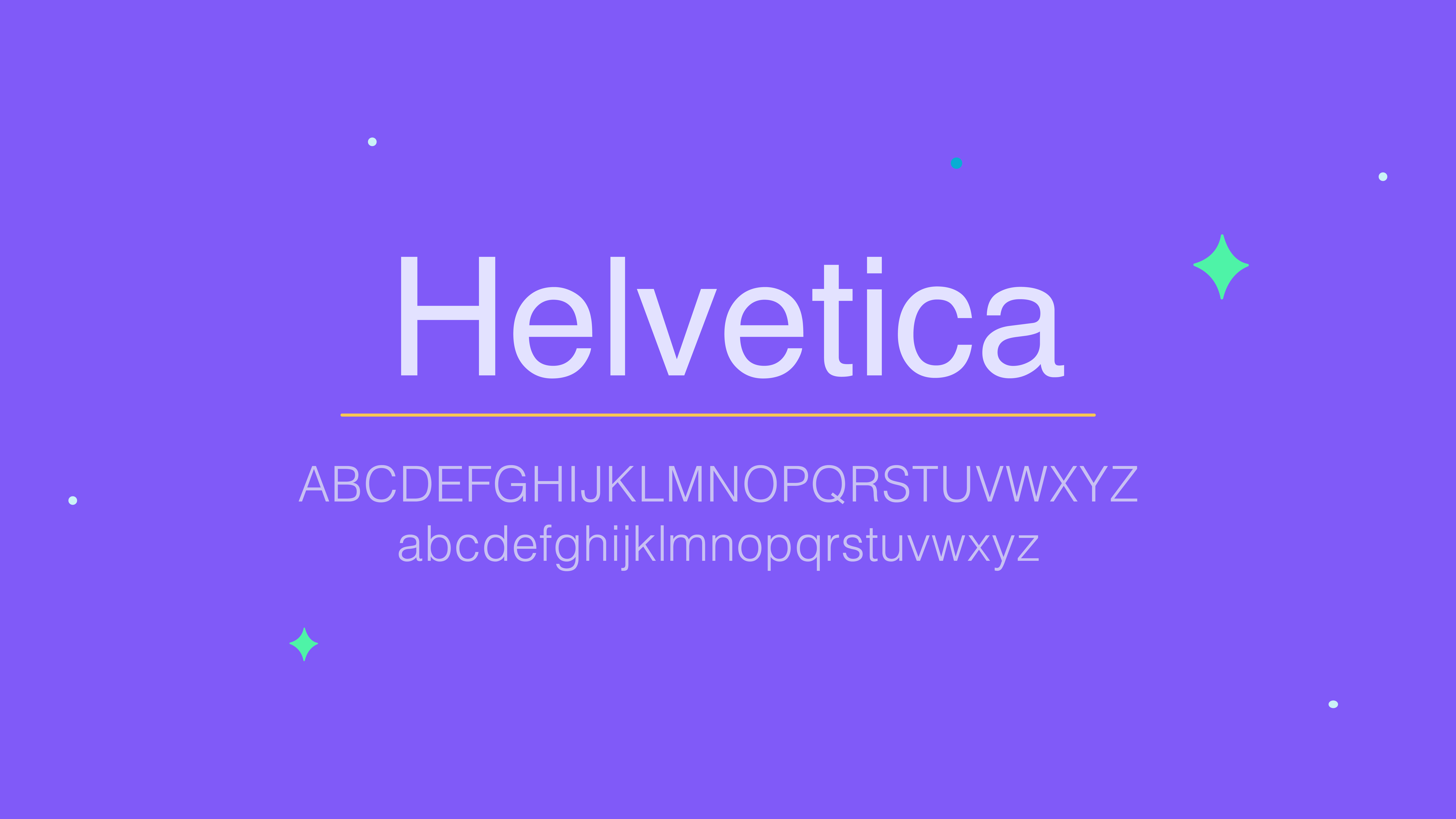
Helvetica
A classic sans-serif font with its own fanbase, Helvetica has an almost-symmetrical proportion that makes identifying letters easy when viewing from afar. Helvetica is a great choice for headers or titles in a PowerPoint where there is an audience viewing from varying angles and distances from the screen. To make your point stick, consider a Helvetica typeface for your titles.
Georgia
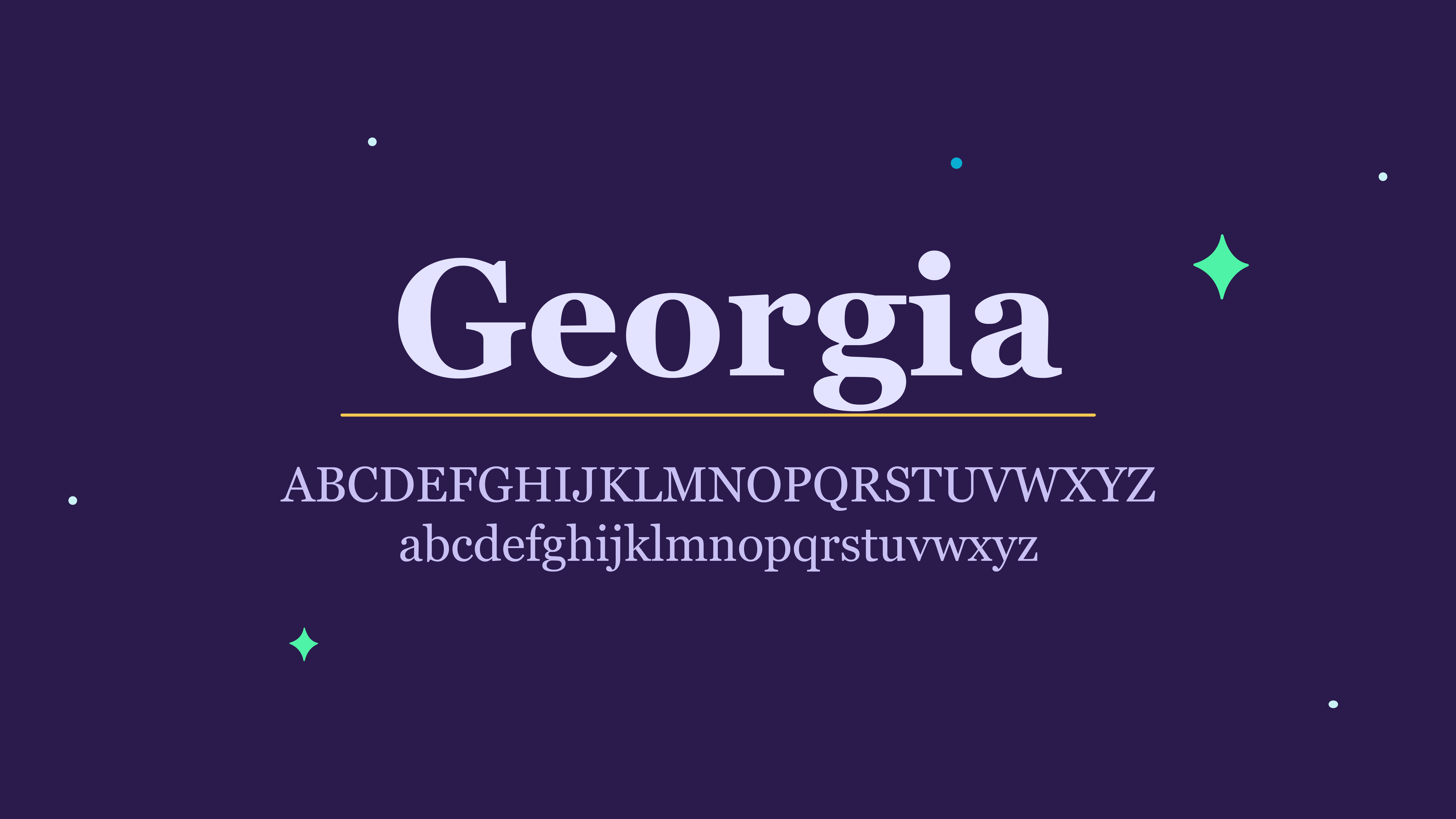
Georgia’s elegant design blends thick and thin lines for its impressively proportioned serif letters. It can be compared with Times New Roman, but it holds its own as a timeless font that is a graceful choice for a PowerPoint presentation.
How to import a font into PowerPoint
Sometimes, you might find a perfect font that is ideal for your presentation, but it is not available on PowerPoint. No need to fret; you can still include it in your presentation by importing it into PowerPoint through these easy steps.
Step 1. Download your fonts
Find your desired font on a font or design website such as Google Fonts or Da Font and download it.
Step 2. Extract the font
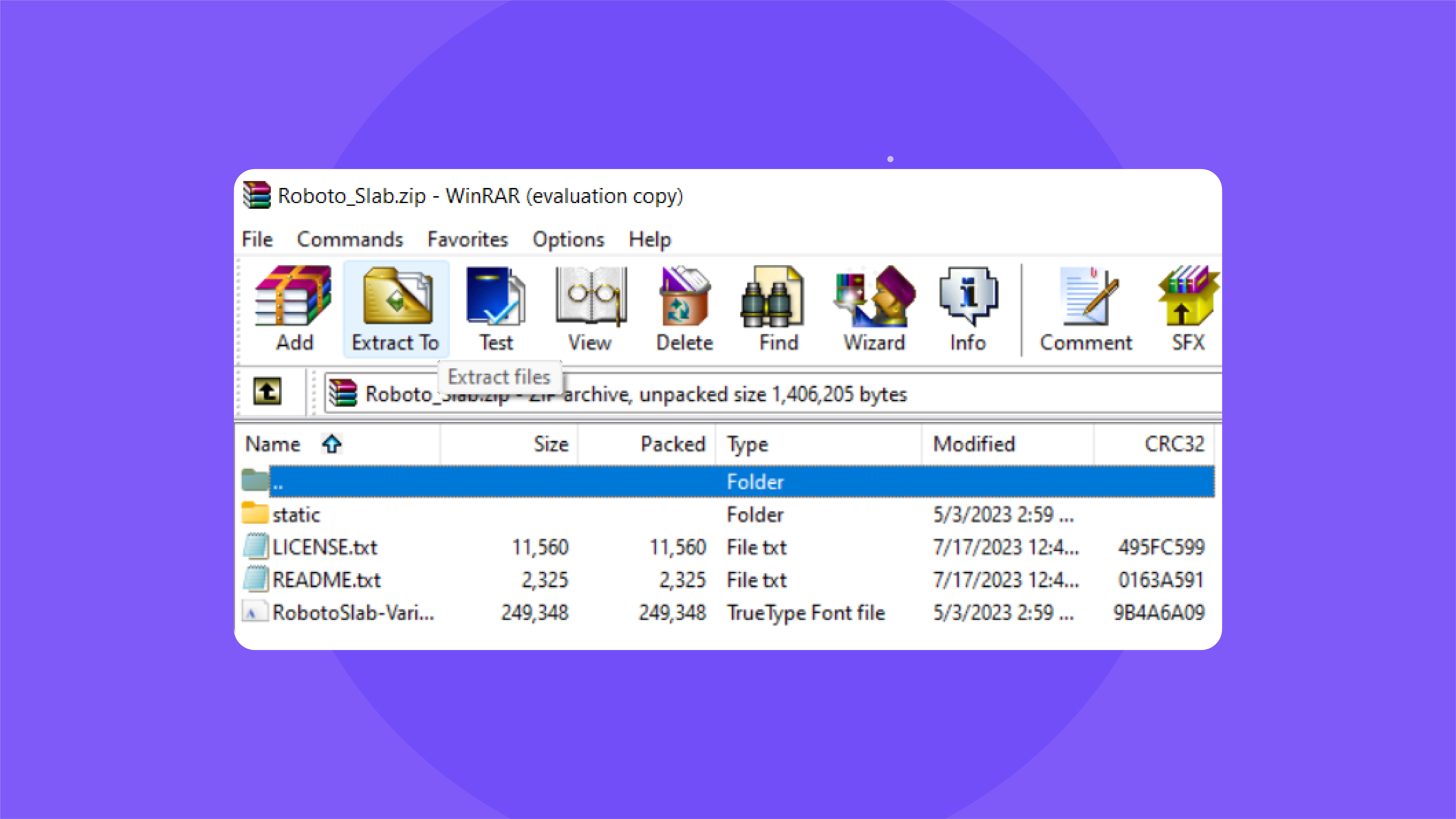
Usually, when you download a font, you will find that it’s a compressed file. Extract it before installing it into PowerPoint. You will not need to unzip the file if it is downloaded as an .otf or .ttf file.
Step 3. Install the font
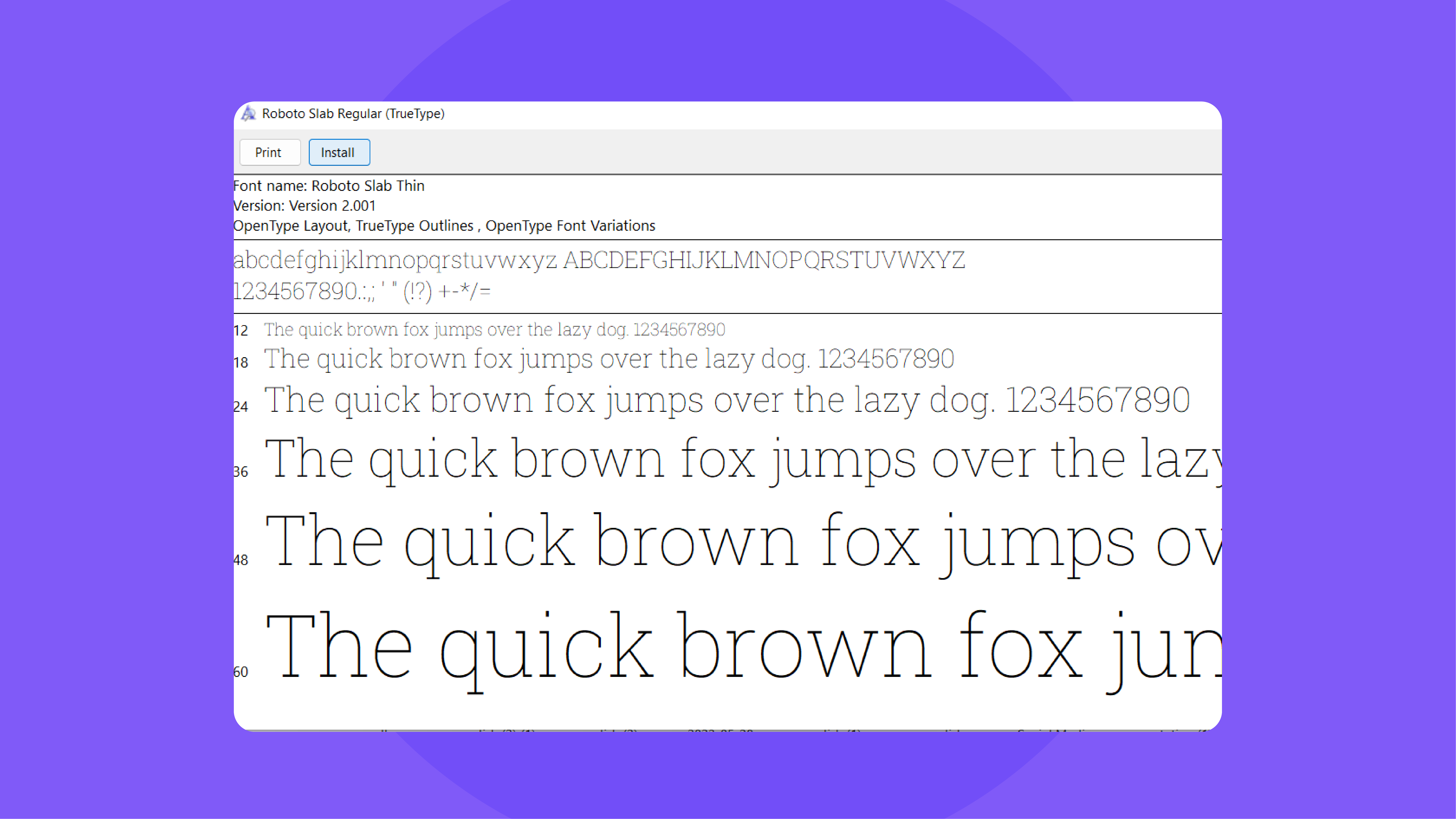
In the font file, you will find a button to install. Once installed, the font should appear in your Window’s font library. To reach it, go to Local Disk (C:) on your computer, go to the Windows folder, and click on the Fonts folder.
Step 4. Open PowerPoint
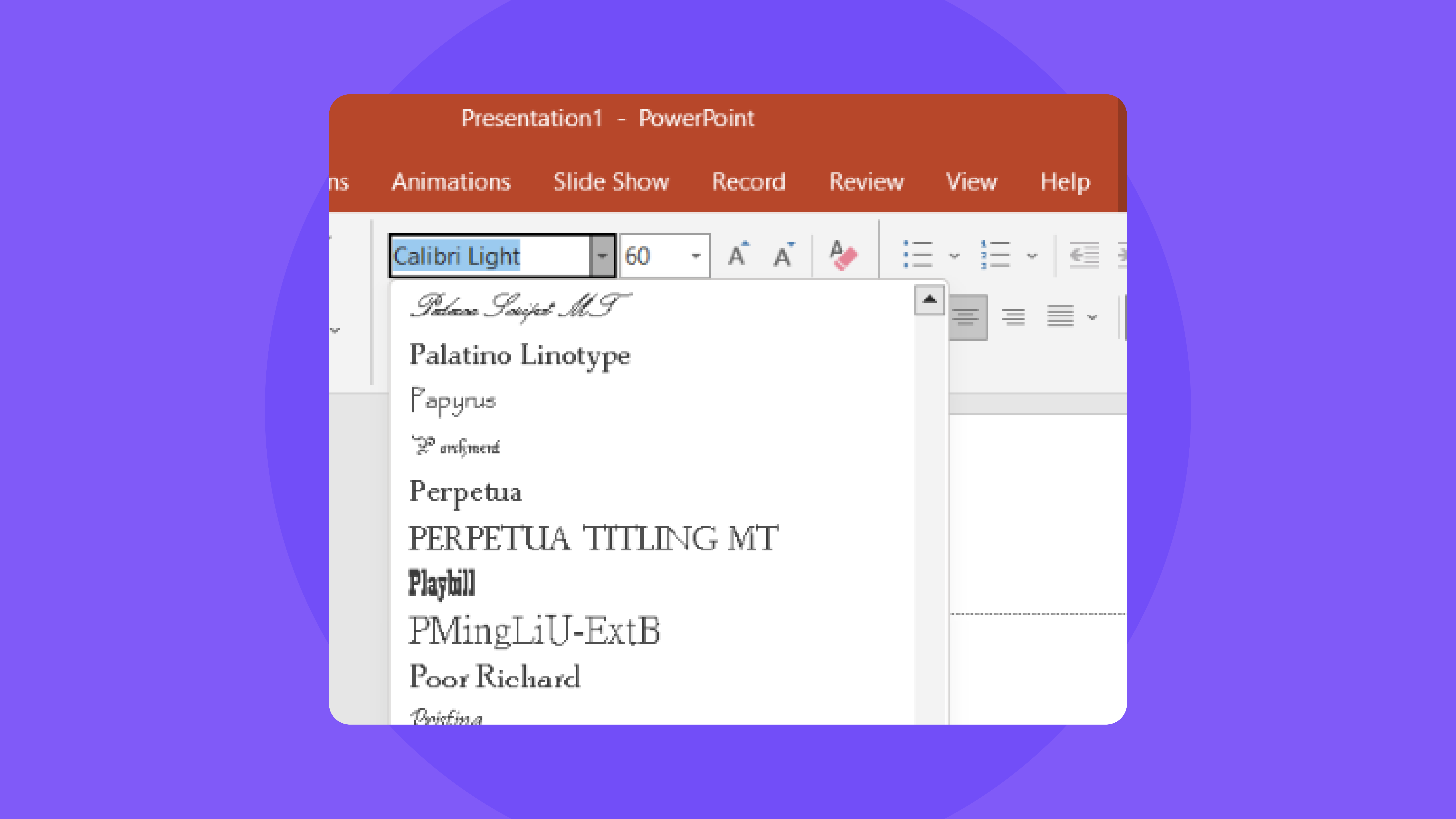
Finally, open PowerPoint and you should find your new font among the others.
Selecting the right font is tricky business; it needs to align with the content, and context, and also deliver the desired impact of your presentation. Use this opportunity to create an accessible and engaging presentation suitable for all types of audiences. The right font will not only elevate your presentation but also effectively share your message. So explore and experiment with different fonts to create a visually appealing presentation.


