22 November 2024
Data visualization is an art form. Picture this: you tap those dull spreadsheets once, and they transform into captivating visuals that effortlessly convey your message. In the realm of presentations, data visualization is like giving your numbers a much-needed makeover. They are a powerful tool that simplifies and communicates information and also captures your audience, leaving them spellbound by the stories hidden within the numbers.
What is data visualization?
Data visualization is all about representing data through fun and engaging visual or graphic elements such as graphs, charts, maps, infographics, and other formats. Instead of overwhelming your audience with raw data, visual representation makes information easier to digest and more visually engaging.
Why is data visualization important in presentations?
How come data visualization is so important for presentations? Simply because it’s a game-changer! It makes complex data easier to understand, helps spot trends and patterns, and enables better decision-making. When you present data in a visual format, it becomes easier to comprehend and remember, which is especially helpful for more complex data sets or data the audience is unfamiliar with. Also, visuals are like magnets for audience attention; they keep them focused and maintain their attention throughout the presentation. Moreover, data visualization elevates your storytelling by facilitating the visual communication of your message and enhancing your connection with the audience.
Types of data visualizations for presentations
Depending on the data, there are many ways to represent it through various formats. Let’s dive into the common types, including:
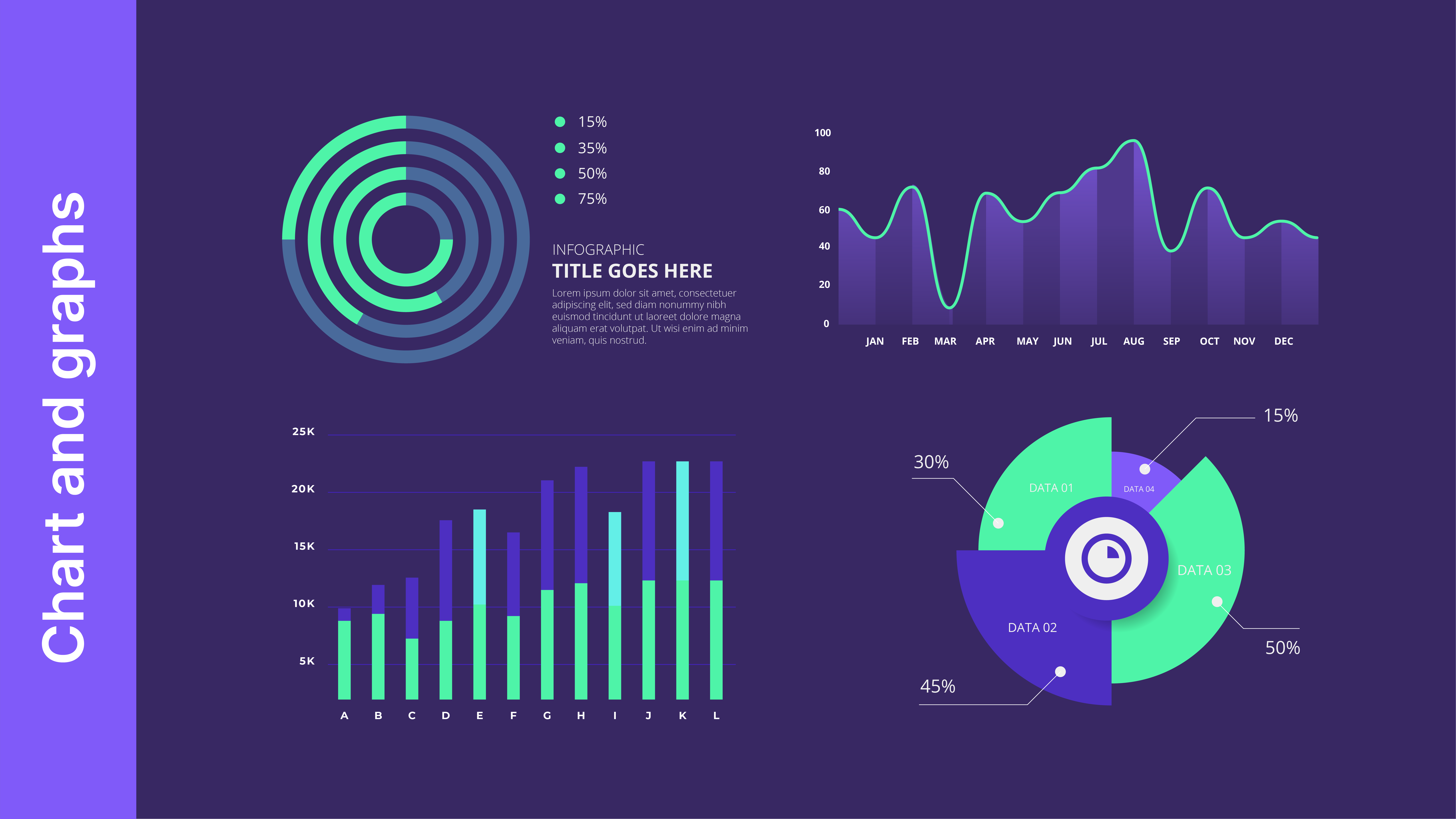
Charts and graphs
Charts and graphs are the true rock stars of data visualization and one of the most popular ways to represent data. They are classic, versatile, and can represent a wide variety of data. Pie charts, bar graphs, and scatter plots are just a few of the many types of charts and graphs available. As tried-and-true tools for making data stand out, they can show trends, patterns, and relationships between data points. Also, they are easy to understand and can be used to tell a story about the data.
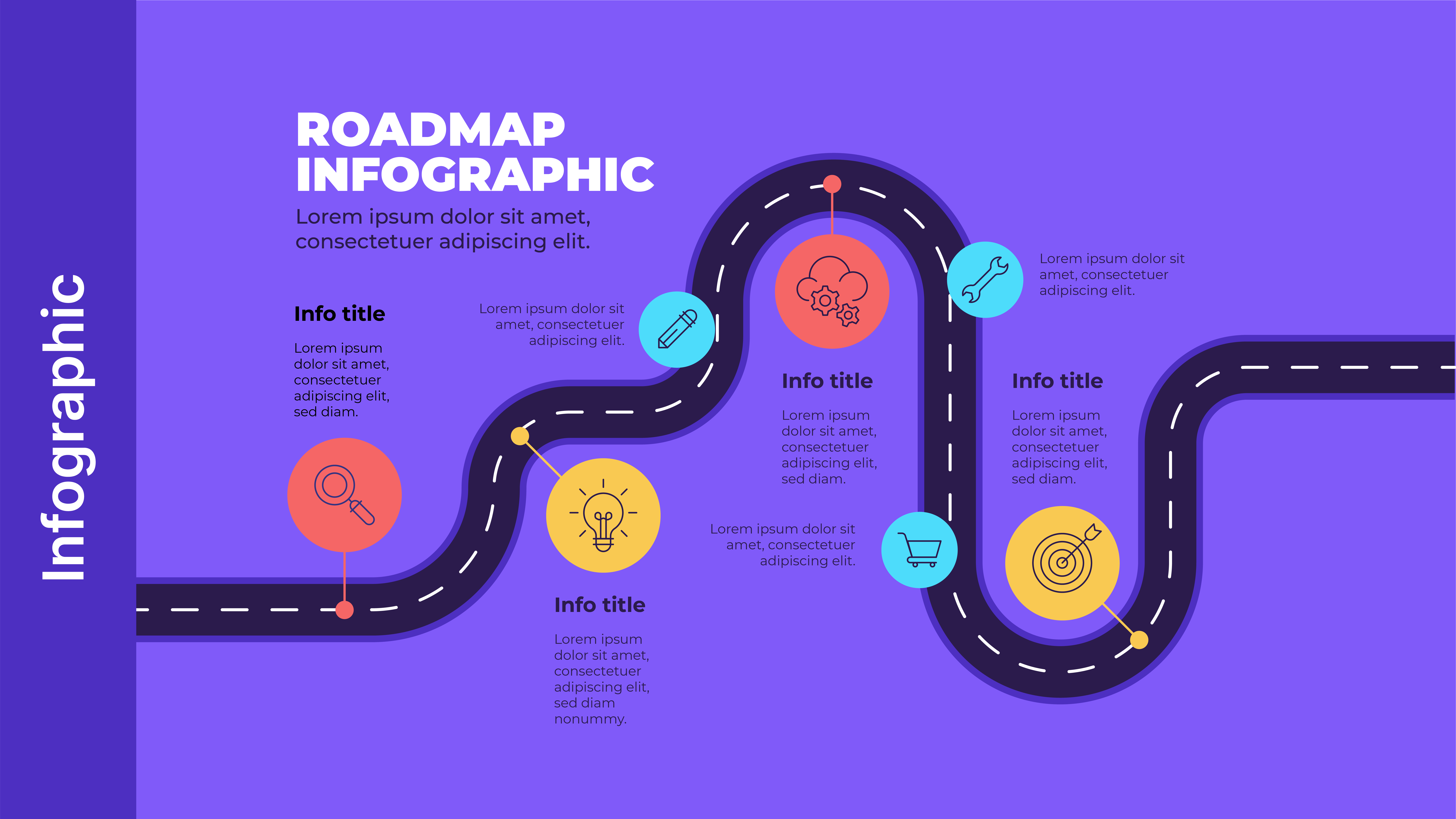
Infographics
Infographics communicate complex data through a combination of text, images, and charts that share information easily and quickly. With the right mix of visual elements, an infographic can be a powerful tool to help audiences understand complex data clearly and concisely while effectively showcasing the data’s story.
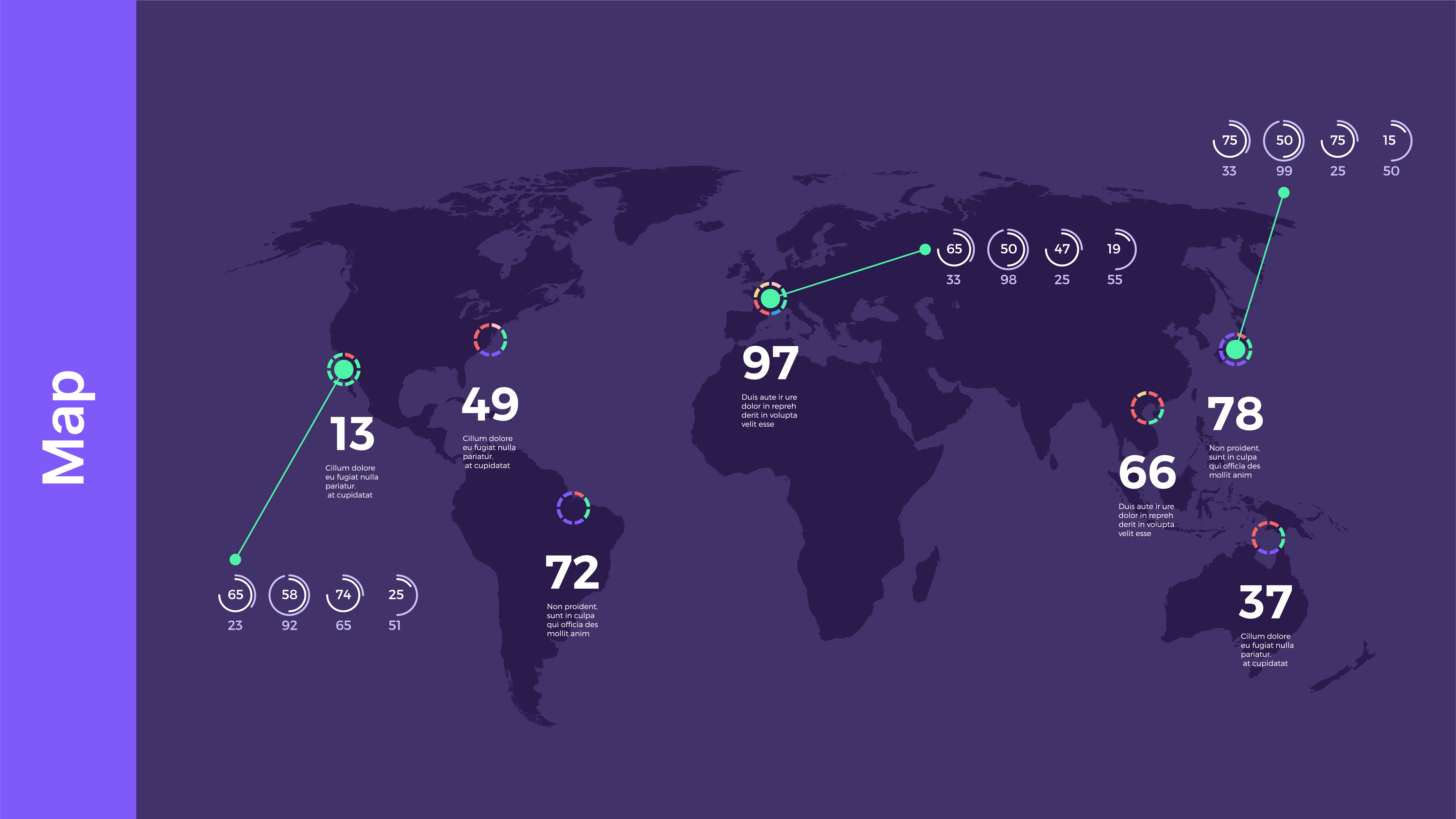
Maps
Maps are a powerful tool for visualizing geographic data. They can showcase trends and patterns, such as sales by region or global statistics. Moreover, maps can demonstrate patterns of distribution and movement and, by extension, can be used to tell stories about the data. Another note is that a map of global statistics could show how different countries compare across several factors, such as population, GDP, or life expectancy. This could help businesses understand the global market and identify potential growth opportunities.
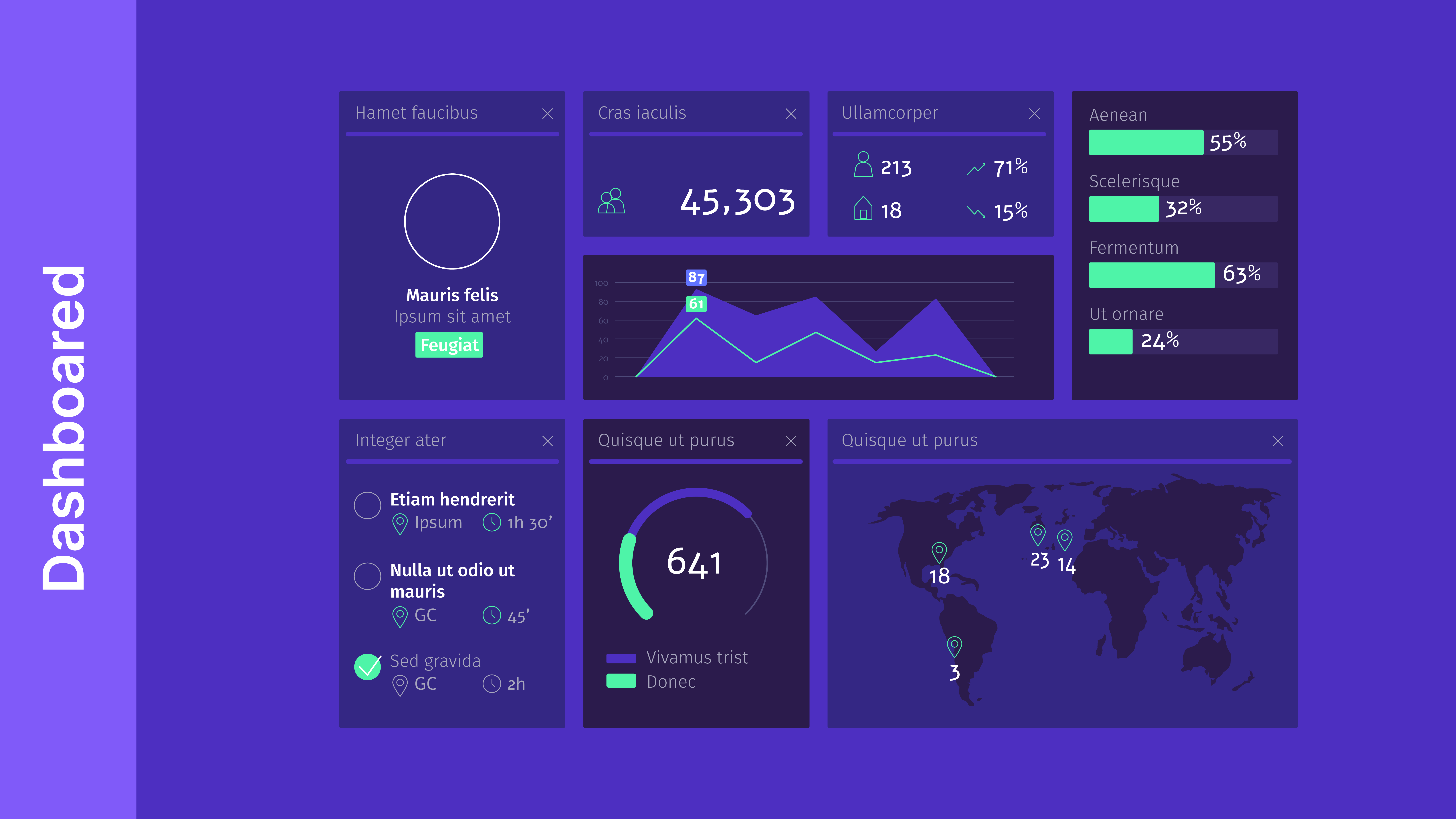
Dashboards
Dashboards are a creative way to display several data points on a single screen, providing an overview of the data at a glance. Dashboards can be used to track different data trends, allowing you and your audience to explore and analyze the data to make informed decisions.
Interactive visualizations
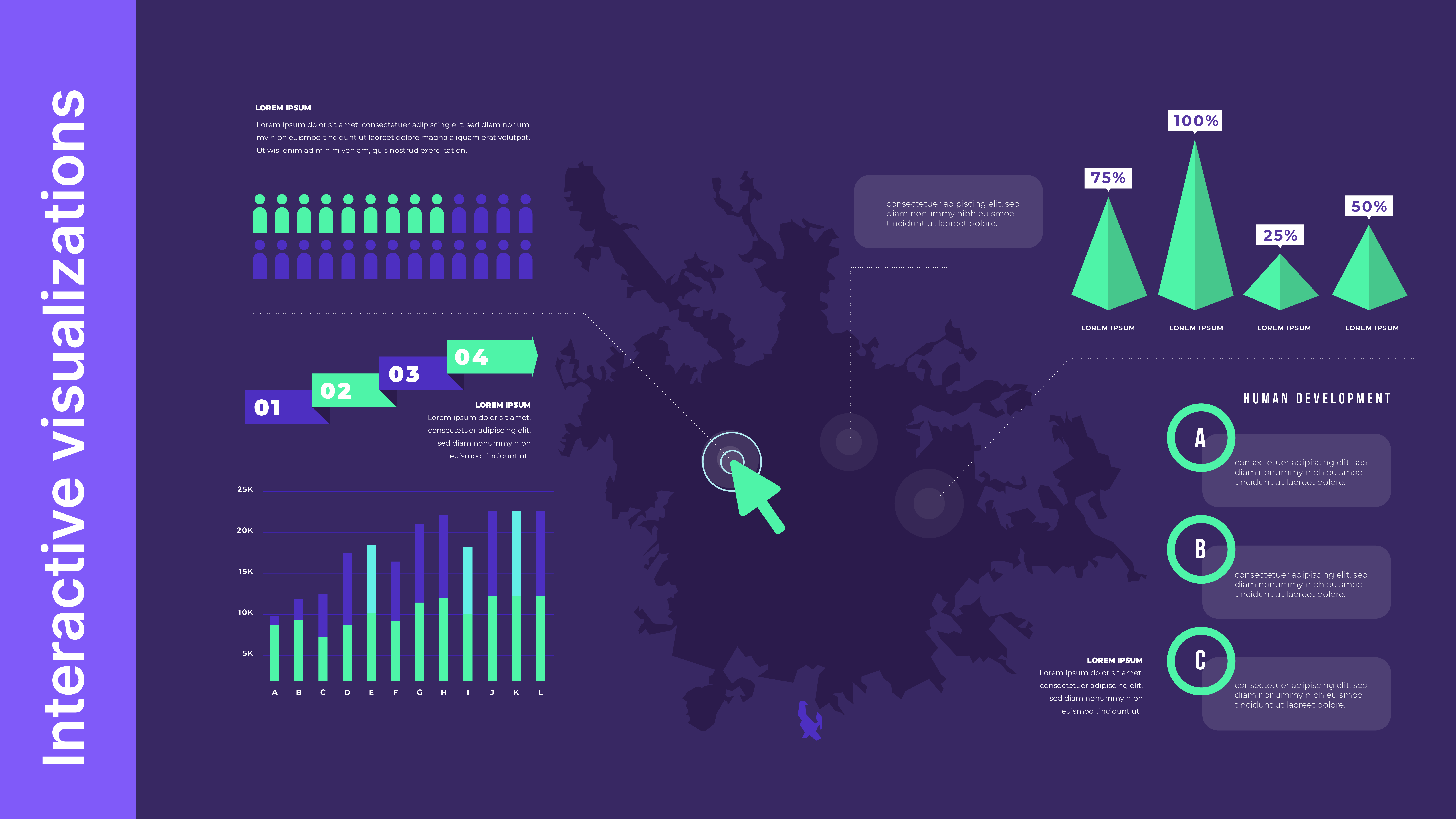
Traditional formats, such as charts and graphs, can help understand trends and patterns in data. However, they can be static and limiting, offering only a single perspective on the data. Here is where interactive visualizations come in. They are still a relatively new type of data visualization that invites the audience to interact with the data points and encourages them to navigate the information and engage in self-learning. It offers an immersive experience for users to zoom in and out, switch between locations, click, and reveal information at their own pace.
Best practices for data visualization in presentations
When using data visualization in presentations, it is important to follow some best practices. These include:
Keep it simple
As usual, a presentation is meant to share a message, and you cannot do that if you have too much going on. Use data visualization strategically to avoid clutter and keep the visuals themselves straightforward and easy to follow. And to keep your data visualization clean, avoid too many data points and colors.
Focus on the story
Your visuals should always be relevant and uplift your main message. They are tools designed to guide and navigate your audience on an informative journey, so any data visualization you opt for should complement and support your presentation’s story.
Use color effectively
A general rule of thumb for using color is that less is more. We’ve spoken before about the importance of an effective color palette; it is another tool to bring out the best of your data. An effectively chosen color palette can highlight key data, create contrast, and enliven your presentation.
Tools for data visualization
Several tools can be used to create data visualizations. Some of the most popular tools include:
Microsoft Power BI
Power BI is Microsoft’s software for creating different data visualizations, including charts, dashboards, and graphs. It offers a wide range of tools to help create rich, impactful reports and visuals.
Tableau
Tableau is the go-to tool for many professional data professionals. Known for its flexibility and easy interface, it also has powerful features that can create detailed and comprehensive data visualizations to help with developing better analysis.
Looker Studio
Looker Studio, a Google product, offers a free, user-friendly data visualization platform that can seamlessly integrate with other Google tools. By simply inserting your data, you can convert the information into extensive reports that are easy to customize.
Adobe Illustrator for Infographics
When it comes to creating high-quality infographics, Adobe Illustrator will reign supreme as the most effective tool. With its powerful vector graphics editing capabilities, it is the go-to software for designing visually stunning infographics that can both captivate and inform viewers.
Examples of data visualization in presentations
Still unsure about how to use data visualization? Here are some examples of how to incorporate data visualization into presentations:
Corporate earnings reports
You can bring that dull quarterly earnings report to life through appealing data visualization tools. Show trends and revenue growth, compare figures, and observe other key metrics with visually appealing analysis to make stakeholders more invested in your story.
Market research findings
Data-heavy market research can quickly amass a mountain of data. Yet with the right visuals, you can have information like market trends and customer demographics converted and communicated into clear and actionable insights.
Social media analytics
Details about social media activity, social media performance, audience demographics, and engagement can be presented through data visualization to showcase growth. They also provide thorough guidelines to determine the next steps.
When you skillfully incorporate and showcase crucial data in an engaging and clear manner, you unlock the power to deliver truly compelling arguments in your presentations. By reinforcing your narrative with impactful visuals, you allow your data to shine and ensure your message takes center stage. Data visualization tools enhance your ideas and also empower your audience with a deeper comprehension of your content.


