22 November 2024
Infographics are an essential tool for data communication in the digital age. Simplifying complex data points in a clean, concise, and appealing manner, they are used across different fields and industries. Much like the rest of the design world, infographic design is an evolving medium that is constantly innovating and expanding. In the digital age, we have become more reliant on images as a source of information, and in this article, we will explore what new directions infographic design will take us in 2024.
Considering that information overload is a common challenge, data-driven storytelling leverages the natural appeal of stories to make data approachable and influential. Data-driven storytelling has been at the forefront of infographic design for a while now, and it won’t be going away anytime soon. Now, designers use storytelling as an essential element in presenting narratives rooted in data. By fusing creative visuals and narratives driven by data, you get data visualizations that display engaging stories that inspire action in their viewers.
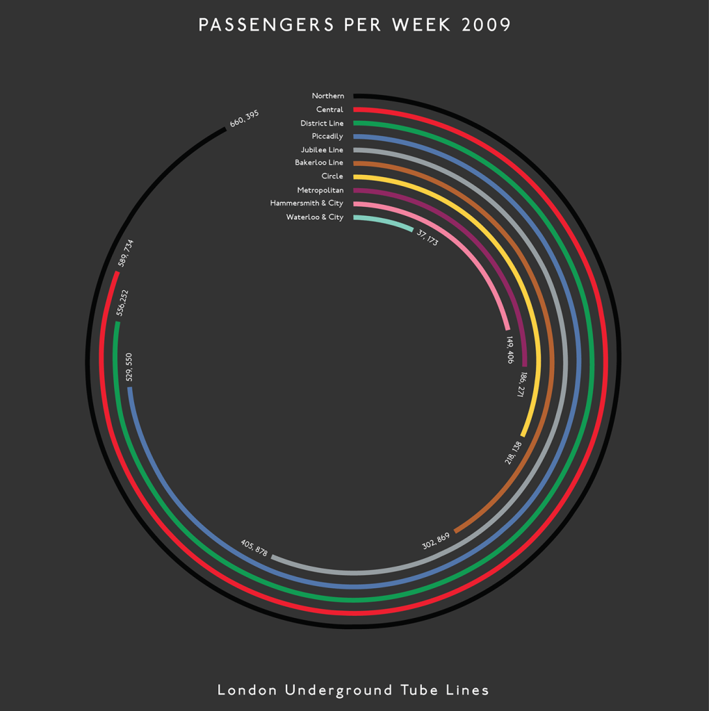
Minimalist and clean aesthetics
As always, minimalism stands out as a pillar in timeless infographic design that flawlessly balances style and functionality. The beauty of simple, clean lines, uncluttered layouts, and a limited color palette serves the data it showcases with impactful design. One of the main tenets of this approach is the use of white space, which creates breathing room for the most crucial information to stand out. Plus, thoughtful color choices will guide the viewer through the infographic and make its key points pop. Most notably, a clear hierarchy of information is a tenet of minimalist visualizations, where every element serves a purpose and points directly to the next one.
Mixed media infographic design
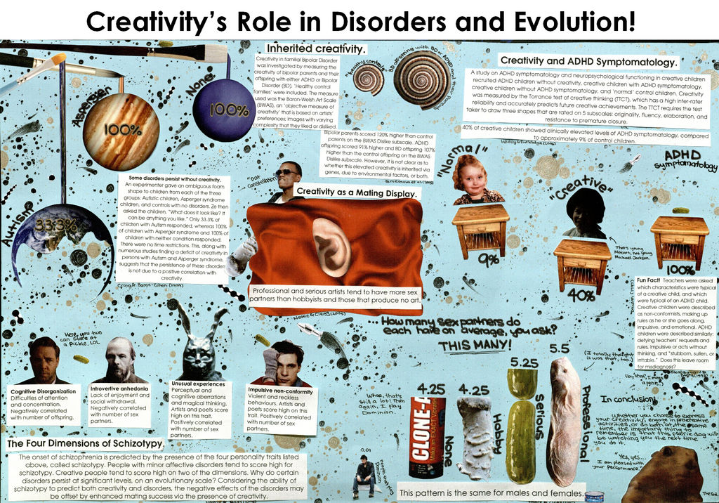
One notable trend in the evolving landscape of infographic design is the use of mixed-media art styles. Considering the value authenticity holds for many consumers, custom illustrations will boost their appeal. Hand-drawn and collaged infographics showcase originality and offer a uniquely personal touch. Moreover, this personal touch can forge a connection of trust with the viewer, considering that this style can convey empathy and understanding in its whimsical and personalized style.
Large headers
In our blog about accessibility, we discuss how incorporating alt text and using high color contrast are ways to enhance the user experience, as is the use of readable fonts.
As accessibility takes center stage in design, large text is being embraced more and more in infographic design to cater to a diverse audience, ensuring that those with impairments or disabilities can navigate and understand the content. Using bold, eye-catching headings helps guide the viewer’s eye along the points, creating an easy-to-follow hierarchy of information.
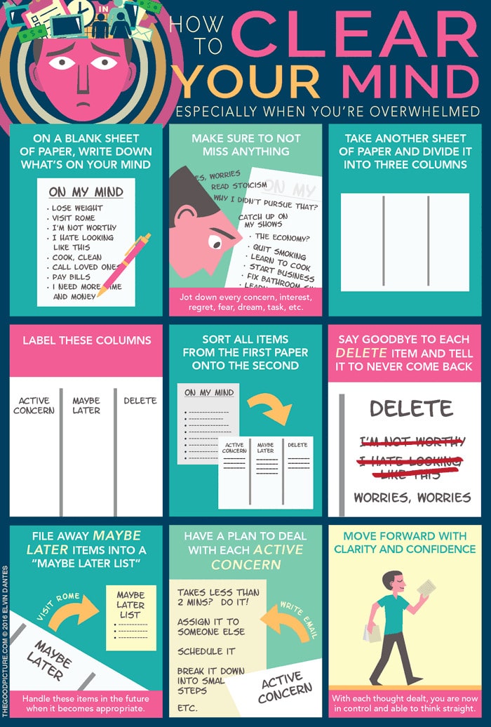
Guided infographics
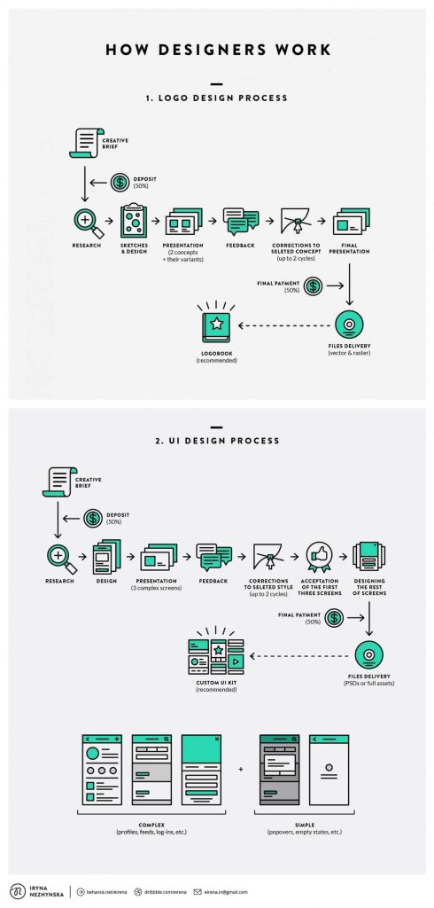
Guided infographics that use a notable flow of information simplify complicated concepts and decision trees, making the data shared more accessible to a broader audience. By breaking down ideas into digestible steps, these infographics hold tremendous visual appeal and easily convey information for a shareable post. In the digital realm, in particular, guided infographics have become an invaluable tool for online learning and aiding individuals in the way they experience new information.
Divisible content
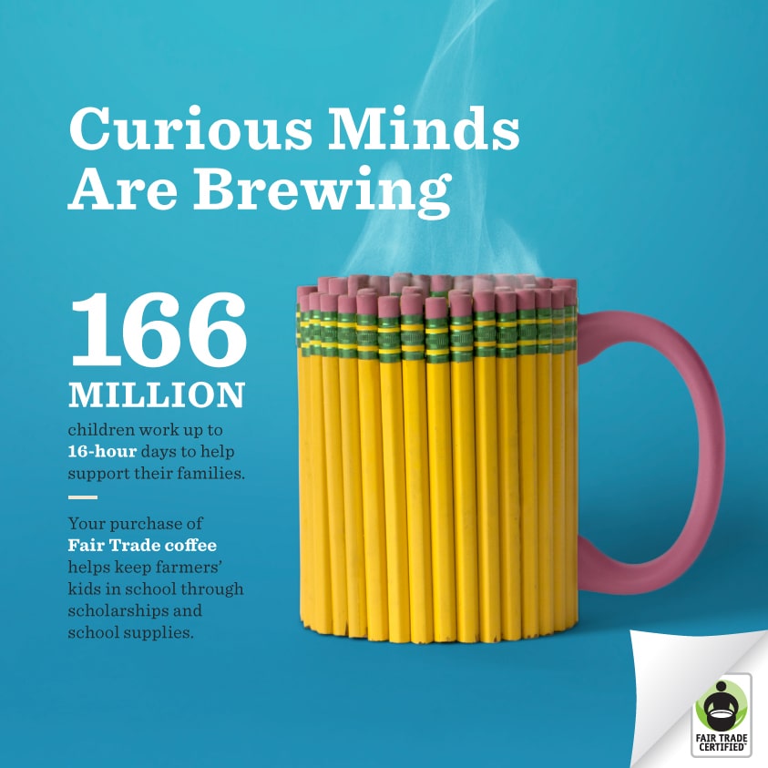
Divisible content is a smart way to maximize the impact of your content by breaking down larger information pieces into bite-sized pieces for different platforms. The data you wish to share would be reduced into mini-infographics for a social media carousel or microcontent to stretch out its reach. The purpose behind divisible content is to adapt information and content into several formats and reuse them across different mediums. That way, viewers can retain small pieces of information rather than be overwhelmed by everything at once.
Infographic videos
A trend worth mentioning is the emergence of infographic videos. By integrating the power of infographics into video content, you can create dynamic content that is both informative and shareable. This exciting approach uses the strengths of each medium and combines them, resulting in a compelling tool for conveying complex information seamlessly and effectively for greater understanding. Instagram reels, in particular, have been a vehicle for popularizing infographic videos recently, as creators are constantly experimenting with the medium. This trend reflects the desire for more immersive and accessible content that caters to the digital audience.
Carousel infographics
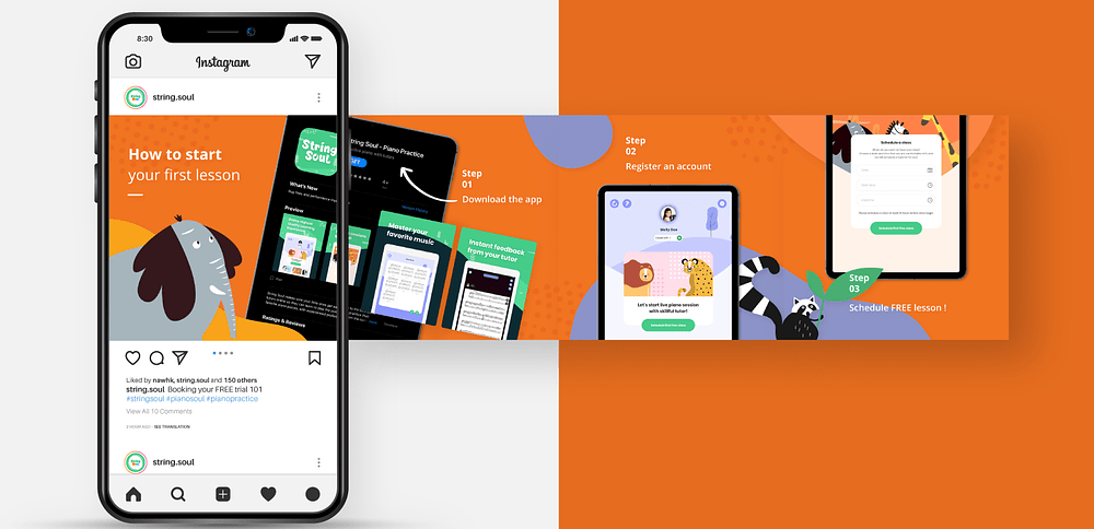
With the increasing reliance on smartphones and tablets as the primary means for viewing information, data visualization must be able to adapt to smaller screens. Creating carousel infographics on platforms such as Instagram and LinkedIn allows users to survey the content for a more user-friendly and intuitive viewing experience. Utilizing carousels to showcase infographics takes advantage of the platform and adapts to its horizontal format, which makes for easy scrolling on mobile devices. Not only does this cater to mobile accessibility, but it also remains a versatile way to showcase data conveniently.
Infographic design is continuously evolving to adapt to new developments in technology, and as a communication tool, it is an indispensable tool that cannot be underestimated. By embracing these new directions in infographic design, designers can create impactful works that effectively engage and educate their viewers in meaningful ways.
References:
(1): https://www.behance.net/gallery/6237395/Information-Graphics-Tube-Map-Passengers-Per-Week
(2): https://www.deviantart.com/nbyrdman/art/Infographic-1-Mixed-Media-645686294
(3): https://elvindantes.com/image/138155001229
(4): https://www.pinterest.com/pin/484629609913920140/
(5): https://www.behance.net/gallery/26057619/Mini-Photo-Infographics
(6) https://dribbble.com/shots/12438588-String-Soul-Instagram-Carousel-Post


