Uncategorized - Prezlab

Why the McKinsey presentation style commands attention

Key Ideas: 

  • McKinsey presentation standards, from visual hierarchy to data visualization, create an aura of authority and clarity that makes business audiences take notice. 
  • Professional credibility is not just about content—the visual and structural elements of a presentation play a huge role in building authority. 
  • Visual elements matter: The right typography, structure, and design choices are crucial for influencing decision-makers and establishing trust.
  • Effective slide design isn’t just pretty—it’s purposeful. Every decision, from color to structure, enhances the clarity and impact of your message. 
  • Implementing McKinsey slide design can transform your presentations into authoritative tools for persuasion and decision-making. 

Clear, professional slide design signals authority before the speaker even begins. The moment a presentation is put in front of a decision-maker, the visual elements automatically do much of the heavy lifting. At first glance, people are already deciding whether or not to engage with the content.  

While most people think presentations are about flashy visuals or fancy charts, they’re missing something important. Presentation design creates an environment where ideas can be absorbed, decisions are made faster, and trust is established. 

McKinsey has mastered this. Their presentation standards are meticulously crafted to build professional credibility. They focus on creating an experience that leads to decisions. Let’s break down what makes the McKinsey presentation style so effective. 

McKinsey presentation standards for building credibility 

1) Visual hierarchy

The McKinsey presentation style relies a lot on visual hierarchy. In a high-level meeting, no one has time to sift through a cluttered slide. The most important point needs to be immediately obvious.  

  • Headlines are bold and clear, often in larger font sizes, creating an immediate focus. 
  • Supporting content flows logically, helping the audience navigate easily through key insights without feeling overwhelmed. 
  • Each slide is organized in a way that guides the viewer’s eye naturally, so they know where to look next. 

2) Professional typography

Typography is often overlooked as an element of authority, but typography sets the tone for the entire presentation. Professional, clean, and consistent typefaces instantly elevate the quality of a presentation. McKinsey uses simple, legible fonts that reinforce the message without distracting from it. 

  • Titles are clear and bold, creating visual dominance. 
  • Body text is kept simple with appropriate spacing to ensure easy reading. 
  • Everything follows a consistent font hierarchy, ensuring that no information gets lost. 

Data Visualization: Turning raw data into clarity 

Data is nothing without context. When a decision-maker is looking at raw numbers, they want to understand what the data means, not just what it says. McKinsey’s use of data visualization focuses on highlighting the story behind the numbers, making them actionable. 

Every visualization serves a clear purpose: to highlight insights and empower decisionsColor coding is used sparingly but strategically, so the most important trends stand out. 

Driving decisions with slide structure 

A major reason McKinsey’s presentations command authority is their consistent slide structure. Each slide has a clear purpose, and the audience can quickly understand what they’re looking at. Structure is the unsung hero of clarity. 

  • Situation to implication: McKinsey often uses this structure—facts (Situation) are presented on the left, and the meaning (Implication) is on the right. 
  • Option to criteria to recommendation: This is a decision-making model, where the audience is shown a set of options, the criteria for choosing between them, and then the final recommendation. 
  • Driver trees and roadmaps are used to break down complex problems into bite-sized chunks that make decision-making easier. 

By organizing slides in this way, McKinsey ensures that every piece of information flows naturally toward a clear, actionable conclusion. 

Colors for professional branding 

Color can be a powerful tool, but if used incorrectly, it can kill the credibility of a presentation. McKinsey slides understand that color is not about making things “pop”; it’s about creating focus and ensuring visual consistency across the entire presentation. 

  • Brand colors are used sparingly, reinforcing the company’s identity while not overwhelming the content. 
  • Neutral backgrounds allow the content to breathe, while high-contrast text makes sure it’s easy to read. 
  • The design doesn’t compete with the message; it supports it. 

Mckinsey presentation style

Implementing McKinsey slide design in your presentations 

Now that you know what makes McKinsey presentations stand out, it’s time to think about how to implement these standards in your own work. Here’s a simple checklist that you can start using today: 

Set clear objectives for each slide 

Start with a clear action title that states the goal of the slide.
Support with minimal text. Use bullet points and short sentences, and if possible, avoid paragraphs. 

Ensure consistency 

Use a consistent font family, hierarchy, and layout across all slides.
Make sure every slide follows the same structure (for example: Situation to Implication). 

Simplify data visualization 

Use clean, simple charts that highlight insights, not just data points.
Choose colors carefully and avoid excessive decoration. 

Design for impact 

Use white space and clear alignment to ensure that content is easy to follow.
Remove anything unnecessary; every element should have a clear purpose. 

The impact of using McKinsey-style slides 

When you’ve successfully implemented McKinsey slide standards, you’ll start noticing these signs: 

  • Fewer review cycles—Stakeholders are clear about what is being communicated.
  • Quick approvals—decisions are made faster because the slides are easy to understand and act on. 
  • Increased confidence in your presentations—people trust clarity and structure, and they feel empowered to make decisions. 

Design is a decision-making asset. When presentations are structured well and the visual elements are used correctly, they become powerful tools that help high-level audiences make informed decisions faster.

By following the principles behind McKinsey’s presentation style, organizations can create presentations that command authority and deliver clear, actionable insights. Aside from looking professional, they make sure your message is received, understood, and acted upon.

Think like an interactive presenter with these techniques

Key Ideas 

  • Interactive elements turn passive viewers into active participants, making presentations more memorable and effective.
  • Feature selection should consider audience size, context, and presentation goals for maximum impact. 
  • Implementation must balance creativity with usability to prevent distraction and maintain focus. 
  • Measuring engagement through participation metrics, time-on-task, and behavioral observation helps optimize future presentations. 
  • Thoughtful interactivity transforms presentations from static slides into experiences that drive understanding, alignment, and decision-making. 

If you aren’t a super interactive presenter, even great slides can fall flat. People drift off, phones appear, and key points are forgotten. Interactivity changes that. By actively involving the audience, presentations stop being a one-way street and become a shared experience. Engaging the audience directly affects their retention, comprehension, and ultimately, action. 

Usually, people remember and act on information they participate in, not just passively consume. In consulting presentations or corporate briefings, this approach ensures the audience’s focus and reinforces critical messages.  

Types of elements in an interactive presentation 

To truly become an interactive presenter, you should consider engaging techniques and exercises that bring in and maintain your audience’s attention. Though it’s important to note that not every interactive feature is suitable for every situation. Choosing the right element depends on the audience, objectives, and complexity of the content. Some of the most effective features include: 

  • Live polls and quizzes: Great for assessing opinions, sparking discussions, and reinforcing key points. They turn viewers into contributors, giving instant feedback. 
  • Interactive Q&A: Enables audiences to submit questions, vote on topics, and prioritize discussion points in real-time. 
  • Clickable infographics: Allow viewers to explore complex data at their own pace, improving comprehension. 
  • Embedded games or challenges: Engage participants actively, making learning or brainstorming sessions fun and memorable. 
  • Slide annotations and highlighting: Let audiences mark important information during sessions, creating personal engagement and encouraging reflection. 
Feature TypeAudience SizeEngagement GoalImplementation Difficulty
Live Polls/QuizzesSmall to MediumFeedback & participationLow
Interactive Q&AAnyDiscussion & prioritizationMedium
Clickable InfographicsSmall to LargeExploration & retentionMedium
Embedded Games/ChallengesSmall to MediumEngagement & learningHigh
Slide Annotations/HighlightSmallActive note-takingMedium

This table can help you prioritize which interactive features suit your sessionbalancing impact with feasibility. 

The psychology behind audience participation 

Interactivity taps into human behavior and psychology. When people feel in control, able to choose, and able to provide feedback, they become more engaged. Passive viewers absorb less; active participants retain more. 

For example, including a live poll in a financial presentation lets executives voice priorities or concerns, creating a sense of ownership over decisions. Participants become stakeholders in the discussion. This ownership and accountability drive deeper engagement and better retention. 

Even subtle features, like allowing participants to highlight key insights on slides, provide small but meaningful moments of agency. These small moments in an interactive PowerPoint contribute to long-term understanding and alignment across teams. 

Becoming an interactive presenter 

As with everything, balance is key. In an interactive PowerPoint, adding too many elements or overly complex tools can be confusing or distracting. Interactive features need to feel purposeful. To remain focused, here are some practical tips: 

  • Limit the number of features: One or two interactive elements per 10–15 slides prevent fatigue. 
  • Choose familiar tools: No need for the audience to learn or adapt to a new tool or game mid-presentation. Keep it simple and preferably something they already know about. 
  • Test functionality beforehand: Nothing kills engagement or momentum faster than technical hiccups. 
  • Align features with goals: Every poll, quiz, or clickable graphic should serve a specific objective; otherwise, they become a distraction. 

The best implementations integrate interactivity naturally into the narrative. It shouldn’t be a gimmick; being an interactive presenter should be about enhancing understanding, sparking discussion, and reinforcing your message. 

Measuring engagement 

If interactivity is the goal, then measurement is essential. You can’t optimize what you don’t track. Key metrics include: 

  • Participation rate: What is the percentage of attendees interacting with polls, quizzes, or Q&A? 
  • Time-on-task: How long did the participants spend engaging with clickable or exploratory content? 
  • Feedback quality: Did the interactive content bring depth and relevance to the questions or comments? 
  • Behavioral cues: How were the participants absorbing the information? Were they attentive, taking notes, or adding to the discussion? 

Measuring engagement shows the immediate impact of an interactive PowerPoint and informs future improvements. Over time, these metrics reveal which features consistently drive participation and which may distract or fall flat. 

Optimizing interactive engagement 

Once engagement metrics are collected, the goal is to refine them: 

  • Adjust to audience type: Tailor features for different sizes or familiarity levels. 
  • Replace low-performing features: Swap out elements that don’t generate interaction. 
  • Sequence interactions thoughtfully: Spread activities across the presentation to maintain energy. 
  • Combine modalities: Mix polls, quizzes, hyperlinks, Q&As, and interactive charts for reinforcement. 

Think of interactivity as supporting the story, not competing with it. When executed thoughtfully, the presentation feels dynamic while the audience stays focused on the key message. 

Interactive presentations are about creating participation, understanding, and impact. By choosing interactive features that support the message, you help your audience stay engaged and focused on what matters. The trick is tailoring your approach to the audience’s size, context, and familiarity, ensuring each addition feels purposeful and natural within the narrative. When interactivity is thoughtfully integrated, slides evolve into shared experiences, encouraging audiences to become active contributors. 

Using the Pyramid Principle for consulting presentations

Key Ideas 

  • The Pyramid Principle is a powerful tool used by top consulting firms to create presentations that win clients and drive business outcomes.
  • Structuring presentations effectively with clear logic, hierarchy, and actionable insights is critical to client persuasion and engagement.
  • Using a solid framework in consulting presentations helps convey complex ideas with clarity, leading to quicker decisions and stronger client buy-in. 
  • Success in a presentation isn’t just about design; it’s about structuring content for maximum impact and understanding. 
  • Implementing this structure ensures that your message is not only heard but also acted upon. 

 Most people think a consulting presentation is about the design, but they’re missing something crucial: structure. That’s why you find yourself staring at a draft, wondering why it isn’t capturing your client’s attention.  

The Pyramid Principle is a well-established framework that top consulting firms use to organize ideas logically and persuasively, making it easier for clients to understand and act on the presented information. It’s the backbone of many consultants’ presentations, and here’s why. 

At its core, the Pyramid Principle asks presenters to start with the answer first (the key message) and then logically break it down into supporting arguments, making it easy for the audience to follow. This framework is especially valuable in high-stakes consulting settings, where clarity, efficiency, and persuasion are essential. 

Here’s a quick breakdown of how it works: 

  • Top Level: Start with the main message or recommendation. 
  • Middle Level: Support the main message with 2-3 key arguments. 
  • Bottom Level: Provide evidence or data to back up each argument. 

Structuring a consulting presentation for client impact  

For an effective consulting presentation, you need to think bigger than filling slides with text and data.  Craft a compelling story that resonates with clients. The Pyramid Principle helps achieve that with a frame that structures your ideas for maximum impact. It breaks down complex ideas into digestible chunks, guiding the audience step-by-step toward a clear, actionable conclusion. 

Why structure matters

A disorganized presentation can confuse or overwhelm a client, causing them to lose interest and, ultimately, trust in the solution being offered. On the other hand, a well-structured presentation helps guide the client through the thought process, building credibility and ensuring the information sticks. 

Benefits of structured thinking: 

  • Clarity: Presenting the key message first provides immediate understanding. 
  • Brevity: The Pyramid Principle reduces fluff and focuses only on what matters. 
  • Logical Flow: A clear progression from the top to the bottom helps clients follow the argument with ease. 
  • Client Engagement: A well-structured argument is easier to digest and act upon. 

Persuasive communication in consulting 

In consulting, the primary goal is persuasiongetting the client to see your point of view and make decisions based on your recommendations. The Pyramid Principle helps structure the narrative in a way that is not only logical but also emotionally engaging. 

While data and analysis in a presentation are important, how those elements are communicated makes all the difference. This framework ensures that each argument is tied back to the central message, which resonates with both the logical and emotional sides of the client’s decision-making process. 

Client psychology and persuasion in presentations

Presentations often focus on data and facts, but understanding the client’s decision-making process is just as important. Top consultants frame information in a way that aligns with the client’s needs, goals, and challenges. The Pyramid Principle helps in this by allowing the presenter to guide the client through a structured story that resonates on both a logical and emotional level. 

Persuasive methods in consulting:

  • Storytelling: Presenting data in a way that tells a compelling narrative. 
  • Emotional Appeal: Connecting recommendations to the client’s values or goals. 
  • Data-Driven Insights: Ensuring that each point is backed by data to build trust and authority. 
  • Actionable Solutions: Always ending with clear, actionable steps to move the process forward. 

Meeting professional standards

The Pyramid Principle is an essential part of consulting presentation standards that helps establish credibility and professionalism. Top firms have adopted these frameworks to ensure every presentation is clear, focused, and persuasive. 

Key components of professional consulting presentations:

  • Clarity: Your presentation should have a single, clear message. 
  • Relevance: Only include information that directly supports the central message. 
  • Being Concise: Get to the point quickly and avoid unnecessary details. 
  • Consistency: Maintain a consistent structure across slides for a seamless experience. 

Framework Application:
Here’s a quick guide on how to apply the Pyramid Principle in your next consulting presentation: 

StepActionPurpose
Start with the answerState the main recommendation or conclusion.Gives clarity and context for the rest of the presentation.
Break it down into key argumentsIntroduce 2-3 main points supporting the conclusion.Keeps the focus on the most important aspects of the recommendation.
Provide supporting evidenceUse data, facts, and examples to back up each argument.Builds credibility and strengthens your case.
Conclude with a call to actionEnd with actionable next steps or decisions.Ensures the client knows what to do next.
 

Best practices for consulting presentations

A presentation’s success isn’t just about whether the client understood the message; it’s about whether they took action. For consultants, the ultimate goal is client buy-in, and that’s where measuring effectiveness becomes essential. 

Success metrics to look out for: 

  • Client Feedback: Did the client express confidence in the solution? 
  • Decision Speed: Was a decision made faster due to the clarity of the presentation? 
  • Client Engagement: Did the client actively participate and ask questions, showing interest? 
  • Actionable Outcomes: Did the presentation lead to a clear next step or project initiation? 

The success of any consulting presentation lies in its ability to move the client toward a decision, meaning that the structure of your presentation is just as important as the content. The Pyramid Principle is a tried-and-true method that helps structure presentations in a way that’s logical, persuasive, and impactful. It is guaranteed to guide the client through their decision-making process, which is something to think about when you’re preparing your next presentation.  

Creating Data Narratives: Storytelling techniques that work

Key Ideas 

  • A strong data narrative transforms raw numbers into stories that inspire action rather than overwhelm.
  • Structure matters: stories built on clear frameworks make complex data easy to understand and hard to forget.
  • Emotion and logic aren’t opposites—when combined, they create business stories that persuade and resonate.
  • The effectiveness of a data story should be measured not by how beautiful the chart looks, but by whether it drives decisions.

The thing about data is that it doesn’t matter how accurate or detailed it is. If it isn’t connected to a story, it won’t move anyone. Data narratives are about bridging that gap. Rather than slapping numbers onto a slide and calling it a day, shape the numbers into a narrative to drive real business decisions.

Narrative-driven data presentation 

A good data narrative doesn’t drown the audience in metrics; it guides them. Think of it like walking someone through a forest. Without a path, they’ll get lost among the trees. A narrative-driven data presentation provides the path.

This means starting with the big question, not the chart. Instead of saying “Here’s revenue by region,” try framing it as “Our growth engine is shifting from Europe to Asia—here’s the evidence.” Same data, different impact.

Creating a business story 

A business story isn’t just facts dressed up in nicer slides. It’s the combination of context, conflict, and consequence.

Context sets the stage—what environment are we in, and what’s the baseline?

Conflict shows the challenge—what’s happening in the data that demands attention?

Consequence makes it matter—what’s at stake if we act, and if we don’t?

For example, showing churn data isn’t enough. Framing it as “Rising churn in our premium segment threatens $20M in lifetime value unless retention initiatives launch this quarter” tells a story that pushes leadership to act.

Data story structure 

If you’ve ever built a strategy deck, you’ve probably used frameworks like SCQA (Situation, Complication, Question, Answer). That same logic applies to data narratives. The structure matters as much as the numbers.

Here’s a simple template you can adapt:

Data Story StructurePurposeExample
SituationEstablish the baseline“Sales grew 10% YoY in North America.”
ComplicationShow the tension or anomaly“Growth is slowing in Q3 while costs are rising.”
QuestionFrame the decision“How do we protect margin without stalling expansion?”
AnswerDeliver the insight-driven action“Shift resources toward higher-margin product lines in Q4.”

The point isn’t to lock yourself into one model but to stop data from becoming a jumble of disconnected insights.

Professional data narrative techniques 

Numbers alone rarely change minds. People respond to stories, patterns, and emotions. Professionals know how to weave those elements into their data.

Some techniques that work:

Contrast: show “before vs. after” or “with vs. without” scenarios.
Anchoring: relate a number to something tangible (“$3M lost churn = cost of launching two new product lines”).
Progression: reveal data in stages so the audience feels discovery, not overload.

For example, instead of showing a dense cost breakdown, frame it as “saving enough each month to hire 30 more people.”

Stroytelling for data narratives

Measuring the story’s impact 

How do you know if a data story is effective? Wait to see what happens afterwards. Did leaders make a decision? Did the team align on next steps? Did the narrative stick in conversations a week later?

Some quick indicators of impact:

  • The audience repeats your framing of the issue.
  • Decision-makers ask “what if” questions instead of “what does this mean.”
  • Your insights turn into action items in follow-up meetings.

Applying narrative frameworks  

Frameworks are like scaffolding. They don’t replace creativity, but they give you structure so you can build higher.

For business data, SCQA is common, but you can also use:

  • Hero’s Journey for change initiatives (status quo → disruption → transformation).
  • Pyramid Principle for executive communication (answer first → supporting arguments → data).
  • Cause and Effect chains for operational issues (problem → root cause → consequence → solution).

The trick is to pick the right framework for the right audience. A board meeting may demand a sharp pyramid. A team workshop might benefit from a journey.

Storytelling success metrics 

Measure your storytelling success the way you measure campaigns. Be practical; create a checklist and track it.

Quick questions to measure effectiveness: 

  • Did the presentation lead to a decision or action?
  • Did the audience repeat or share the narrative?
  • Did the story reduce confusion or debate about the data?
  • Did stakeholders recall the key message days later?

If you’re checking yes to most of those, you’re on the right path.

Data narratives transform data into business stories that give your ideas a little nudge forward. The professionals who do it well understand structure, psychology, and impact. They use frameworks, measure effectiveness, and never lose sight of the audience.

So the next time you’re faced with a deck full of numbers, ask yourself: What’s the story here? Once the story is clear, the decision usually becomes clear too.

Aristotle’s formula for persuasive presentations

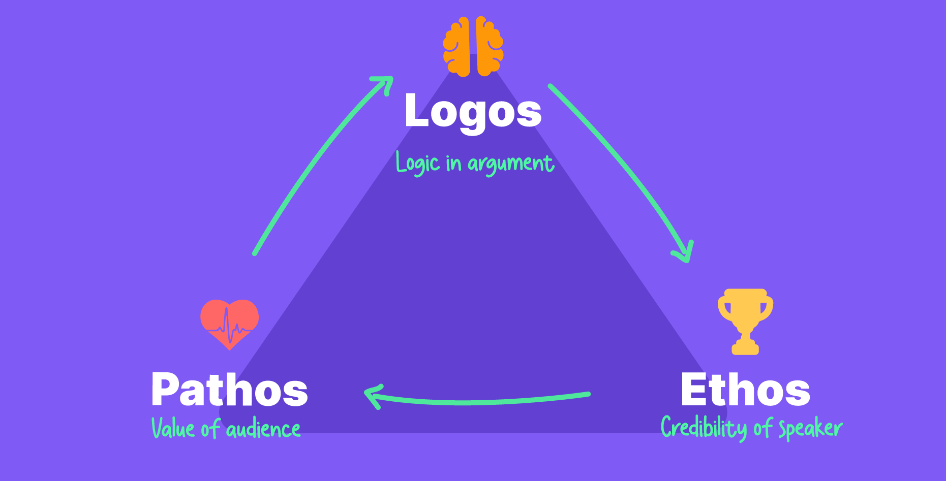
Long before persuasive presentations or sales decks, Aristotle identified a classic, unchanging formula that would forever influence all powerful communication. The three modes of persuasion—ethos, pathos, and logos—were first outlined in his Rhetoric in the 4th century BCE, yet still remain as influential today.

While business strategies and technologies have evolved, human psychology hasn’t. We still connect through emotion and need reason to make our decisions. That’s why Aristotle’s framework continues to be timeless in how it influences leaders to take action and presenters to turn information into conviction.

In this article, we’ll be exploring Aristotle’s modes of persuasion and how we can tap into them to apply them to persuasive presentations.

Why Aristotle?  

Virtually no speech or presentation doesn’t follow Aristotle’s formula; they just get buried beneath the bullet points and graphics. But at their core, you find that each persuasive presentation tends to fall back on these basics.

Despite how old Aristotle’s modes of persuasion are, they survived for over a millennium for a reason. It’s because its core pillars of trust, logic, and emotion are all a fundamental part of human nature and play a significant role in how people make decisions. When these three elements all work together, it distinguishes a truly persuasive presentation from a merely informative one.

So, what really are Aristotle’s modes of persuasion? And what do they look like in a presentation?

Ethos: Building Trust

The ethos represents the “trust” factor, referring to the elements that reinforce your credibility or trustworthiness. Before anyone can take the leap and trust the speaker, they will need to know why you’re qualified to work with them. The ethos is established with your reputation and track record, influencing how your audience perceives you before you even speak.

Things like your professional accomplishments, endorsements, educational background, case studies, and previous products all build your ethos.

Reinforcing Ethos

To demonstrate your ethos within a presentation, you can include and showcase:

  • Your expertise and deep knowledge about the topic
  • Relevant examples or case studies that reveal your experience
  • Honesty regarding your obstacles or limitations
  • Preparedness in answering challenging questions
  • Professionalism through presentation design and consistency

Audiences can easily pick up when someone is being inauthentic, so avoid undermining your ethos with simple mistakes in slide design or making bold claims you cannot back up.

Pathos: The Emotional Factor

Pathos refers to the emotional appeal developed through stories, metaphors, engaging imagery, and relatable experiences. Aristotle understood that much of decision-making is driven by emotion, rather than rationality. People then use logic to justify the choices they made emotionally.

Facts alone don’t do much to persuade; it’s important to develop that emotional connection first. In the end, it’s the emotional resonance that pushes people to take action.

Building the emotional connection

Stories are the primary foolproof method for getting an audience to be emotionally engaged in what you’re saying. They help the audience live the experience, rather than just absorb information passively. To build a resonant story, try to include:

  • Realistic characters that feel familiar
  • Building tension from relatable challenges
  • Specific details that help audiences visualize the setting
  • Universal themes that surpass one’s individual circumstance
  • A climax that shows a transformational moment

The key is choosing stories that your specific audience can relate to. A story about startup struggles might resonate with entrepreneurs but alienate corporate executives who face different challenges.

Logos: The Right Brain

Logos is all about the numbers. The data, evidence, reasoning, numbers, and structured arguments that back up your ideas. As we mentioned earlier, emotion drives decisions, but logic is needed to justify those decisions. It’s important to note that data dumps do not qualify as logical appeal. Logos isn’t the numbers and statistics; it’s the structured reasoning that helps audiences to reach the conclusions themselves.

Building your argument

Numbers and statistics become persuasive when audiences actually understand their significance. To inspire action, build the context around the facts to make the interpretation easier for listeners.

To package data within a logical structure, think about:

  • Comparing figures to benchmarks from previous examples or competitors
  • Showing trends rather than a single data point
  • Showcase the cause-and-effect relationship between issues
  • Giving the implications of the findings
  • Connecting the numbers to outcomes or impact

The goal of logos is to help the audience properly grasp your information, so it’s important to frame it well and ground it in context to give it power.

Aristole modes of persuasion for persuasive presentations

Integrating the Ethos, Pathos, and Logos

The strongest persuasive presentations blend the ethos, pathos, and logos into one cohesive narrative. This helps balance the information with influence. To effectively incorporate all three elements, consider the following structure.

Opening (Ethos + Pathos):

To start, begin by both establishing credibility and creating an emotional connection. Share a story that sets the scene and is also grounded in your expertise to build trust. This primes your audience to listen up to what you have to say.

Body (Logos + Pathos):

Then, dive into the meat of your presentation by presenting your logical reasoning. Support your ideas with data, examples, and stories that connect abstract ideas to concrete examples. Facts show clarity, while emotion makes them memorable. Address any doubts with both reason and empathy.

Conclusion (All Three):

Close your presentation by blending all three elements in your conclusion. Reinforce your credibility with examples (ethos), inspire with vision (pathos), and end with a clear takeaway that your audience can act on (logos).

Balancing the Elements 

When integrating the three modes of persuasion in a presentation, make sure to keep in mind the appropriate balance for your audience. Different settings call for different emphases.

For example, a data-driven audience, such as analysts or engineers, responds best to a logos-driven presentation. They are looking for evidence and airtight logic. But even then, they still engage better when the information is backed with credibility (ethos), and a touch of emotion (pathos) helps highlight why it matters.

But for relationship-focused audiences like sales teams or HR, they are driven more by pathos and ethos. They value authenticity, connection, and trust, though they still need a logical thread to give their decisions structure.

As for executives, it’s best to use a balanced approach. Since their time is limited, they need credible insights delivered with emotional clarity and supported by sound reasoning.

Over-relying on one pillar has its pitfalls. Too much data makes your presentation too dry, while too much emotion can feel manipulative, or too much self-focus can come off as arrogant. So it’s important to consider a balanced approach that weaves all three pillars seamlessly.

Every persuasive presentation rests on three timeless pillars: trust, emotion, and logic. These principles continue to form an unchanging foundation for influential communication, no matter how much we’ve evolved.

Now, things like design, storytelling, and data visualization help presenters bring these ancient principles to life. While the tools have changed, the art of persuasion hasn’t.

Information design for real impact in the GCC

Key Ideas

  • Strategic information design translates national visions into clear, compelling narratives that drive alignment and action.
  • Tailored communication for diverse stakeholders ensures that information resonates with everyone.
  • Data visualization simplifies intricate details, making performance and progress easily understandable and actionable.
  • Stakeholder buy-in is achieved through persuasive visuals and clear storytelling, motivating engagement and participation.
  • Long-term engagement with national visions requires ongoing, transparent communication that adapts to changes and sustains momentum.

Information design plays a huge role in communicating national visions in the GCC, such as Saudi Vision 2030, UAE Vision 2071, and Qatar National Vision 2030. These represent some of the world’s most ambitious transformation agendas that aim to diversify economies, foster innovation, and build sustainable societies. However, these plans are naturally complex, including multiple pillars, hundreds of initiatives, and long-term, abstract goals. 

The challenge of communicating ambitious GCC visions

Communicating these blueprints effectively to diverse stakeholders, ranging from high-level officials to project managers, investors, and the general public, poses significant challenges:

Overwhelming scale & complexity

These visions involve many interconnected programs across all sectors. The sheer volume and complexity make it difficult for stakeholders to see the big picture, understand dependencies, or grasp their specific role and how it contributes to the whole. This can lead to confusion and disconnected thinking.

Diverse audiences

Stakeholders range from government leaders and investors to project managers and the public, each needing different information presented to them in a relevant way. Generic communication fails to engage or properly inform these different groups with distinct needs and levels of understanding.

Long-term engagement

Spanning decades, these visions require continuous communication to maintain momentum, adapt to change, and keep stakeholders aligned. Initial enthusiasm can fade, and staff changes necessitate ongoing efforts to reinforce the goals, report progress clearly, and avoid “vision fatigue.”

Technical jargon & abstraction

Official strategy documents use dense, technical language and abstract concepts (e.g., “ecosystem development” and “enhancing competitiveness”). This makes them inaccessible to many, hindering the translation of strategy into practical understanding and action for non-specialists.

Risk of misalignment

Without a clear, shared understanding from effective communication, efforts can become fragmented. Agencies might repeat work, projects may not align with strategic goals, and resources can be wasted, ultimately slowing down progress toward the national vision.

Infoformation design

Strategic Information Design: Turning complexity into clarity

Strategic information and presentation design are the critical enablers that transform complex national visions into clear, compelling narratives that drive alignment and action. This goes far beyond aesthetics; it is about shaping understanding and facilitating execution.

Breaking down complexity

Expert information design uses visual hierarchy and intuitive visual metaphors to break down intricate plans into digestible, actionable components. This helps stakeholders grasp both the big picture and their specific contributions without feeling overwhelmed.

Tailored narratives

Strategic design creates audience-specific visual stories—executive dashboards for leadership, detailed roadmaps for project teams, infographics for public engagement, and persuasive visuals for investors.

Visual storytelling

Moving beyond static slides, visual storytelling explains the vision’s “why,” “what,” and “how,” fostering a deeper understanding and emotional connection.

Data visualization

Transforming raw data and KPIs into insightful visuals highlights trends, tracks progress, and allows for better decision-making, making performance updates transparent and actionable.

Alignment tools

Visual models such as strategy maps and ecosystem diagrams create a common language, letting ministries, departments, and partners all be on the same page and rally around shared goals.

The measurable impact of data visualization

Strategic information and presentation design bring out the full potential of GCC visions by delivering tangible benefits. Firstly, data visualization drives alignment, ensuring that all parties understand what’s expected of them and allowing for smooth synergy and faster results. Secondly, it secures stakeholder buy-in through compelling communication that highlights the overall value and motivates participation. Thirdly, it translates strategy into clear action plans, enabling effective implementation on the ground. Also, visualizing progress against key metrics boosts transparency and accountability, fostering trust. The resulting clarity and professionalism help build critical confidence among citizens, investors, and global partners in the vision.

Beyond Slides: The imperative of expert partnership

Bringing grand national visions to life demands more than compelling presentation slides or infographics; it requires strategic visualization. This means expertly weaving together strategic insight, complex information architecture, stakeholder understanding, and the persuasive power of visual communication. Such capabilities are often best executed through specialized partners—information design experts who act as translators, turning tricky blueprints into shared realities that inspire action.

The success of GCC national visions depends on the quality of the strategies themselves and also on the ability to communicate them well. Strategic information and presentation design are the keys to understanding, fostering alignment, and enabling action across the complicated stakeholder landscape. By transforming abstract blueprints into compelling and actionable narratives, information design shows the path forward, helping turn visionary goals into tangible realities for the entire region.

What makes a presentation design agency different

Key Ideas:

  • Presentation design is about storytelling—it transforms complex ideas into clear, engaging messages that drive action.
  • Clients need clarity, not just attractive slides—the goal is to simplify information and align it with business objectives.
  • A presentation design agency focuses on strategy—it blends storytelling, design, and data to make presentations persuasive and impactful.
  • Choose a design partner that adds value—look for agencies that challenge your content and align design with your business goals.

A presentation design agency can either focus on delivering basic slides or create a transformative experience. Many agencies rely on templates, offering visually consistent slides that can feel generic. Others focus on sleek, polished designs but lack the strategic alignment needed to make a true impact.

The most effective presentations go beyond design; instead, they tell a story that reframes the client’s problem, connects data to business strategy, and aligns every chart and word with the overall goal. This approach ensures that the content drives action once it resonates with the audience.

What clients really need

Clients rarely need “pretty slides.” What they really need is clarity. They need their complex strategies turned into something a board member understands in two minutes. They need a sales team armed with decks that make clients nod instead of yawn.

CEOs walk into high-stakes investor meetings carrying decks full of raw PowerPoint templates. They looked “designed,” but the story was buried, leaving the investors confused. Now, compare that with a deck informed by the knowledge and experience of a presentation design agency, and suddenly, the same information sparks confidence and serious interest.

Beyond pretty slides

While visual appeal does matter, presentation design agencies tend to look far beyond the visuals. A deck can look beautiful and still fail completely if it lacks substance. Instead, they link design with functionality, combining narrative, data visualization, and functional design to share ideas in a way that is clear and engaging. 

Agencies help you spot the blind spots, such as:

  • Highlighting the true story and objectives, blocking out the noise

  • Align design choices with business strategy

  • Build narrative arcs that make sense to a skeptical audience

  • Design visuals that clarify, not just beautify

Instead of compliments, powerful slides get results, which is what clients actually need.

Agencies vs template providers

It’s easy to confuse a template provider with a strategic presentation design agency. While both offer solutions for creating slides, the approach and outcome are quite different. Here’s how to view the two:

Provider TypeWhat You GetThe ChallengeThe Result
Template ServicesPre-designed slide layouts, plug-and-play designsGeneric, one-size-fits-all approachFast delivery but lacks impact or alignment
Presentation Design AgencyTailored storytelling, strategy-driven design, alignment with business goalsRequires more discovery and collaboration upfrontEngaging, memorable, and strategically aligned presentations that drive action

When choosing between templates and a strategic approach, it’s important to consider your goals. Template services offer speed and simplicity, but they tend to lack the personalization and strategic direction needed to make a lasting impact. A presentation design agency goes beyond aesthetics by aligning design with business objectives, ensuring that the content doesn’t just look good but also works to engage, persuade, and influence decisions.

If your focus is on simply creating slides, templates can be a quick solution. But if you want to ensure that your presentation drives meaningful results, a strategic agency is the better choice.

The value of a presentation design agency

Value creation in presentation design comes from solving business problems, not just formatting slides. Here’s how we think about it:

  • For sales teams: Turning decks into conversion machines by simplifying complex offers

  • For executives: Equipping leaders with clarity and confidence for boardrooms and media appearances

  • For consultants: Turning dense analysis into digestible insights that drive action

  • For government clients: Communicating strategies to diverse audiences in a way that inspires trust

That’s where the ROI comes from.

The importance of building relationships

Most people overlook this, but the best presentation design agencies don’t just deliver a deck and walk away. They build long-term relationships.

We’ve had clients come back again and again—not because they couldn’t design internally, but because they trusted us to think like partners. Knowing their brand, their strategy, and their pain points meant that we could anticipate what they needed before they asked.

Presentation design process

What should you look for in an agency? 

When selecting a presentation design agency, it’s important to know what to look for to ensure you’re getting the right support. Here’s a simple checklist to help guide your decision:

  • They ask thoughtful questions about your goals, not just about colors.

  • They’ll challenge your content if it feels unclear or lacking direction.

  • They offer frameworks for creating a narrative, not just design templates.

  • They focus on measuring success based on business outcomes, rather than just visual appeal.

  • They view presentation design as part of a broader communication strategy, not just a standalone service.

If you’re not seeing these qualities, it may be a sign to reassess whether the agency aligns with your needs. You want to work with a team that’s truly focused on delivering value and helping you achieve your goals.

Choosing your design partner

Here’s our advice if you’re evaluating a presentation design agency:

  • Ask them how they approach storytelling, not just design.

  • Request examples of decks that created measurable outcomes, not just nice visuals.

  • Check if they understand your industry—great design means nothing if it ignores context.

  • Look for a process that includes discovery, iteration, and testing.

And maybe the most important question: Will this partner help me win?

At the end of the day, presentation design isn’t about slides. It’s about clarity, persuasion, and business transformation. Presentation design companies understand that; they know presentation design services are not just decoration—they’re strategic tools.

When you’re choosing a partner, don’t look for templates. Look for transformation.

Persuasive presentation design that turns slides into stories

Key Ideas

  • Psychological principles are at the heart of persuasive presentation design.  Understanding cognitive biases, emotional triggers, and how audiences process visuals can drastically improve your slide’s effectiveness.
  • Audience analysis should guide design decisions. Knowing your audience’s needs, mindset, and preferences allows you to tailor the message for maximum impact.
  • Decision-making is influenced by structure, contrast, and clarity. The right visual hierarchy and persuasive techniques can guide the audience toward your desired conclusion.
  • Presentation specialists don’t just design slides. They apply a methodical process that blends psychology, storytelling, and design expertise to influence outcomes.

To understand visual persuasion, think of it like this: You could show a deck full of data and insights, but the audience’s brains just won’t process numbers. Instead, they absorb visual cues and emotional triggers and make snap judgments about the information’s credibility. 

Presentation design needs audience psychology just as much as the content itself. Every element you place on a slide, from color to typography to layout, sends signals that can subtly influence decisions. This isn’t magic—this is grounded in neuroscience and psychology.

For instance, did you know that people tend to trust visuals more than text? That’s because our brains process images 60,000 times faster than words. If you’re relying on dense paragraphs to convey complex ideas, you’re missing a golden opportunity to guide the audience’s thought process.

Expert vs amateur mindset

Effective presentation design in a professional context doesn’t need flashy transitions or images that are too out there. Embrace the mindset of an expert to build slides based on psychological principles that drive how an audience perceives and reacts to information.

Most people think that design is just about making things look pretty. But here’s the difference: Amateurs design for aesthetics; experts design for persuasion. The goal is not just to present information but to influence decisions and guide actions.

An amateur might choose a bright color because it’s “visually appealing,” but an expert will choose that color because it signals urgency or draws attention to key data, ultimately leading the audience to a specific conclusion.

Reading audience psychology

Audience psychology is about understanding what people feel and how they make decisions, not just about understanding what they see. This is key in presentations; emotions heavily influence cognitive processing. For example, we’re naturally more likely to be persuaded by data if we feel positive or excited about the visuals supporting it.

Examples of audience psychology in presentation design include: 

  • Decision fatigue is real. The more choices an audience is faced with, the harder it becomes for them to make a decision. That’s why a simplified design keeps your message sharp and without distractions.
  • The framing effect, how information is presented, can alter perceptions. Presenting a positive outcome first, followed by a risk, tends to make the negative seem more manageable.
  • Emotions are contagious. If your slides make your audience feel positive or excited, they’re more likely to be receptive to your message. This can be achieved through design elements that invoke feelings of clarity, trust, and credibility.

Techniques for influencing decision-making

When designing persuasive slides, it’s important to think about the underlying decision-making process of your audience. Here are a few key techniques to craft impactful slides:

  • Clarity first: Decision-makers don’t want to work hard to extract meaning from a slide. A clean design with a clear hierarchy makes it easy to absorb and act on the message.
  • Contrast for emphasis: Use contrast (color, size, positioning) to draw attention to the key takeaway. The function of contrast is to guide the viewer’s eyes to where the story matters.
  • Whitespace to breathe: Don’t overcrowd the slide. Whitespace isn’t “empty space”; it’s a tool to highlight importance and give the audience a chance to process what they’re seeing.
  • Story structure: Just like any good narrative, data stories need a beginning, middle, and end. When designing, think about how the story flows logically and emotionally. Guide the audience through the data, leading them to a clear conclusion.

For example, when designing a financial report for a client, focus first on the top-line metrics that define success (the “beginning”). Then, break down the contributing factors (the “middle”) and conclude with a call to action, or what decisions need to be made based on these findings (the “end”). This clear structure helps the audience make sense of the data and act accordingly.

Presentation design for storytelling

Applying specialist knowledge 

While presenting does involve showcasing data, presentation design specialists know how to incorporate visuals to influence decision-making. The expertise comes from applying knowledge of visual psychology to structure slides that do more than just display data.

Pie charts aren’t added because they look neat; they’re chosen for their function in displaying comparison segments. Similarly, icons and infographics are used to tell stories in a way that feels intuitive, not overwhelming.

The best part? These are all tools that can be learned and applied consistently. Here’s a checklist to make sure your design is grounded in psychological principles:

Psychology PrincipleHow to Apply It
The Primacy EffectPresent the most important information first.
Anchoring BiasSet a reference point (e.g., “This year’s revenue is up by 20% from last year’s benchmark”).
Contrast PrincipleUse contrasting colors or sizes to draw attention to key elements.
Cognitive Load TheoryKeep designs clean and simple—less is more.

The framework for persuasive slides

To make it more actionable, when designing persuasive slides, think of it like creating a framework for influence. This means using a structured approach that combines psychology with design elements.

Here’s a practical framework to follow when crafting persuasive slides:

  • State the issue clearly: Define the problem right away. The audience needs to understand the challenge.
  • Present the options: Show the different courses of action available, whether they’re financial options or strategic choices.
  • Justify the solution: This is where you use data to back up your claim. Use charts and visuals to make your argument.
  • End with a call to action: What do you want the audience to do next? Be clear and direct.

This simple framework helps you create slide decks that are persuasive and action-oriented.

Visual psychology principles for presentation design

The core of visual psychology in presentations lies in the balance between emotion and logic. People remember how something makes them feel, so using design to spark positive feelings can make a massive difference in decision-making.

Examples of visual principles used in presentation design: 

  • Colors: Different colors evoke different emotions. For example, blue is often associated with trust, while red signals urgency or excitement. Use this knowledge strategically.
  • Typography: Your font choices matter. Sans-serif fonts tend to be more modern and approachable, while serif fonts can evoke a sense of professionalism and tradition.
  • Shapes and lines: Rounded shapes tend to feel friendly and approachable, while sharp angles can make a design feel more aggressive.

Putting these elements together, you’re creating an experience that speaks to both the audience’s emotions and logic.

The art of persuasive presentation design lies in understanding how your audience processes information. It’s about designing slides that guide decision-makers toward your desired outcome without them even realizing it.

The next time you start designing, ask yourself: How can I use design to influence decisions here? When you answer that question, you’ll be crafting an intentional, persuasive narrative through which you push for your ideas.

Developing an interactive presentation

Key Ideas: 

  • The goal of interactivity in a presentation is to make the audience feel engaged in a conversation and make discovery more interesting.
  • Non-linear design still requires structured approaches like hub-and-spoke menus, layered depth, and role-based journeys that respect audience time while tailoring the experience.
  • Audience psychology drives engagement; things like predictability, reward, and rhythm matter more than the tools used.
  • Strong foundations win. Clarity, consistency, accessibility, and testing are what make interactive presentations professional and impactful.

Watching an audience take control of an interactive presentation for the first time says a lot. At first, there’s hesitation, like navigating an unfamiliar rental car. Then there’s the curiosity, followed by the moment of excitement when the realization hits: this is working—the audience is responding to the content. That simple shift reveals something important. Interactivity isn’t about flashy visuals or overly complex pathways. It’s about creating a sense of control and discovery.

That’s why some interactive decks energize a room while others collapse under their own weight. The difference lies in the methods used, including the practical processes, design psychology, and the small decisions that shape how people experience the presentation.

What makes an interactive presentation feel professional

When people ask how to create an interactive presentation, they usually expect a list of software or plugins. But here’s the thing: a proper interactive presentation starts with the mindset, not tools. You need to treat the presentation like a product, not a slideshow. That helps you think about the user journey, friction points, and what kind of choices make sense for your audience.

A linear slide deck is like a speech. An interactive one is like a conversation. That shift changes everything about how you design and deliver it.

Non-linear presentation design

Non-linear doesn’t mean chaotic. It means structured flexibility, where every path is carefully curated to get you to the right message.

Here’s how you can think about it:

  • Hub and spoke: There’s a central menu, and each section branches out, but you always come back home.
  • Layered depth: The core slides are short and sharp, but you can click for more data, examples, or visuals.
  • Role-based journeys: Different audience members (for example, executives vs. analysts) can click into the level of detail that matters to them.

Done right, nonlinear presentation design respects people’s time and attention.

Have an audience engagement strategy

Most interactive presentations fail because they neglect the basics of audience psychology. Although people love control, they hate confusion. They want the thrill of clicking, but they don’t want to work hard to figure out where to go.

So to balance freedom and guidance, focus on three key principles:


Key PrincipleWhat It MeansPractical Example
PredictabilityInteractive elements must behave the way audiences expect.A “Home” button that always brings users back to the main menu.
RewardEvery click should reveal something meaningful or valuable.A data point, visual, or stat revealed when exploring a new section.
RhythmAlternate between giving choice and guiding direction.Let the audience choose a case study to view, then return to a guided narrative.

Using design psychology

If you’ve ever used a poorly designed app, then you’re familiar with how frustration can interfere with any curiosity you might have initially felt. The same thing applies to interactive presentations. Applying design psychology and presentation storytelling is about creating frictionless paths and little dopamine hits along the way.

Here are some practical principles:

  • Split information into bite-sized slides that reveal progressively.
  • Use contrast to signal choices (buttons that look like buttons, distinct menus).
  • Anchor the story with visual cues so people never feel lost.

For example, a training module could have users “unlock” case studies by answering short scenario questions. Simple, but it helps transform passive reading into active engagement. 

Interactive slides

Making presentation technology work for you

There’s always a temptation to chase the newest tech. Prezi, HTML5, and embedded microsites inside PowerPoint. But, we iterate: the tool is secondary. If the story or structure is weak, no tool will save it.

With that being said, tech choices do matter. When selecting platforms, make sure to look at:

  • Ease of navigation for presenters and audiences
  • Device compatibility (desktop, tablet, mobile, offline)
  • Design freedom (can it support custom visuals, animations, branding)
  • Sustainability (will the client actually be able to maintain and update it)

Pick the one that balances your story needs with practical delivery.

Testing the experience

Unfortunately, no matter how excited you are, playing around with new tools or platforms will always require a learning curve. Links misfire. Animations lag. Buttons overlap. To be safe, test, test, test. 

The way to handle it professionally is by testing early and often. First with the internal team, then with a small external group. Refine after each round until the experience feels invisible, especially since the best interactivity is the kind people barely notice.

The backbone of any interactive presentation

So what’s the standard? It comes down to this:

  • Clarity over complexity
  • Consistency across every interaction
  • Accessibility so it works for every audience, every device
  • Maintainability so the client isn’t locked into something they can’t update

Think of it like building codes. Nobody cares about the wiring when the house looks good—but if the wiring is bad, the whole thing burns down.

Interactive presentations are exciting, no doubt. But they’re also tricky. The professionals who make them work aren’t the ones who cram in the most buttons or effects. They’re the ones who consider things like psychology and design pathways with care, test relentlessly, and pick technology that serves the story.

If you’re thinking of creating an interactive presentation, start with the story. Sketch the pathways. Then worry about design and tech. Create something memorable, not just clickable.

The psychology behind your presentation color palette

Key Ideas:

  • Colors shape emotions, behaviors, and decision-making, not just aesthetics.
  • When creating a color palette, it’s important to consider the cultural context and brand alignment.
  • Balanced combinations and strategic use of primary, secondary, and accent colors keep presentations clear and persuasive.
  • Thoughtful color choices turn slides into stories that resonate and influence.

A presentation color palette serves a function much more important than aesthetics. Whether you’re aware of it or not, colors have a profound psychological impact on your audience. Colors can stir emotions, create a sense of urgency, or even calm nerves. Think about it: Have you ever noticed how you feel differently when looking at a bright red logo compared to a navy blue one? That’s color psychology at work.

If you’re designing presentations to influence decision-making or evoke specific responses, you need to think about your color palette strategically. Choosing the right colors can influence whether it falls flat or captivates, shaping how a presentation is received by stakeholders. 

The foundation for a presentation color palette 

You’ve probably heard that “color sets the tone,” and they’re right. But what does that actually mean for you as a designer? Well, since color can trigger certain emotional responses, it can affect how your audience processes the information you present.

Here’s an example. 

You’re preparing a presentation for a healthcare client. If you choose a bold, aggressive red as your primary color, the message could come across as alarming or confrontational. Green, however, is known for its association with health, tranquility, and renewal. So using soft, calming green instead, it’s far more aligned with the message you’re trying to convey. 

In short, color helps frame the way your content is received. So, before you dive into your color scheme for a presentation, think about the emotional response you want to evoke.

How colors impact behavior

You know how certain colors just “feel” different? That’s related to the neuroscience of color response. Different hues can trigger distinct physiological reactions. For example, red is often associated with urgency and can increase heart rate, which is suitable for calls to action or when you want your audience to feel energized or motivated. On the other hand, blue tends to have a calming effect and promotes trust, which is why it’s so commonly used in corporate presentations or tech-related industries.

Here’s a quick rundown of what colors often represent:

  • Red: Urgency, excitement, action, passion
  • Blue: Trust, professionalism, calmness, security
  • Yellow: Optimism, attention-grabbing, creativity
  • Green: Health, growth, balance, harmony
  • Purple: Creativity, luxury, sophistication
  • Orange: Energy, enthusiasm, friendliness

These are generalizations, of course, and the context always matters. But having a basic understanding helps you select a color palette for a presentation that aligns with your messaging and creates the right atmosphere.

Color psychology

Cultural color considerations 

When you’re working with global or multicultural audiences, don’t forget that colors can mean different things and are perceived differently across cultures. For instance, in Western cultures, white is often associated with purity and peace, while in some Asian cultures, it symbolizes mourning and death. Meanwhile, red can signify good fortune and celebration in China, but in other cultures, it may carry connotations of danger or anger.

So, when you’re developing your presentation color scheme, always keep in mind the cultural context of your audience. It isn’t about what looks good on screen; it’s about making sure the colors align with the cultural expectations and sensitivities of your viewers.

Keep it consistent with brand color integration

One thing that is commonly overlooked is brand consistency. Your color palette should never clash with your existing brand colors. After all, presentation design is a reflection of your brand identity. If the colors you use deviate too far from your core branding palette, you risk confusing your audience and undermining your professionalism.

Think about major companies: Coca-Cola’s red, Facebook’s blue, and McDonald’s yellow—these are essential elements of the brand identity. Similarly, when you’re designing for a client, integrating their brand colors into the color palette helps reinforce their brand and keeps everything aligned.

For example, if you’re designing a consulting pitch for a client whose brand colors are dark blue and gray, you could incorporate lighter shades of these colors for background elements and accents. This subtle approach maintains brand recognition without making a massive change to the brand’s identity.

The effect of color combinations 

Balance is key. You can’t just throw every color you like into your palette and hope it works out. The combination of colors should feel harmonious, not chaotic.

For example, if you’re using yellow, pair it with gray or blue to tone it down. Too much of one color can overwhelm your audience, but the balanced combination will keep them engaged and focused on your content.

Using a color strategy for decision-influencing palettes

To use color more purposefully, crafting a strategic color palette for your presentation can help guide your audience’s decision-making process.

Here’s a simple framework to keep in mind:

  • Primary Color: Pick one color that embodies your core message (e.g., red for urgency or blue for trust).
  • Secondary Colors: Use these to complement and support your primary color (e.g., yellow or gray to soften or energize the design).
  • Accent Colors: These should be used sparingly to highlight important points (e.g., green for callouts or highlights).
  • Background Color: Keep it neutral to make sure the content stands out (e.g., white or light gray).

Putting it all together

Color is one of the most powerful tools at your disposal when creating presentations. It’s powerful because it plays on psychology to influence the viewer’s emotions, behavior, and decisions—it’s not just about looking good.

Designers know that choosing the right color palette is bigger than making aesthetic choices; it involves a thoughtful process that aligns colors with your message, your audience, and your brand. Which is why it’s helpful to ask yourself about the type of emotional response you’re hoping to evoke, the decisions you want to influence, and how to reflect the story you’re trying to tell.

Pitch Like Steve Jobs: 4 Techniques to learn from

Steve Jobs knew how to persuade his audience, making every pitch and presentation seem effortless. And let’s face it, whether you’re pitching a product, presenting a new idea, or building a sales deck, you’re also in the business of persuasion. But becoming a persuasive speaker isn’t just for natural-born salespeople or charismatic leaders. Thanks to behavioral science, there are simple, proven methods that anyone can use to make their message more compelling. Today, we’re breaking down four of the most powerful persuasion techniques backed by science and famously used by Steve Jobs to transform your next pitch.

Labor Illusion: Show your work, boost your value

Ever notice how you appreciate a meal more when you see the chef preparing it? That’s the labor illusion in action. People value a product or idea more when they’re aware of the effort behind it. Jobs mastered this during his 1998 Apple keynote. At a time when Apple was struggling, Jobs rebuilt confidence by highlighting the long hours and dedication of his team: “You can see a lot of cars in the parking lots on nights and the weekends.” By pulling back the curtain on the hard work, he made Apple’s products feel more valuable and trustworthy.

How to use it:

In your next presentation, share the behind-the-scenes effort—the research, development, or iterations that went into your solution. This transparency increases trust and heightens the perceived value of your work.

Halo Effect: Brilliance by association

The halo effect is a cognitive shortcut: if we admire one thing, we’re more likely to view related things positively. Steve Jobs applied this technique in Apple’s iconic “Think Different” campaign, associating Apple with visionaries like Einstein and Gandhi. The positive glow from these figures rubbed off on the brand, making Apple seem more innovative and inspiring.

How to use it:

Associate your idea or product with respected brands, influencers, or even customer testimonials. For example, show logos of big clients or mention endorsements from well-known figures. This simple association can dramatically boost your brand’s credibility and appeal.

Anchoring: Frame first, then shape what follows 

Anchoring is the psychological principle rooted in how the first piece of information we see sets the reference point for everything that follows. Steve Jobs used this when launching the iPod, which was twice as expensive as competitors. Instead of focusing on the high price, he reframed the conversation around “price per song,” making the iPod seem like a better deal.

How to use it:

When presenting your offer, introduce a higher-priced option first or compare your solution to a more expensive alternative. This makes your actual offer seem more reasonable and attractive by comparison.

Recency Bias: Save the best for last

The last thing people hear is often the statement that sticks. Steve Jobs famously ended his keynotes with “one more thing” before revealing a final, exciting feature. This wasn’t just showmanship—it’s recency bias at work. The last message lingers longest in your audience’s mind.

How to use it:

End your pitch or presentation with your strongest argument, insight, or call to action. Recap the key points and save your most impactful message for the closing. This ensures your audience walks away remembering what matters most.

Bringing It All Together: Crafting a pitch like Steve Jobs

These four techniques—the labor illusion, halo effect, anchoring, and recency bias—aren’t about steering the audience in a certain direction. They’re about understanding fundamental aspects of human psychology and making communication much more effective within that framework. By showing your effort, using positive associations, and strategically framing information, you can make your message resonate more deeply.

Example of a pitch in action:

“After months of research and countless prototypes (labor illusion), we partnered with industry leaders and drew inspiration from Apple’s design philosophy (halo effect). While similar solutions cost over $10,000 (anchoring), our product is available for just $2,499. And here’s what matters most: with our tool, you’ll save time, reduce stress, and unlock new growth—starting today (recency bias).”

Each of these methods taps into deep-seated psychological biases. They don’t require manipulation or trickery, just a simple understanding of how people make decisions. Steve Jobs didn’t rely on luck or charisma alone; he systematically applied these principles to captivate audiences and drive action.

The best part? You don’t need to be a tech visionary to use them. With a little planning and practice, anyone can make their pitch more persuasive, memorable, and successful.

Which presentation software is best for you?

With so many presentation programs out there, how do you know which one to use? While PowerPoint might be the standard, other programs have interesting features and perks that make them hard to miss. Depending on your goals, each option can have features that can impact how you want to present your message.

Today, the most popular presentation softwares are PowerPoint, Apple Keynote, Google Slides, and Prezi. In this guide, we’ll be breaking down the pros and cons of each program to help you determine which one works best for your needs.

Microsoft PowerPoint

Microsoft PowerPoint

PowerPoint is most people’s staple for creating presentations, and for good reason. It’s the oldest software on this list, which also means that Microsoft has had a lot of time to improve and update it. Plus, its software integrates well with the other Microsoft Office Suite products. 

Pros

It’s user-friendly

The software is easy to use for both professional designers and beginners; even those with little background can quickly learn and create a good-looking slide deck. 

Variety of templates

PowerPoint has a wide range of ready-to-use themes and templates, which makes it easy for those without design experience to put together an aesthetically pleasing slide deck.

Easy to edit

Making quick changes and alterations on PowerPoint is straightforward and uncomplicated, saving users time.

It’s helpful for presenters

PowerPoint is designed to work with the presenter as they speak; features like Speaker Coach help presenters prepare by helping them rehearse and providing feedback.

Cons

Too many features

Though there are many features and extra extensions in PowerPoint that are helpful, they can easily become overwhelming and distracting, especially for beginners. 

Advanced features need a subscription

Another disadvantage of PowerPoint is the cost of the Microsoft 365 Office Suite, which can be a barrier for many. Plus, having an Office Suite subscription comes with features and storage space that aren’t available if you were to purchase the software on its own. 

Apple Keynote

Apple’s Keynote

Keynote is Apple’s presentation software, only supported by Apple products, which is why many don’t use it. However, its basic features are functional and customizable, with a useful “comments” system.

Pros

It’s easy to use

Just like any other Apple product, Keynote’s layout is straightforward and easy to navigate, making it a smooth experience for all users.

Seamless multimedia integration

Keynote is designed to naturally integrate multimedia, so elements like sounds, videos, and images are easy to add in and remain high-quality.

Animation features

The program’s animation and transition effects are captivating, adding a magical and unique element to the presentation.

Cons

Limited compatibility 

Keynote can only be used on Apple products, meaning that they aren’t compatible with Microsoft or any other software. Although Keynote slides can be exported into PowerPoint, the layout will change. 

Lack of resources and support

The community of Keynote users is small, meaning there aren’t as many resources and support available for them as there are for Microsoft.

Google Slides

Google Slides

Other than PowerPoint, Google Slides is the most popular software on this list, mostly thanks to its accessibility. It is available to anyone with a Gmail account since it is included in Google Workspace. It’s known for its real-time collaborative features that let multiple people share and edit slides at the same time, and it is also the easiest program in this list to use. 

Pros

Accessibility and collaboration

As a cloud-based tool, Google Slides can be accessed from any device with access to the Internet. Plus, it allows several users to work simultaneously, making it the ideal option for collaboration and team projects.

Integration with other tools

Google Slides integrates with the other Google Workspace applications, including Google Docs, Google Sheets, Google Drive, and more, which makes it easy to weave in content from other resources into your slides.

Cost-free and available

Google Slides is free for anyone with a Gmail account, making it a reasonable and tempting option for smaller businesses or individuals. Especially since it is accessible on multiple devices with Internet access, such as smartphones, laptops, and tablets.

Cons

Limited offline functionality

One drawback is that Google Slides has limited accessibility when not connected to the internet, which makes it an inconvenience in case of poor connection or when working in a different environment.

Fewer template options

Although Google Slides does have premade templates and themes, it has a limited variety. Tools like PowerPoint and Keynote have more layout and customization options.

Prezi

Prezi

Prezi is presentation software known for its zoom navigation and unique approach to “slide” design. The idea is that all the sections are connected, and the presenter can smoothly navigate between them. Though it sounds complex, it offers a fresh way to share ideas and stand out, especially since there are many templates that users can utilize.

Pros

Unique presenting format

Prezi’s signature zoom and overview features offer an unconventional approach to storytelling, making it a perfect choice for those looking for a fresh alternative to traditional slide decks.

Integration support

Another advantage of Prezi is the long list of apps it can be integrated into, including Slack, Zoom, and Google Meet, which make it easier to present Prezi projects. 

Cloud-based

Since it’s cloud-based, you don’t need to rely on a USB or hard drive to bring to your presentation. You only need to have Internet access and a computer you can log in to.

Cons

Tricky to work with

Whether you’re a beginner or have experience with different presentation tools, Prezi can be a tricky platform to navigate. It can take some time to figure out how to use it and make the most of its features. 

Not ideal for heavy slides

When there’s a lot of movement going on, Prezi might not be ideal for more content-heavy slides. This format makes it hard for the audience to follow along since it can feel like it lacks structure. 

So, which one should you choose?

In summary:

Choose PowerPoint if you want a versatile tool with extensive multimedia features and custom animations for large, professional decks.

Choose Keynote if you want to create clean, minimal designs that easily integrate with Apple products. 

Choose Google Slides if you want a collaborative workflow with your team, accessibility, and easy cloud-based access.

Choose Prezi if you want to shake things up with unconventional slides and add a dynamic element to your slides.

Choosing the right presentation software will depend on our flow, needs, and goals. While PowerPoint remains the standard, Keynote is a sleek option for Apple users, Google Slides helps teams collaborate, and Prezi offers an original flow for those who want to break tradition. Each tool has its strengths and weaknesses, so it’s up to you to determine which program will enhance your message. Plus, at the end of the day, it’s less about the tool itself and more about how you use it. At Prezlab, we specialize in creating and uplifting presentations so they can bring out the best in your content. To learn more, you can reach out to our team right here!

3 Data storytelling frameworks used by creative strategists

In a presentation, great ideas aren’t enough on their own. However, giving them life with storytelling makes all the difference. Whether you’re explaining a complex strategy, pitching to a client, or shaping a campaign, a well-done story can transform your message, making it more memorable and persuasive. 

This blog unpacks three proven storytelling frameworks often used by creative strategists and consultants to bring clarity to their ideas and purpose to their presentations. Beyond frameworks, they’re also used as thinking tools that can sharpen your narrative and help your message leave a real impact. 

The SCQA Method: Storytelling for Consultants

SCQA stands for: Situation, Complication, Question, and Answer. It’s a go-to storytelling method for consultants at firms like McKinsey, and for good reason. It helps turn scattered thinking into a clear, logical story. The reason why it’s such a staple is simple: it mirrors the natural way our brain processes information; we first need context, then a problem, then a question, and a solution. Instead of burying the lead, SCQA forces you to structure your thinking from the start, guiding your audience toward your conclusion. 

Here’s how it works:

  • Situation – Set the stage. Where are we now?
  • Complication – Introduce the tension. What’s the challenge or shift?
  • Question – Ask the strategic question your story will answer.
  • Answer – Provide the solution. Resolve the tension.

Here’s an example of how to use the SCQA framework:

Let’s say a company’s retail division has grown 8% annually over the past five years. 

However, new competitors are now changing preferences that have slowed and stabilized this growth.

Now, how can we regain momentum in a competitive market? 

We can redefine our customer engagement strategy by prioritizing personalization in our content on our social channels. 

Why we love it:
SCQA helps simplify complex decks and clarify messaging. This framework is especially helpful in high-stakes settings like pitches, reports, strategic recommendations, or executive presentations, where clarity and logic are prioritized. 

Simon Sinek’s Golden Circle: Start with Why

Popularized by Simon Sinek, the Golden Circle is about getting to the emotional core of your message and connecting with your audience before you even talk about your solution. You do that by starting not with what you do, but with why you do it. This storytelling approach taps into your message’s emotional core, creating a deeper connection with your audience. Starting with “why” shows people what drives you and why they should care. It’s an inside-out method that builds trust and inspires action. 

The structure:

  • Why – What’s your purpose or belief?
  • How – What’s your approach or differentiator?
  • What – What product or solution do you offer?

A perfect example of the Golden Circle is often used in Apple’s presentations: 

Why – We believe creativity unlocks human potential.
How – We design intuitive, user-first experiences.
What – We make smartphones, laptops, and creative tools.

Why we love it:
This framework brings depth and meaning to presentations. It can help brands define their narrative visually, and when done right, it leaves an impact on their entire presentation, from tone and layout to the structure of their pitch.

Monroe’s Motivated Sequence: From Emotion to Action

Less known but highly effective, Monroe’s Motivated Sequence is a five-step structure designed to maximize persuasion, especially when your goal is action. Unlike traditional presentation formats that focus on informing the audience, this method is rooted in the psychology of persuasion, encouraging the audience to make active decisions. It’s especially powerful to use for storytelling in campaigns and pitching where the goal is to motivate the audience.

The five phases:

  • Attention – Start with a hook: stats, stories, or visuals.
  • Need – Introduce the problem and its emotional weight.
  • Satisfaction – Offer a clear solution and how it works.
  • Visualization – Help the audience see the outcomes, good and bad.
  • Action – End with a direct ask: what should they do next?

An example of Monroe’s Motivated Sequence:

By 2050, there could be more plastic in the ocean than fish. 

11 million tons of plastic enter the oceans every year, harming wildlife and ecosystems. 

If every household began using reusables, we could dramatically reduce plastic waste. 

Imagine a clean beach where turtles nest in peace. And now imagine it littered with plastic. 

Start today with small actions: bringing a reusable bag, avoiding plastic straws, and sharing the message. 

Why we love it:
This is our go-to for emotional storytelling. It is ideal for awareness campaigns and presentations where the goal is to move people to take a certain action, not just inform them.

Final Thoughts

At the end of the day, the most powerful presentations persuade and drive action. These three storytelling frameworks help you think through your ideas and data to clarify your message, create a structure your audience can follow, and develop more intentional stories. 

Best used as pathways, you can start with one that fits your goal, experiment, and then you can make it your own. Need more help? You can reach out to Prezlab, and we can help you arrange your ideas and communicate them better for a stronger and long-lasting impact. 

Transparency by Design: Building public trust in the GCC

Across the Gulf Cooperation Council (GCC), national strategies and public expectations are landing on a common goal: transparency, accountability, and citizen engagement. While governments regularly release information on performance data, budgets, and policy updates, these materials are often too dense and technical for the average citizen. This results in a gap between information availability and genuine transparency. The solution lies in principled information design that simplifies content into clear and accessible communications that foster understanding and trust.

The link between transparency and public trust

Transparent and inclusive communication is essential for building public trust, promoting accountability, and fostering a thriving society. When governments communicate clearly and openly, they reduce suspicion, demonstrate accountability, empower citizens, and invite participation. However, when the information released is not understood, it can undermine trust, as it may be perceived as muddling rather than genuine openness.

Value of public trust and transparency

Information design principles for building public trust

Incorporating information design principles transforms governmental communications from mere presentations into foundational practices for transparency, accountability, and responsiveness. Prioritizing how information is structured and presented empowers citizens and cultivates trust.

  • Clarity & Simplicity: Make information easy to grasp by using plain language, logical structure, and clean design. Translating complexity shows respect, reduces suspicion, and builds foundational trust.
  • Accessibility: Ensure everyone, including those with disabilities or differing literacy/language needs, can access information through standards like WCAG and alternative formats. This commitment to inclusivity is vital for trust.
  • Data Visualization: Transform complex data (budgets, performance metrics) into understandable visuals (charts, maps). This empowers citizens to see trends and hold institutions accountable transparently.
  • Hierarchy & Navigation: Make information easy to find through clear structure, headings, and search functions. Effortless navigation signals competence and respect for the user’s time, reinforcing trust.
  • Contextualization: Provide necessary background and explanation to prevent misinterpretation of data. Answering the “so what?” demonstrates a commitment to genuine understanding, not just data dumping.
  • Consistency: Maintain a unified visual identity and voice across all communications. This displays professionalism, builds recognition, and reinforces the credibility and reliability of government information.

By embedding these principles, governments can create communications that not only inform but also actively build a stronger, more trusting relationship with the public they serve.

Where can you apply transparency design principles in government outputs?

Implementing a design-focused approach to government communications is proving to be effective globally. For instance, in the GCC, governments are pairing digital transformation efforts with clear information design, using tools like public dashboards to enhance transparency, improve service delivery, and bolster their international standing. Design-driven approaches can be found across many mediums, including: 

Annual reports/performance data

Instead of dense tables, design transforms annual reports using interactive online dashboards. These allow citizens to scan over performance data and trends. Clear narrative summaries can also highlight key achievements and challenges in plain language, making complex performance information truly accessible.

Budget summaries

Design makes complex government budgets understandable. Engaging infographics can visually break down revenue sources and spending categories using charts and icons. Simple, readable guides explain financial information in everyday terms, debunking misunderstandings about finance and allowing for informed discussion.

Policy explainers

Design clarifies new laws or government initiatives that might otherwise be confusing. Simple flowcharts can illustrate new processes, FAQs can directly answer common questions, and visual summaries provide quick, easy-to-grasp overviews of a policy’s key points and impacts.

Public service information

Applying design principles to public services focuses on the user experience. This means creating clear, step-by-step instructions, simplifying application forms (both digital and print), and ensuring government websites have intuitive navigation to help citizens easily find information and access essential services.

Designing trust in action — MOHAP’s “Back to Work” campaign

An example of transparency being used in design can be found in our collaboration with the UAE Ministry of Health and Prevention (MOHAP).

When COVID-19 restrictions eased and workplaces were preparing to reopen, MOHAP faced a major communication challenge:

How do you clearly explain evolving health protocols to a diverse, multilingual public quickly and effectively?

Prezlab partnered with MOHAP to bridge this gap through strategic information design. Instead of overwhelming citizens with complex policy documents, we created:

  • Visual explainer videos summarizing key safety steps
  • Simplified, step-by-step guides for employees and employers
  • Bilingual content (Arabic and English) adapted to the UAE’s audience
  • Accessible, mobile-friendly layouts for wide digital dissemination

The impact:
Clear design helped citizens and businesses easily understand new workplace rules, improving compliance, reducing confusion, and strengthening public trust in the government’s pandemic response.

This project is a strong reminder that transparency isn’t just about publishing information—it’s about designing it for real-world understanding and action.

👉 View the full case study.

The tangible returns of clear communication

Strategic information design delivers measurable benefits beyond building trust, impacting both government operations and citizen interaction.

When complex topics are made accessible, it boosts citizen engagement and allows them to participate in more informed ways. Clear instructions and simplified processes remove barriers and make public services easier (and more widely) used. At the same time, professional communication demonstrates credibility, showcases transparency, and builds trust with the public. When information is easy to understand, it encourages productive public discourse. Most importantly, it also eases pressure on support staff by reducing confusion. Ultimately, clarity in public communication optimizes how the government functions for a smoother, more efficient way of serving people. 

Designing for clarity is designing for trust. Principled information design is not a luxury but a strategic necessity for modern, transparent governance in the GCC. As governments strive to meet rising expectations for openness and accountability, clear communication must be at the heart of their approach.

What about you? Is your public communication building trust? Learn more about how Prezlab helps government agencies design for transparency by getting in touch. You can also explore our portfolio of projects focused on creating accessible public-sector communication.

How corporate presentations shape business decisions

Corporate presentations are strategic assets that influence decisions and drive business growth. Yet, many presentations fail to interest audiences, leading to missed opportunities. So, how can companies and businesses guarantee that their message is clear and memorable? The answer is simple: professional presentation design. Strong visual storytelling makes ideas stick, helping businesses communicate better and more persuasively. In this blog, we’ll explore the importance and impact of a well-designed corporate presentation deck.

The value of professional corporate presentation design

In corporate settings, visual communication is vital for delivering clear and memorable messages. The purpose of a presentation is to share ideas that lead to action, whether for an investor pitch or to align internal teams. Polished slides are crucial to guarantee that complicated ideas are communicated effectively. According to research, humans receive visual information far more quickly than text; therefore, effective design is crucial for reiterating important points. Investing in presentation design is a strategic advantage rather than merely an aesthetic decision because, in a more high-stakes setting, it might mean the difference between a successful buy-in and losing an opportunity.

Why corporate presentation design matters

Clear communication is everything. A presentation is a powerful tool for persuasion since the way information is shared directly impacts how it’s received. More often than not, your presentation is the first touchpoint with stakeholders. Therefore, it is true that first impressions are crucial; a well-designed, expert layout instantly establishes your reputation and shapes how others will interpret your thoughts. Clean design and unified branding demonstrate your attention to detail, which increases the audience’s likelihood of trusting your material.

The goal of presentations is to deliver information in a way that people remember. Studies show that people only recall 20% of what they read but 80% of what they see, making slideshows and visuals an effective way to increase engagement. Big, complicated ideas can be simplified through thoughtful design, which engages viewers and keeps them interested.

The features of an effective corporate presentation

An impactful corporate presentation is meant to enhance communication and engagement. So, to guarantee effectiveness, presentations should follow the following design principles to help reinforce the message and guide the audience through the information.

Simplicity and clarity: Avoid unnecessary details and clutter by concentrating on a single, important point per slide.

Visual hierarchy: Organize the components on a slide and purposefully use spacing, contrast, and font to direct the audience’s attention throughout the content.

Consistent branding: Follow the brand identity while maintaining coherence and consistency with colors, typefaces, icons, and other visual components.

Data storytelling: To make the data and numbers easier for people to understand, present them using graphs, charts, infographics, and other visual aids.

Motion and animation: By adding a captivating aspect to the slides without detracting from the material, subtle animation can increase engagement.

Business advantage of corporate presentations

Using corporate PowerPoints to maximize impact

A corporate presentation must carefully combine aesthetics and substance in order to be both visually appealing and persuasive. The objective is to direct focus, improve clarity, and convey the main idea without overpowering the audience. To guarantee that the audience fully processes the information, this calls for clear layouts, purposeful images, and concise language. You can increase the impact of your corporate presentation in the following ways:

Know your audience

A corporate presentation that leaves an impact needs you to know who you’re talking to. For example, a pitch to investors requires data-driven storytelling, while internal company updates focus on fostering engagement. Another example is that executives typically prefer summaries, whereas clients want to examine case studies that highlight value. Tailoring the design and message to specific audiences ensures it is more relevant and persuasive to those you’re addressing. By aligning with the priorities and expectations of your audience, you maximize the presentation’s impact.

Leverage professional templates

A well-designed corporate presentation is rooted in consistency, and professional templates help achieve that. Custom-designed templates from professional presentation agencies can help ensure that each slide is consistent with your brand identity and tone to reinforce your credibility. Instead of wasting hours formatting slides manually, teams can focus on refining their content and strategy while still maintaining a polished, cohesive deck. Templates help standardize the fonts, layouts, and visual elements, making it easier for employees across all departments to create on-brand slides easily.

Use engaging storytelling techniques

The most impactful presentations always follow some sort of narrative, guiding the audience through key insights and building engagement and interest. Storytelling in presentations isn’t fluff; it’s persuasively structuring the information. A strong narrative organizes the ideas so that they are presented logically instead of as confusing and disconnected data points. Weaving the facts into a story by introducing the problem, building anticipation, and leading to a resolution makes the information easier for stakeholders to act on.

Use high-quality visuals

Using high-quality visuals is vital for a professional corporate presentation. Things like pixelated images, blurry graphs, or stretched graphics can instantly harm a presenter’s credibility, making even well-researched content appear untrustworthy. For sharp, professional slides, always use images with high resolution, vector-based icons, and brand-aligned graphics. Investing in custom-designed assets or stock images can ensure that each slide is compelling and visually appealing. In the world of corporate presentations, clarity means credibility; relevant, well-chosen visuals make a huge difference in how the audience perceives your slides.

The ROI of investing in corporate presentation design

Investing in professional presentation design is about investing in impact. A well-made slide deck helps stakeholders and decision-makers absorb information better, making it much easier to close deals, secure buy-ins, and get approvals. In a sales context, compelling visuals and storytelling can increase conversion rates by making pitches more engaging and memorable. The return on investment of great presentation design is endless: more effective pitches, better engagement, and many more factors that contribute to a business’s success.

A corporate presentation is more than a set of slides; it’s often the first encounter in a professional setting. To make the message resonate with audiences, a strong presentation design is needed to ensure clarity, build trust, and achieve objectives. At Prezlab, we specialize in turning ideas into strategic business assets to get real results. If you’re interested in elevating your corporate presentation, get in touch to make your message stand out.

What AI can’t do (and why that’s a good thing)

AI is transforming workflows, making processes faster and more efficient, yet when it comes to tasks that include storytelling and decision-making, it has its clear limitations. A great design or presentation isn’t just about how well the data is organized, although that does play a role. It’s about the story it tells and how it resonates with the audience, which requires nuance, emotional intelligence, and intuition, all of which AI notably lacks. However, that’s not necessarily a bad thing. In this blog, we want to discuss its limitations and how these push us to reconcile and hone our uniquely human skills for effective and memorable presentations.

Here’s what AI cannot do… 

AI is a powerful tool, but it lacks the little nuances that make communication truly effective. Although it can understand patterns, it doesn’t understand context. The essence of great presentations, such as persuasion, adaptability, and creativity, still requires human expertise. This is why technology should be seen as a tool rather than a replacement. When combined with human insight, it enhances efficiency, but it is our strategic thinking that turns information into impact.

It can’t replace narrative intuition

Presentations are an opportunity to present a strategic narrative to persuade and drive decisions in the audience. While artificial intelligence can generate content and layouts, it doesn’t quite grasp the nuances of storytelling. It cannot see the bigger picture and determine an emotional arc that can resonate with an audience. A list of facts is not convincing, but a narrative is. A powerful presentation knows when to highlight key details and when to step back to present a compelling overarching message.

Human intuition informs how data is framed, what to emphasize, and how to create a journey that will capture attention. It takes human insight to transform data into a story, whether by creating an analogy, incorporating an anecdote, or shaping a natural flow that leads to a call to action.

It lacks emotional intelligence

Great presentations don’t just inform; they inspire and connect with audiences on an emotional level. AI, however, can’t read the room or adapt based on audience reactions. Even if it generates an excellent speech, it will still lack the tone and nuance to make a message resonate. Decisions are driven by emotion as much as logic, and emotional intelligence turns slides into persuasive moments, which is something it cannot replicate.

Aside from that, slides are a tool that supplements presenters. Presenters need to sense reactions, adjust their delivery, and build trust. Especially in more high-stakes presentations, where trust and credibility are needed.

It doesn’t understand stakeholder dynamics

Every audience is different, and every stakeholder has their own unique expectations and needs. While a CEO would care about long-term results, a CFO would instead care about the financial impact. AI lacks the judgment to adapt the messaging to cater to each. A well-structured argument with carefully selected points and a nuanced approach to persuasion can be the difference between a successful and unsuccessful deal. While it can help with the execution, the ability to influence stakeholders comes with understanding people. Strategic thinking and adaptability continue to be irreplaceable features in high-stakes presentations and presenters.

It needs human oversight & judgment

Artificial intelligence can generate content, but it cannot fact-check itself. Although it pulls from vast datasets, without human oversight, there’s a risk of misinformation. A strong pitch needs accuracy and credibility, which is something only human expertise can guarantee. Aside from accuracy, AI also doesn’t have any moral reasoning, meaning that its output doesn’t consider ethical implications. Sensitive topics or industry regulations need human judgment to guarantee responsible communication. Blindly trusting AI-generated content without verification can lead to misleading data interpretations, which is why collaboration is needed for ethics and strategy.

What AI can and can't do

How is that a good thing?

Unique perspectives & creativity can’t be automated

Artificial intelligence knows how to recognize patterns and generate content based on existing data; however, it lacks originality. This is a common misconception about creativity: that it’s about assembling ideas. Rather, creativity is about challenging conventions and having an original point of view, which can only come after having experiences and developing a perspective. The best presentations or designs don’t follow templates; they weave in a fresh angle and emotional intelligence that technology simply cannot replicate.

Emotional connection drives decisions

As we mentioned earlier, decisions aren’t just about logic and data; they rely on emotions as well. Humans instinctively understand tone, humor, and nuances, which AI cannot. So whether you’re creating a pitch or engaging stakeholders, the human connection built in the process is what makes the message more memorable and impactful. It can assist, but it cannot empathize with what truly matters to an audience.

Strategic thinking goes beyond data

Although AI is super helpful at analyzing data, identifying patterns, and predicting trends, you need strategic thinking to figure out your next steps. Business decisions aren’t all about the numbers; context and persuasion are essential. Stakeholders’ priorities change, the market evolves, and impactful messaging depends on who the audience is. It can generate insights, but humans alone can interpret them and determine their impact over time, refine content to adapt, and align the strategy with business goals.

Context matters more than automation

When it comes to communication, context matters much more than automation. AI-generated slides and visuals might look polished, but without human intervention and judgment, there’s a risk that they’ll miss the mark. Each audience will respond differently; investors might not have the same focus as internal teams, for example. Adjusting the tone, structure, and emphasis depending on the audience is what makes it effective. This is why great presentations are crafted with strategic thinking and insight, not just assembled.

Yes, AI is an incredible tool. But when it comes to things like building an emotional connection or creative strategy, it falls short. A great design or presentation isn’t just about pretty aesthetics or arranging information; it’s about framing a story, understanding the intended audience, and crafting a message that resonates—all of which are still uniquely human skills. So while technology can assist in execution, it’s human intuition that makes it effective. At Prezlab, we are now introducing AI services that improve our workflow to bring our clients cleaner results in less time. You can reach out to our team to learn more about how these services can help your workflow!